need some inspiration...
http://i131.photobucket.com/albums/p...metpermwip.png
ideas on top of the helmet design?
Printable View
need some inspiration...
http://i131.photobucket.com/albums/p...metpermwip.png
ideas on top of the helmet design?
Do a mini darth vader helmet type thing, where its rounded on the top, but droops down on the sides a bit
I'll say what everyone's thinking when they first see it: too many lines on the visor..
.Quote:
Originally Posted by Conscars
lol awww, origional it was supposed to be based on ancient roman armour and the Roman's used the symbol of the eagle as power and nobility, so i tried to incorporate it into the vizor's design.
Ok, basically divide the visor lines into 3 separate pieces, that center one, and the wings.
It looks more alien than human.
Forerunner battle helmets?
..........NoQuote:
Originally Posted by sKc_Chains
Well it does have a pretty Forerunner look to it actually :eyesroll:Quote:
Originally Posted by TeeKup
No
Yes. It's got all the same angles, the same pointless lines...
The helmet looks atrocious. I can never imagine a forerunner warrior wearing such a helmet.
These people have been dead for millenia, who knows what kind of aesthetic they would have had <_<Quote:
Originally Posted by TeeKup
Besides I didn't say I liked it, I just said it had Forerunner elements in the design.
I REJECT YOUR REALITY AND SUBSTITUTE MY OWN.
UGLY HELMET IS UGLY.
:phonegonk:
Pretty much that... :lol:Quote:
Originally Posted by TeeKup
ha ha was tryin to a bit different and creative, guess i should abandon this design. :\
two versions, sunset and un-sunset
I think I actually like the second one better, the sunset version feels a bit melodramatic.
Looking at it again, I need to do something about the phong on that K98. Jesus Christ, it's like a mirror.
Vaguely related story: one day while the bushfires were really - and I mean really - bad, and about 10km away, the smoke was filtering the light so that there was this eerie blood-red glow cast over everything even though it was still only about 11 in the morning. It stayed like that all day, it was pretty nifty (though the sweltering heat, ashes, smoke [which starts my hayfever up pretty bad], and the fact it could easily change direction and burn my house down on a whim were kind of shitty)
The dead guy behind seems a bit to blurred.
I had the same thing a few months ago, during the CA wildfires.Quote:
Originally Posted by rossmum
This thread gets more attention:
http://gamerscreek.com/users/WMHunte...e_9.29.10.jpeg
Un-Armored:
http://gamerscreek.com/users/WMHunte...e_9.45.10.jpeg
you've got the front outer armour piece the correct width that bottom of the outer armour on the handle should be...
other than that nice.
p.s top of handle looks fubar
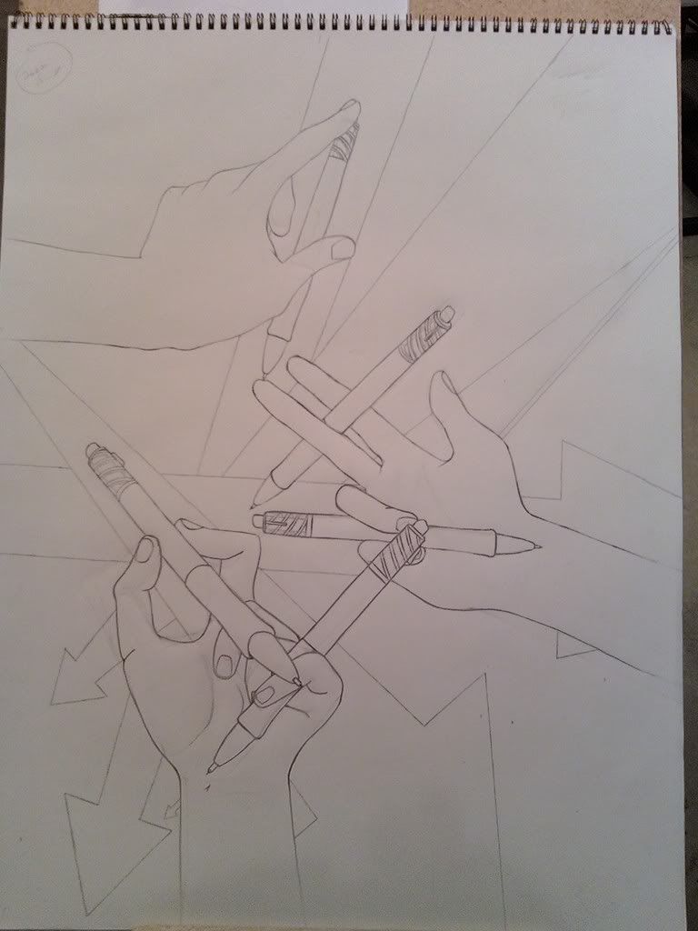
Bottom thumb is still weird, bring it in a bit closer, and the perspective on it is screwy, the nail should be more over to the left side on top, not near center.
Dangit, I knew something looked weird about that nail... Further fixing the thumb itself was out of the question. The drawing's finished and it's good where it is.
Decent, but the glow around the text seems out of place, and your name on the lower right is barely visible. Make it stand out.
I don't see the relevance of the halo font with that image. Damn font's overused.
Coming along pretty well.
Also, don't forget guys that tank crews are usually issued with shortened assault rifles and such (like, REALLY shortened), so it'd be work asking Snaf if those count ;)
Ok so I took some criticism I got before and rolled and smoked it. 2 weeks later I found time to make some changes...
Spoilerd becauseapocalypsesome bitches don't like gifs
Maybe I should have written some notes with it but I just wanted you guys to find the flaws for me so I could address them. This is for a forum banner and my name is not meant to stand out. It's mark of just the artist's signature or trademark.Quote:
Originally Posted by ExAm
Hahaha, of course not. It's just there because it was the best looking font in the list I already had. The font was there from a previous Halo-related project last year.Quote:
Originally Posted by Reaper Man
That's pretty cool.Quote:
Originally Posted by ExAm
TBQH, they look exactly the same to me. What did you change?Quote:
Originally Posted by ironclad
Watch more carefully, they have some key differences
I see it now. Although, it is really hard to notice but I think the stock pointing to the left while ejecting the magazine (or whatever caseless ammo uses) looks more authentic.
I should really update my gallery at some point
... wait, what??
Am I interpreting that right, or is my mind just seeing what it wants to see?
Probably the latter
e/ oh, she's looking at the sky, so yeah
e/ oh wow, I knew I should've folded her arms across the top of it, that just looks suss
She's clearly hiding her erection. :downs:
Looks like she's grinding the pillow :v:
hopefully she smuthered that bitch.
oh jeez ross.
ironclad, that animation looks way better now. Get it ingame gogogogo
fuck you guys have you never seen a person sit backwards on a chair or something ffffff
:D thanksQuote:
Originally Posted by Conscars
Unwrapping comes first though, and it doesnt help that the modeler *COUGH DONUT COUGH* decided to tweek some things after I finished unwrapping it, which totally threw off the uvw coordinates. Admittadely the model has much more :awesome: now though.
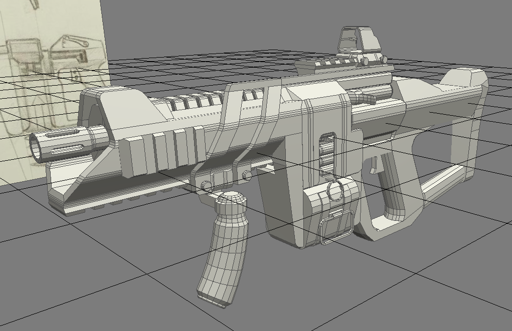
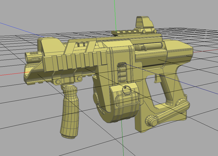
So as it's been said before, this thread gets more attention than any of the other ones, and I would really like to improve my gun... please help me out guys...
Thread here:Quote:
Originally Posted by BobtheGreatII
http://www.modacity.net/forums/showt...194#post300194
I actually like it alot. Looks like that EMP gun from Timesplitters.
think I'm getting the hang of this skinning lark
http://i298.photobucket.com/albums/m...0progress1.jpg
The only thing I don't understand about skinning is getting everything to be consistent between UV slices.
Ross ur doing it the old wrong way. Chunk by chunk, you don't need to. Fill everything on your texture map with the same metal material if it's using it, and flood other areas with other materials if they use them, and skin EVERYTHING at once. you
ll get better blending in the end and it'll be much quicker. Also, if you learn a bit more, you can just bake a shadow map and an ambient occlusion map rendered from max onto your texture to cut out alot of time, so virtually in the end all your doing is details, rather than wasting time on all the big flat areas.
I like doing things the old-fashioned way. vOv
I generally find I work better if I do things in segments. If I do the whole thing at once, I end up getting overloaded, or forgetting things, or rushing them, or just generally fucking up. This way, a section has to be complete and up to scratch before I even consider doing anything else.
As for AOs... I don't know how they work yet, and in any case, it'd be both pointless and detrimental on such a low-poly model when there's no high-poly handy (and I'm not making one). I wouldn't have shadows where I need them, and I would have shadows where I wouldn't need them.
Maybe once I progress onto larger maps and more detailed models I'll start learning some of the fancy baking stuff people do, but until then, I'm happy with doing everything by hand.
Ross, isn't that model a little... terrible? I'm used to seeing really good gun models from you.
Third person model, I'm guessing?
Model is Fallschirmjaeger's, skin is mine on a 1024x512 (needs to go down to 512x256 but I fail at downsizing it without making it look like shit). It's for GR, hence the oldness
lol @ GR trend
Downsize using bicubic sharper interpolation :eng101:Quote:
Originally Posted by rossmum
isn't it weird how you learn a new phrase and then immediately hear someone use it?
I just discovered that as one of the methods for downsizing an image in ImageReady not two hours ago. :tinfoil:
Lol, yeah I know what you mean, I find myself constantly ending up using new words almost immediately after I learn them, and then it makes it appear to others as if I know what I'm talking about.Quote:
Originally Posted by Rob Oplawar
E:
Also, I drew a baby. White pencils and white sketch sticks.
http://img362.imageshack.us/img362/2...ysketchhw8.jpg
Still looks possessed.
nice baby.. the right eye (well the babies left...) looks hairy though :P
e: lookin at it now, that is one ugly ass baby and will deffo need braces when its older.
that kid scares me.
Something about the eyes....
they're hairy :P
The eyes are huge
Did you know your eyes never grow at all, so when you're a baby, they're the same size as they are when you're an adult?
The more you know.
But seriously, that baby is freaky.
Reminds me of something I'd see in Bioshock. And whats up with the right side of the mouth? looks like there's a thin mustache coming out the side.
It's called a dimple.
I've seen plenty of babies, and their eyes do not look entirely disproportionate to the size of their head.Quote:
Originally Posted by sKc_Chains
This.Quote:
Originally Posted by ironclad
sup
The shovel on the side looks really flat but that might just be a distance thing so, otherwise nice.
Ross, stop posting shit models.
...
:glomp:
I have to ask, what are the weird little pipe dealies on the side for, anyway?
It looks as if its bulging out though, rather than inward. That's why it looked weird to me, I realize that its supposed to be a dimple.Quote:
Originally Posted by rossmum
It's the distance.Quote:
Originally Posted by selentic
I actually don't know, lolQuote:
Originally Posted by Rob Oplawar
Are they actually from the Tiger? They look like supplies for towing or track replacement.
Yeah, they are from it.
I'm not 100% certain what the rods are, but they're usually striped like barber's poles.
Gun cleaning kit, maybe?
I based it off a photo, so it's not my fault :phonegonk:Quote:
Originally Posted by ironclad
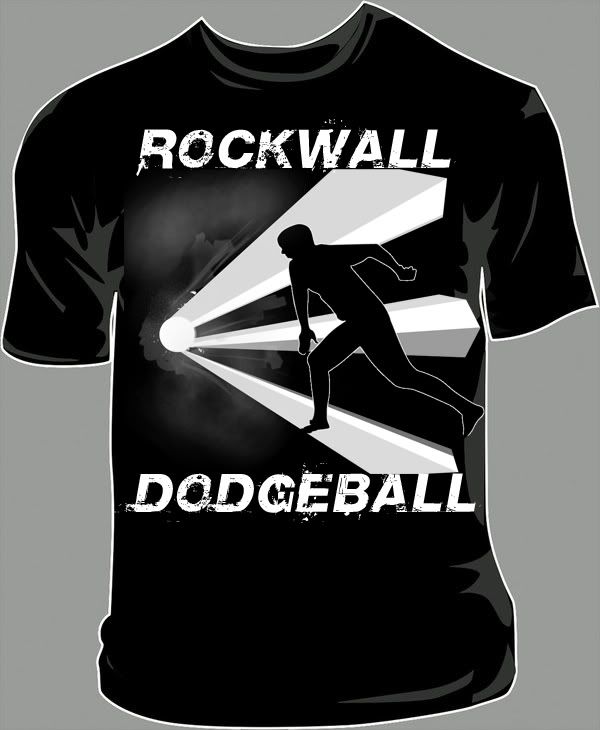
I'm making a dodge ball club for my school... We need t-shirts so I'm trying to design some.. here's the actual design:
And here's what it looks like on a shirt:
I think it's pretty meh, but my friends like it, so I guess it's ok.
Mint, I like that.
Badass...Make shit for my school.
Are you kidding... i'd wear that just for the sake of wearing it lmao... love designs like this, nice work. :cool:Quote:
Originally Posted by Snowy
E: but jus to give you some criticism, I notice something seems off with the pose, not entirely sure, just doesn't look convincing enough that he threw a ball. (didn't even notice that, thats what it was supposed to be at first glance). Something with his throwing hand seems off, I'm not sure. Thats just my opinion, not entirely sure how you'd fix it, if your happy with it though keep it the way it is.
Text quality seems a bit low too, but it probably doesn't matter.
Also is something gonna be on the back?
You might want to consider putting the person on the back and something different in the front too, or just the text in the front, with person on the back.
(different combinations might look better or worse than others... just some suggestions...)
shirt looks cool
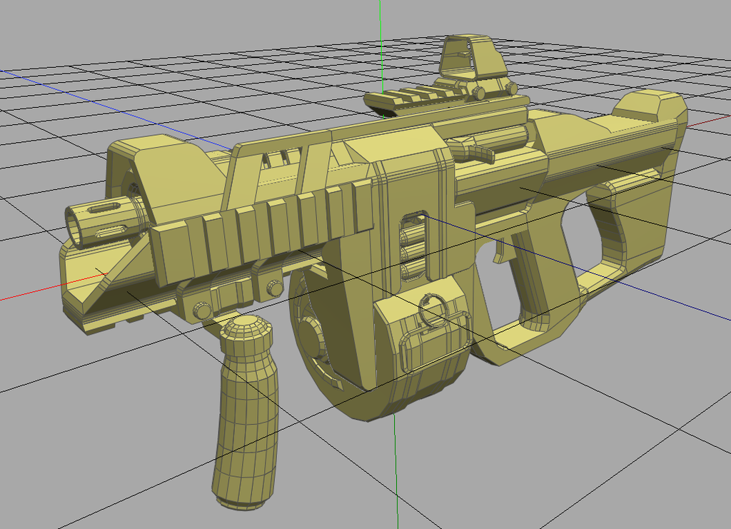
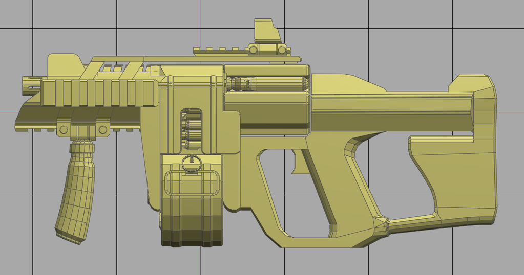
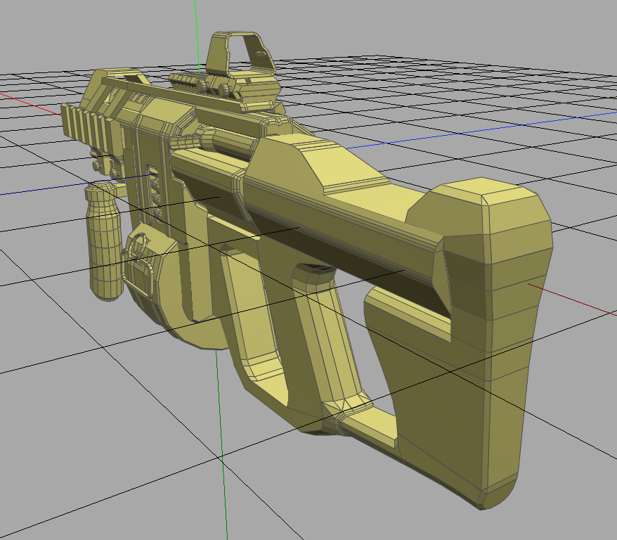
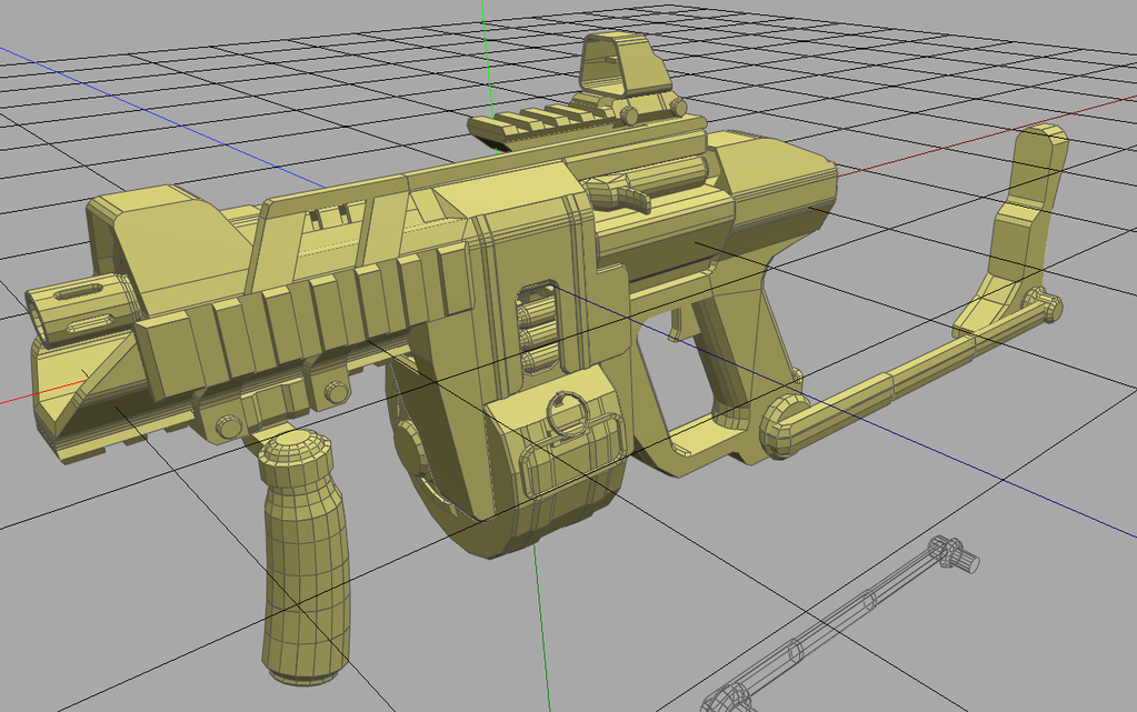
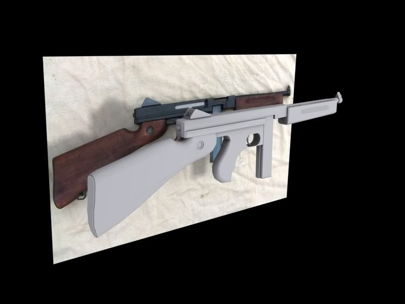
Moar:
EDIT:
Now with folding stock!
Reminds me of the Demoman's sticky launcher. Looks good.
I actually like it a lot. Very original design...
I found a pretty big spider, and my 5 Mega pixel camera finally took a decent picture :O
Not edited or anything.
e;
I love that weapon ExAm
Garden Spider. My house and backyard are a hive for these things. I can't step outside my laundry room door without spotting 3 of them off the bat.
They're wild and nervous, but they're extremely docile and benign to human beings......at least mine are :-3
love the gun exam. I was a bit skeptical at first but it looks nice.
Wished I had that much talent as you guys, great suff!
WTf forums, made my post go away.
Hunter, the image is kind blurry and grainy, the lighting is boring and lacks color. the subject is too centered and the angle could be more interesting.
I like the blue one. Im not a huge fan of C&C.
Also, nice shot of Garden Spider. I have never actually seen one of those.
exam, that's really come along nicely
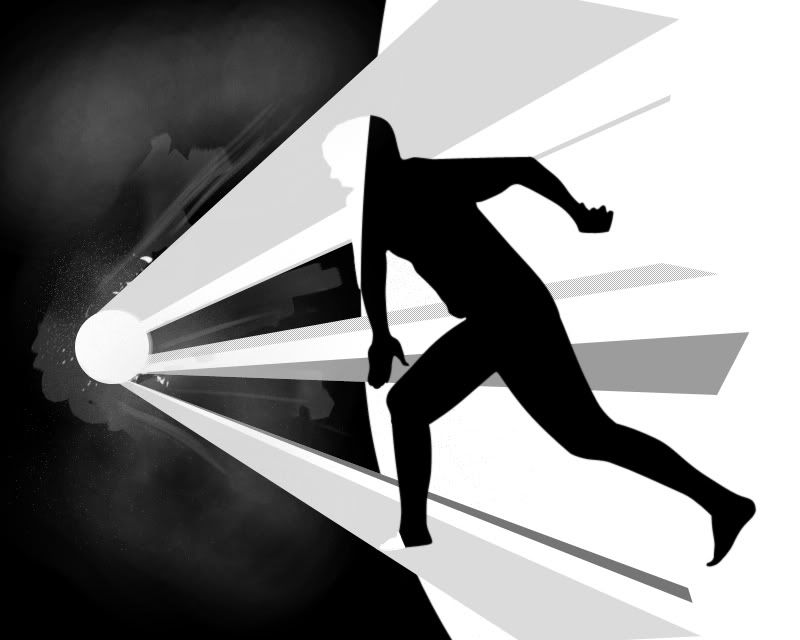
submitted this for the bungie/HBO contest. I didn't have any time to colour properly since the deadline is tonight and I had to head off.
Megapixels and image quality are irrelevant once your camera is 5MP or more, it's about lens quality, this whole megapixels = better is a massive misconception. Generally higher MP = noisier photos due to higher pixel density. >_>Quote:
Originally Posted by Hunter
Anyway, you shouldn't have used the flash, it really blew out the highlights.
I didnt use a flash Lol.
EXIF data says the flash fired, it's also obvious when you look at the picture.Quote:
Originally Posted by Hunter
Negative space project
http://i231.photobucket.com/albums/e...922081935a.jpg
E:
Bored, I did a quick shoop of the above
http://i231.photobucket.com/albums/e...egspacepsd.jpg
Gotta fix some smoothing errors, then I'll detail it. :D