If you need refs to supplement my horrible descriptions body-wise I suppose I could always force myself to find refs for that too :downs:
Printable View
If you need refs to supplement my horrible descriptions body-wise I suppose I could always force myself to find refs for that too :downs:
Looking good Disaster, IMO the forehead looks a little large though.
The way the nose is turned down a bit makes her look more manly. Try giving her a more feminine face.
Practicing my speed painting, time this took was 10 minutes, was just getting in some base style for a character design I was thinking about.
http://i305.photobucket.com/albums/n...rpractice2.png
You modeled the tits wrong disaster.
Looks like a Native American.Quote:
Originally Posted by sKc_Chains
Also Im not an artist, so whats with the color splotches on the right?
They aren't going to be seen.Quote:
Originally Posted by CLS{GRUNT}
should be :BQuote:
Originally Posted by disaster
Base colors, what I used to create the tones on the man there, you pick out a certain set depending on what color or age you want him/her and blend them to create what you want. Detailed areas like cheeks, forehead and center nose tend to be render then other areas, while on men the jaw area tends to be a grey steel or chrome color blended for an aftershave. Then the other colors are just natural ones.Quote:
Originally Posted by Advancebo
I'm guessing so he can go back and pick the same color he was using before after he changed the color he was using.Quote:
Originally Posted by Advancebo
You sir, are correct. Its like a painters paint palette thing. That little odd shaped, wood paint holder.Quote:
Originally Posted by Corndogman
Except all I have to do is use a dropper tool to get the color back. :3
you could have saved them into swatches palleteQuote:
Originally Posted by sKc_Chains
You can do that? Holy crap!Quote:
Originally Posted by Advancebo
I like it better having them on the canvas so I can mix them quickly and so I can constantly view each one at once while painting at the same time, I just find it quicker.Also, elite base mouth practice:
http://i305.photobucket.com/albums/n...elitebase3.png
Nice, except no tongue
Elites do not have tongues from what I have seen.
AUG! The colors are wrong tbh. The elite is supposed to have dark black/brown skin, with a dark red + maroon mouth. There's also way too many teeth being shown than there should be at that angle.
Mabye he wanted an albino elite? Hmhm?
I am making race colors of grayish white, brown, black, redish, and blueish.
The coloring for the grey one I based off the small lizards that live around my area. Also I raised the gums to show off the teeth more on the upper jaw.
Well I am back, and have been working on redoing the night of the covenant as I promised, and have decided to show that I have the cliffs done. All I have to do is paint in the lake and sky and elite and it will be ready.
http://i305.photobucket.com/albums/n...ntrevamped.png
You've got different techniques clashing in that piece. In the water it looks like you used a filter or a brush that makes that pattern, but everywhere else (except the stars) is sketched. They don't mix nicely. Parts of your image are blurry and hand drawn, others stand out and ruin the good parts. I'm also having a hard time seeing shape. Though you generally did a good job shading, the perspective is confusing and it's hard to tell the difference between one plane and another.
I always have trouble with ice, but I wanted the ice to stand out, as in smooth ice bright ice versus jagged rock. Also I am aware of the distance of planes issue and am working on that, can you be more specific on what parts need to be less sharp or less blurry?
that really depends on your style. I like to keep things detailed, but it takes much longer.
I dunno if you remember this drawing of mine:
http://img261.imageshack.us/img261/3011/ruinsxp1.jpg
You can see I got bored of it and stopped, and i never achieved the detail I wanted consistently through the image. The foreground is nice, but the background was rushed I think. I also didn't spend enough time on laying out the pic, I just started drawing once and this was what I ended up with.
I like it but I am having a hard time figuring out the angle....its too obscure.
stop being such a good photoshop artist, con. you're making me feel inadequate.
e: have you seen this comic before? that's what that picture reminds me of. i can't remember precisely where I found that comic- it's quite possible that you or someone else from modacity first introduced me to it. :P
ee: oh yeah, now I remember, somebody posted a panel of it in the random funny pictures thread.
yeah it was inspired by blast wave, I was reading through a bunch at the time.
XD never seen this blastwave stuff before, looks like something I'd spend hours reading lol...
Also bak to what con said, I usually tend to draw my backgrounds better than I do my foregrounds.. lol
E: I like the styles from this blastwave comic, and I'm, reading the info on it apparently its all just taken widely off of apocalyptic styled games and movies. Some of this stuff would make a cool mod/game. e1.5: sounds like he doesnt like the idea of people expanding on it tho..
Pastel stuff
http://www.youtube.com/watch?v=QsxV49pmnL8
I'll be completely honest here, the thing underneath looks like a face with feces spewing from the mouth.
Other than that, It looks great!
Supposed to be a mask with a beard or a trunk I guess.
This is what I saw it as at first. Thanks for fucking it up, Corndog. >:|Quote:
Originally Posted by ExAm
D:
I saw the shit too :\ My mind is kafuxed
yeah, I saw it that way too. gg internet
I haven't actually watched 2g1c yet :awesome:Quote:
Originally Posted by Conscars
I'm trying to make nice renders these days.
Just something I'm making (a Bacardi glass). Not yet entirely finished, but I'm getting there. I'm still tweaking a lot of settings, one of them being the text on the glass that states Bacardi (it's black while I've set it to be white :s)
:lmao:Quote:
Originally Posted by Corndogman
You shut your whore mouth >:UQuote:
Originally Posted by Pooky
The bump effect and the sticker is cool, but tbh my whole class has made better glass material in blender.
Cmon man this is max, use that shit.
I'm still trying to get it to look :awesome:, but it already takes 45 min to render that, maybe I'll try on a lower resolutionQuote:
Originally Posted by DaneO'Roo
Use Vray.
Me neither :awesome:Quote:
Originally Posted by ExAm
I am using vray.Quote:
Originally Posted by DEEhunter
Learn how to use it. Ill be glad to tell you how. I made a template for WIP renders you may use. http://deelekgolo.deviantart.com/art...plate-99926790Quote:
Originally Posted by beele
http://i218.photobucket.com/albums/c...aith_types.png
Back Wraiths: Halo CE
Front Wraiths: Halo 2
Middle Back/Front: Standard
Middle: Darker Blue Standard
Left: Anti Vehicle Green
Right: Anti Air Red
Modeling new cannons for the Anti Vehicle and the Anti Air Wraiths.
Soon to be Open Sauced
Oh cool, you can use the selection and hue/saturation tools in PS! Bravo!
I especially like the sloppiness of forgetting about the metal that's supposed to remain dull blue/gray.
^ At least make new skins for them instead of changing colors...Quote:
Originally Posted by teh lag
actuall i switched channels
...Quote:
Originally Posted by Advancebo
:suicide:
At least put some effort into making a decent product.
i will modify the textures, maybe retexture after i finish modeling new cannons
Starting on H3MT's elite, any suggestions will be nice, planning on using a detail map for metal.
http://i305.photobucket.com/albums/n...techestwip.png
i really dont think h3mt doenst want an elite not halo 3?
Too much plating. And it really isn't giving me the "Halo/Covenant" feel.
Then how did I get the model and unwrap? Directed at advancebo.
Texturing makes it look more like some kind of gray harlequin fetus than an elite.
Make a higher polygon version, bake out some bumps and use that to help give your texture more detail. Right now it looks really flat, ugly and boring.
Not my model, it is going into CE, so no bumps, so I can not truly make it unflat unless nugget redoes the model. I will bake when I have the lines done, and I am keeping it a neutral grey since it s a biped for obvious reasons, instead of skinning it red, white, green, blue, purple, orange, ect. Grime and stuff will be added with a detail map.
It's too overdone. There are lines everywhere and it's distracting, not to mention it doesn't really look all that Covenant - and grime really does not strike me as something you'd see on an Elite's armour.
Chipped paint?
D: chains it looks really flat. Also, if this is h3mt's elite, shouldn't the elite look like halo 3's elite? Don't put so much detail in one place, it distracts the eye, and frankly, it looks like the elite used a torch to burn a maze design into his helmet. I'm expecting to see a mouse running around in there somewhere looking for the cheese. I can appreciate the attempt at detailing, and maybe it does look good on the unwrap, but really the details your adding are things that should be modeled in, not skinned on. Elites usually keep it clean , so the grime and chipped paint you added don't really fit. A few light burns or scratches might look ok, but this doesn't really look right to me.
E: also don't forget your promises!
Fine, screw it.
Model, Rig, and Sounds aren't mine, but I wanted to animate something that WASN'T Halo, and I found these things. Crit, comments are welcome. Also, some parts are snappy and have been fixed.
These aren't humans. They're Elites. They are a race of fiercly proud warriors with longstanding traditions and and an overly stuffy, vain bearing. I strongly doubt you would find their armour in anything less than immaculate condition, with the exception of battle damage which would be repaired immediately after the cessation of hostilities.Quote:
Originally Posted by sKc_Chains
Not the attitude to take, sonny.Quote:
Originally Posted by sKc_Chains
e/ mag tap looks more like a grip tap, might want to do something about that
Shameless bump
http://i298.photobucket.com/albums/m...2/ma5bflat.jpg
Working with this thing is a pain, the way the skin stretches in some places and just plain doesn't show in others pisses me off. In the end the only real advantage of redoing the entire receiver and upper heatshield was being able to say I did the bastard myself. :|
jesus fuckign christ, what kind of a little girl are you, you fucking crybaby.Quote:
Originally Posted by sKc_Chains
boohoo, they is not say nice things!
go sit in a corner and cry yourself into a fucking dehydration ffs.
Hmmm? You do not understand, I decided to ditch it to give it to someone who knew better. I am not a very good skinner, and I am not going to stubbornly do it when people say its wrong. I am not giving it up, I just need to learn a bit more before trying at it, and since I will not change overnight, it will keep the owner of this elite waiting, when someone else could skin it just as good, maybe even better. Sorry if it came off in the wrong form to you, but I am more laid back and when it doesn't work out, I either restart or just toss it out, not cry myself to hydration and never touch an unwrap again, sorry if you misunderstood.
Wow. You must not understand what criticism is. You cannot be babied through this. Take that fucking crit and use it. People actually give EFFORT to tell you what is wrong, and instead you trash it. I know, because I used to do that, but did you see that my work got about 25% better after I actually took the criticism?Quote:
Originally Posted by sKc_Chains
Carbine skin by me. Model by nugget.
That's hot, but it might just be the lighting. Pic of just the diffuse please.
its not the lighting, theres just 1 omni, Its the spec and normals.Quote:
Originally Posted by FlamingRain
Just the diffuse and nothing else.
I dont like it. Its just too uniform with the purple. Hard to explain atm.
Metal is never 1 solid flat color. There should be some lighter variants, and darker variants of scratches and detail. It just shouldn't be 3 colors on your skin.
http://www.bungie.net/images/News/We...te/carbine.jpg
Its all same colors with a few variation just like my skin. The variation is all done in specular maps btw.
Don't do that. Put the variation into the diffuse map, even if just a little.
There is. You just can't see it because of the bad render. Let met get a better one.
And thank you doan for the normal maps (he got all pissy because i didn't say anything :|)
Normal by Doan.
wat?
the hand movements when he goes back to grab the grip don't look very natural to be honest. it looks a little too flowy. When he pulls the magazine out, it doesn't really look forceful, and there could be a bit more time between mag out and mag in. I like the animation overall though. Where did you get the rig?Quote:
Originally Posted by FlamingRain
It looks pretty bland to be honest. Without the specular and normals it looks a bit stretched and boring. You could put a bit more detail into the diffuse at least. Also, unwrap on the handle looks very bad, along with the circular holes in the back of the gun. It looks lazily unwrapped overall.Quote:
Originally Posted by disaster
Don't do what the big devs are doing these days. They're all getting excessively lazy and putting no effort in, relying on normals, spec, and God knows what else to make things look good. If you look at some of the diffuses that end up in games these days, they're more or less just flat coloured. It might be easier and some people might actually think it looks better, but it's a bad habit to get into because if you do need to rely on the diffuse alone later on, you're fucked.
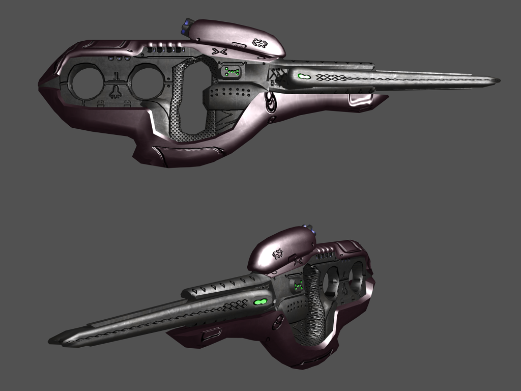
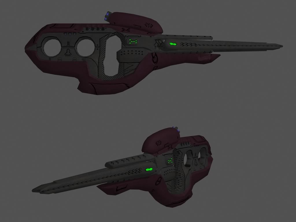
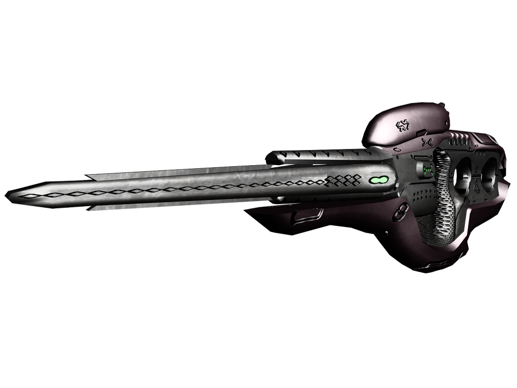
Silenced BR
http://i58.photobucket.com/albums/g2...enced_br_2.jpg
http://i58.photobucket.com/albums/g2...enced_br_4.jpghttp://i58.photobucket.com/albums/g2...enced_br_5.jpg
Shit renders are shit, un-realistic silencer un-realistic because its basicly a metal tube and silencers are not made like that.
Your battle rifles always makes me happy
How come no view from the other side hunter? You even mirrored the scope-less BR to avoid showing it.
I mirrored that it in the last picture because that picture wasn't meant to look like the BR was duel wielded. It saved me rendering two pictures each with the other sight on.
http://i58.photobucket.com/albums/g2...enced_br_6.jpg
Lol i wishQuote:
Originally Posted by Hunter
I made them so they can be baked into the diffuse. The spec and normal won't go into CE. Also, I didn't unwrap it, I'm not sure who did.Quote:
Originally Posted by rossmum
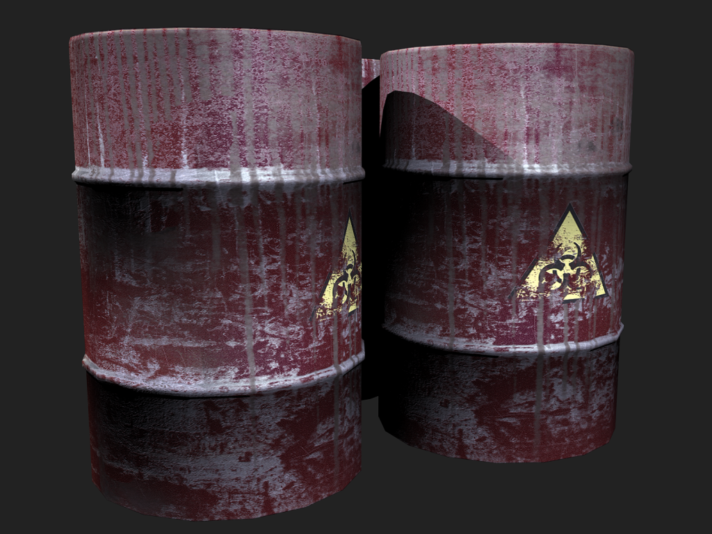
E: Also, Advancebo, Your Barrel makes me unhappy
its my first unwrapped texture :/Quote:
Originally Posted by disaster
Its to low res for an object like a barrel.
Your screenshots textures disgust meQuote:
Originally Posted by Advancebo
Those sst's are bad.
I used screenshots as a base
I think you mean as a barrel.
Seriously. All you did was screenshot a texture and put it on a cylinder...
You didn't even unwrap the white rings to the rings you modeled on.
actually i unwrapped, then i placed the screenshot then edited.
It doesn't matter what you did or didn't do, it looks terrible.
I still feel something is missing on the front part of the helmet, may make some indents. Also, I need to make the honeycomb pattern less noticeable.
http://i305.photobucket.com/albums/n...helmettype.png
Looks way better :D
But I thought the honeycomb pattern was only on the elites grey rubber-like parts to allow movement at joints?
It is on the rubber parts, and not on the metal, but I decided to give the metal less noticeable ones, sort of like the vehicles.