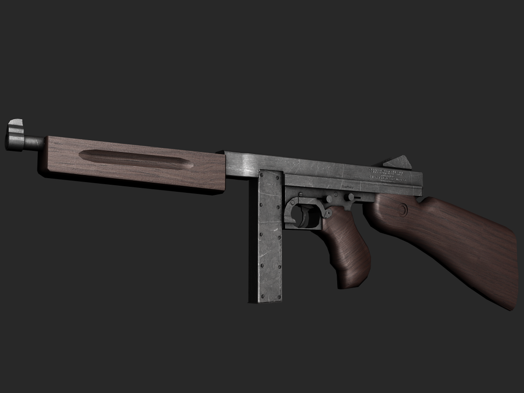
Yeah. My spec and normal maps for the wood make it look like shit. I'm going to most likely redo them.
E: Btw, its the first time I've ever tried to paint wood on a texture.
Printable View
Yeah. My spec and normal maps for the wood make it look like shit. I'm going to most likely redo them.
E: Btw, its the first time I've ever tried to paint wood on a texture.
Double post:
Fixing up the wood. Have yet to make the normal map.
better...but something still seems...off
That good sir would be the wood that looks entirely unreal.Quote:
Originally Posted by LinkandKvel
Grain is right...its either too glossy or the wood is the wrong color. IDK my BFF sel
Wood is very, very wrong.
I can't really think of a way to describe it, but it's still way off. The specular really isn't helping the matter, either.
Highlights on the wood and the metal look to be off. Make it so that the bottom is a bit darker and has some very light earthy tones while the top is lighter and has more sky tones.
The hightlights that you have on your wood make it look like it is that fake vinyl paste on wood. That looks icky.
Oh, and the model seems to be off a bit in the wooden front grip area.
Notice that the grip has a slight slant to it as it goes up? Also, the barrel is more prominent than in that model. Post better renders that show more of the top if that isn't the case D: .
The barrel is what bothered me.
That whole thing is totally off. Detailing in the wrong places, looks like a toy gun rather than a real one.
would look great in a Timesplitters title.. but yeh, not very realistic looking at all
You have got to be joking. That model barely looks like a Thompson. As for your wood, it's ok, but still not at all like what's on a Thompson, and as for your metal, way too cloudy/spongey/soft with random nonsense scratches all over it. Terrible, redo it.Quote:
Originally Posted by disaster
eh I thought the metal looked good but now that u mention it, it does have some nonsense scratches, I don't think it calls for re-doing it. It really depends what hes trying to achieve though.Quote:
Originally Posted by SnaFuBAR
It looks realistic enough for a game to me... then again thats why I say whats he trying to achieve. If its meant to be for realisim then yes it has problems, imo it looks to perfect to be real. (talking texture wise, the model looks good to me, but I don't know much if anything about guns)
The wood has almost no imperfections in it, thats the main problem I see in it right now, keep working on it. I really don't think you need to redo it unless your really going for complete realism like snaf up there is.
E: reminds me of the thompson from MOHAA (metal of honor allied assualt)
reps for whoever can guess what it is
Forgot to mention, the model is by Geo. The origin is mine. We make a good team
EMP gun...
Nope. it is a halo themed weapon, and you've probably seen it before
Brute themed weapon? Hair dryer? hehe.
haw, you try and dry your hair with this thing and your going to be in for a surprise.
Its the ghost gun....or one of the weapons from the vehicles.
http://farm4.static.flickr.com/3149/...20c1ba.jpg?v=0Quote:
Originally Posted by ironclad
^The 3rd one down...
D; the one guy I cant +rep
yes thats it but we skipped the front blade because its ugly
It looks like a boxy version of the Brute Shot
e/ nevermind, where's that from
Some halo MMO abortion.
I like it.
thanks. it wont be skinned that way most likely though. firetruck red is not very brute IMO
Thats one of the things I liked about it tho. Dont change it.
Random, but good. I'm guessing its for school or work.
Accurate none the less.
where are the tape worms?
Quote:
Originally Posted by LinkandKvel
I don't like how they have done this... there should only be one bruteshot... the forrunner assault rifles suck. Microsoft suck...
You realize that that game will never hit the market, and so they technically haven't "done" anything but make concepts?
Haha, Will test on bunnies. :3 jk.Quote:
Originally Posted by ironclad
The picture lnk posted was the same one I was thinking of, just was too late for me to find it. :)
Dont change the front blade or the color clad. I am begging you.
Well it really is up to Geo, and he didn't like the front blade. I suggested he make his own kind but he opted not to and it really isn't necessary since we still have the back blade for splattering faces. Color will be up to Veex.
:(
bad edits are bad.
What's it's use gonna be? It can't really be a Brute Shot clone, so it has to be different, right?
I think that it looks kind of like a Pistol, or a Rifle (single shot).
You'll just have to wait and seeee :)
twat
I prefer the term "cockgina", or "team leader".
WIP Vector piece, drawn in Flash (because I'm more comfortable in it than in Illustrator)
The next step is to age it, either digitally or physically (print it)
Based on a minimalistic 2d futurist style.
http://img408.imageshack.us/img408/3...orsmallkx1.jpg
haha, I love it! Can I have a print?
Sure, how big do need it?
Quote:
Originally Posted by Hotrod
I would have told you what it was, but ICEE wouldn't so I better not. But yeah since I modeled it I think it should be red. I like it hotrod red. It reminds me of Ironman. Also, me and ICEE tested last night and it was fricking sweet.
:)Quote:
Originally Posted by GeometricGeek
I'd be agreeing with you on that one, for several reasons.
Your name has nothing to do with your opinion of course :PQuote:
Originally Posted by Hotrod
Edit: Just incase you were wondering what the whole gun looked like. Every pic but the first is how it reloads. (No mag in the pic but there is one)
http://upload.pxspot.com/px/0/300/35...nebrutegun.jpg
http://upload.pxspot.com/px/0/300/35...40_reload2.jpg
http://upload.pxspot.com/px/0/300/35...45_reload1.jpg
http://upload.pxspot.com/px/0/300/35...42_reload3.jpg
Well now I'm getting into human modeling after looking at some of gears 2 environments, here is an attempt at it. Does it look good?
http://i148.photobucket.com/albums/s...tled_09892.jpg
http://i148.photobucket.com/albums/s...kdshfhklsg.jpg
Rebars look extremely fake. They look random, and the blown out wall portions look too perfect. When walls get blown out, the blown portion isn't level. Your walls are making perfect 90 degree angles. Walls flat surface is REALLY killing it.
Rebar is bad. Also, would you mind explaining to me where the bits and pieces of blown-out wall are?
the rebars look... "creaturey". They all have about the same length, change that.
IIRC, rebar is interlaced horizontally and vertically, so all your rebar should be emerging from the broken wall vertically or horizontally, and not diagonally. Rebar is also a lot thinner than what you've got there.
Front/top in general is not curved enough, look more closely at the reference image.Quote:
Originally Posted by GeometricGeek
Also refer to bruteshot.
How can I contact you? Something I'm getting into might interest you. :)Quote:
Originally Posted by LinkandKvel
Just PM me. I'm usually here at least twice a day.
Why does this texture suck?
http://i31.photobucket.com/albums/c3...n_floor_03.jpg
The black outlines are a little cartoony in places, and the whole thing could use a bit of a sharpen in my opinion
The metal is very cloudy and lacks any other details other than the scratches you have on the edges. Keep working on it, you could end up with a nice product if you keep going and doing the right things to make it look good.
Thank you Conscar for those pics. I couldn't find any good ones.
What is this suppose to be? It doesn't look good at all in my opinion, have more to show then present it.Quote:
Originally Posted by killer9856
E: Model innacuracies spotted, will repost in second.
To the rebars
Like I said, logicsQuote:
--- Original message by: Advancebo on Halomaps
Also the bars, (rebar w/e), wouldnt just point in different directions, they would point away from the explosion or whatever made the hole. If the explosion is outside, the bars would be facing in. If it was like a pod crashing through the wall, the bars would point in the same direction that the pod is going.
if you posted it on halomaps, why did you need to put it here too?
Quote:
Originally Posted by mech
Its a building of course. What did you think at first?
I was more looking for advice on how to make the blown out part more better.
Since you said "have more to show, then present it.", Im taking my time. Those pictures Conscars posted was a huge help. :)
Quote:
Originally Posted by disaster
Looks good. I like it. :)
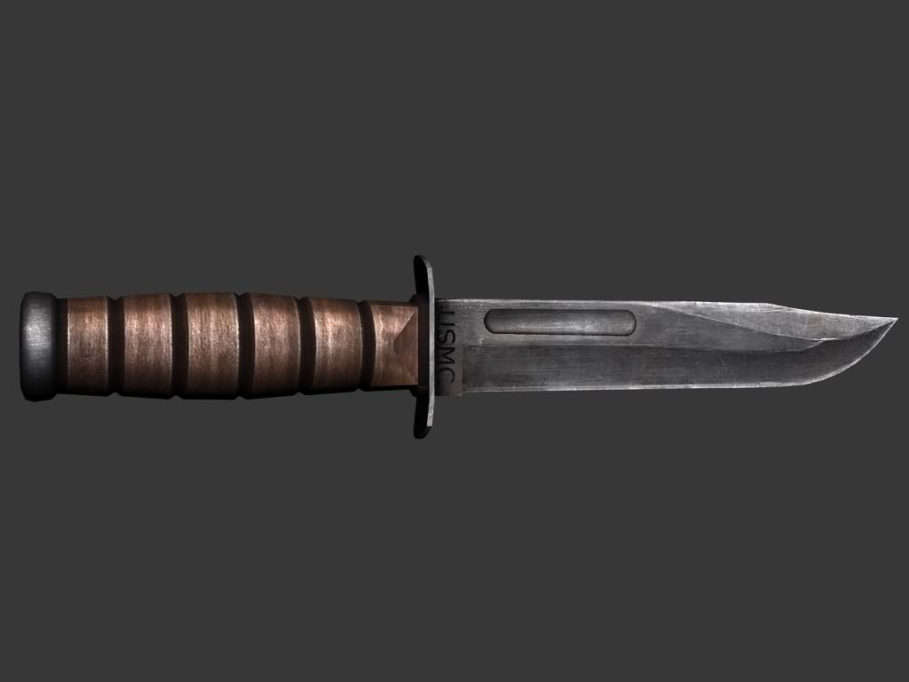
Make it so it's less scratched inside the groove on the blade. The wood handle doesnt look amazing but ok. Or is that sappose to be a leather handle?Quote:
Originally Posted by disaster
Compressed leather washers IIRC
^
I will see what I can do with the inside of the indention on the blade.
Need to skin it now.
Tiny cock pit.
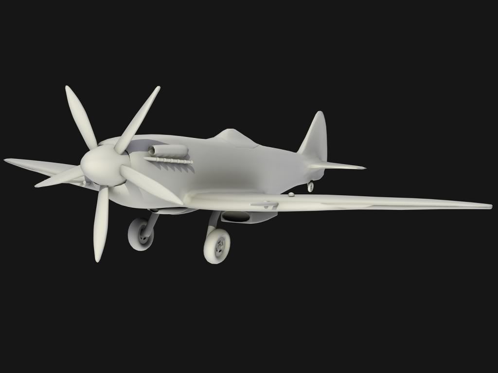
I think I fixed it.
A random marine guy running.
http://i305.photobucket.com/albums/n...htexpand-1.png
Yet another artistic venture doomed to abortion...
His body position in that drawing looks wrong.
Proportions are wrong
and
Stop discouraging him and give crit at LEAST.Quote:
Originally Posted by .::Sim::.
THEN you can discourage him.
:p
He wasnt insulting me.
ninja
Its running from your avatar.
GET TO DA CHOPPA
Im thinking of painting in a bag of money in the left hand, and have the hand up to his face pulling away the face as if its a rubber mask there and have a shop of bill gates in it.
FINISH MAH DAM AR YOU :|
Also, looks a little abstract but not bad
:v:
Forgot I had elite, decided to start back up on it.
http://i305.photobucket.com/albums/n...losetodone.png
http://i305.photobucket.com/albums/n...almostdone.png
Also yes I am aware of the mouth, the unwrap has that group with the lips, and since its tiny and in a corner I cant exactly get the precision to fill half a pixel line that represents that on the unwrap.
Just... no.
Wait until you can better control your base materials before skinning something so big. You need to start waaaaay smaller.
Where did these pics come from? Art of Halo 3?Quote:
Originally Posted by LinkandKvel
I read it was from some Microsoft MMO project that got aborted.
More specific please.Quote:
Originally Posted by teh lag
Quote:
Originally Posted by Masterz1337
http://news.filefront.com/ensemble-s...on-a-halo-mmo/
Right here
Your elite's face looks like it's made out of brownie batter, or something else that is brown.
Ok, ways to make it better?
Took me all day sitting in this chair. D:
Dee unwrapped
http://img90.imageshack.us/img90/4091/fgbd6.png
Deehunter made an awesome sauce render. I was actually stunned when I saw it.
:D
It looks like he's punching himself in the face. :/Quote:
Originally Posted by sKc_Chains
lol. Just realized that.
It looks urgh.Quote:
Originally Posted by jngrow
Mind posting an actual shot people can see? This isn't a gallery. If you want crit, post a close up.Quote:
Originally Posted by disaster
I am still waiting for someone to be specific on how I can improve on the elite so I can get back to work on it.
Quote:
Originally Posted by sKc_Chains
You want crit? I give you crit, though its really annoying to me that you wont finish the things you start before going on a new project (assault rifle). Here you go:
The helmet looks a lot less like covenant metal and more like concrete or plaster. I know this is a diffuse only render but the wear and tear still takes away the smooth feel it should have. The black spots look too splotchy, definitely painted on. It should be less worn and more of a solid color with minor scratches. The skin on the face looks fairly good to me, though a little bit flat. I think that elites have more purplish skin than brown though. The skin on the neck however completely doesn't match. Its darker, more sinewy looking. You should pick one color scheme or another for the flesh textures, not jump between them. And im going to assume that the pink part is purely placeholder. Now finish the dam AR you. <:mad:>
Well one, I technically started the elite before the assault rifle, so eh.
Also the elites wear a full body rubber suit that only exposes the skin on their face and hands, so the neck skin is actually not skin. Also, I would like to show you why the helmet is splotchy with its seams, even though I've repeatedly explained it to people.
http://i305.photobucket.com/albums/n.../elitecopy.png
The small thing up in the right hand corner is the helmet, so as I said, I literally had to use a one pixel brush plus constant erasing and painting to smooth it out to even that much.
Parts of the unwrap look pretty sloppy, granted that I have no idea what some of them are. Did you do this unwrap yourself? There is clearly plenty of room to spread the helmet out a bit and make it better for skinning.
No, Mr. I am the greatest uver in the world did this. :\
Dee.
lol