-
Re: The Studio Quick-Crit Thread
I didn't use those UV maps for this elite. Also the armor will cover the body anyways so the diffuse texture will be changed drastically.
http://img405.imageshack.us/img405/9331/zgrab01iq3.jpg
The skin. I made a little mistake with the lip flaps. That will be fixed.
http://img442.imageshack.us/img442/1...iteskingm3.jpg
-
Re: The Studio Quick-Crit Thread
That is not a hi res sculpt. That looks like a turbosmooth.
and the diffuse is URGH.
Again, that is not a diffuse. You've not only wasted space in the uv map, but you've also wasted the res of the texture by having a blurry diffuse.
-
Re: The Studio Quick-Crit Thread
Quote:
Originally Posted by
DaneO'Roo

That is not a hi res sculpt. That looks like a turbosmooth.
and the diffuse is URGH.
Again, that is not a diffuse. You've not only wasted space in the uv map, but you've also wasted the res of the texture by having a blurry diffuse.
any solutions to those relevant points?
-help him out a little :P
-
Re: The Studio Quick-Crit Thread
Theres only 1 solution.
Do it again, and try this time, because the uv layout is half assed, the sculpt is half assed and the diffuse isn't even half assed, it's just bad.
-
Re: The Studio Quick-Crit Thread
Quote:
Originally Posted by
DaneO'Roo
Theres only 1 solution.
Do it again, and try this time, because the uv layout is half assed, the sculpt is half assed and the diffuse isn't even half assed, it's just bad.
What's half assed to you may be full effort to someone else. That doesn't really help him out.
-
Re: The Studio Quick-Crit Thread
study some anatomy before attempting a sculpt again, because you completely missed the point. looks more like soggy mashed up clay with silly putty over it than a sculpt.
your diffuse looks nothing like elite skin.
While i'm at it i might as well comment one last time that your UV's are a waste. I hope you honestly start taking crit instead of making more excuses like, "oh it's gonna be covered, it doesn't matter". If it doesn't matter, why are you doing it in the first place?
What's your relevance to the project if your UV is poor, your sculpt is poor and your texture is poor? Why shouldn't you outright be replaced?
-
Re: The Studio Quick-Crit Thread
-
Re: The Studio Quick-Crit Thread
Blood Asp. <3
Fucking love the Blood Asp.
-
Re: The Studio Quick-Crit Thread
Quote:
Originally Posted by
SnaFuBAR
study some anatomy before attempting a sculpt again, because you completely missed the point. looks more like soggy mashed up clay with silly putty over it than a sculpt.
your diffuse looks nothing like elite skin.
While i'm at it i might as well comment one last time that your UV's are a waste. I hope you honestly start taking crit instead of making more excuses like, "oh it's gonna be covered, it doesn't matter". If it doesn't matter, why are you doing it in the first place?
What's your relevance to the project if your UV is poor, your sculpt is poor and your texture is poor? Why shouldn't you outright be replaced?
I got the first part but telling me that I should be replaced did not help me at all.
-
Re: The Studio Quick-Crit Thread
I'd really like to see the finished UVW map because it seems like you improved a bit.
As for the zbrush sculpting, it looks decent, but you could add more detail and not just go over it with a simple brush adding a speck here and there.
Dane's crit is a bit harsh (although true); I don't think you need to start over.
My two cents.
-
Re: The Studio Quick-Crit Thread
Crowded mech hud is crowded.
-
Re: The Studio Quick-Crit Thread
It is? Lewl, I know I took the shot from sandbox.
-
Re: The Studio Quick-Crit Thread
-
Re: The Studio Quick-Crit Thread
Quote:
Originally Posted by
mech
:mechs:
I love you
You know, I've always wanted to see Mech Warrior redone properly. None of this "Mech Assault" bullshit, where you see the mechs in third person. I miss choosing your chassis and weapon layout and looking down from your high perch in your cockpit while you rain destruction on the world.
God, it's been forever, all of a sudden I'm feeling extremely nostalgic. I wonder if I can get it running... it runs on DOS, right?
-
Re: The Studio Quick-Crit Thread
Mech, that is awesome. What engines that?
-
Re: The Studio Quick-Crit Thread
Quote:
Originally Posted by
DaneO'Roo
Mech, that is awesome. What engines that?
Crysis
-
Re: The Studio Quick-Crit Thread
Quote:
Originally Posted by
Heathen
Crowded mech hud is crowded.
This. But other than that it looks sweeeeeet.
-
Re: The Studio Quick-Crit Thread
Thought so. The AO looked familiar.
-
Re: The Studio Quick-Crit Thread
Mech HUDs are meant to be crowded
-
Re: The Studio Quick-Crit Thread
Quote:
Originally Posted by
Conscars
Mech HUDs are meant to be crowded
This man knows what he's talking about. Keep up the good work, Mech.
-
Re: The Studio Quick-Crit Thread
Just trying out my new/old tablet. A self portrait lol.
http://i164.photobucket.com/albums/u...lfportrait.jpg
It's really sketchy and shit, I know. My hands are always shaky; I gotta find something to fix that. :p
-
Re: The Studio Quick-Crit Thread
thinner brush, also what tablet are you using?
-
Re: The Studio Quick-Crit Thread
Yeah, I thought I should've used a thinner brush, and I'm using a Wacom Intuos3 6x8.
Quote:
"FOR THE SERIOUS PHOTOGRAPHER, DESIGNER, AND ARTIST"
-
Re: The Studio Quick-Crit Thread
Quote:
Originally Posted by
Conscars
Mech HUDs are meant to be crowded
But it was ugly default Crysis console font, and the stuff was in kinda awkward places on the screen.
-
Re: The Studio Quick-Crit Thread
-
Re: The Studio Quick-Crit Thread
Quote:
Originally Posted by
jngrow
But it was ugly default Crysis console font, and the stuff was in kinda awkward places on the screen.
It was taken in Sandbox, so the status messages are going to be displaying all over the place. Should be different in normal play.
-
Re: The Studio Quick-Crit Thread
Quote:
Originally Posted by
mech
Lmao, finally got them in game. :)
-
Re: The Studio Quick-Crit Thread
Wow, that looks awesome. Though, somehow, the mechs don't look nearly as good as when they were rendered in Max (like they lost a lot of geometric detail). Are these final textures because have one or many textures that look the same (same color, no contrast) doesn't make anything stand out, to be honest.
-
Re: The Studio Quick-Crit Thread
Mech, you got any videos of those things in action?
-
Re: The Studio Quick-Crit Thread
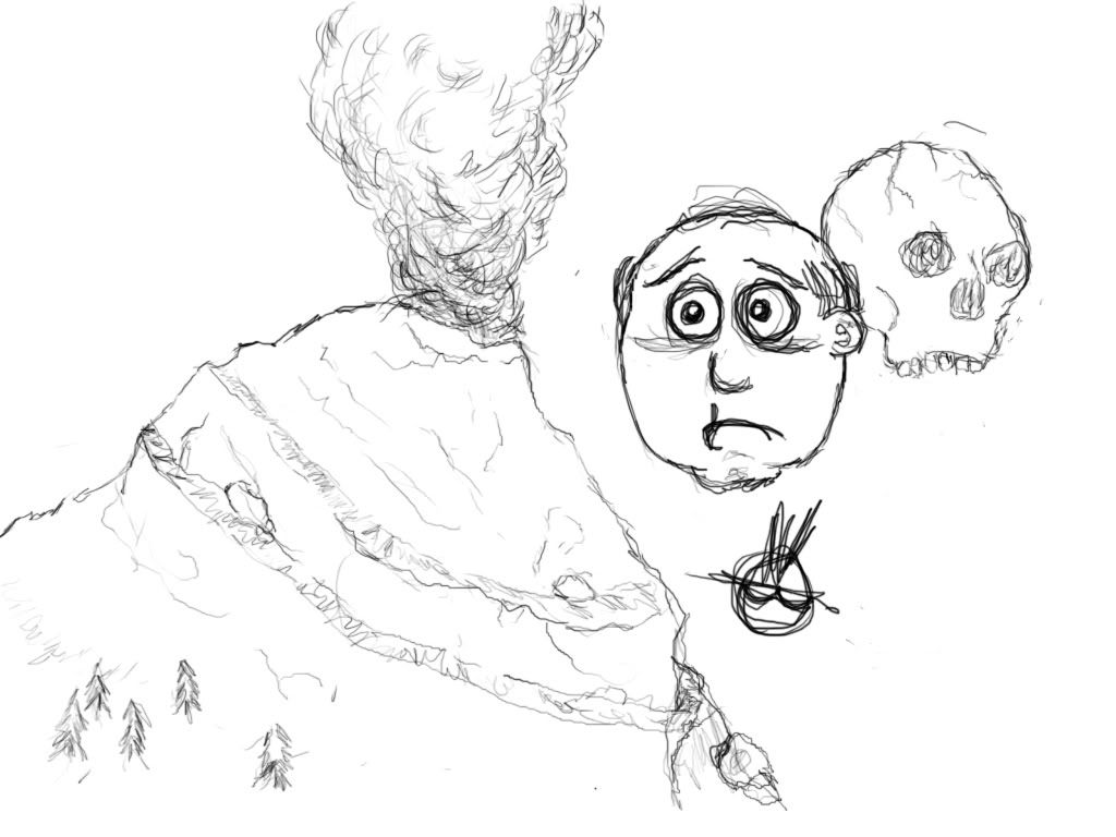
Messing around with the tablet some more:
-
Re: The Studio Quick-Crit Thread
Uh, so what do you want crit on? I see a buncha doodles..
-
Re: The Studio Quick-Crit Thread
Mostly the mountain. I had an idea going, but then my ADD kicked in and I got bored.
-
Re: The Studio Quick-Crit Thread
http://soundclick.com/share?songid=7229461
I think this is good for 20 minutes worth of work.
-
Re: The Studio Quick-Crit Thread
Quote:
Originally Posted by
NuggetWarmer
Just trying out my new/old tablet. A self portrait lol.
(pic)
It's really sketchy and shit, I know. My hands are always shaky; I gotta find something to fix that. :p
I think you are off by a few years. :P
But Nice. :o
-
Re: The Studio Quick-Crit Thread
-
Re: The Studio Quick-Crit Thread
^:awesome:, Needs more spoiler tags and 56K Warning.
-
Re: The Studio Quick-Crit Thread
Hot shit in a champagne glass there.
-
Re: The Studio Quick-Crit Thread
I just jizzed in my pants
-
Re: The Studio Quick-Crit Thread
Quote:
Originally Posted by
Conscars
I just jizzed in my pants
well that's good I'd hope you wouldn't jizz anywhere else.
No really though those are beautiful ;-;
-
Re: The Studio Quick-Crit Thread
lol @ Atlas ready to step on Elemental.
-
Re: The Studio Quick-Crit Thread
Great work. The environments need tweaking and the mech textures are pretty ordinary, but it looks quite polished and things seem to be working nicely.
-
Re: The Studio Quick-Crit Thread
-
Re: The Studio Quick-Crit Thread
Just installed tablet drivers, did a quick scribble to make sure all was working as intended
http://i298.photobucket.com/albums/m...daksoldier.jpg
-
Re: The Studio Quick-Crit Thread
Jesus mech, what engine is that. Also elemental ftw.
-
Re: The Studio Quick-Crit Thread
Quote:
Originally Posted by
DaneO'Roo
Mech, that is awesome. What engines that?
Quote:
Originally Posted by
TeeKup
Jesus mech, what engine is that. Also elemental ftw.
Quote:
Originally Posted by
Conscars
Crysis
Yarr.
-
Re: The Studio Quick-Crit Thread
That Mech map has a lot of fun written all over it. Awesome.
-
Re: The Studio Quick-Crit Thread
An early concept for a local girl 'soft-rock' band logo... already got feedback from them, they love it but want it to be more girly.
- I also know the edges are real scruffy... and thats because i just took some photos of playing cards and cropped them out quickly and roughly whilst the idea was still fresh in my noodle.
Ideas to make it more 'girly' please :P
http://i131.photobucket.com/albums/p...asconcept1.png
-
Re: The Studio Quick-Crit Thread
Make all the suits bright red hearts
-
Re: The Studio Quick-Crit Thread
Quote:
Originally Posted by
SMASH
Make all the suits bright red hearts
no.
-
Re: The Studio Quick-Crit Thread
Desaturate everything and have the hearts be pink.
-
Re: The Studio Quick-Crit Thread
̕̚̕̚ ̔̕̚̕̚҉ ҉̵̞̟̠̖̗̘̙̜̝̞̟
Uh, you could find more girly cards....some have girly patterns..
-
Re: The Studio Quick-Crit Thread
-
Re: The Studio Quick-Crit Thread
Needs more DOF.
Quote:
Originally Posted by
Heathen
̕̚̕̚ ̔̕̚̕̚҉ ҉̵̞̟̠̖̗̘̙̜̝̞̟
Copying my custom title?
-
Re: The Studio Quick-Crit Thread
Depth of Field?,
slay me now, Its gotta be clear to some degree so people can read it.
-
Re: The Studio Quick-Crit Thread
Quote:
Originally Posted by
Malloy
I think I liked the red better.
When I think of 'girly' design I think of lots of curly stuff like this
http://farm4.static.flickr.com/3270/...fbf670357b.jpg
Or this
http://www.phrizbie-design.com/beaut...ogo-design.jpg
Maybe try going back to the red but in the "epic win here" place a single large heart with fancy, curly stuff in the same way the little curlies surround the pink circle in the second pic above.
does that make sense?
-
Re: The Studio Quick-Crit Thread
-
Re: The Studio Quick-Crit Thread
lol, wrong person, Malloy is the one making the logo, not me. :p
-
Re: The Studio Quick-Crit Thread
rofail.
I think the curlies idea is good.
Kinda what I meant by girly patterns.
-
Re: The Studio Quick-Crit Thread
Two random images I made by screwing around with Photoshop:
First, I followed this tut and wound up superimposing a hand over it. I was going to make it a .gif with a face which popped up every so often, but I decided against it.
http://i449.photobucket.com/albums/q...my/circuts.jpg
That face which I was going to make pop up, after some modifications (a.k.a. Me hitting random buttons), turned out like this:
http://i449.photobucket.com/albums/q...mbie_blood.gif
-
Re: The Studio Quick-Crit Thread
-
Re: The Studio Quick-Crit Thread
Haha, it does look like one, doesn't it?
Nah, just some random thing cooked up in my imagination.
-
Re: The Studio Quick-Crit Thread
I like the Pink better Malloy, its all just personal preference really, but I think it works better with the girly-ness of it. Put something Curly in the epic win spot though, and it'll look good.
E: Mech, Your stuff looks great and all, but this is a crit thread, and your not really even looking for crit on all of it. Could you at least put some spoiler tags on it?
-
Re: The Studio Quick-Crit Thread
thanks, im working on it :D
-
Re: The Studio Quick-Crit Thread
I was practicing terrain with my tablet, I think i got a basic understanding of making it. Got a long way to go though
http://img177.imageshack.us/img177/5...ceneov7.th.jpg
I just need to learn how to make a sky. Anyone can help me with that, like a few tips or tricks? Or if there's a tutorial, that would be awesome.
-
Re: The Studio Quick-Crit Thread
Just from a Point of View. The yellow or flower things.. the ones closer to the viewer would be bigger and further away smaller kinda common sense thing.
-
Re: The Studio Quick-Crit Thread
I did that, but now that I look at it, I see I did some wrong things in there. Each piece of land has its own size, so not good enough "depth" I did then :(
Also, I did a little forerunner texture after a while. Comments?
http://img394.imageshack.us/img394/5...tedbfmeyb3.jpg
-
Re: The Studio Quick-Crit Thread
-
Re: The Studio Quick-Crit Thread
That looks pretty nice.
Edit: Did this a while ago.
http://i58.photobucket.com/albums/g2...w_unwrap_1.jpg
Just want to know if the unwrap is "good"? Bare in mind there are more parts which will take the space in the middle.
-
Re: The Studio Quick-Crit Thread
Quote:
Originally Posted by
Hunter
If there are parts which will exactly or almost perfectly fit within the black voids with little or no stretching (porportional to the size of all of the other parts' UVW coords), then yes, looks great, but if there are parts that you doubt will fill the middle and the bottom and somewhat upper left, then I'd sugget you try and move stuff around so you get the most out of all of that space.
-
Re: The Studio Quick-Crit Thread
It will probably unwrap it again, I was just messing around ages ago and found that in my photobucket.
-
Re: The Studio Quick-Crit Thread
Quote:
Originally Posted by
Hunter
Just want to know if the unwrap is "good"? Bare in mind there are more parts which will take the space in the middle.
You could have used space WAY more efficiently. A lot of parts could have been scaled up. Without that "middle" though, it's really hard to say. It looks clean at least.
So I'm now venturing into the world of covie - if anyone can give me some opinions on if I'm in the right direction, it'd be much appreciated. Irony of ironies, I was pretty wasteful myself with the UV.


Diffuse :
http://img72.imageshack.us/img72/764...diffuseyo2.jpg
Specular :
http://img132.imageshack.us/img132/4...eryspectw5.jpg
Bump :
http://img132.imageshack.us/img132/6...erybumpcr0.jpg
Tris : 764
Yeah, I know the cicle is distorted on the top.
-
Re: The Studio Quick-Crit Thread
Looks covenant-esque but it doesn't really seem it.
-
Re: The Studio Quick-Crit Thread
Add a couple darker grudge-styled brushes on the colored part for the diffuse. And perhaps make the color slightly a bit more red.
-
Re: The Studio Quick-Crit Thread
make it a bit more purpley.
Something about the top bothers me.
-
Re: The Studio Quick-Crit Thread
Quote:
Originally Posted by
Invader Veex
Add a couple darker grudge-styled brushes on the colored part for the diffuse. And perhaps make the color slightly a bit more red.
Quote:
Originally Posted by
Heathen
make it a bit more purpley.
Something about the top bothers me.
Keep in mind that the coloring is handled by a change-color map; it can be literally anything.
Heathen, could you (if possible) try to be more specific about what's wrong? I also feel something's not quite right, but I can't tell what - that's why I posted it here.
-
Re: The Studio Quick-Crit Thread
Thatsthe thing...I am not really sure. I just dont think it looks covie.
-
Re: The Studio Quick-Crit Thread
It needs to have more of an organic feel to it.
-
Re: The Studio Quick-Crit Thread
Do I smell Covenant Fusion Coil?
-
Re: The Studio Quick-Crit Thread
Quote:
Originally Posted by
teh lag
Keep in mind that the coloring is handled by a change-color map; it can be literally anything.
Heathen, could you (if possible) try to be more specific about what's wrong? I also feel something's not quite right, but I can't tell what - that's why I posted it here.
Too many sharp angles, looks like some kind of hybrid of Forerunner and High Charity styles
-
Re: The Studio Quick-Crit Thread
It looks to hard and blunt. It should have a smoothness to it, and maybe make the edges look almost sharp. It looks more human that covenant to me.
-
Re: The Studio Quick-Crit Thread
This is a male character model underlay that I'm working on for the Source Engine.
Tri-count: About 2000
http://i724.photobucket.com/albums/w...echaracter.jpg
-
Re: The Studio Quick-Crit Thread
He is leaning forward too much and his arms need to move forward a bit.
-
Re: The Studio Quick-Crit Thread
I can agree with you on the arms, but the model isnt even fucking rigged. Leaning forward is nothing.
-
Re: The Studio Quick-Crit Thread
Not sure exactly what it's called, but the area behind his knee is too thin. Also are there any elbows?
-
Re: The Studio Quick-Crit Thread
It doesnt have to be rigged for it to look like its leaning forward.
-
Re: The Studio Quick-Crit Thread
Quote:
Originally Posted by
LinkandKvel
Not sure exactly what it's called, but the area behind his knee is too thin. Also are there any elbows?
Omg haha. I didn't even notice that. I'll get on it. And like I said at halomaps DEE, it doesn't matter if hes leaning forward like that before he is rigged.
-
Re: The Studio Quick-Crit Thread
I think I get what dee means. From the knee up, it looks curved outward. Rigging could fix it I suppose though..
-
Re: The Studio Quick-Crit Thread
he looks too bulgy. his muscles/structure needs to be more subtle.
-
Re: The Studio Quick-Crit Thread


And an incredibly bad top view render to give a better idea of the layout I've setup here.

Also the cave doesnt go anywhere, and will probably lead to some forerunner room with a teleporter leading to somewhere else.
-
Re: The Studio Quick-Crit Thread
Looks good. I'd do a little more geometry in the cliffs but looks great.
-
Re: The Studio Quick-Crit Thread
-
Re: The Studio Quick-Crit Thread
Waste less space, k? This is probably the 5th time you've shown us UVs you've made and you still haven't gotten any better. Take our advice already.
-
Re: The Studio Quick-Crit Thread
-
Re: The Studio Quick-Crit Thread
If I was to try and use as much space as possible then I would end up with uvs like this.
http://img72.imageshack.us/img72/9360/girluvbadzd4.jpg
Quote:
Originally Posted by
Wave of Lag
Who modeled that girl?
Who else?
-
Re: The Studio Quick-Crit Thread
Tbh that's better than what you first posted.
-
Re: The Studio Quick-Crit Thread
The texture is going to be low-res and I wanted the UV to be aligned right in the case of extreme dithering or pixelated normal maps. But if it seems to please you guys better. Then I will UV like that.
-
Re: The Studio Quick-Crit Thread
The priority of the individual shells are screwed up. I would want the face piece the biggest, followed by the clothing/arms/legs. However, it's your Layout not mine.
In all honesty, I liked the layout of the first better, just utilize your space more.
-
Re: The Studio Quick-Crit Thread
On the first one, I scaled the UV elements according to detail importance. Most of the skin was going to be hidden by the clothes so I scaled that lower then the actual clothes. And I aligned them so then the detail I plan on putting on them have more pixel flow. But apparently not everyone agrees on that.
-
Re: The Studio Quick-Crit Thread
DEE, the reason why everybody keeps bugging you about the UV mapping you've been doing is because you seem not the realize that all of that extra space = detail that could have been there. That black space is screaming "fill me in fill me in fill me in." You don't want to be racist now do you ;) ?
-
Re: The Studio Quick-Crit Thread
I scale the elements the same way I want the detail amount to be. The uvs are fine for what I plan on doing what I need to do with them. The skin elements are smaller as they have less detail. The cloth is bigger. But the way I pack them is to have better pixel flow and so they are easier to texture since I separated the cloth elements from the skin elements. If I was to use the second one then I would have pixelated normal maps and textureing it will be a bitch.


