Maybe you've got the balls and the table as one object?Quote:
Originally Posted by RobertGraham
Printable View
Maybe you've got the balls and the table as one object?Quote:
Originally Posted by RobertGraham
No, they are 2, I think, I followed exactly what was in the tutorial too.
set up more materials in your material menu or make a multi sub-object material and apply them where you want.
How exactly would I do that? I am very new to Max, so I don't know all the features. I also can't find where you can set new materials.Quote:
Originally Posted by SnaFuBAR
hit the M key, it'll bring up your material list.
When I change this:
This happens:
My box IS selected when I set the material.
What?..
When you apply a material from the editor to an object, that object becomes linked to that material slot. When you change the material, you change all objects that use that material. (It's actually more complicated than that because different materials can exist in the scene that don't exist in the material editor and vice versa, but yeah...). If you want to change the material on the box but not the spheres you have to create a new material and click the "apply material to selected" button, so the box has its own material separate from the spheres.
I think that's the problem you're having; if I've totally missed what you're getting at, my bad.
OMG, Thanks so much! This looks so sexy now!
There are no shadows being cast D:
They are clear, they aren't supposed to have shadows... and the light is coming from above
or it might just be the angle
The shadows are canceled out by the diffuse light they give off.
Look carefully around the right sphere. There is a soft yellow-ish glow around it. (toward the bottom).
hmm.. im not seeing it. Is there a way to throw a shadow down? Or do I just need to adjust the light?Quote:
Originally Posted by Anton
My screen's brightness is 100% so that might be way I'm seeing the little differences in your render, such as the glow/diffused light.
I'm not sure on how to change render setting, your best bet is to just try things and look online for tutorials.
iirc, if you play with the material's transparency/translucency, it will affect how strong a shadow it casts. It seems like right now it's actually working as a bit of a lens, refracting a bit of extra light down onto the surface below it.
All glass objects have a shadow, due to the fact that they scatter some of the light going through them .Quote:
Originally Posted by RobertGraham
^ Its not incredibly dark like a solid object thoughQuote:
Originally Posted by ExAm
Just set your lights to render shadows :|
Hmm. for some reason, I have tried different angles and that didn't work. Also, how would I set up the render to show shadows?
In the "General Parameters" of your light, there is a "Shadows" section, check the "On" box.
Its on, I don't know why its not rendering. Its probably this shitty integrated intel chipset
http://i228.photobucket.com/albums/e...trendering.png
E: I'll just make a Tech thread for this
use 3 point lighting and if your rendering transparent/translucent objects you should use ray trace.
Maxwell render is ownage, but hard to use.
http://i113.photobucket.com/albums/n...08/unwrap2.jpg
i uv mapped my spiker. what u think? if u want wireframe on it, i can get it.
Where's the texture?
Or you just added the colors so we can see the unwrap?
Uh... what exactly are we supposed to be commenting on? Quite a few shapes look like they could be scaled up from what you have now, but that's really all I can tell from that picture. Without a view of the model we have no idea what's what, except the most definitive shapes like the blades. Tbh I really don't understand why people would post unwraps in the quit-crit thread unless it's an "unusual" one like for a biped. This isn't a thread for just posting progress.
I really do wish unwrapping stuff was easy. :smith:
I would feel more tempted to actually give it a shot if it didn't take so long to do.
It is easy, it just sucks to do.
Yeah. Unwrapping is incredibly easy, it is just the most boring thing to do on a 3d model. :saddowns:Quote:
Originally Posted by mech
If its easy, please tell me how to do it so I can learn.
You just have to know the tools. Your basically just mapping down the faces then stiching them together. The only "hard" part i would say about unwrapping is packing. Trying to make the most efficient layout possible from the clusters you stitched together.Quote:
Originally Posted by paladin
Like I said, teach me.
It's kindof hard to explain without pictures so i'll link you to a few good tutorials.
http://www.escalight.com/tutorials/3...nwrap-uvw.html
http://waylon-art.com/uvw_tutorial/uvwtut_01.html
http://www.moddb.com/tutorials/unwra...-for-beginners
http://www.game-artist.net/forums/vb...e&articleid=38
Ok, I worked on my desert scene and changed the ground texture. Any thoughts?
http://i279.photobucket.com/albums/k...sertscene2.png
Desert? Looks more like some rocky mountains to me, it wouldn't be that dark in the desert yet if the sun was just setting. Certainly better than anything I can do though.
too bumpy. make the ground smoother on the flat parts
^ The large ground texture makes it look like your close to the ground.
Quote:
Originally Posted by paladin
This. Any bumps should be softer, more subtle, but definitely not perfectly smooth.
Is this the tutorial you're following?
If so, try figuring out how this tutorial works, then you can get more control over your geometry.
Needs some low shrubs or patches of grass/weeds. You never see an area without some kind of plant.
Arctic.
Been working on this. Its still very much a WIP. Most of detailing still needs to be done along with final diffuse colors, but that's why I'm posting.
http://img19.imageshack.us/img19/188/metalwall06.jpg
The orange strip isn't too convincing. Next to the blue, it just screams "rice burner".
Overall though, pretty interesting. But the line details in the middle area are pretty washed out.
I don't know what you mean by that/see it.Quote:
Originally Posted by SnaFuBAR
It doesn't look like a light? i dunno, thats what I got from it.Quote:
Originally Posted by MetKiller Joe
Those gray bars up in the blue strip in the top left area doesnt seem equal.
Also the middle of it where the X thing is doesnt look forerunner.
Has grass/weeds.Quote:
Originally Posted by sKc_Chains
There are plenty of large areas of land with no visible vegetation. There are areas in the arctic like this. Desert too (to a lesser extent)Quote:
Originally Posted by Huero
Arctic ocean is frozen. Unless plants can grow on pure ice, you will not see anything there unless on some sort of land and only in short periods when spring hits.
Yeah but that render didnt look arctic.
Gah, it doesn't even matter people. The point is that the scene would look more interesting with some type of plant.
Metkiller, those transparent hexagonal strip patterns in the background have some lines that are pretty screwed up, not sure if that's something you're still working on but I just wanted to point it out. Besides that, I like the patters on most of your textures, you just need to work on your colors and making it look more realistic.
the point is everyone has done that type of tutorial and it is so simple there is no point in showing renders.Quote:
Originally Posted by Corndogman
Full pic's not done, but I did a quick side-by-side comparison of the most complete part. I'm definitely getting better at this, as before I'd be terrified to touch hair or skin, but I've still got a ways to go.
Any suggestions?
The wrinkles on the cloth looks like it is sticking out to much.
It's meant to be a few sizes too large, which is why I did that, but with that in mind do you reckon I went a bit overboard?
Yes. The dark areas of the cloth were you try to show depth could be lighter.
Thanks. I'll do some tweaking next time I open it up, see how it looks then.
I agree.
It looks like her clothes are wet. A few too many wrinkles, methinks, and they're a bit too uniformly sized compared with one another.
http://i238.photobucket.com/albums/f...covyfinish.png
http://i238.photobucket.com/albums/f...ovyfinish2.png
Ignore the little base, im fixing it up alot. lol
dammit I was gonna say this.Quote:
Originally Posted by ExAm
@ higuy
High Charity eh?
http://i266.photobucket.com/albums/i...216/ar-new.jpg
Working on it a bit more based on opinions received. Its been a while I know but I've been busy lately.
A lot of the deeper/thicker scratches are really awkward in their placement - for example, the bottom of the grip and the front.
Otherwise, not half bad!
Hmm. I'll work on those scratches tomorrow. I'm done for the day. But thanks :)
The entire stock looks too much like it's metal. At most, it'd be hard synthetic, though more than likely it's synth with a rubber-like surface. The forend suffers from the same, aside from the actual bumps in it.
I tried to make my profile pretty on Youtube, how does it look on the site?
http://www.youtube.com/LlamaJuice
I think it looks great. Definitely a great YouTube profile page template.
When I was doing research on web design, I came across what I thought was great advice. Westerners are trained to go automatically to the top left to read anything. But then again, this was for resume/portfolio websites.
Disaster, needs more Hornet texture ;)
M4 Carbine:
http://i58.photobucket.com/albums/g2...M4Carbine1.jpg
(Stock/Butt and Front grip attachment)
2540 Polys
6485 Tris
Work in progress. No where near finished. And before you start saying it has to many polys for ingame then dont, Because I am not modelling it for ingame use, I might make a lower poly version.
first unwrap ever. a light post model im working on.
The fuck is with the trippy colours? Texported UVs are usually rainbows, but not like that...
i dunno whats up. i have never done it before so I dont know how/what to do.
at first I thought the mc was deliberately posed like that, rather than just thrown in for scale reference. I was all ',:|
I think those are local XYZ coordinate colors. The unwrap isnt bad though.
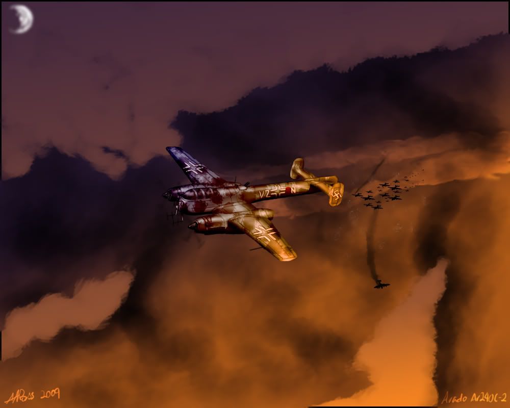
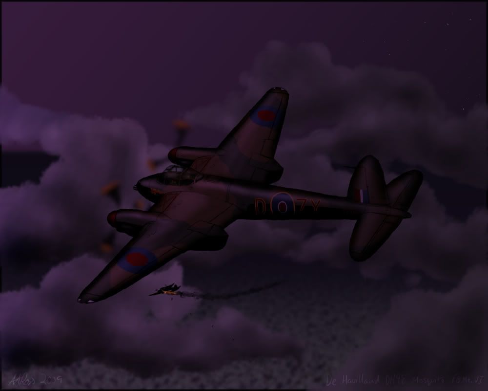
Drew these last night/ this morning from about 11PM to 3AM while I was waiting for my net to come back up, I gave up and went to bed after finishing the second picture. My two favourite nightfighters of the war, one of which (the 240) I'm modelling so I can get it into Il-2:
some roflborked perspective going on with the cockpit/wing/tail/body alignment but the mood is good, as well as "colour".
I thought the second pic was from a game at first glance :aaaaa:
The moon on the first one needs to have a blue/yellow tint to it, and needs to look less like a fairytale moon. Along with that, it needs to be a little less blurry.
The clouds in the first pic could also use some more details (grey spots) like you have in the second picture.
Great atmosphere and color, but as Snaf said, borked perspective. What could be cool is some tracers, as, how did the planes get shot down? Then again, it may make the painting too busy..
Last crit - dead-center composition, feels bad man.
I usually lopside it to hell but then it feels kind of odd
The idea behind the lack of tracer is that they've already swooped in for the kill, blatted some poor sod, and blown right through the formation. I wanted it to look like they were just about heading for home, not in the midst of an attack.
I made a fucking lighter
http://www.hivclan.net/hivshack/imag...ttguwbem2u.jpg
look at this fucking lighter
It's a fucking lighter.
vertex distribution looks shot. Lots of fine detail in some areas, but you didn't even bother to round the big surfaces. :/
no flame adjustment? pay more attention to your refs! buy a lighter! :crossarms:
My ref was a picture. ...of all the things to not have around my house ffs.Quote:
Originally Posted by SnaFuBAR
Also first serious UVW template. (I bet I'm doing it wrong)
http://www.hivclan.net/hivshack/imag...eytdx1dqvo.bmp
I imposed a poly limit on myself, so I didn't add as much detail as I could. It was more of a practice to expand my horizons, after all the only thing I can model well is forerunner and halo-esque terrain.Quote:
Originally Posted by Rob Oplawar
You could certainly use more space. Also remember your placement. Like, what parts are going to be seen the most, and which ones need the most detail. Looks good so far though, just use my advise.
Make it transparent so that you can model the internal areas.
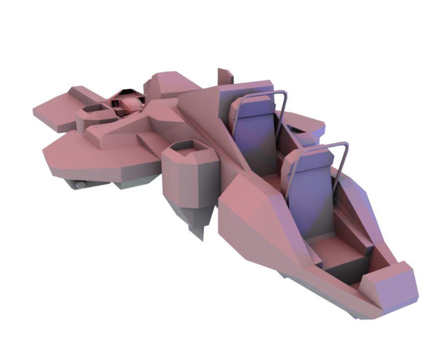
http://i164.photobucket.com/albums/u...PALBOTROSS.png
WIP
Only cool kids will know what this is.
An Albotross apparently, although whether it is at all related to the Albatross I am not entirely certain
:eng101:
Looks kind of like a lot of generic video game starfighters tbh :S
o i c wat u did tharQuote:
Originally Posted by rossmum
Yup, its a FLAPFLAPALBOTROSS
Nope, put that there to fool people. :)Quote:
Originally Posted by rossmum
KM00 should know what it is.
Looks like that human flier that was in the h2 beta shared.map.
You've got some pretty nasty geometry in a few places... Maybe give us a pic of how it's supposed to look in the end so we can point it out better?
Quote:
Originally Posted by teh lag
Correct, it was called the Falcon. Oh, and I know about the bad faces. I'll fix those soon.
Here's what it's supposed to look like when it's done:
http://unexistent.net/h2b/falcon/beta108.jpg
http://unexistent.net/h2b/falcon/beta109.jpg
Not the same textures though, obviously, lol.
Since it doesnt have a texture, who ever textures it can make it how ever they want.
Looks like some of this
http://supersmashbroslucky.files.wor...05_080222n.jpg
Almost done. Next up is error fixing, details, and the chaingun.
Can I animates?
Yea, I see a couple of non planars. Looks pretty low poly though.
I think it looks great man.
Besides a few non-planers it looks great man :)
+rep