-
Re: The Studio Quick-Crit Thread
Here is another project I was working on. Not much though, still practice shit. Haven't had much time to sit down and do so since school started.
Anyways, enough explaining
http://fc42.deviantart.com/fs42/f/20..._by_iTails.png
It kind of reminds me of a Rock.
Things I did.
-Bend
-Twist
-Taper
That was about it. The ground was the Glass - Translucent and the Rock looking thing was Glass - Clear. I still need to learn how to texture :S
Second Pic
http://fc82.deviantart.com/fs42/f/20..._by_iTails.png
-
Re: The Studio Quick-Crit Thread
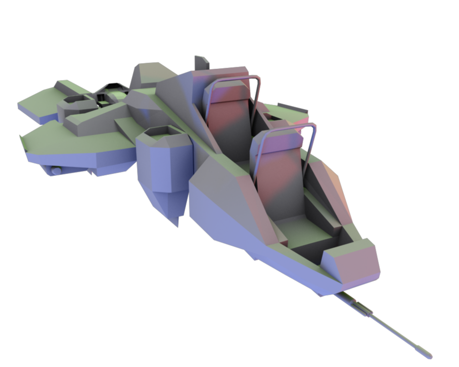
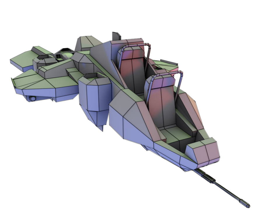
I need to fix one last error and get rid of the mirror line and I'll be pretty much done.
I changed the design of the gun a bit to my liking, just so you know.
EDIT: Wireframe:
-
Re: The Studio Quick-Crit Thread
I like it Nugget. So far it's turning out nice.
-
Re: The Studio Quick-Crit Thread
Thanks. Too bad I have no idea how anybody would steer the thing. I think I might add some steering wheels or something.
-
Re: The Studio Quick-Crit Thread
Quote:
Originally Posted by
NuggetWarmer

steering wheels
lol, look at dis non-pilot.
http://images.google.com/images?hl=e...h+Images&gbv=2
something like these perhaps? :gar:
flight stick, rudder petal, throttle controls. rossfag will go more into it i'm sure.
-
Re: The Studio Quick-Crit Thread
Don't you think it could use some sort of glass cockpit? Being exposed like that is dumb.
-
Re: The Studio Quick-Crit Thread
-
Re: The Studio Quick-Crit Thread
Quote:
Originally Posted by
Advancebo
Maybe it hovers?
Even still, would you want to be driving a vehicle that leaves you completely exposed, right in the front? Seeing as it's clearly a vehicle that was never finished by Bungie, finish it.
Also, I think that the jets rotate, I doubt it would simply hover.
-
Re: The Studio Quick-Crit Thread
working on my canyon map iv'e got one side reasonably drafted out, there are some parts ive not edited since making the canvas for but other than that, im rather impressed by what its turning out like.
Should i make this into a canyon or should i leave this section as it is and build on this into a full map?
Im looking at you Snafubar and Rossmum.
http://i43.tinypic.com/2db2gpu.jpg
-
Re: The Studio Quick-Crit Thread
If you leave it as it is, it would look like Peril.
-
Re: The Studio Quick-Crit Thread
Quote:
Originally Posted by
Advancebo
If you leave it as it is, it would look like Peril.
Is that good or bad...?
-
Re: The Studio Quick-Crit Thread
The cliffs' bumps don't look like they have a lot of variation. To me at least, it looks like organic bubble-wrap, a mite too soft for cliffs. The botton also could use some work.
-
Re: The Studio Quick-Crit Thread
Quote:
Originally Posted by
SnaFuBAR
I knew what it was called, but I couldn't remember it, and I was just too lazy to look it up.
;)
Quote:
Originally Posted by
Reaper Man
Don't you think it could use some sort of glass cockpit? Being exposed like that is dumb.
I was planning on doing that, I just need to come up with a design suitable for it.
-
Re: The Studio Quick-Crit Thread
-
Re: The Studio Quick-Crit Thread
chrome doesn't have gloss. right now it looks....off.
-
Re: The Studio Quick-Crit Thread
Shadow's make it look retarded.. It looks like you got multiple lights, all shining from different angles.
-
Re: The Studio Quick-Crit Thread
Quote:
Originally Posted by
Newbkilla
Shadow's make it look retarded.. It looks like you got multiple lights, all shining from different angles.
Yeah, I do, should I just use Skylight?
Also, does anyone know what the material is for Chrome?
-
Re: The Studio Quick-Crit Thread
Quote:
Originally Posted by
RobertGraham
Yeah, I do, should I just use Skylight?
Also, does anyone know what the material is for Chrome?
http://www.cgarena.com/freestuff/tut...ome/index.html
-
Re: The Studio Quick-Crit Thread
I was debating whether or not I would post this, but whatever...
[thumb]http://entropy.phpwnage.com/en_001.png[/thumb]
Critiques? Also, any suggestions for the site?
-
Re: The Studio Quick-Crit Thread
Quote:
Originally Posted by
=sw=warlord
working on my canyon map iv'e got one side reasonably drafted out, there are some parts ive not edited since making the canvas for but other than that, im rather impressed by what its turning out like.
Should i make this into a canyon or should i leave this section as it is and build on this into a full map?
Im looking at you Snafubar and Rossmum.
Canyon, and do something with the ground. It looks boring at the moment.
Quote:
Originally Posted by
MetKiller Joe
The cliffs' bumps don't look like they have a lot of variation. To me at least, it looks like organic bubble-wrap, a mite too soft for cliffs. The botton also could use some work.
this
-
Re: The Studio Quick-Crit Thread
Quote:
Originally Posted by
JunkfoodMan
chrome doesn't have gloss.
lol, no
Quote:
Originally Posted by
=sw=warlord
Should i make this into a canyon or should i leave this section as it is and build on this into a full map?
Im looking at you Snafubar and Rossmum.
Like Ross said, make a canyon. The tops of those cliffs need some kind angle between the top and side.
Quote:
Originally Posted by
=sw=warlord
Is that good or bad...?
bad
Quote:
Originally Posted by
NuggetWarmer
I knew what it was called, but I couldn't remember it, and I was just too lazy to look it up.
;)
lol kk
-
Re: The Studio Quick-Crit Thread
Quote:
Originally Posted by
SnaFuBAR
Like Ross said, make a canyon. The tops of those cliffs need some kind angle between the top and side.
Ok, so should i make this into a Ushaped canyon with a waterfall going through the middle or as paralel cliffs?
Im just trying to get some ideas flowing so i can work on this and know im going in the correct direction with this as the last canyon work i was doing a fair few people strongly disliked.
-
Re: The Studio Quick-Crit Thread

Made it today because I haven't made anything and actually completed it in ages, so I picked something really simple. <_<
Crit?
e: The maps.

-
Re: The Studio Quick-Crit Thread
-
Re: The Studio Quick-Crit Thread
It's nice but boring. I'm a bit surprised to see that it's 1024x - you don't seem to have such great definition there (especially around the chipped parts). The specular could also stand to be a bit more than just a recolored version of the diffuse; add some scratches, turn up the reflectivity... something to make it more interesting.
-
Re: The Studio Quick-Crit Thread
I was actually thinking the same thing, I might just down res all of the textures considering it would be a rather unimportant piece anyway. Or then again I could just add in more detail.
-
Re: The Studio Quick-Crit Thread
I think you should make an open version of the crate, as well, just do add variation.
-
Re: The Studio Quick-Crit Thread
At the very least, stamp some markings across it so it isn't so monotonous. Look at all the crates in H3 - they're khaki boxes, but they're usually covered in writing and diagrams.
-
Re: The Studio Quick-Crit Thread
Quote:
Originally Posted by
rossmum
At the very least, stamp some markings across it so it isn't so monotonous. Look at all the crates in H3 - they're khaki boxes, but they're usually covered in writing and diagrams.
...And they pop open when you hit them to reveal cargo webbing :eng101:
-
Re: The Studio Quick-Crit Thread
some more work i would like some comments on for improvement.
i've added a wireframe overlay to help distinguish the shape a bit better.
something seems wrong though.
http://img7.imageshack.us/img7/7982/tower.png
-
Re: The Studio Quick-Crit Thread
-
Re: The Studio Quick-Crit Thread
Quote:
Originally Posted by
MetKiller Joe
What is it?
im intending it to be a hybrid forerunner antenna mix between the structures on the bridge in halowars cutscene "walk in the park" and the arial found in A30.
-
Re: The Studio Quick-Crit Thread
It doesn't seem very forerunner to me. There isn't much to it, so I'm wondering if this is part of something larger? Or if that is the final product; in which case, there isn't much to crit on.
-
Re: The Studio Quick-Crit Thread
Hardly any detail, doesn't look much forerunner, the spikes at the top are not pretty, because forerunner doesn't have points that, that.. Pointy.. So, I suggest adding some detail here and there, completing more, and remove the spikes.
-
Re: The Studio Quick-Crit Thread
Never make spikes with forerunner, just leave it round but thin. If you'd show the whole area of whatever it is you're making it'd be easier to crit. Right now it looks horribly basic and very boring. Do what Newbkilla said, add details.
-
Re: The Studio Quick-Crit Thread
Quote:
Originally Posted by
Newbkilla
Hardly any detail, doesn't look much forerunner, the spikes at the top are not pretty, because forerunner doesn't have points that, that.. Pointy.. So, I suggest adding some detail here and there, completing more, and remove the spikes.
the spikes are on a few of the buildings for a30_A and a30_B, which was part of the reson i did that.
-
Re: The Studio Quick-Crit Thread
Well, it looks ugly anyway.. Fix it.
-
Re: The Studio Quick-Crit Thread
-
Re: The Studio Quick-Crit Thread
does this look like a real diamond? how can i improve it so it looks more...real?
http://i113.photobucket.com/albums/n...08/diamond.png
-
Re: The Studio Quick-Crit Thread
To me it's too see-through. That's all I think is wrong with it.
-
Re: The Studio Quick-Crit Thread
give it something more interesting to reflect/refract than just a grey background
-
Re: The Studio Quick-Crit Thread
-
Re: The Studio Quick-Crit Thread
it'll never look like a diamond unless it breaks apart the light spectrum.
http://img339.imageshack.us/img339/4400/1sjg3.jpg
-
Re: The Studio Quick-Crit Thread
Quote:
Originally Posted by
SnaFuBAR
it'll never look like a diamond unless it breaks apart the light spectrum.
how do I make it divide white light into the visible light spectrum?(in max ofcourse).
-
Re: The Studio Quick-Crit Thread
I was talking to snaf about it last night and neither of us knew if it was even possible, directly. But you can still fake it by adding strategically placed lens effects and extra lights with rainbow projection maps.
-
Re: The Studio Quick-Crit Thread
cant this be achieved through caustics? correct me If I'm wrong...
-
Re: The Studio Quick-Crit Thread
Yes, I believe Caustics can be used for Jewels, as well as water and glass, as stated in the tutorial in the first post.
E: wrong thread, thought this was the tutorial thread.
-
Re: The Studio Quick-Crit Thread
Had a few spare minutes and finished this off. Sight is a place holder. Should be making Pelican for Pen really but I have not got the time :(
7K. Needs to be made lower poly if anyone is going to use it in CE.
http://i58.photobucket.com/albums/g2...ball/SMG_3.jpg
http://i58.photobucket.com/albums/g2...ball/SMG_4.jpg
-
Re: The Studio Quick-Crit Thread
Your poly distribution is absolutely out of whack. The top needs some serious work - it's basically a chamfered block with stuff on it. Smooth it out dude :\
Also the handle - do you honestly thing you can fit your hand comfortably on that? The stock and back handle also need to match up; the stock could be taller while the back handle should be shorter.
I'm not really liking how the sight thing looks either.
http://img16.imageshack.us/img16/8569/smg5u.jpg
-
Re: The Studio Quick-Crit Thread

how about how? apperently the light spots(donno technical term for it) don't show up with glass so i'm going mess around with the ground mat to see which one works best.
-
Re: The Studio Quick-Crit Thread
looking much better, still needs less grey though, maybe try setting a few lense flares or see if snafubar can think of a way for the diamond to break the light up to its spectrum.
-
Re: The Studio Quick-Crit Thread
It looks way too cluttered now, the main diamond is reflecting and refracting all the background stuff and it makes the caustics look gross in the middle.
-
Re: The Studio Quick-Crit Thread
-
Re: The Studio Quick-Crit Thread
No. Lose the rail. We've been over this; rails are not a fix for a lack of interesting shapes, they exacerbate the problem (not to mention that if this is meant to be canon, they're completely out of place). Smooth the top out like it is ingame, don't leave it boxy and don't cover a boxy surface with a whole shitload of boxy repeating shapes. Ditch the ridges on the collapsing stock as well; they're a waste of polies and make no sense. Once that's done, move the cocking handle forwards, right to the front end of the receiver, and shorten it. Add a notch for it to lock open.
If you're going to go balls-to-the-wall with detail, you may as well get the basics right.
-
Re: The Studio Quick-Crit Thread
Okay, I guessed you where going to say ditch the rails Lol. The rails on the collapsing stock are on it in Halo 3 OSDT. Thats why I put them on. Should I add small holes to make the stock lock into place instead? Because it needs some sort of technique other wise it would just move backwards and forwards.
Also I added a cocking handle sorta thing to the clip, basicly I though it could be used to release the clip, instead of it just falling of.. That a good idea?
-
Re: The Studio Quick-Crit Thread
I'm guessing this is for CE, so normals are out; just texture them on. You're not that likely to notice them, and they wouldn't be hugely visible anyways. As for alternative locking mechanisms... feasibly you could have a smooth surface, as long as it wasn't slippery and there were decent enough clamps to hold it steady. The SMG isn't exactly a powerhouse.
Whatever you go with, skin them on. There's no need to waste polies on something you won't be paying much attention to, they could be better used to round out the top cover. For the mag release, I'd suggest a button or pressure pad rather than that, it just doesn't look quite right. Perhaps something similar to your average plastic strap buckle, but without the central prong? If you have to squeeze the top and bottom at the same time, it makes it hard to accidentally release the mag, and it could also be kept fairly low-profile so as not to intrude too much on the design. Just two little buttons or tabs poking out of the magwell would be all it'd take.
-
Re: The Studio Quick-Crit Thread
I model for looks, I dont bother about putting in game. H3MT might use it if they want to. That is why I am making it high poly. I could texture bake it and texture it easier with that.
-
Re: The Studio Quick-Crit Thread
Uh, if that's the case then why is it boxy on the top and in other places? If you're going to make a highres mesh then don't half ass it, go all the way with it. Make it like this:

The model is kimono's.
If you really don't care about poly count, then quit modeling low poly meshes.
-
Re: The Studio Quick-Crit Thread
Okay then, lets say I model medium detail... w.e
-
Re: The Studio Quick-Crit Thread
Kimono is really good at sub-d modeling
-
Re: The Studio Quick-Crit Thread
http://farm4.static.flickr.com/3539/...2dda9a9a_o.png
Beam tower based on Halo 3 concept art. May or may not make it ingame.
-
Re: The Studio Quick-Crit Thread
-
Re: The Studio Quick-Crit Thread
Quote:
Originally Posted by
Hunter
Okay, I guessed you where going to say ditch the rails Lol. The rails on the collapsing stock are on it in Halo 3 OSDT. Thats why I put them on. Should I add small holes to make the stock lock into place instead? Because it needs some sort of technique other wise it would just move backwards and forwards.
Also I added a cocking handle sorta thing to the clip, basicly I though it could be used to release the clip, instead of it just falling of.. That a good idea?
Leave the rails.
Quote:
Originally Posted by
Cagerrin
i actually like it alot.
-
Re: The Studio Quick-Crit Thread
Quote:
Originally Posted by
Cagerrin
Make the larger fin (but not anything else) wider, and while doing so, widen the front edge of it as well, and add an intrusion (see Valhalla's towers). Add more of the magnetic accelerators along the beam emitter - two just isn't enough - and have them on a different face than their support structure as well (deeper or shallower - either works, depending on whether you want it to be a sleeker or more industrious Forerunner style), of which also needs its front face's angle to match the rest*. Finally, put a platform underneath the structure with an interior space connecting to the corrected front face, including an open area in which the player can see and be killed by the beam, to give it a game-play purpose other than just background scenery.
*...it's front to match the overhanging tower's bird's-eye profile - doorways connecting to the interior would work best on the two angled edges.
Also, Cagerrin, don't let this post scare you away or make you think your work is rubbish - I only ever really comment on work that already shows potential, and could probably be a modest finished product as-is.
-
Re: The Studio Quick-Crit Thread
Quote:
Originally Posted by
Sever
Make the larger fin (but not anything else) wider, and while doing so, widen the front edge of it as well, and add an intrusion (see Valhalla's towers). Add more of the magnetic accelerators along the beam emitter - two just isn't enough - and have them on a different face than their support structure as well (deeper or shallower - either works, depending on whether you want it to be a sleeker or more industrious Forerunner style), of which also needs its front face's angle to match the rest. Finally, put a platform underneath the structure with an interior space connecting to the corrected front face, including an open area in which the player can see and be killed by the beam, to give it a game-play purpose other than just background scenery.
Blargh, should've stated exactly how I'd be placing it in the first place. It's not going to be a playable area, just background, positioned like the towers below.
http://www.majhost.com/gallery/Talon...ntrefs_002.jpg
More accelerators are go, as is groove if I can make it not look fat.
Edit: Certainly won't, I've done a good deal of creative stuff(Lego, heh) elsewhere, and this sort of reply is the polar opposite of the sort of crap I usually get, so it's kinda nice for a change.
-
Re: The Studio Quick-Crit Thread
Quote:
Originally Posted by
rossmum
No. Lose the rail. We've been over this; rails are not a fix for a lack of interesting shapes, they exacerbate the problem (not to mention that if this is meant to be canon, they're completely out of place). Smooth the top out like it is ingame, don't leave it boxy and don't cover a boxy surface with a whole shitload of boxy repeating shapes. Ditch the ridges on the collapsing stock as well; they're a waste of polies and make no sense. Once that's done, move the cocking handle forwards, right to the front end of the receiver, and shorten it. Add a notch for it to lock open.
If you're going to go balls-to-the-wall with detail, you may as well get the basics right.
Rails aren't for lack of detail, they're incredibly popular and allow for weapons to be more versatile than a weapon without rails. So don't lose them, just fix them a bit, they look off.
-
Re: The Studio Quick-Crit Thread
I know that's what they're for in the real world, but people tend to use them to try and make something look more complex and detailed than it really is when they're modelling.
Anyway, prominent 1913s have no place in the Halo universe, we've been through this.
-
Re: The Studio Quick-Crit Thread
I think I have modelled them right from the refs, They need to be making bigger or something? Because I dont get how they look off.
-
Re: The Studio Quick-Crit Thread
Quote:
Originally Posted by
Hunter
Any better.
here's some stuff i see is wrong...(if you're going for accuracy)
http://i113.photobucket.com/albums/n...d908/SMG_6.jpg
-
Re: The Studio Quick-Crit Thread
-
Re: The Studio Quick-Crit Thread
Now THAT'S a nice piece of Forerunner architecture! It might look a tad less blade-ey if you made the groove down the middle thinner - right now you have it taking up about 3/4 of the leading edge, and leaving only 1/8 on either side. I'd say go for a 1:2:1 ratio rather than the current 1:6:1. Other than that, it looks great!
-
Re: The Studio Quick-Crit Thread
top should be thinner than the bottom.
-
Re: The Studio Quick-Crit Thread
That all depends on if he wants it to or not - not every Forerunner beam emitter tapers to a blunt point when viewed from the front. Take a look at Valhalla's towers:
Their edges are parallel all the way up, until they reach the top where the leading edge's profile projects itself and causes the chamfered edges.
-
Re: The Studio Quick-Crit Thread
http://img16.imageshack.us/img16/641/camera5g.th.jpg
Mainly the grass. I finally figured out how to render it. Im working on the density of it but how does it look so far?
-
Re: The Studio Quick-Crit Thread
Honestly it doesn't look good at all. If you can still easily see that it's just a bunch of the same sprites, then it obviously isn't working. The shape of the grass isn't that organic, and it needs a much higher range of values and colors. Vastly increase the density as to hide the sprites' bottom edges and create the illusion of actual grass. If you want thinner grass, use a set of sprites that display that, not less sprites.
Keep it up though - the palm trees look great and act as proof that you know what to do.
-
Re: The Studio Quick-Crit Thread
ty, i finally got it to do what i wanted after a few hours. thanks. ive done a lot already on it.
-
Re: The Studio Quick-Crit Thread
Ha anyone else noticed, that irl shadows aren't that sharp? Like seriously. For stuff (not so much this render, but like games) that are aiming for photo realism. The lack of soft shadows bothers me. Just thought I would throw that out there.
-
Re: The Studio Quick-Crit Thread
For that render, to save time, i didnt render with the best shadow properties. That only have low quality final gather and minimal light sources. But yeah I understand what your say in general.
-
Re: The Studio Quick-Crit Thread
Quote:
Originally Posted by
BobtheGreatII
Ha anyone else noticed, that irl shadows aren't that sharp? Like seriously. For stuff (not so much this render, but like games) that are aiming for photo realism. The lack of soft shadows bothers me. Just thought I would throw that out there.
Main reason for this? Processing power. Soft-shadows cause a HUGE performance hit (usually) as opposed to ray-traced (hard edged) shadows.
E: Actually paladin, if you use Shadow Map for your shadows with a bias of 0.2-0.4, you'll be able to render faster with more realistic shadows (for the time being)
-
Re: The Studio Quick-Crit Thread
Quote:
Originally Posted by
Cagerrin
anyone got a link to this art and more?
-
Re: The Studio Quick-Crit Thread
Quote:
Originally Posted by
Conscars
anyone got a link to this art and more?
http://www.majhost.com/cgi-bin/gallery.cgi?f=179551
-
Re: The Studio Quick-Crit Thread
Quote:
Originally Posted by
Jean-Luc
Main reason for this? Processing power. Soft-shadows cause a HUGE performance hit (usually) as opposed to ray-traced (hard edged) shadows.
E: Actually paladin, if you use Shadow Map for your shadows with a bias of 0.2-0.4, you'll be able to render faster with more realistic shadows (for the time being)
TY will do ;)
http://img18.imageshack.us/img18/4108/camera5.th.jpg
Put in various colors/types. I plan on adding 2 more. Still working on desity, volume, and scale.
-
Re: The Studio Quick-Crit Thread
Quote:
Originally Posted by
Conscars
anyone got a link to this art and more?
You can also get The Art of Halo 3 book. I have it and it has a whole bunch of pre- and post-completion artwork.
-
Re: The Studio Quick-Crit Thread
http://img11.imageshack.us/img11/4108/camera5.th.jpg
I remade the palm tree. Completely new model (x5 the polys) updated the textures (increased size and add 2 detail layers) and updated normals, opacity and added a specular to the frond. Ill add a more close up shot of the tree and fronds.
e: and the opacity map has some errors. I need to fix some of the values where the bitmap is still visible the corners.
e2: new version. the middle is the old.
http://img18.imageshack.us/img18/3415/camera5d.th.jpg
-
Re: The Studio Quick-Crit Thread
Just started working on this today. I was trying to aim for a sci-fi style hallway.
http://img16.imageshack.us/img16/3066/scifihallway.jpg
http://img16.imageshack.us/img16/4951/sexwgu.jpg
It's about 24k triangles. This may, or may not go in game. If I were to put this in game, I would have to re-do the wires. Because those combined are a total of 18k triangles.
-
Re: The Studio Quick-Crit Thread
Very nice. but is this forerunner? Or human? Hard to tell.
E: NVM I forgot to read the title, nice.
-
Re: The Studio Quick-Crit Thread
Quote:
Originally Posted by
CSFLOYD
:iamafag: i liek it
Ehy whats up? I have some advise for you, go die in a pit of shit. Eh?
Anyways, That's looking awesome newbkilla, only thing is that the things at the bottom when cloned dont look as good. At Least IMO. :)
-
Re: The Studio Quick-Crit Thread
The placement of detail could be more even, mostly more on the bottom. And where it connects at the top is horrid. But other than that it's alright.
-
Re: The Studio Quick-Crit Thread
Quote:
Originally Posted by
Fear1337
Ehy whats up? I have some advise for you, go die in a pit of shit. Eh?
Anyways, That's looking awesome newbkilla, only thing is that the things at the bottom when cloned dont look as good. At Least IMO. :)
Nah I'd rather not... You would probably sue for breaking and entering.
-
Re: The Studio Quick-Crit Thread
Add something between each wire holder.
-
Re: The Studio Quick-Crit Thread
Quote:
Originally Posted by
Newbkilla
Nice I like that, would +rep but need to spread around.
-
Re: The Studio Quick-Crit Thread
^ I really like that. A few things look off, but for the most part it looks good.
-
Re: The Studio Quick-Crit Thread
I work on the edges. For a sci-fi look, the edges are too harsh.
e: edges as in corners (not so boxxy)
-
Re: The Studio Quick-Crit Thread
Those little insets at the bottom of every support/crescent shape don't seem to add much to the scene. IMO, it would look better if you had some kind of large repeating shape, and after, you could make things complex with normal maps.
I dunno, my two cents.
-
Re: The Studio Quick-Crit Thread
Also, there are too many flat surfaces without much detail. IMO a sci-fi looking area would not have many flat surfaces..
-
Re: The Studio Quick-Crit Thread
You gotta fix the wires: either add little clips that hold them to the walls, or "increase" the tension. Right now they looks like they are magically floating in water or will fall out.
Looks cool overall though.
-
Re: The Studio Quick-Crit Thread
Looks more future industrial than sci-fi.
-
Re: The Studio Quick-Crit Thread
Well, I meant sci-fi as in futuristic. Halo is a futuristic game as well as a sci-fi game. But anyway, I'm going to somehow attach the wires to a wire holder, so they are not floating, I'm going to add more detail on the bottom, and I'm going to try and fix some sharp angles. I did some more today as well, it's about 30k triangles. (With wires and mirrored)
-
Re: The Studio Quick-Crit Thread
-
Re: The Studio Quick-Crit Thread
Quote:
Originally Posted by
Newbkilla
Just started working on this today. I was trying to aim for a sci-fi style hallway.
Extend the pillar-ish thingys down accross the wall to break up the large flat space.
http://www.wku.edu/~wilkidj/html/untitled.jpg