Its a script that attaches the camera to the #head marker. Simple stuff.
Printable View
Its a script that attaches the camera to the #head marker. Simple stuff.
Pointless, because then you lose FP animations for the weapons. Still cool though.
If there were a way to make a LOD for the spartan model that switches the model to one without a head or arms at such a distance threshold that it is only shown to the camera that is attached to the head and not anyone else standing around the biped, that would be awesome. Then you could turn on the FP arms and it'd look great. This is of course assuming that this is even possible.
Need some quick crit on a site: http://oasisgames.net/
The rotator only has one entry but continues rotating anyway, so it'll say "undefined" most of the time - just ignore it.
All completely custom. May not appear correctly on IE8 due to the fact that all of the IE 7- compatibility code is just under "IE". Don't really care right now.
Clouds in the background look rather bad - replace them with a gradient or something. Rotating looks ok but it doesn't look like it is perfectly aligned with the surrounding stuff; the links bar looks like it is 1 pixel too short. Not sure if that part is supposed to grow as more links are added but it looks like it's supposed to be aligned right now and it's off by a pixel or two.
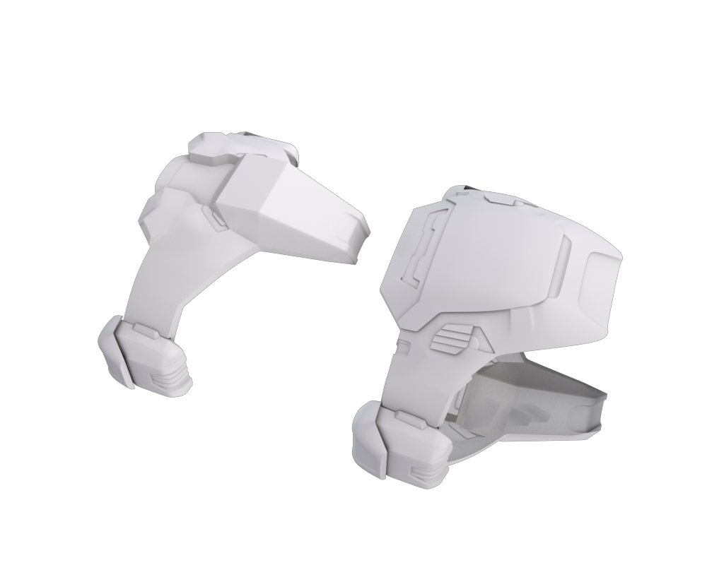
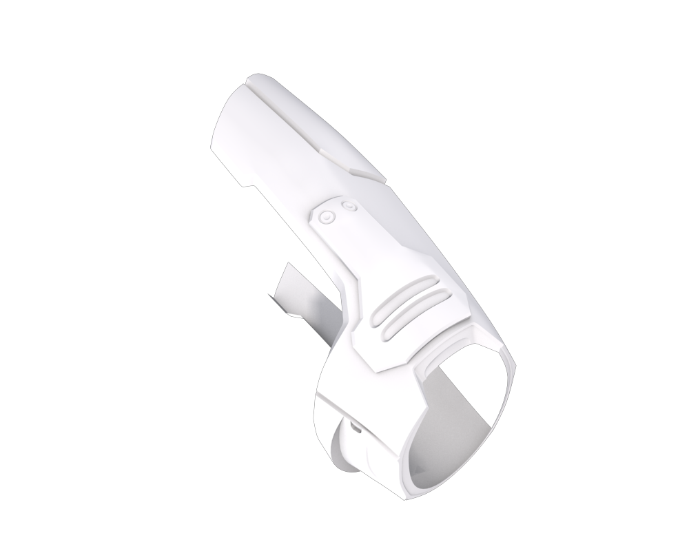
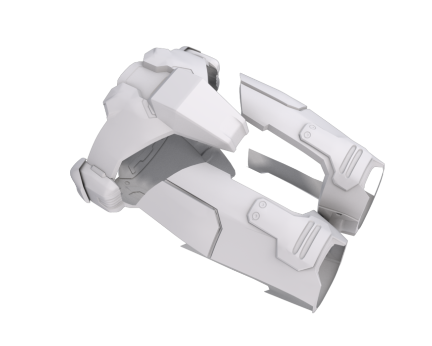
Working on Cod and thigh pieces now.
EDIT: I see obvious errors, and the clip holding the butt plate on isn't final.
I'll have a better render with the thigh pieces later.
Awesome. I notice some minor stuff, but its probably just me.
+rep
Still need to add more details to the front cod piece, fix obvious errors, then redo most of the bits on the thigh pieces along with the addition on the side.
EDIT:
Does anyone have a link to that thread about the high resolution MC model being made? I believe it was on HaloMods awhile back.
Reminds me of gundam, where the core booster, upper torso, and legs had to combine.
I believe that was Transformers >:VQuote:
Originally Posted by TeeKup
no, advancebo, just no. and stop adding :V every time you post, it makes you look like a fucking moron.
:lol:
im debating whether or not to post some things
Quote:
Originally Posted by Ki11a_FTW
Please do. :highfive:
:lmao:Quote:
Originally Posted by SnaFuBAR
its funny when its not me your hitting with your anti-funny blueballs enducing train
No that was gundam.
A wooden palette from my work at CVS.
http://img19.imageshack.us/img19/8682/rendersgh.png
:snafubar: Very nice! something doesnt seem right about it but I still like.
Not bad. The modelling seems accurate, so I won't fault that, however your texturing could use some work. The large black lines look supremely unrealistic, as unless marker is used on it, wood will not have lines like that. If those are supposed to be cracks in the wood, it would be best to create those cracks with a normal map, rather than what you have. Also, the wood you have there looks oddly shiny. While some wood has a natural shine to it, yours seems excessive, and therefore makes it look fake. Make it a little more of a matte material.
E: Looking at it again, it may be that your diffuse texture is too highly contrasted. The differential between light and dark wood is too extreme, so I would suggest balancing it out a little more.
Finally, and this is a purely aesthetic quibble, you need to up the quality on thsoe shadows.
The "shine" comes from the normal map I have on it I believe, because I have no specularity what-so-ever on the material so idk...
and of course the modeling is accurate, when I work I spend hours with these lousy pieces of wood lol.
I hope that the texture is a place holder because pallets are made of out piece of shit wood and the grain would not line up like that. Every piece would be different. I'm not saying the texture is bad, it just does not have real-world accuracy.
I was thinking that about the grain.
The Impulse gundam?Quote:
Originally Posted by TeeKup
no i shouldn't, mister design languageQuote:
Originally Posted by SnaFuBAR
You were the one who drummed that concept into me (albeit indirectly) and I see no reason there should be an exception made for rails, just because people seem to get off over the same repeated shapes on things. If you want attachment points, match them to the designs evident already or devise a new one based on the aforementioned designs. Don't shoe-in something nearly 550 years away and very different in design from what you're meant to be making.
It adds bugger all to the top except boring generic shapes. If you want to add something to the top, add something that isn't just the same toothed pattern repeating over and fucking over. Do something original.Quote:
Originally Posted by Hunter
I think everyone else needs to remember what the word originality means.Quote:
Originally Posted by =sw=warlord
innovation* :D
That too.
Hey, just looking for opinions on a hovertank i'm making. Currently sitting at a little over 43,000 triangles. Most of the detail objects will be put into texture and the whole thing reduced to work in CE.
Front/Top:
Back/Bottom:
Ortho/Wireframe (Sorry Dial-ups:P)
Wow, that looks awesome.
omg, that looks like something out of Red Alert 3, but in a really good way. Wow.
http://img.4chan.org/b/src/1239678381337.jpg
That is awesome! Its really futuristic and detailed, I recomend getting someone to (attempt) unwrapping and texturing that! Nice..
Cant wait to see it in Halo CE! I cant think of anything else to add to that piece of win.
need a hatch. that's my only crit. how about a high poly cinematic end of it? some actual modeled panels screws etc. love to see it in full high detail, but the half-assed detailed still looked awesome (not saying it half assed, more high end game model).
It looks like a mid-turreted, twin-gun Scorpion with some fancy hovering shit thrown on. That's not to say that it doesn't look pretty decent, though. Give the driver some protection and you've got a pretty impressive tank there.
Thanks guys, I'll look into putting in some protection for the driver, which should be a challenge as the driver seat rotates :P.
The original you tool. God I hated Impulse and Shinn.Quote:
Originally Posted by HDoan
Either a cupola or rotating vision blocks vOvQuote:
Originally Posted by FireScythe
Or an energy shield :SQuote:
Originally Posted by rossmum
badass hover tank mate
reminds me of the s-tank.
Keep that as a high res mesh. Build a low poly, then unwrap and bake normals. :)
I've kept it simple with a basic hatch and a couple of screens. Not too sure about the screens though, might redo them.
http://img7.imageshack.us/img7/2714/hatch.jpg
Looks great really.Quote:
Originally Posted by FireScythe
What Heathen said, except for the fact that all it provides is slight shrapnel resistance and rollover protection, both of which are very low on the defense priorities list, when compared to things like bullets and missiles. Make it practical, then go back and do the awesome detailing.
What Server said, I don't see any real protection from anything besides debris. I'd have a full hatch that covers the whole thing, and has bullet-proof glass for viewing outside. Other than that though, it's a great looking model.
What are the blue screens used for?:downs:
I'd guess display screens of some sort.Quote:
Originally Posted by CSFLOYD
They look like an afterthought - they should be on a separate shell inside and cover the full field of vision, and act as an advanced HUD overlay for the driver.
:mysterysolved:Quote:
Originally Posted by Sever
I like the idea :P. Ill give it a go.Quote:
Originally Posted by Sever
and greenQuote:
Originally Posted by FireScythe
E: is this going in the halo universe?
if so then it should be brown with green screens for earth tech.
E: Or green with orange screens to stress the spartan part of it.
You DO realize how ugly and idiotic things look when they're all the same, monotonous color, right? Take a look at Halo Wars, and its horrid monochromatic style. Pelicans are supposed to be gray, Scorpions are supposed to be tan-brown, Warthogs are supposed to be golive. NOT EVERY FUCKING THING SPARTAN GREEN. Also, if you wanted it to be a traditional UNSC HUD, it'd be cyan.
But themes for teams makes a point.
If you saw a purple hog you would either think its covie or that the warthog doesn't ask and doesn't tell.
No, I'd think it belonged to the player who was able to choose their team color beforehand.
Cant do that on halo.
Right. That's one of the numerous small reasons (not to mention the glaringly obvious huge reasons) why Halo Wars isn't as good as it could be.
Fuck all driver protection there :FQuote:
Originally Posted by FireScythe
I get the need for it to look cool and have a feasible way of sniping the driver out for MP, but it just looks wrong to have a birdcage hatch on a monstrous tank like that.
If you're going for something that'd keep the covering practical for MP, you could have the hatch be partially torn-off in places... battle damge or something of the like. I agree with everyone else though - it needs to be heavier. No sense in having so much armor on a tank with an open driver like that.
or you could close the hatch and not make it vulnerable to small arms fire.
I like you Idea
My god firescythe you have been away for way too long :O
http://i298.photobucket.com/albums/m...theGriffon.jpg
Something strikes me as off. Any takers?
The ground just doesn't look right to me. Those lines look like they're scratches of some sort, and look really out of place.
The ground is the standard ingame ground texture. The 'scratches' are little tracks or something. There are certainly a lot of them, but that's none of my doing.
For me, the blur on the trees (I'm assuming they're trees :P) doesn't fit as something that far away would look to be moving slowly and wouldn't be that blurred.
That doesnt look like a ground to me. I do love your motion blur, and im not to good with shadows but would shadows make it better?:ehhh:
Clouds.
The back of the yellow plane is being stretched with black? Or is that smoke from it being shot?:iiam:
Bingo. You're right, I overdid the blur in my quest for a sense of speed.Quote:
Originally Posted by FireScythe
It's on fire.Quote:
Originally Posted by CSFLOYD
doublepostin
Spit PR.XIX. Pink-painted photo reconnaisance Spits were used to fly low-level dawn or dusk runs, often requiring pilots to literally cut the grass so every detail of a German installation could be clearly seen. More than once startled German fighter-control radar operators who wandered out to see what the commotion was ended up serving as human yardsticks, allowing the British to work out their radar's operating characteristics.
Black-and-white bands are D-Day identification stripes; the squadron letter code is an authentic PRU squadron but the skin is simply based on typical PRU Spitfires, not any one specific airframe. Took me about 20 minutes using the new Mk.XIV template, most of the credit goes to Nightshifter for making that. All I did was add the stripes, lettercode, serial, noseart, and change a few minor details.
Its no where close to finished just tell me what you think.
http://i129.photobucket.com/albums/p...l_edited-2.png
Interesting, but I think you should rework the hair.
Hair looks like spaghetti. Add the details too (assuming you're not going to already), like the slight bulge over the shoulder blades and the various bumps in the lower back. Looks odd without them.
Thats a firm mattress.
Before I can crit it I have to know what exactly you're gonna go for? Are you doing a paint over, or just using a reference? What is the style, cartoony or realistic? Depending on what you're doing, I can give the proper crit.
well the hair was supposed to look wet, i didn't get to draw in the wet stains on mattress, and the mattress is very difficult to do, I've tried to draw and redraw it several times but it doesn't seem to fit.
Edit@Chains: It's a more stylized realism. Where shapes and shadows match but colors are more vivid. And I drew the basic body shape from a quick reference.
The folds in the bed look like cracks, it needs a more long and organic feel to it. When you see the darker areas touch lighter parts, make sure it changes values smoothly.
wow that looks great
Ok, what you need to do is get the reference photograph and sketch out the outline of everything, and sketch where its all set up. I usually use a hard brush at 70 percent to fill things in, the bigger the canvas the better, but at the beginning stay on the fit screen option for the canvas. Now just anazly all the colors in the piece, and roughly paint in lighting and shadows and highlights an basic colors, keep it all contrasted and at 70%-100% to where oyu can now see the basic highlights and shadows. Now its obvious things that are soft and bump will have a dull lgow such as human skin, and harder things, like finished wood and metal will shine. Be ocnsistent on these materials and go donw to about 40% and use the color dropper to pick a color slightly dark then the paint highlight, you never want to go darker to brighter as it tengs to go overdone with highlights, always go light to darker, starting at 40% opacity and going from 40% to 30% to lower and lower, until the colors from light to shadow are properly blended. A prolbem I already see is shakey lines, thats why do not use 100%, but 70%, as you can create smoother lines the blend well. Next time I paint I will set up a .gif of the process I use. The one problem I mainly had, was getting crit from different people on how to different things, but in different techniques. You'll have to mix and match to find your own style, and I reccomend painting in as many different ways as possible, and in the parts that you excel at, combne them to create your style. Also if none of this made sense, heres a tutorial that really helped me:Quote:
Originally Posted by samnwck
Heres a .gif by killing.people on what the above means if you're a little lost.
http://members.cox.net/wisdim2/Forum/Demo/tutorial3.gif
See how he paints in highlights, then works from lighterto darker? Its a very rough way and is in simple greyscale, but if you have trouble doing the above with colors, then I recommend doing greyscale first, and using colorize afterwards.
Hope this helps.
http://img9.imageshack.us/my.php?image=boredomm.jpg
I was bored.. ok?
I dont know what laptops look like as I dont own one, so there probably is an innacuracy or two.
The keys are spaced too far apart. And its called the internet.
Well, apart from the spacing between the keys (where there should be pretty much no space) the alignment of the keys is wrong, they should be staggered (same as the keyboard in front of you). Also, it might just be the angle, but the screen/lid looks bigger than the base when they should be the same size. Plus the hinge should extend along the entire width of the screen.
I've put a full driver cover on my tank. I'll probably keep the cage for an MP version. Still a fair bit of work to do on it to add the mechanics and detailing.
http://img4.imageshack.us/img4/7471/drivercanopy.jpg
http://img21.imageshack.us/img21/688...canopyopen.jpg
gnarly, that able to get in CE and function correctly?
That looks fucking sick. It's not pretty, but it looks fucking sick all the same.
@ Veex- it does look good, but it looks like your trying to base the environment off CMT B30, get some new cool ideas, perhaps people will like it even more :D
Meh I rushed the keys cause I wanted to go to bed.Quote:
Originally Posted by Advancebo
Believe me when I tell you, don't rush your art. In this particular case, go to bed, then finish in the morning.Quote:
Originally Posted by CSFLOYD
FireScythe - That looks pretty awesome, you should work on the top part a bit more though.
I am pretty sure every part of it is possible.Quote:
Originally Posted by Malloy
@ Floyd, lol macbook wheel.
@ Firescythe, thats about what I was thinking when I said the hatch. Really nice job.
Oshit your right :suicide:.Quote:
Originally Posted by ThePlague
Started this yesterday, but restarted today. I drew up a concept in German :l
http://img27.imageshack.us/img27/1262/wipzxa.jpg
Yes, I know I went gay happy with wires..
Those don't look like wires. A cable of that thickness wouldn't be able to freely bend that easily to curl in a way such as that.
Wires arent that messy...
Mech is very right.
Damn.
And move those insets at the top, where that circle is with the wires coming out, to align with the circle.
I say lose the wires entirely. There would be no reason for someone to put glass over that section just to show off a bunch of messy wires. The wiring inside your walls probably looks like that, but you wouldn't put a window there for everyone to see it. Put something more interesting there if your going to have glass.
You guys have seen DEEHunter's avatar right?
http://www.modacity.net/forums/image...tar2127_12.gif
It made me rofl so hard I modeled it! :ohboy:
But I didnt want an avatar sized render, So I made it a background!!! :cool:
I dont think anyone will find this funny, but I do.
Its called: Guy in a box.
I dont think the camera is right, but you can still tell what it is in both pictures.
http://img25.imageshack.us/img25/6133/maninabox.th.jpg
Or if you want edited version (that is if your even interested in this thing at all.)
http://img14.imageshack.us/img14/3706/maninaboxe.th.jpg
proportions are wrong
you fucked up modelling a box with a hole and some eyes
owned
anyway,
Thats looking really nice, only things that come to mind are how uninteresting the land looks, as the trees are the only feature on the landscape and the texture is too low res to break up the mass of green with tracks, hedges and such. Also the fog density on the right makes the horizon look lower than it is.
I'm really liking the plane. How come the wing guns have been removed though?
No, I didnt you moron, its just didnt have porportions exact.Quote:
Originally Posted by rossmum
It is still a box with a hole and some white spheres, it just isnt exact with the picture I based it off of. :toughguy:
Im fixing the porportions like Snafubar said.
E:
how about now?
http://img17.imageshack.us/img17/683...theboxd.th.jpg
http://img17.imageshack.us/img17/457...heboxea.th.jpg
wow way to get trolled by a joke
ps wrong proportions count as fucking up on an object that simple, since they're about the only thing you could fuck up without deliberately trying to suck