Shoulda said that :smugsome: Cause I hate jokes.Quote:
Originally Posted by rossmum
Printable View
Shoulda said that :smugsome: Cause I hate jokes.Quote:
Originally Posted by rossmum
as a general rule any post i make which contains little or no punctuation can be considered at least partially unserious, except for this one in which case i'm just lazy
get trolled easier, jesus
Ok my bad, now I know when tell if your joking, sorry. :downs:Quote:
Originally Posted by rossmum
Lay off the smilies floyd.
also flaming ends here!
Jesus never gets trolled.Quote:
Originally Posted by rossmum
And nice bocks.
:o
Looks like shit to me, but you can judge it.
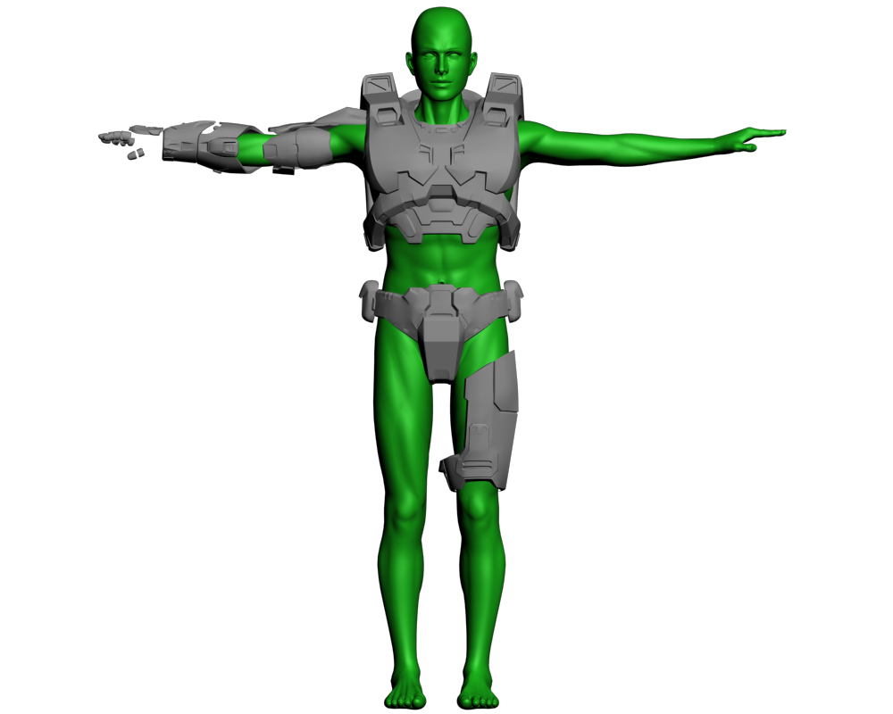
I still have a lot of details to add to the chestpiece, and the shoulder was started like five minutes before this render.
BTW Should I do the helmet?
Yes, you most certainly should.
The most described attribute bungie says of master chief is that he is a "walking tank."
He is a super soldier, and so I think the actual biped you're modeling the armor off of should be more muscular, but that's just me.
Turns out, the MC biped in all three games is horrendously anatomically inaccurate. I say, if you're trying to make a feasibly wearable suit of armor, stick with what you have now, which seems for the most part anatomically correct.
hurf durf completely ignore the other posts including stuff for thisQuote:
Originally Posted by sKc_Chains
It's getting CNC'd and turned into armor. Most people wearing this will be your average string bean nerd like myself.
EDIT: Plus, the underarmor and padding I'm going to be making will add extra 'muscle' to me anyway.
Yet they've sold millions of copies...Quote:
Originally Posted by Rob Oplawar
Hmmm... face it, we're the only ones that give a shit
UGH. Will the Real BODZILLA please stand up.Quote:
Originally Posted by NuggetWarmer
Can we stop this yet I keep thinking the few of you are bod.
When a better avi comes my way I'll be happy to change it. :)
You're referring to arm length and such, right? Also, no male has a gap that wide between their thighs. The Chief's got one the size of an anorexic chick's.Quote:
Originally Posted by Rob Oplawar
You cant fuck up on proportions of a box considering they come in all shapes and sizes.
Yes, you can. He was modeling a specific box and he got the dimensions wrong.Quote:
Originally Posted by Terror(NO)More
Halo 3 Beta SMG reload, did it for Grunt's Open Source Sandtrap. Arms are rigged by Moses. Please, try to resist the urge to bitch about the use of ripped content.
Looks totally robotic.
You don't want it to snap that awkwardly, you want to make it have a more natural feel. I'm not as well versed with animating but something definitely looks wrong there.
And your ripped and baked texture looks hideous.
Well, it looks fairly accurate with respect to H3... Most of the gun motion is quite choppy though. I realize that that's part of the H3 style which you're trying to emulate, but please make it at least a little smoother. The gun just jerks from point A to point B with no real in-between.
BTW loose the background and just make it gray. Also get some ambient lighting going on, it's hard to see exactly what's going on in some places.
Yeah, Halo 3 tends to make things jerky at times, but at least their animators are better than decent compared to some other 'professionally' made games.Quote:
Originally Posted by teh lag
:( But gray backgrounds are so boring. Sorry about the lighting also, I know nothing about 3ds max really. I like to say that all I do is load rigs, import models, and move bones and nodes around.Quote:
Originally Posted by teh lag
I didn't rip them, I was just given the model and a skin. Other reasons I would use would be the above.Quote:
Originally Posted by legionaire45
That goes without saying. Of all games I've seen, Halo is one of the few that has FP animations that look like actual care was given to making them look good. That doesn't change the fact that you could improve on what you have there.Quote:
Originally Posted by ODX
And the one you have is distracting. Also, Rendering > Environment > Ambient Color.Quote:
:( But gray backgrounds are so boring. Sorry about the lighting also, I know nothing about 3ds max really. I like to say that all I do is load rigs, import models, and move bones and nodes around.
Just did some big edits with your crit, changed the mag when it came out also, looked horrible now that I take another glance.Quote:
Originally Posted by teh lag
Ah, I see. Thanks for everything Lag. First time showing any of my work on Modacity, glad I wasn't trolled to death, or even at all.Quote:
Originally Posted by teh lag
I wonder why people would always say this would happen... :eyesroll:Quote:
Originally Posted by ODX
Pretty generic Forerunner erection, not sure if I'll be using it in anything.
Looks neat, but you have some real bad errors in various spots.
I think thats lighting
Urgh, I should re-render. It's just crappy light placement, I forgot to change the sun position.
E: *shakes fist*
Taper it, it shouldn't be a box...
Looks like he beveled the sides.
If that was in reference to my post, they're not even similar, that doesn't cover it.
A bevelled box is still a box, something a lot of people here could stand to learn.
How fucking observant. Someone give this guy a medal. Give me one too, while you're at it.Quote:
Originally Posted by Advancebo
Of course he cut the sides at an angle. You know how I can tell? The sides are cut at an angle!
e: How fucking observant and WRONG. Give him another medal.
/rant
Now, on to your most recent work, Cagerrin. It's looking ok - it definitely looks like Halo 3 Forerunner architecture, but isn't anything special. You started to taper the front, but it looks like it scared you off. Never be afraid to be bold with your angles when creating Forerunner constructions - you can usually easily remodel something complicated into something regular, but doing the reverse can get a bit tricky and/or untimely.
Now, on to the detailing you've done. The notches on top don't really fit - most Forerunner structures have large, simplified leading edges (in this case, the top is the leading edge) and have their interiors detailed to hell. Also, the three protrusions on the support beam don't really look that in-place there. Try some different arrangements for that area - I don't really have anything to give you at the moment, other than the fact that it doesn't really work yet. Maybe I'll have something later. Also, I love the progress you made on your previous piece. Did you ever finish draping the terrain over everything?
eh i decided to edit the h3 spartans skin since i dont like plane smooth shiny metal, more dirty metal like combat
http://screenshot.xfire.com/screensh...44246a4e54.png
http://screenshot.xfire.com/screensh...3e017d6d33.png
do you
like or
back-to-the-drawing-board
It looks like he went through a car was that ued oil instead of water. It's everywhere, and it's all the same. I think going back to the drawing board would be a good idea. +rep for trying though
edit: what are you using to show the time ingame?
dunno about the time, it appeared a few days ago and i didnt do anything so :confused2:
edit: LOL on the oil, i tried thou and thanks, ill fix it up when im done researching Bass (fish) lol
double edit: i think its the multi as well making it look weird aswell, i just looked at the multi and i went :ew:
just make a reg clay render with only skylight. works fine for ur purpose. skylight highlights everything, but once u get lighting in, u'll have some areas that's too bright and others that are too dark.
That forerunner whatever it is is to square and boxy. Kind of not pretty.
Should have more angled rising to the structure.
Quote:
Originally Posted by Conscars
Xfire, seems to have this as a new feature for all games now I think. eh..
So that's where it is fucking coming from, I thought it was steam as it only shows up on TF2 for me, and had the steam style.
http://i118.photobucket.com/albums/o...methoughts.jpg
some thoughts, your proportions and angles are right, but I think you need to work with your lines more.
those ribs need to finish their horizontal lines or they'll stay looking awkward
The way that the 45 degree pillar meets the ground is unsatisfying and looks incomplete
the top is a box and should probably come in at a 60 degree angle (as I drew it.)
The thing I put on top is definitely not necessary, but please let your lines finish themselves more gracefully.
and don't forget to taper it
as in, it gets progressively narrower as it goes, pester snaf if you need a less shitty description
crit needed
http://i238.photobucket.com/albums/f...uffy/blah2.jpghttp://i238.photobucket.com/albums/f...ffy/blah-2.jpg
http://i238.photobucket.com/albums/f...uffy/blah1.jpg Don't know why the screens went like that sorry :S
Also, most of it is going to be surrounded by terrain so the sides don't really matter much
Not all forerunner structs are tapered, valhalle and some of the buildings in Halowars are good examples of that.Quote:
Originally Posted by rossmum
still a good idea to learn how to do it since a lot of people lack the .... hmm... maybe i'll make another tutorial..
Only problem with it is that at this stage it'd be easier to start over than to make it taper.
Will keep it in mind in the future, though.
E: Gah I just realized why the bottom of the support beam looks so wierd. It was originally stuck into a 60-degree-ish cliff, and I extended it a bit so the back side wouldn't look ugly in the renders.
Question, what angle do they usually taper at? Does it follow regular forerunner angles? It seems like 30 would be too much, so I'm thinking 15. (though It's not technically one of the angles, it is still used sometimes.)
Quote:
Originally Posted by Mass
First thing that came to mind, which I ripped off mass before that HEH
. It looks like a sci-fi dinosaur head.
Without a jaw.
Awesome job on that. The only thing I'd say is that it would benefit from some texture variation on the top. You seemed to use a variety on the bottom and then stopped for some reason after the middle.
Also, that cage in the middle, I think it would look better if the cage was facing straight rather than at 45 degrees down.
I remember that, it was the first time i've ever seen a forerunner erection...that sounded soooo wrong.
Use ninja tags next time. The white text on the Source theme is more noticeable than the regular text.
Also, mass had some good ideas with that. You should do it.
e: Also, tapering (the already created model) would be easy. Just delete exactly half of the model. Then, rotate all the faces so that the front of the structure is converging. Then, move all the verts that are supposed to be in the middle back to 0. Then, use a symmetry modifier. Not too difficult, and your faces are still planar.
?Quote:
Originally Posted by Corndogman
That's from last year lol, really really old shit :pQuote:
Originally Posted by MetKiller Joe
not made by bungie, doesn't countQuote:
Originally Posted by =sw=warlord
Hehe, wasn't aware. Oh well.Quote:
Originally Posted by Selentic
Very, very unfinished
http://i298.photobucket.com/albums/m...v2/spitwip.jpg
Are you painting over a screenshot or is that from scratch?
Your highlights and shadows are kinda wavy and the highlights in particular look a little like plastic. Try to smooth them out, as well as dull the highlights a little. We're talking painted metal here, which often adds a certain dull quality to reflected light.
On the waviness, notice the shadows on the air scoop under the nose skew the perception of its shape.
And, unless this is a night shot, brighten your shadows.
Paintover. I could do it from scratch as I have a near-photographic memory where the Spitfire is concerned, but my proportions and perspective skills aren't the greatest.
Wavy lighting is a problem, I know, but I'm still trying to get the hang of my tablet. I should probably adjust the sensitivity or something for the pressure sensor. That said, any close-up photo of a WWII fighter will show inconsistent and wavy highlights and shadows as no panel was perfectly smooth. This was particularly noticeable along rivet lines or curved sections. The highlight is the way it is because those squadrons with the time and resources to do so and a need for maximum performance would polish their aircraft regularly.
Overall lighting intensity is low because it's going to be rather late in the evening.
I'll see what I can do with the lighting on the carby scoop and the top plating of the fuselage, but the rest will probably remain as-is.
The only way to get better, is to use references and not actually paint over it. You should really consider painting in the lighting to some extent, then adding dodge and burn afterward to help with volume and other things, I don't know much about old planes, but can help you on technique if you want.
I only used the screen for a shape/proportion template and to get the panel joints in the exact right spot. The lighting on the original screen is nothing like what I added, because once I got the basic shape and colours down, I disabled the layer.
Painted lighting is something I'd like to have done, but I'm pretty terrible at it. I dunno, I might go back and redo it later with painted lighting.
Posted this on another site on some useful tips with lighting n' such:
Its really about practice and a passion for your work, I spend at least 2 hours a day in TOTAL (does not mean to stare for 2 hours straight) at pictures of professional digital paintings, just to see the different styles and how they do it. To keep so sharp, I paint with a 76 percent, hard, round brush, start out large and get smaller and smaller, and start zoomed out and zoom in more and more as the brushes get smaller. Try to use more then one type of brush to give a sensation of different materials, and do not be lazy, find references and things for inspiration. I tend to use a 2500 by 2500, but most pros use 3200 by 3200.Normal sites scale down the painting by alot, so doing actual pixel setting you can make some pretty sketchy things, that will be so small on the full size it will look clean. (for example, on gray man, the lines on his torso are not perfectly attached lines, but a 2 px hard round brush at 80% with black being slowly sketched down. For shading, I will figure out the light source at the very beginning, and paint in lightest spots and darkest spots, very contrasted. You always want to work and blend from lighter to dark, or it will come looking washed out if done darker to lighter. You get a decent blend of the colors by using a 80% hardness on a regular circular brush using between colors, using opacity in accordance. Many people do not think that outlines are used in paintings, they are, just in the color of the piece, not in black, so it blends in well, yet gives a clear cut definition of everything. Now once everything is blended, I get a large, round brush at 50% hardness on the burn tool at about 10% 9note it can be adjusted or not if it burns too harshly) and go over the side and curves that are in shadow, making the soft part of the brush create a gradient to the other side, while making the very edge of the body in shadow darkest. It's great to add a little bit of improvising on the light to make it very contrasted, this makes the piece more dramatic and pop, now after the burn, I get the same size brush, same settings and do the other side with dodge at 8%.
You must realize you are setting up the lighting and not things like glare and material definition, so don't go crazy yet. Now go back to Bburn and get smaller, harder brushes, creating more defined shadows in areas that receive less light, also shading under out croppings in clothes, armor, ect. Now get smaller brushes for dodge, metal being shiny, but not ultra white, and a slight, dull shine for clothes and skin. I tend to paint in greyscale for volume and form since its easy to distinguish light and dark, then Imake a new layer and colorize different sections, stick to the color wheel to use complementary colors and contrasting colors to bring focus and make things pop, hope this helps.
~Chains
Christ, thats EXACTLY what I thought was wrong with it.Quote:
Originally Posted by Mass
Having done some thinking, I'm not so sure about fiddling with the lighting. As I said, it's what I've seen on countless photos of the Spit in action; it might not be perfect artistically speaking, but I want a faithful portrayal of arguably the most beautiful plane ever produced, not something that ticks all the right boxes with artists but is an affront to Reginald Mitchell's memory. What I will do is take another look at the panelling, because I don't like the way the joints currently look. Other than that, I don't think I'll change much on the aircraft itself aside from minor details and the lighting that goes with those. Once the entire picture is assembled, then I'll look at the lighting colour and intensity.
If I do spot an area where the lighting could be better without ruining the accuracy, I'll adjust it (as I already have on the fuel tank, and as I need to do on the upper cowling where it bulges ever so slightly to cover the piston rows... I need to fix the rear fuselage lighting around the roundels, too).
I know this probably sounds like I'm trying to get out of actually changing it, but honestly, I have a very firm image planted in my head of what a Spitfire should and always will look like and I'm sticking to that before anything else. If there's one thing I do well, it's putting accuracy first and everything that anybody else would care about last :ohdear:
All I can say is then, make the wings brighter, as the small extrude at the base of the wing that is pointing at a slant backwards is lit, giving the light source to be high and back.Also where the exhaust things are (no idea what they're called) there's too much burn there and along with the smoke makes the whole thing look indistinguishable unless you squint. Be aware of things such as volume in the face that on the exhaust things, they are round, and some of the edges will be lighter if the light source is hitting them, same for edges are bumps on the wings.
The wing's profile means the highlighted area is largely not visible on the left wing, but the right definitely needs a highlight boost - about two-thirds of the left wing is out of view from this angle. Dark area over the exhaust stubs is the slight bulge in the cowling made to cover the whole engine, as the V-12 arrangement necessitates it (if you look at the Bf109E and later which had an inverted V-12, you'll see the opposite shape - the top is curved, the bottom is squared off and bulged outwards). The dark stuff coming from the exhausts is not actually smoke but rather a stain, as the engine would often both send flames and a lot of smoke out in that direction on startup. I can distinguish it from the shadowing but as we've already established, my monitor is much better at displaying the contrast between darks than most peoples'. I'll go back and add some browns and greys into it though, to show where the flames have scorched the paint. The exhaust stubs themselves weren't actually round, either; they were either oblong, semicircular, or somewhat rectangular in section, depending on which Merlin version was installed and whether they had been locally modified for whatever purpose.
I'll fix all the necessary stuff up later on, as I've closed Photoshop for now... been alternating between it and forums all day, without leaving myself any time for gaming or whatever.
Thanks for helping out, by the way, even if not all of your suggestions end up getting used :F
No problem, glad I could help. :)
Power lines under the glass look really ew, make them smaller and make more, and make them all one color..
Might as well restart them. I shrunk them down considerably. They used to be much larger.
They look like string. Cables that thick shouldn't bend anywhere near as much, and would probably be tied or otherwise secured neatly during construction of the hallway.
Glad you didn't add what you wanted to this. :rape:Quote:
Originally Posted by Newbkilla
The power cables under the center wouldnt be that loose. There would be more tension in them.
So I started this around 8, and finished around 10:30.
All was made from scratch (talking about the textures of course. Model is bungie's too, plus the cubes) EXCEPT the normal map bungie made. I used it and added the scratches to it. Two problems I have with it right now: The detail bump I've got on it makes it look like stone when viewed up close (or at least it's too pitted, maybe not stone). The second thing is when I put the scratches on the normal map, for some reason they got raised like 4 pixels up, so I need to fix that.
Heading to bed, so I'll check back tomorrow.
Hmmm, from first glance, I would say your first problem is that the armor is way too bright of a green. Even at high noon, the armor wasn't that luminescent ingame, so I would tone that down a bit. Secondly, the scratches you have on the diffuse look good, but you need to carry them over to the specular and bumpmap properly in order to make them look like they belong there. Next, the specular and reflection maps on your chief need work. He just doesn't look like metal right now, but rather a plastic toy. Also, Ima give you my custom bumpmap to help you along. Low-res pains me :p
Get on aim real quick then, I have to go real soon
That's because Bungie's armor sucks compared to Rooster's. He's going for improvement, not duplication.Quote:
Originally Posted by Jean-Luc
He shouldn't look metal at all, the outer layer of the armour is and always has been ceramic, a fact nearly everyone but Bungie themselves (and hell, even them sometimes) seems to overlook.Quote:
Originally Posted by Jean-Luc
It seems a little blue in the first render.
*glances back at 4 years of working to make the chief look like metal*Quote:
Originally Posted by rossmum
:(
Really?Quote:
Originally Posted by rossmum
In Halo 2, I could have sworn his armor was made out of hard rubber :p
(low res bump maps ftl >_<)
What's all this about ceramics, metals and rubber? Everyone knows the chief's armor is made of a material called leetium diawesomide. I suggest someone consult a reference manual with canonical information.
<-- Haha, 1234
What Im going for....
What Ive done...
Looks accurate and nice. I would advoid getting the textures on there though until its finished. Just saves a bit of time. :)
I'm in Europe right now, but I get back I might take a crack at that mossy concrete texture, if I have the time.Quote:
Originally Posted by paladin
Looks great so far.
Quote:
Originally Posted by Hunter
Thank you for your masterous wisdom. :P
But to be honest if you texture whilst you model... you end up with a finished product or something near completion as I know alot of people just model and dont texture it at all...
I like to at least start to texture as I go because a lot of times, you have to create geometry specific to textures.... otherwise its a pain to go back and add geometry to get what you want textured.
The balcony thing needs to be farther from the wall, and the small building needs to be longer, and moved to the left slightly. Besides that, it looks great.
I agree with the balcony, but the angle of the image stretches the building, ill try and show you another angle. I think I got the measurements pretty accurate.
http://i113.photobucket.com/albums/n...d908/8drag.jpg
glass dragon/8. Logo for 8-Dragon studio(hope it's not a real studio cuz i made it up and don't want to end up in some law suit). i spent prob a good 8-10 hours modeling it(quite high poly, the model is) and 1-1.5 hours setting up the scene and agh. 48 min render. my computer is crap i tell you!!!!!!!!!
logo was designed during TAKS week (agh...5 fucking hours in 1 room w8 for damn kids to finish an easy test). not much to see since i only drew it 2inX1.5in, hope you guys like the design.
Its probably just me, but the background color makes it hard to make out what the glass shape is. Unless your using it to color the glass, id suggest changing it to a darker color. Nice job though.
Also, the gold part (or whatever it is, the base) if it has that much reflection, it wouldn't it be shinier? and the reflection would travel down the side, which it doesnt
no it shouldnt be on the side of the gold base(reflection) because the object is center right above the base and the side is parallel to the glass object, but the gold should be shinier, i think its just the way the light is set up that makes it that dullish. ill fix the background colour when i get home.Quote:
Originally Posted by paladin
Looks like your typical Halo 3 Chief. Give it stuff that will make it stand out.
I think its h2.
Check the handplates, Chains. It's the H3 chief.
add more reflection to it and mb add some detail maps and it would look pretty good, i like it thou but keep at it ;)
IMO the reflection is where it needs to be. How about getting this ingame?
Like in CE? :downs:
http://img17.imageshack.us/img17/9228/asdfghjkle.jpg
oh cool, it walks on its head
Lol, I'll have to find out how to fix it sometime I guess. If I'd actually put it in CE, I'd want some new anims with it.