Is there some new ref available that shows the back being like that?
Printable View
Is there some new ref available that shows the back being like that?
Its called custom. Why would I make it the same as everyone elses? Thats just boring.
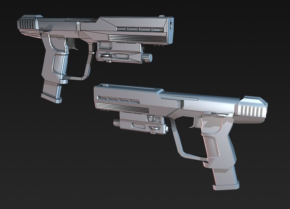
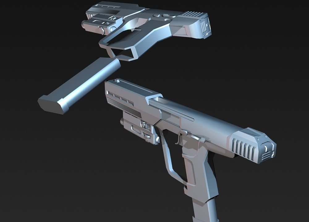
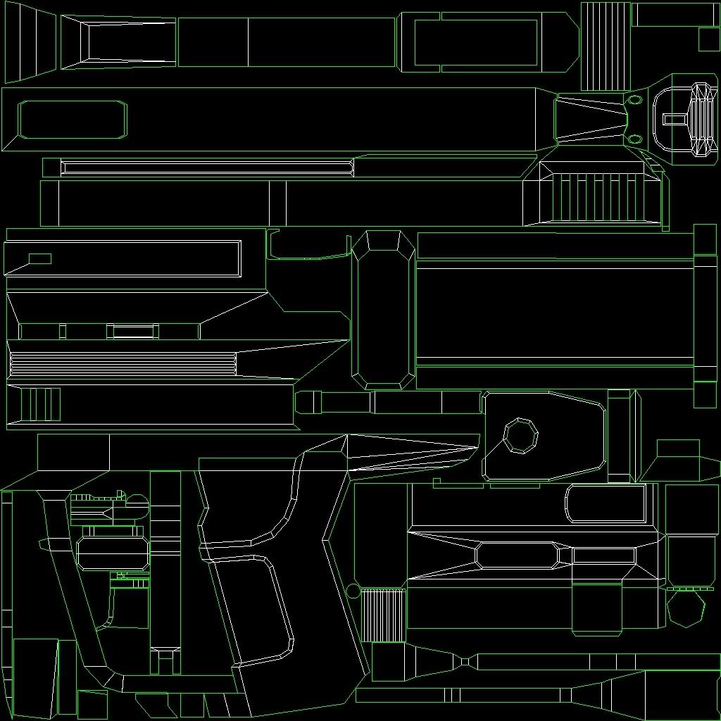
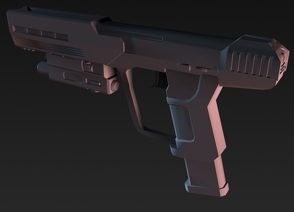
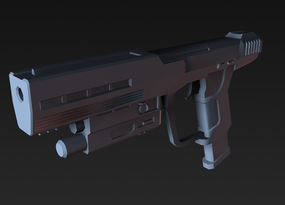
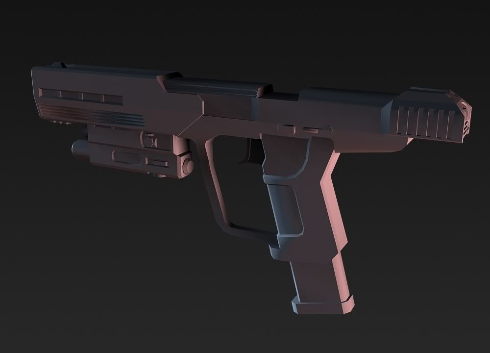
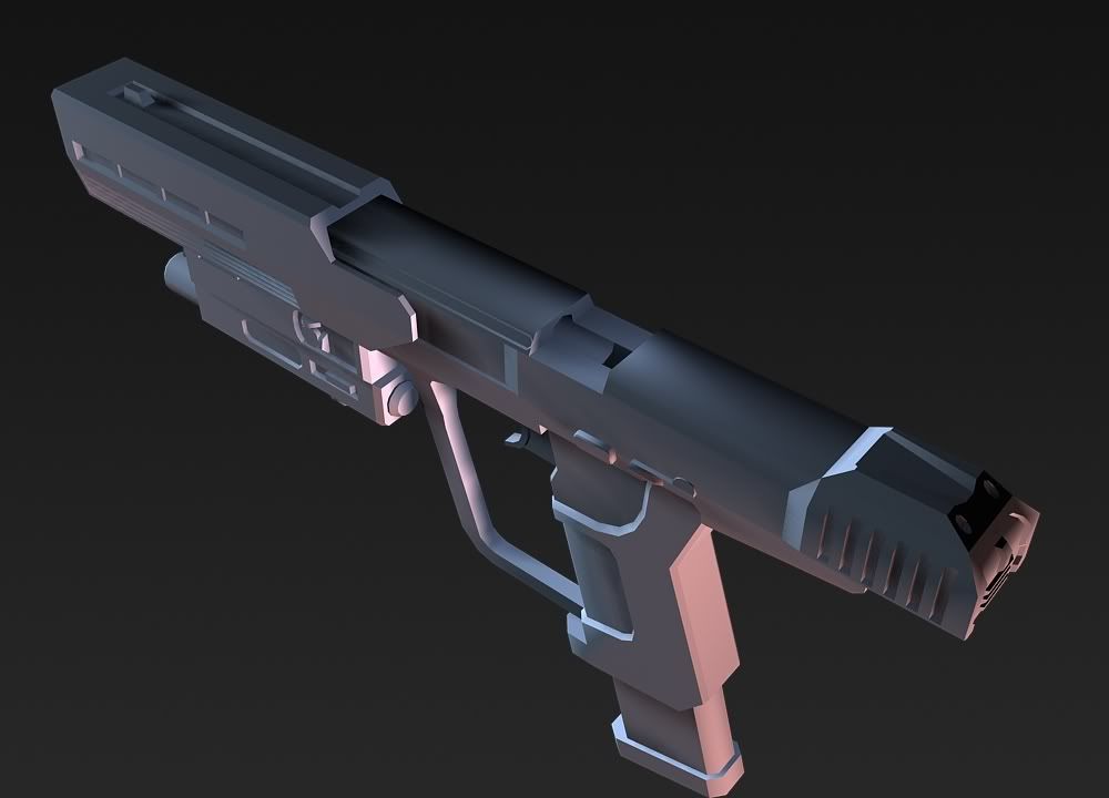
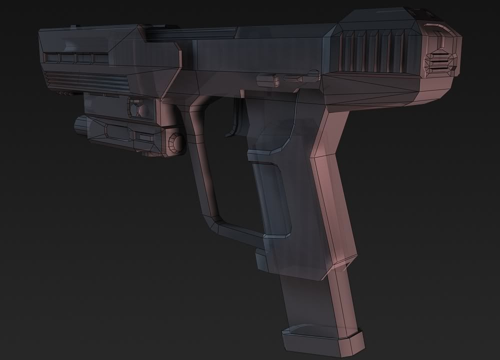
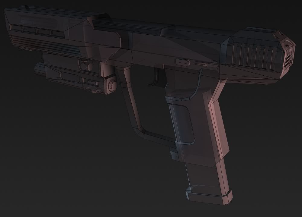
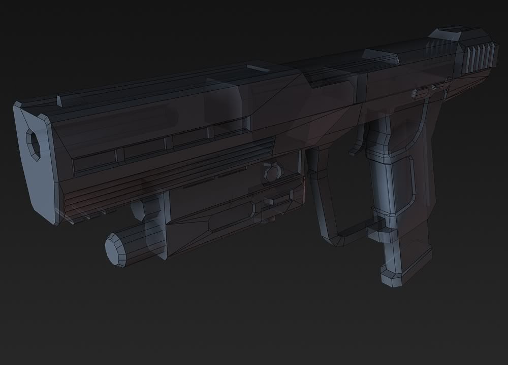
Image 1: "Yeah, thats a Halo 3 ODST Silenced Pistol"
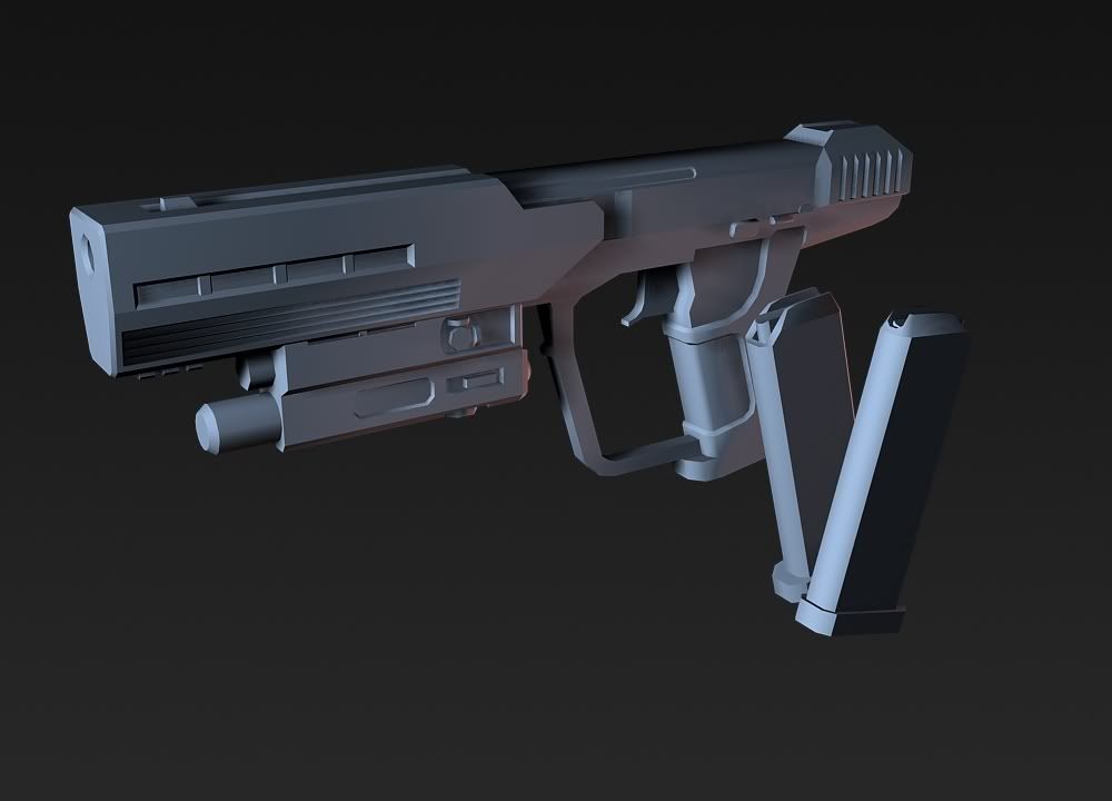
Image 2: "Yeah, thats a Halo 3 ODST Silenced Pistol"
Image 3: "Yeah, thats Hunter's Halo 3 ODST Silenced Pistol"
See the difference? Just something I have noticed whilst being here. Replicates are just boring.
If you are going to replicate something replicate it right. If you cant, don't just say: I'm going custom.
From what I see, you did try to replicate it, but you got stuff backwards. Like the top part, where its beveled inward, its supposed to be from the back going to the front. Not beveled from the front going to the back.
But really, its fine if you wanna go custom, but from what I see, its more like a replica that will be remembered as yours because some parts are the wrong way instead of being just like the ODST one.
Custom is making something like nothing that is out there. Like what ODST did with the H3 pistol.
:eyesroll:Quote:
Originally Posted by Fear1337
Okay then... It is Semi-Custom.
What do you want me to call it. it is the ODST Pistol but different... I didnt really try to replicate it, I just used the basic outline and worked from that, and thats how it turned out. Does it really matter? Gees...
How about Hunter's Version/Interpretation of the Halo 3: ODST Pistol? It looks awesome btw.Quote:
Originally Posted by Hunter
Call it what ever Lol. Just don't complain about the accuracy or anything. 100% recplicates are boring. Lol.
I...you'll see:
Click for larger image(like it's really necessary LAWL):
http://th04.deviantart.net/fs47/300W..._by_kid908.jpg
http://th05.deviantart.net/fs49/300W..._by_kid908.jpg
I got my profile organized (finally), but not everything is up. Tell me what general design should i make for it (ex. techno, neon, etc.); I don't like the default styles they gave, but I want so many different style of design that it's not really going to help. Pick a style that you feel fit with the materials. In addition, is there any free domain or do you have to pay b/c I'm a real cheap ass?
http://www.kid908.webs.com/
Omg I love that heart, it's awesome! :D
That's really the poorest excuse I've ever heard. I really liked that last render, but it was quite apparent that the outline (the part you said is the only thing you tried to get accurate) is extremely inaccurate. All I can say is, don't make a weapon so similar to bungie's that people can get confused and think you're trying to replicate it. Right now it seems like a lousy excuse for laziness and poor modeling. If you're going to make something custom, make something custom.Quote:
Originally Posted by Hunter
This is out of hand. Swine flu's out there people and its comin :D, worry about that before worrying how accurate a recreation of a fictional weapon and grilling someone about it because it gives you a false sense of authority and opinion. Shame on you :P
It looks good even if a bunch of random fucking extrusions arent the same as bungies.
I didnt state any where that I tryed to make a certain part accurate... Okay, for the hell of it, lets call it Hunter's Muvafukin Magnum...
It does not matter whether it looks like a replicate of the ODST one or not. Why make such a deal out of something which does not matter. Seriously. There is no need.
It is finished now. It looks okay to me. It has not got to be perfect, you fire the dam thing, not stick it in a museum.
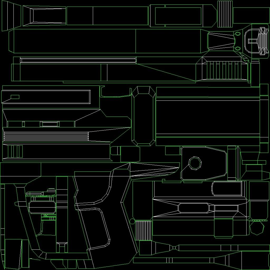
Triangles: 2374
And yeah, I am being bitchy because you are making such a fuss over the most stupidest thing ever...
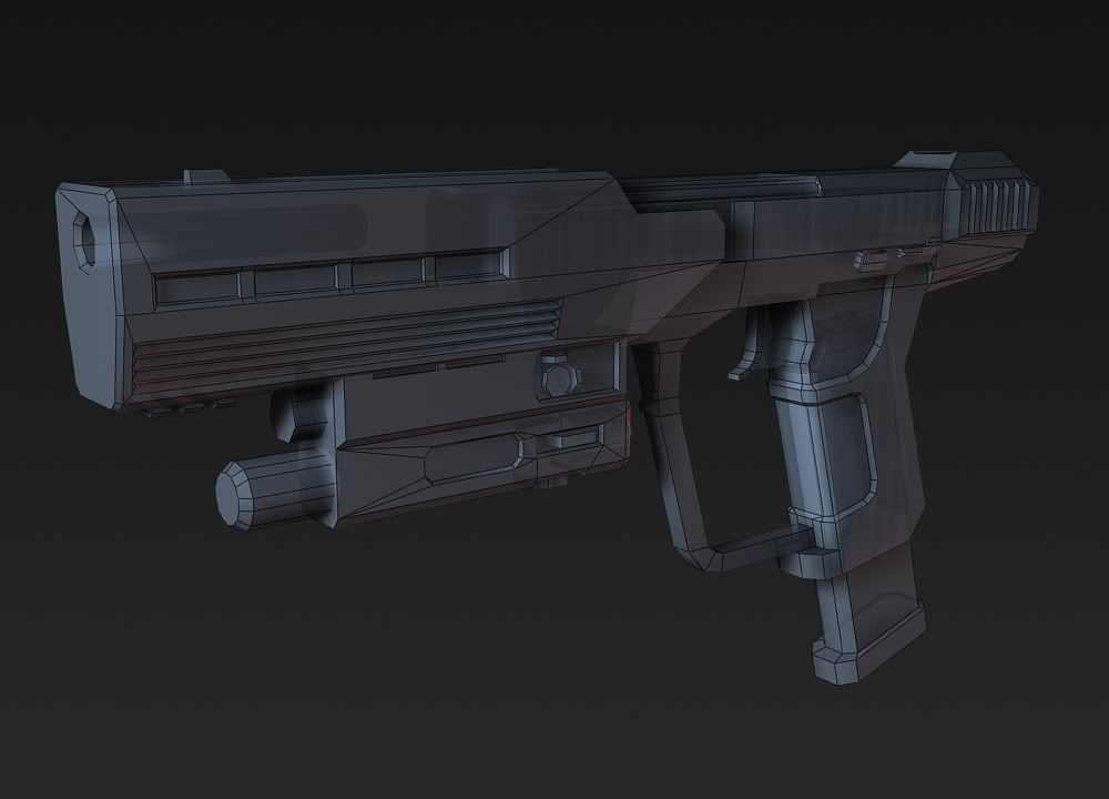
Hunter's also looks lot more optimised than other peoples attempts at this.
Malloy, if all you're going to do is stick it to the man and tell him his shit's fabulous, you only have to post that once. I wouldn't suggest starting shit about people giving crit in a thread that was made for giving crit, anymore.
/end (I can see arguing starting)
Optimized, doesn't always mean it works well with Halo's engine. It actually causes a ton of errors most of the time, that's why things tend to be made in triangles.Quote:
Originally Posted by Malloy
Hopfully it will work good. I have turned a lot of triangles to make sure no errors will occure.Quote:
Originally Posted by BobtheGreatII
I cleaned the thread. We disagree. It was a good idea to stop the argument. +rep for that hunter
Mmmk, was just pointing that out. :rolleyes:Quote:
Originally Posted by Hunter
Mollay, just because you dont see your point, you dont have to drop a load of shit to make it sound good. Your a really annoying kid.
Anyways, did I post this here?
http://i303.photobucket.com/albums/n...ghter/odst.jpg
Hey, what can you do. Two seperate people with two seperate opinions :pQuote:
Originally Posted by flyinrooster
Oh, and cheers for my 5th bar :woot:
How may tris are the two barrier things?
Those barriers don't need some of that detail, a skin will do just fine.
Yeah, I've stated that previously Con but apparantly... I dont see my own points and I drop alot of shit to sound good. Im a really annoying kid. LOL
End the argument or more penalties.
@Hunter: barrow for your magnum don't need to be that many sided. No one looks down that way.
@Fear: looks good but can't really say much since i donno what it is.
It's a barrier from one of the firefight areas. You can see them here:Quote:
Originally Posted by kid908
http://tinypic.com/view.php?pic=s6qhkj&s=5
I wanted it to be a texture, but dee said to just leave it like that...
Texture it -.- unless all you want is a portfolio model.
@Con: ah. but what's the center thing?
Its the base of a Halo Wars turret, without the turret.
because apparently, that's the only thing you CAN do.Quote:
Originally Posted by Hunter
i haven't seen a single piece by you which isn't another halo-3-thingy.
so you change a few little thingies around, it's still the same damn thing.
look at it this way, if you think you can be sued for IP-infringement, (hypothetically speaking, before any whiners come along) you're still making the same damn thing.
Why don't people try to get inspired and do something better than bungie's silenced magnum.
Tbh it's fucking shit, and they should be ashamed for making a box. Surpass bungie on their stuff ffs, please.
This isn't directed at anyone in general, but at everyone who has or will attempt a box magnum.
What the fuck is it with everyone and hating on things with hard edges? So it's a bit boxy, so fucking what? Just because you design something doesn't mean it has to be the fucking David of weapons. I think bungie's design looks good and fits with the canon. I don't fucking care if it has angles under 120 degrees.
it doesn't have to be a box to have hard edges, hth.
Fixed that, just didnt want to make more renders. I have halved the amount of sides on that part.Quote:
Originally Posted by kid908
Oh my motherfucking god! Sorry, how many times, have I said, that I am making a H3 style tag set? I am sick of saying it. But then people are still like "Oh luk, anuva h3 modelzzz!!!11!!!!11!"Quote:
Originally Posted by neuro
It is fucking annoying!
Okay, let me say again.
I want to make my self, a good Halo 3 Style tag set. :eyesroll: End/
:D
@Hunter: Try putting that in your sign. Maybe people will look there.
My update:
I barely get time to work on this anymore! school ends next week so progress should be faster now that I've gathered enough reference pictures to get it as accurate as I can.
http://img407.imageshack.us/img407/9...9120143237.jpg
Poly Count: 432379
Tris Count: 929711
I've found areas where I can cut a majority of the faces so I'll optimize that later on. I estimate I can cut the try count about 1/4 to 1/3 of the number above after optimizing it. Area of optimization would be the area of the smaller buildings you see in the 2nd picture. I over did the detail levels on those. I've also estimate the final model to be between 2.2 MILLION TRIS and 3 MILLION TRIS. Remember, this is meant to be a cinematic model if you did not know.
If you don't know what the final product looks like, this is an render made by a guy who worked on the tv series, so I'm considering it the official model:
If you try to google the city, you'll get 2 different official models that are significantly different b/c they used 2 different models.
In addition, don't ask for a wireframe, my computer can't handle it. I'm planning on getting a better computer in 2 years when my current one die. I have wireframe of the older WIP(only 1 or 2) if you want those.
C&C
The buildings in those sections look a little to close together. Eh, I wonder why Star Gate Atlantis didn't actually explore and show more, because they only showed 1 percent of the actual structure. There could have been many cool stories made out of different discoveries and stuff. :[
Anyways, its turning out very nice, I remember it when it was only the basic outline. :p
You use xfire?
Thats looking very well-made good job.
ye.Quote:
Originally Posted by Fear1337
- Email: cdk908@yahoo.com (also used for msn and yahoo messenger)
- X-fire: kid908
- AIM: tehkid908
:confused2:Quote:
Originally Posted by kid908
The thing you said about wanting your own custom halo 3 tag set. The thing ppl keep pissing you off about and make you repeat over and over again.Quote:
Originally Posted by Hunter
You wanted to bake it but all your angles are perpendicular so nothing would show. I said you would have to sub div model it if you want anything to show up on your normal map.Quote:
Originally Posted by Fear1337
What do you think I was trying to do after when I said I wanted to model it in quads?
Unwrapped my pistol. Im not going to bother make any big changes. I will just take in what you tell say to me and use it on my next unwrap. Bare in mind this is my 3rd unwrap I think. And I havn't watched a tutorial or anything.
Looks great for a 3rd unwrap ever done.
There is a seam going through the middle of the gun it seems?
Fairly rough right now, I've only really worked on the prongs so far.
Reference(Art of Halo version, don't know if it's different from the ingame version.
Why didn't I think of that?!
Lookin good so far.
way to misuse your scratch brush :mech:
Oh come on now Disaster, they don't need to be perfect. As long as they aren't a flat bright neon color, and the texture makes the object distinguishable, it's fine. Imo they're nice. Now release them because I would love to use those crates. :3
The metal looks a mite cloudy to me.
Yea, easy way I use to tone that down is to lower the contrast using the special tool below it, Legacy?
If you haven't already taken a look at it, I'd recommend going over this tutorial here. Right now the paint like material really doesn't look much like paint - it looks like you were trying to make a metal base texture and just recolored it for the paint effect. At least in my uneducated-lame-o-texturer-opinion :P.Quote:
Originally Posted by CSFLOYD
Looks like you overused sponge and palette knife modifiers. You definitely need to create a new base before doing anything else. Now onto the scratches, they are way to thick and are a solid color only. They are also in completely ridiculous places. Its ok to have some worn paint on the edges but don't do it with white :|. Have it showing the underlying material such as metal. Not a boring blurry white brush stroke :|
I suggest going back and redoing the skin.
Crates look funny. Seems like you put a color on a layer and set it to overlay.
Try to avoid that :)
Do you use a tablet? I think a lot of your scratches will improve if you get one. Right now they just look like marks you drew. Seriously though, if you don't have one and can afford one, it is infinitely worth it; get one.
Can you help me find a good priced one? I am a very bad product searcher and I do not know what tablet is good and what tablet is bad, and yes I will redo the texture.Quote:
Originally Posted by flyinrooster
intuos3 6x8. I have it, its a nice size, and it is very useful. I think I got mine new around $270.Quote:
Originally Posted by CSFLOYD
But I think the intuos4 series is out and selling the same size for around $330.
This is american money.
http://i58.photobucket.com/albums/g2...dstmagnum6.jpg
I put the ejection port in the completly wrong place last time, seems better this time I think...
I'm sure this isn't what he imagined when he was thinking of getting one that was well priced. Your best bet is to search ebay or amazon or any place like that for good deals. Just make sure you get a larger one, like a 6x8. If it's small, tbh you've wasted your money. IIRC someone said they found an Intuos for ~$80 USD (maybe it was MetKiller Joe?), you should probably ask them.Quote:
Originally Posted by Invader Veex
After hours of experimenting with different lights, filters ect... I have finally managed to get some decent renders which bring out the details and curves.
I have moved the ejection port to a place which seems more realistic.
And some wireframes:
And the unwrap:
I'm disappointed that you didn't model the chamber.
^This. If you're going to see the chamber in FP, don't just texture a black hole into it, put some effort into making it look good.Quote:
Originally Posted by SnaFuBAR
You have a point, I wanted to keep the triangle count as it is. But it is relatively low, so I could add it.
FFFFFFFFFFFFFFFFFFF, if you do, better not mess up the objects locations on the unwrap, I already finished texturing 1/3 of it. >:(
It will mess up parts, because I will be adding new faces and stuff. So hold on texturing. You can texture the handle section and other small parts. But try and avoid texturing the magazine and top section of the template.
Good, because the grip and handle are what I have done.
Okay good. I would stop for now if I where you, because I will probably need to move parts around as well.
Send the rest of your messages about your pistol via PM or IM.
Well since I can not work on it until the model is revised, here is the finished grip.
http://i305.photobucket.com/albums/n...ns1/render.jpg
http://i305.photobucket.com/albums/n...s1/render2.jpg
Lol, looks Forerunner. Also, do not render so dark.
I don't have a good understanding of chambers, so I have modelled in a basic chamber shape. I have also added a bit of detail to the magazine to give a more realistic look and feel. Animations will look nicer.
I will post images when finished unwrapping new parts.
You're metal is really cloudy and the rubber looks nothing like rubber. Also, the entire grip should be rubber.
Triangles: 2532
(Btw, the weird lines on the last two pictures is because of the shadows)
And here is a fp shot:
(I am not master at setting up origins btw).
I had this whole thing with this, and stuff, but I deleted it all. I hated it.
-Re-rendering
The texture on that pistol is uuuugly.
Whoever's it is.
Also, why are there about 3 or 4 of those in production atm?
Next time ODST shows any gun with some kind of alteration its going to be stormed all over.
Just like the SMG was.
http://i303.photobucket.com/albums/n...ifirontier.jpg
Quote:
Originally Posted by Heathen
I think it was Lag who did the first one. Then a month or more later, I was asked to do one.. and from there on, everyday someone was making one.
CtrlAltDel and I did one the day after ODST was show at E3. CtrlAltDel was shameless though and actually used the Halo 3 pistol for his model. I modeled mine from scratch.Quote:
Originally Posted by Fear1337
Lag? :d
He's only as shameless as bungie
yarp.
Too much blur on the left side, the pathway in the middle is dragging my eye back up to the blurred part.
Oh shi- sorry Ctrl, I'll fix it. lol.Quote:
Originally Posted by CtrlAltDestroy
Eh, because this is such a minor thing, I see no point in making a thread for it. I'm in need of a favicon for my website (http://www.feignphoto.com/) The one I have is sorta.. bland, idk. I guess it serves the purpose, but if anybody else has any better ideas I'd like to hear them.
http://www.feignphoto.com/favicon.ico
How dare you experiment with your growth ray.Quote:
Originally Posted by Llama Juice
Needs moar vignetting.Quote:
Originally Posted by Llama Juice
What is with you and that technique dee?
I thought about it Dee, decided to try it with just using blur rather than darkening it 'cause I was basically just wanting to use it for my background on my lappy.... and thought the dark edges would look weird.
Blur looks fake. Vignetting will draw your attention to the center of the frame, just keep it subtle.
Hell, you could have slightly off-center vignetting, but only slightly.
For a more genuine tilt-shift look, try:
http://tiltshiftmaker.com/
E:
I deliberately overdid it, so you get the idea.
Protip: to get the defocusing like that, rotate your image portrait before uploading.
Looks more realistic like this, but your blurred image spoils it.
<3 tilt/shift
Is that the colour/shade of your logo? If so, don't use it. Make it black, and give the background transparency. It would look a lot better on most web browsers.Quote:
Originally Posted by Reaper Man
Will give it a go.Quote:
Originally Posted by JunkfoodMan
Ok, it's now black. I'd make the aperture blades the same blue as the background, but it's so close to black... Eh, should I bother or just leave it as it is?:Quote:
Originally Posted by JunkfoodMan
http://www.feignphoto.com/favicon.ico
Halo 3 Emotion WIP I did.
I used teh shot tags since its 4014x2258. I have a deviantart which I posted it on.
How does it look? And yes the black background doesn't look so hot.
Credits to bungie for the models and such.
Fix the visor uvs and change the material. As of now it looks pretty bad.
Don't worry I will. I have been messing around with the mats but I can't seem to get it to look as good. As of now the lighting is ok but I will change the mats.
Open the texture and apply a sharpen filter to it once. It might make it look a bit better. And you should add a HDRI enviroment to make the visor look better.
New texture I made for Killa_FTW map
There is an AO and Normal btw.
http://i148.photobucket.com/albums/s...SSHOTSHOTS.jpg
To be honest I think it would look much better if you inverted the height (making the low parts high and the high parts low) and made the dark parts light... and the light parts dark. d:
you serve me well killer ;)
Thanks flyinrooster for the tip. Thanks to disaster for helping me execute it :)
New onehttp://i148.photobucket.com/albums/s...R/LALALALA.jpg
killer why don't you render?