Re: The Studio Quick-Crit Thread
Quote:
Originally Posted by
kid908

depending on how extended the clip is from the bottom of the gun and the fp gun placement, the paper thing wouldn't really matter since you'll only see it during reload which is less than 3 second at most if the mag isn't extruding from the bottom or isn't seem.
It's a very low visible area. maybe adding details where they're more visible.
I am fussy with things like that Lol. if I see paper thin metal because alpha maps then I don't like it. Like I said, I am going to try something else.
Also, I made a lamp-post :/
http://i58.photobucket.com/albums/g2...lamppost_1.jpg
Re: The Studio Quick-Crit Thread
Cute, but I personally think it's a bit overdone. Either way nice concept just the lights look a bit pointy.
Re: The Studio Quick-Crit Thread
Re: The Studio Quick-Crit Thread
Well, I think I've got the model done-ish(still trying to fix a few smoothing errors and such). Now to figure out if I suck at skinning or not. =/

Re: The Studio Quick-Crit Thread
Quote:
Originally Posted by
Hunter
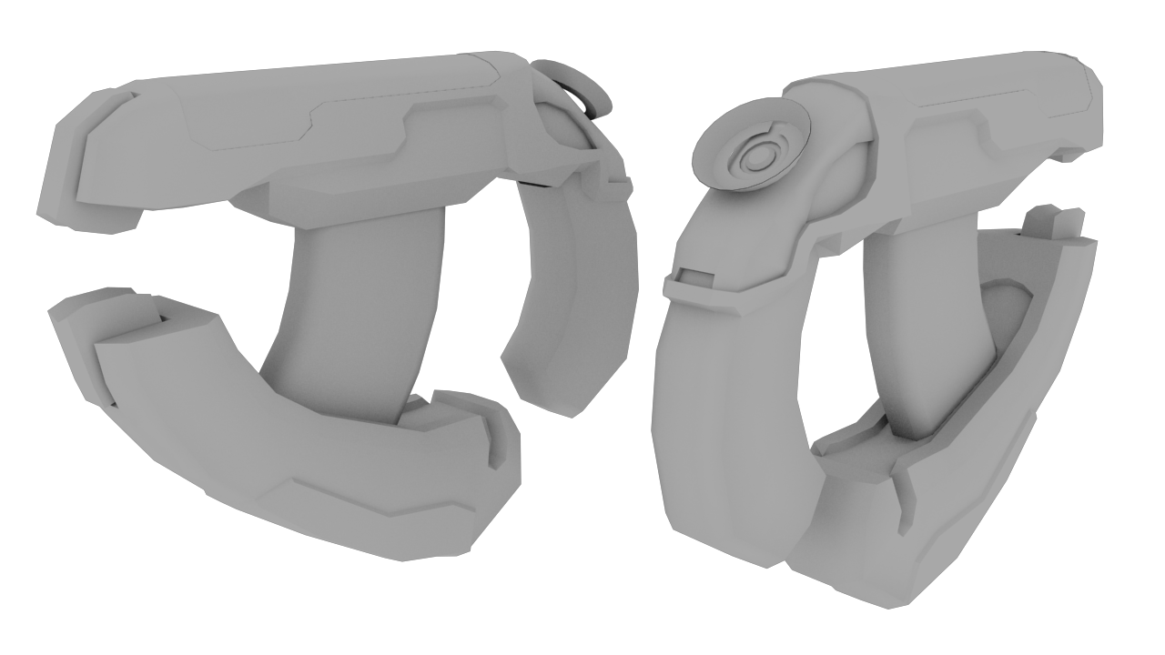
http://i58.photobucket.com/albums/g268/martynball/newclip_odst_pistol.jpg
Doesn't really make sense how the thing that pushes the ammo up is at the top though and there is still ammo into the clip Lol.
:lolugh: either lose the bullets in the mag or lose the magazine follower on the top and add a modeled bullet there.
Re: The Studio Quick-Crit Thread
SPACE RAYZ
Re: The Studio Quick-Crit Thread
Quote:
Originally Posted by
Hunter
Im guessing its based off the ones in Halo 3's The Storm?
Re: The Studio Quick-Crit Thread
Yup ^
And I will lose the bullets Snaf.
Re: The Studio Quick-Crit Thread

Click for lolhuge...
Working on a vector of Scooby-Doo. This is my first time using illustrator and I'm doing this to help me get familiar with the pen tool and all it's functions. I Will be adding color in soon, btw. Was just wondering on what parts of the outline I should fix, if at all. I think now that looking at it some more, the right side ear could use some fixing up, as well as the eyes.
Re: The Studio Quick-Crit Thread
Maybe it will look better when you color it in, but I think it would be best to use the offset tool to make your strokes rather than basic line stroke. That way you can round the edges and have better control of the stroke.