Get rid of the scrollbar down there - let the content take up as much space as it needs. Scrollbars interfere with usability and look fugly anyway.
I'd also go ahead and either widen the content out or fill that space somehow, even if it's just pictures or something. Looks really boring and empty right now.
Those text boxes were just concepts. The navigation bars were originally on the left, but i moved them to the top to make more space and I don't need to make them any wider for a concept. The white one is the one we are using.
October 13th, 2009, 11:01 PM
Llama Juice
Re: The Studio Quick-Crit Thread
WIP design. I want it to be bigger. I'll probably make it wrap further around.
I found a way to make it feasible price wise. AKA do it yourself.
Bought some green dye ($1.27ish)
Bought some black dye... which... it isn't really black.. it's really dark blue... ($1.27ish)
I mixed the green with a little bit of the black to get the color I have there (rinsed out a bunch to desaturate it.)
Bought an exacto knife ($5)
cut out some tagboard and made a giant stencil
Bought a can of black spray paint ($2ish)
tacked it all down (shoulda used adhesive spray rather than tacks... but ye know.... didn't know that beforehand) and sprayed it. If you're going to try it... less paint = better. It doesn't crack and such then.
Rather simple stuff really. :P
October 14th, 2009, 12:29 AM
MetKiller Joe
Re: The Studio Quick-Crit Thread
Wow, that's cool.
Edit: D: can't rep.
October 14th, 2009, 02:50 AM
paladin
Re: The Studio Quick-Crit Thread
spray paint will wash out after 3-5 washes :\, at least in my experiences
October 14th, 2009, 08:25 AM
Llama Juice
Re: The Studio Quick-Crit Thread
It faded a bit after the first wash, but I was glad it did. I like the faded "retro" look.
The spray paint i bought said that it's good for fabric, so that's why I got what I did. I'll be experimenting with other paints and such though over the next month probably.
October 14th, 2009, 02:07 PM
ICEE
Re: The Studio Quick-Crit Thread
I want one... I mean it would say ICEE, but I want one.
October 14th, 2009, 02:10 PM
paladin
Re: The Studio Quick-Crit Thread
In high school we used spray paint for our spirit shit. After about 5 washes everything was blurred into a giant ball of black/blue. But cool if it works for you.
October 14th, 2009, 02:49 PM
Llama Juice
Re: The Studio Quick-Crit Thread
I'll be experimenting, finding different ways to do it... try different paints... see what I can find that's most cost effective/easy.
Some other people use normal fabric paint and rollers over a stencil, then heat seal it with an iron or possibly a hair dryer? I have a hot air gun (hair dryer on crack) so I'll probably try with that, but... *shrug* we'll see how this all goes.
October 14th, 2009, 02:54 PM
Sever
Re: The Studio Quick-Crit Thread
You should learn silkscreening. Take a class for it - it's not only a great way to make your own shirts, but it's also quite fun!
October 14th, 2009, 04:49 PM
Llama Juice
Re: The Studio Quick-Crit Thread
Yea, I looked into that briefly and decided that I don't have the space for it. :/ lol
October 14th, 2009, 05:18 PM
Sever
Re: The Studio Quick-Crit Thread
Don't have the space for it? Bullshit. All you need is space enough to lay your target fabric flat, which you obviously already have. All it takes to do your own is a piece of framed silkscreen, your stencils, ink, and a few tools - it can be as large or as small as you want. When I did it, the one that I used was about 18 inches square, but the teacher had a bunch of other examples that varied in size and complexity.
You'd be better off abandoning tiling textures for most of the buildings and using unique unwraps. Right now, the tiling texture consistency looks really bad.
October 14th, 2009, 11:38 PM
English Mobster
Re: The Studio Quick-Crit Thread
I've been thinking of using unwraps for the majority of the buildings. I don't think ALL of them need it, but definitely the exterior of the escalator area and the train station need them.
October 15th, 2009, 09:04 AM
=sw=warlord
Re: The Studio Quick-Crit Thread
Biped nearly done, i've started on doing the smoothing groups so hopefully a few of the things looked off before now look better.
I've relaxed the arms a little and moved the posture a bit as well.
I've put the halo 1 stock biped next to mine to show a comparison of mine and the stock.
I decided to leave the bad that was on the stomach out as i didnt like it design wise as i said before this isnt a complete true to origin model more of a modernisation and reimaginated version.
Any C&C would be greatly appreciated.
Im looking forward to getting this rigged and Sandbox2. http://i37.tinypic.com/2nis8kk.png
October 15th, 2009, 09:05 AM
Llama Juice
Re: The Studio Quick-Crit Thread
Quote:
Originally Posted by English Mobster
When I saw this image I was like "Is this English's work?" because you always do some horrible ugly triangulated mess of destruction on your buildings. Last time you posted something like this we all gave you tons of reference to look at, it'd be cool if you actually referenced some broken buildings (or even look at how Bungie did it) and tried to replicate it because as it stands your destruction looks beyond terrible.
October 15th, 2009, 04:03 PM
mech
Re: The Studio Quick-Crit Thread
This thread needs to be split.
Well, I'm going to be playing at a show Oct 31st and need crit on a some I'm working on. It's a little sloppy because I was improvising different Ideas, I want to know what you guys think.
Would you rave to this? There's going to be alot of people and I want to get them moving.
October 15th, 2009, 05:08 PM
MetKiller Joe
Re: The Studio Quick-Crit Thread
Quote:
Originally Posted by mech
This thread needs to be split.
Well, I'm going to be playing at a show Oct 31st and need crit on a some I'm working on. It's a little sloppy because I was improvising different Ideas, I want to know what you guys think.
Would you rave to this? There's going to be alot of people and I want to get them moving.
There is little to no bass here. Check this out. Yours is like a higher quality version of the background music in like Sim City or something I'd expect as the background music for an RTS. The sound is interesting, but you want to work the woofers a lot more if you want to get people moving.
October 15th, 2009, 05:27 PM
mech
Re: The Studio Quick-Crit Thread
I'm going to have this hooked up to a half stack, thing is, I'm using a cheap 100 dollar keyboard and can only play 1 sound at a time, hence the lack of bass. But, I can mix two sounds together to make a deeper tone which gives the impression of bass, so it should be pretty good.
What do you think off the over all jams though?
October 16th, 2009, 11:53 AM
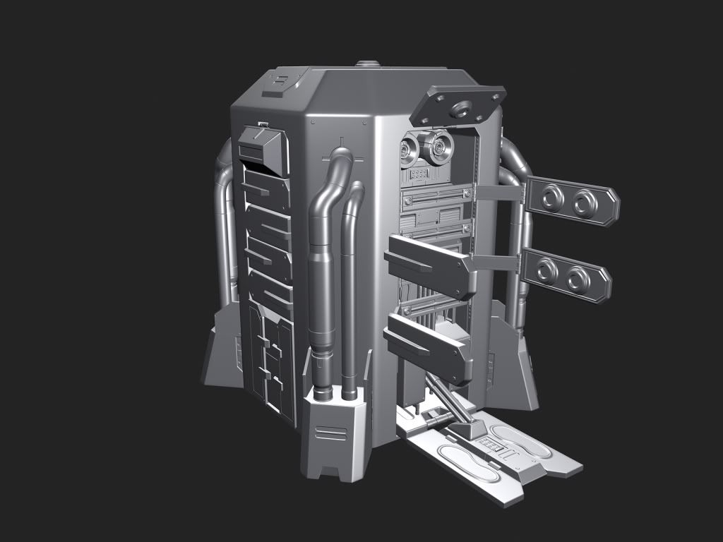
=sw=warlord
Re: The Studio Quick-Crit Thread
3973 Polies.:realsmug:
Model complete i guess unless anyone here can give tips and advice on any issues you might see with it.http://i33.tinypic.com/kaqwjm.png
October 16th, 2009, 12:25 PM
neuro
Re: The Studio Quick-Crit Thread
giant feet, skinny ankles.
October 16th, 2009, 01:55 PM
=sw=warlord
Re: The Studio Quick-Crit Thread
Quote:
Originally Posted by neuro
giant feet, skinny ankles.
Anything else i should work on while doing the ankles?
October 16th, 2009, 02:27 PM
flibitijibibo
Re: The Studio Quick-Crit Thread
Quote:
Originally Posted by mech
This thread needs to be split.
Well, I'm going to be playing at a show Oct 31st and need crit on a some I'm working on. It's a little sloppy because I was improvising different Ideas, I want to know what you guys think.
Would you rave to this? There's going to be alot of people and I want to get them moving.
There are things in here that are addressed in your post, but to make sure I don't make any holes, I'll list whatever I heard. Number of things:
1. Lead is awfully sloppy (rhythmically speaking). I assume you recorded yourself with a MIDI keyboard?
2. Lead could be up an octave. In the lower range used, it tends to blend in with the chords. Depending on what system is used at the show, it could be nearly impossible to hear it.
3. Lead needs less echo. In the more complicated sections, it just sounded like a glissing mess.
4. Drums could use more fills. What I mean by this is rather than just "bass, snare/clap, bass, scare/clap," feel free to put a unique fill at the end of each set (8 measures, 16 measures, or the end of a particular phrase.) Actually, you could probably add another beat into the normal line (use cymbal/hi hat on an "and" maybe?).
5. Be VERY careful with your embellishing tones. There were a couple of notes in there that just sounded plain wrong, improv or not. Be mindful of the key (things like dominant 7th would be alright), and if it's going pretty far off key, either use it with chromaticism or resolve it ASAP.
6. Tritones: Use responsibly. :gonk:
7. Repetition: Good in short bursts. Don't let things go on for too long, and certainly don't toss them out after one run. http://en.wikipedia.org/wiki/Musical_form
Forms are an easy way of repeating ideas without monotony. Depending on how long this is, you could go from simple AABA to something lolhueg like AABACABA.
October 16th, 2009, 02:48 PM
ExAm
Re: The Studio Quick-Crit Thread
Quote:
Originally Posted by neuro
giant feet, skinny ankles.
His boots are huge, his feet inside the boots appear to be on over an inch of platform, so I wouldn't say it's his feet that are huge, and therefore the ankles don't seem that skinny to me if you think of his actual foot size.
October 16th, 2009, 05:29 PM
paladin
Re: The Studio Quick-Crit Thread
Quote:
Originally Posted by =sw=warlord
3973 Polies.:realsmug:
Model complete i guess unless anyone here can give tips and advice on any issues you might see with it.
*img*
He looks like he has 70's platform boots on.
October 16th, 2009, 05:36 PM
=sw=warlord
Re: The Studio Quick-Crit Thread
Quote:
Originally Posted by paladin
He looks like he has 70's platform boots on.
The boots he has on normaly look like that sadly.
October 16th, 2009, 05:45 PM
paladin
Re: The Studio Quick-Crit Thread
That may be, but they are not as apparent as yours.
October 16th, 2009, 06:08 PM
=sw=warlord
Re: The Studio Quick-Crit Thread
Quote:
Originally Posted by paladin
That may be, but they are not as apparent as yours.
That might be because i havent applied smoothing groups to them yet i've only smoother some areas so far.
October 16th, 2009, 06:36 PM
FRain
Re: The Studio Quick-Crit Thread
Quote:
Originally Posted by flibitijibibo
4. Drums could use more fills. What I mean by this is rather than just "bass, snare/clap, bass, scare/clap," feel free to put a unique fill at the end of each set (8 measures, 16 measures, or the end of a particular phrase." Actually, you could probably add another beat into the normal line (use cymbal/hi hat on an "and" maybe?).
this this this this this this this this this this THIS.
I was unable to be the drummer in jazz band (because our always-menstrual director wants someone with "experience" and our drummer only plays (bass bass snare, bass bass snare) and in that song theres even a WHOLE FUCKING SECTION of him to mess around and all he plays is that.
are you even fucking trying to make a map or do you do this just to frustrate everyone
October 16th, 2009, 11:11 PM
ICEE
Re: The Studio Quick-Crit Thread
Quote:
Originally Posted by CtrlAltDestroy
Uh, yes it does. Look at the flood carriers.
Is there something in particular you have to do to get it to work correctly then? in my experience all thats ever happened was the models would start at the tiniest scale they reached in the animation and remain there
October 16th, 2009, 11:13 PM
CtrlAltDestroy
Re: The Studio Quick-Crit Thread
blitzkrieg doesn't export scale data correctly iirc, though the exporter i released should
October 17th, 2009, 12:32 AM
Advancebo
Re: The Studio Quick-Crit Thread
Quote:
Originally Posted by CtrlAltDestroy
blitzkrieg doesn't export scale data correctly iirc, though the exporter i released should
Oh ok :downs:
October 17th, 2009, 09:21 AM
Spartan094
Re: The Studio Quick-Crit Thread
I really don't feel like fixing the feet atm since they are all in one gbx_model and I tend to mess up the bones while doing so.
And heres a visor update, look way better.
I need to fix some uvw's on the visor and some other parts, maybe tone down the brightness.
What ya think?
October 17th, 2009, 09:37 AM
FRain
Re: The Studio Quick-Crit Thread
Looks good, except for that the armor looks too "glossy" as if it just came out of an assembly line. There should be some damage done to it.
October 17th, 2009, 12:38 PM
DEElekgolo
Re: The Studio Quick-Crit Thread
Your fake normal mapping is done wrong sir. I see pre-defined highlights from the normal map all over, especially in the visor.
Hey there, so my previous menu that I posted was a bit too crazy for my game. I had to tone it back a bit on the Maya side. We're going to still get the flipping of the letters in, but we're going to be doing that all programatically. The other menu managed to break something in a teammate's laptop (he was exporting the animation for two days straight....) and so we had to come up with another solution to it. In the mean time I made the background of the menu and animated that. We'll see how it goes this time around :P
also, you won't be seeing this much of the actual menu, it will cut off on the left just about where the pipes end, on the right just after the gears.
October 17th, 2009, 02:10 PM
Heathen
Re: The Studio Quick-Crit Thread
I figured out what is nagging me about your stuff.
Your textures are too uniform, they should change for different parts of maps and junk. Like different parts of buildings,, and they all look like stone.
October 17th, 2009, 02:30 PM
MetKiller Joe
Re: The Studio Quick-Crit Thread
Your background animation goes slow then fast, unless you wanted it that way.
October 17th, 2009, 02:55 PM
kid908
Re: The Studio Quick-Crit Thread
Quote:
Originally Posted by kid908
I see the problem. It was quite hard to see in max considering the repeating pattern gives me a headache. I'll fix the curve and make an indent in the hull for it. Fun Fact: there are 360 of those fuckers on the gate if the cheveron areas aren't cut out. :gonk: So many.
I had to remake those cosmetic patterns :gonk: (had to remake it about 3 times to get to where it is now so it took several hours) God was it hell, but it was for the best. Hopefully it looks alot better now for those complaining about the low poly sided temp hull.
@Heuro: I've seen many different sizes for the stargate in the show. I've made the thicker ones before and it doesn't look very well so I decided to try making the skinnier version.
October 17th, 2009, 07:54 PM
Cagerrin
Re: The Studio Quick-Crit Thread
Need to do some work above where you can see here, to make the upper part look like it slid out and up to reveal the... whatever it is... power core or something.
we have the seats too but its a seperate vehicle and i was to lazy to attach it :smith:
October 18th, 2009, 06:18 PM
Hunter
Re: The Studio Quick-Crit Thread
Wow, nice. Seems a bit high though.
October 18th, 2009, 06:32 PM
Disaster
Re: The Studio Quick-Crit Thread
Just a simple sci-fi piece I wanted to model. Concept art is from Natural Selection 2. Its not 100% accurate but I wanted to be a little creative.
October 18th, 2009, 07:06 PM
SnaFuBAR
Re: The Studio Quick-Crit Thread
looking pretty damn good buddy
October 18th, 2009, 07:12 PM
Hunter
Re: The Studio Quick-Crit Thread
I agree ^
October 18th, 2009, 10:02 PM
paladin
Re: The Studio Quick-Crit Thread
Flour sack jumping over an obstacle, I chose a circular saw. :realsmug:
68 frames @ 24fps
the animation is on 2's. These are the construction lines, so the lines aren't uniform. I am mostly looking for consistent volume throughout the animation.
I noted on the assignment that:
the hang time is about 2 frames too long and that I have fixed that, just not re exported the avi.
after the bag drops the animation sticks. For some reason DigiCell is being a dick and thinking Ive added an extra frame and I cant get rid of it, so there is an extra frame on the land frame.
October 18th, 2009, 10:11 PM
Heathen
Re: The Studio Quick-Crit Thread
Quote:
Originally Posted by Ki11a_FTW
i would be afraid of posting pics of this without new shaders :|
we have the seats too but its a seperate vehicle and i was to lazy to attach it :smith:
I know that map!
:v:
Its derelict!
October 19th, 2009, 01:29 AM
Siliconmaster
Re: The Studio Quick-Crit Thread
Thought I should revisit North Galeton. The city has been lonely for a long time now.
October 19th, 2009, 06:24 AM
Advancebo
Re: The Studio Quick-Crit Thread
Quote:
Originally Posted by SnaFuBAR
Your scale is WAY off.
No, its the right size :downs:
Delta made new shaders:
Quote:
[size=1]--- Original message by: delta49[/size=1]
The shadow is scaled correctly. I went in max, imported the halo 2 model and scaled it to the correct size, then compared it to Bo's model by importing it. It fit perfectly. It might just look incorrect because: 1. The seats were never actually used in Halo 2, the time you saw the three in the tunnel, they were all carrying ghosts. And 2. We've never seen a spartan sitting on the seat normally (unless it was modded). Anyways, I fixed up the shaders. Keep in mind this might not be the final look: http://img39.imageshack.us/img39/3245/saf67.png http://img30.imageshack.us/img30/63/adhf78.png
October 19th, 2009, 08:40 AM
Higuy
Re: The Studio Quick-Crit Thread
To be honest those shaders look horrible. Way to shiny, looks like plastic
October 19th, 2009, 03:27 PM
Spartan094
Re: The Studio Quick-Crit Thread
Those shaders are terrible, looks like plastic, way to shiny (its over done really), and I sense a bad multipurpose for it. No fake bumping either to help it out?
I never done any covenant shaders before on any of the weaps, vehicles and such. Could I have a go at making the shaders on it
Oh, newly redone bitmaps again for the h3 spartan since inferno didn't like it
I might re-uvw back the chest plate back to normal so it will show the dents on the right, and I don't care if the fake bumping is wrong
e: atleast somebody crit it to know what I need to fix or so
E: brought back the indents on the spartan, last image for this post
I always had mixed feelings about the environments of Half Life 2. There are some truly inspiring vistas, but they never seemed to get away from box modeling. Seems everything in the game, with the exception of characters and weapons, is made from extruded boxes. :/
[/ot]
October 21st, 2009, 10:26 PM
Llama Juice
Re: The Studio Quick-Crit Thread
5279 tris
A possibility of an art direction for my game. Currently we're going with a prague look to it all... which doesn't fit the story/game at all. I'm going to try to propose this to my art director when he gets back from his honeymoon lol
October 22nd, 2009, 12:32 AM
BobtheGreatII
Re: The Studio Quick-Crit Thread
Quote:
Originally Posted by Rob Oplawar
I always had mixed feelings about the environments of Half Life 2. There are some truly inspiring vistas, but they never seemed to get away from box modeling. Seems everything in the game, with the exception of characters and weapons, is made from extruded boxes. :/
[/ot]
Yeah, one of the many problems using Hammer... :saddowns:
Yeah ive still got some work to do on the hands but other than that the mesh is unwrapped and has a basic undercoating for colour.
October 22nd, 2009, 03:51 PM
Spartan094
Re: The Studio Quick-Crit Thread
The hand plate looks weird, fingers are ok.
October 22nd, 2009, 07:47 PM
kid908
Re: The Studio Quick-Crit Thread
Progressing along with this one.
Just got bored and rendered this one. The ground material is horrible on my part, sorry. Yeah, the bottom is suppose to be a reflection.
October 22nd, 2009, 07:57 PM
Con
Re: The Studio Quick-Crit Thread
Very nice, how far are you going with this?
October 22nd, 2009, 08:01 PM
kid908
Re: The Studio Quick-Crit Thread
All the way.
October 22nd, 2009, 08:09 PM
Llama Juice
Re: The Studio Quick-Crit Thread
chopped the tris down a bit, down to 4117 now, was at 5279.
October 22nd, 2009, 09:04 PM
Snowy
Re: The Studio Quick-Crit Thread
Looks cool
October 22nd, 2009, 09:24 PM
NuggetWarmer
Re: The Studio Quick-Crit Thread
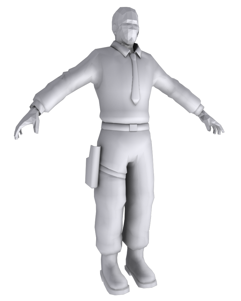
Working on a Barneysecurity guard model for Operation Black Mesa. Ignore my base human mesh.
October 22nd, 2009, 09:29 PM
Llama Juice
Re: The Studio Quick-Crit Thread
That's one beefy tie you have there sir, is it filled with sand?
Been workin on this piece some more :P.
October 22nd, 2009, 09:37 PM
NuggetWarmer
Re: The Studio Quick-Crit Thread
it's a clip on
October 22nd, 2009, 10:49 PM
Heathen
Re: The Studio Quick-Crit Thread
Its still thick.
October 22nd, 2009, 10:55 PM
Corndogman
Re: The Studio Quick-Crit Thread
I think it looks fine tbh. It has a bit of a cartoony look to it being that thick, but I think it might also look bad it's too thin. It'll probably look fine once its textured and all.
October 23rd, 2009, 12:14 AM
MetKiller Joe
Re: The Studio Quick-Crit Thread
Quote:
Originally Posted by Llama Juice
That's one beefy tie you have there sir, is it filled with sand?
Been workin on this piece some more :P.
Those beams on the front still looked tacked on. They don't seem to have a purpose. I'm talking about the ones that go up and then onto the platform, not the ones that frame the windows; those look better now.
October 23rd, 2009, 12:23 AM
Llama Juice
Re: The Studio Quick-Crit Thread
I think I'm done with this for now. I'm not sure if I like how bright the roof is or not.. but *shrug* I gotta take a break from it.
E: @ MKJ they are just kinda tacked on... I didn't really know what to put there, so I tossed some beams in there to break up the surface somewhat. I was considering removing those and running some pipes up the wall, but pipes require more polys than I have to spare at the moment :/. As is I'm already nearly twice my allotted poly count lol. If you have a better idea of what to toss there though, let me know :P
E2: added that last image in there, 'cause lighting is fun.
October 23rd, 2009, 04:34 AM
paladin
Re: The Studio Quick-Crit Thread
Hey there, that looks super good.
October 23rd, 2009, 12:56 PM
Pooky
Re: The Studio Quick-Crit Thread
Quote:
Originally Posted by MetKiller Joe
Those beams on the front still looked tacked on. They don't seem to have a purpose. I'm talking about the ones that go up and then onto the platform, not the ones that frame the windows; those look better now.
Moreover, it looks like they could trip someone who was walking along there, that's just not good design.
October 23rd, 2009, 08:25 PM
ICEE
Re: The Studio Quick-Crit Thread
Liking that building. Interesting artistic style you've gone with here.
So im practicing with character animations, since i really havent got much experience in animation past FP. Starting slow, using poses for now.
There's a few weird smoothing errors going on in the chest plate, but overall it looks alright.
I do dislike the sharp angle to the top of the "bill" on his helmet though. The part where the "bill" connects with the rest of the helmet. That looks kinda strange.... might be like that normally... but creative license sir, make it awesome.
Anyhow...
Gotsa make a town... so I gotsa make a lot of buildings.