Halo 4 vehicle set gogogoQuote:
Originally Posted by SnaFuBAR
Printable View
Halo 4 vehicle set gogogoQuote:
Originally Posted by SnaFuBAR
I sort of feel you've worked yourself into a corner there. It seems difficult to end the leg with something that conforms to the (comparatively) thin and long joint you have ending it right now. I could imagine adding a third leg joint that would taper to a point (like the Scarab) but that seems really boring. Possibly something along the lines of the Blood Asp's foot? Though, if you've got 4 legs or more (as I assume you do) that could start looking crowded really easily.Quote:
Originally Posted by neuro
Possibly do something like a really thick+short cylinder with some underwater gadgetry - a propeller protected by grating or something - inside? And then some curves sticking out from the top in the style you've got on the top joint. That would let you end the limb without much fanciness and still maintain a bit of style/uniqueness; I don't see many mech legs ending in something other than toes.
okok, guess ill have to show where i'm going with this.
http://www.freefallgraphics.com/file...ncebaymech.jpg
it's something a colleague of me was working on before the company went tits-up. i decided to pick up working on the model again after a long time of not doing anything.
http://i623.photobucket.com/albums/t...f/th_robo1.jpg http://i623.photobucket.com/albums/t...f/th_robo2.jpg http://i623.photobucket.com/albums/t...f/th_robo3.jpg
there's aloooot to be done, and right now, the legs are positioned like that for easy modelling, not going to bother modelling it posed. the concept isnt rly clear in anything, which is also the reason i stopped working on it the first time.
please keep in mind that only the parts which are obvious are actually worked on, and the blocky shit is placeholder, so if anyone is going to post 'oh that looks blocky; you need to die in a fire.. slowly.
im not trying to stick to the concept 100% because anyone can copy a picture (assuming he knows what he does).
Looking forward to seeing that beast finished, I really like the concept.
Bit blocky init? ;)
It looks like your lower legs are a LOT skinnier compared to the upper legs than they are in the concept. Yeah, creativity... I don't think that's making it easy for yourself though. I'm trying to think of something for the feet and I just can't think of anything that doesn't look awkward with what you have there. I would add something to bulk the lower legs up, especially in the back. Then the feet seem like pretty generic spread-out toe thingies. I didn't bring this up at first but I think its leg design might help you out.
...Yeah I think that would be a lot easier to make if you made the lower legs wider. Just add some curvy gray... thing coming out at the back and sides.
i havent actually done anythign to the lower legs.
theyre just there to show 'lower leg goes here' nothing more atm.
also, you're not helping hunter.
I'd go the bloodasp route.
..wasnt ment to be helping, because usually if I give some crit it just gets ignored or shitted on. So I simply said that I liked the concept because I did like it, voicing my opinion yo.
The pauldron-looking plate looks cool, but I don't think it works in favor of the overall design. It seems to cap the legs at a stiff angle. You probably should move that detail to a lower leg segment or you could try building the leg from the foot upward and see if that leads you in a more natural direction. But I think you want to leave the first section coming off the shoulder free of fancy shapes and keep it strictly functional. Let the foot or the shin be the parts that draw the eye.
Very cool, but the leg looks to me to be between one and five feet long because of its design. Especially the screws. If it's really that big, why in god's name does it have those massive friggin screws/bolts in it? I actually much prefer it as a roughly car-sized robot, the design makes more sense that way.
Not enough ready to update my main photography thread so i thought i'd post this here (was a little extra thing i did after a big photoshoot at the beach earlier today).
Classic English beach - aye!
click for bigger <3
Can we get some wires?Quote:
Originally Posted by neuro
Also it reminds me of a tachikoma.
no wires. i wasn't rly ready to show this in the first place, so i wont do any request renders at all for now.
small update:
http://i623.photobucket.com/albums/t.../th_roboto.jpg
Looks great to me. The vents on the underside was a nice touch.
Quote:
Originally Posted by FireDragon04
What the fuck is wrong with that beach.
Oh, I see.
Yeah fucking England right, up this end of England there's so many 'rock' and 'cobble' beaches, there's so little sand. Down south there's way more 'sand' beaches, that are actually nice.
I have only seen a couple of decent beachs down south of England :/ But I get bored of just chilling on the beach anyway, and I hate going in the icy waters... so I prefer beachs with sea life like large rockpools or large cliffs/rocks I can climb like a retard lmao.
Most beachs are shitty though :/
Orly.
This is where I live:
http://metroworld.com.au/images/property/66/1265.jpg
Pretty good.
little more quick crit, little less talk about beaches that aren't in firedragon's pano
I find the colours dull. You should try enhancing the blues of the ocean and sky a bit.
Having lived in England and having been to many beaches like that, I think the colors are fine. They reflect the moodiness one generally finds when in England, because the weather is terrible lol.
I think it's a terrible shame those rocks are there.
So this is where the content aware fill comes in! I know, totally amazing right. Yeah, we know, please, stop.
Never before have we seen anything like this before. It's a complete game changer and It's only one of the few great features in our Adobe CS5 Design Premium. Your clients are going to love it, and it's going to help you produce quicker faster, and speedier content creation and deliver it quickly and rapidly more readily to be in line with your clients demanding time schedule.
We think your going to love our CS5. Because we love it too.
http://www.charviinternational.com/i...uche_spray.jpg
Damn right!Quote:
Originally Posted by Reaper Man
I'm moving to the furthest south you can go (300 miles from where i am atm - in the north of england) so hopefully the beaches will be 'nicer' down their. Thanks for the Crit though guys :)
PS: CS5 will rock, i've always wanted to use content aware to make my own sandwiches joke, i just love that video haha
Bournemouth beach is fantastic, lots of hot birds tanning :D Not all beaches in UK are stoney, most are though. Where I live its lovely sand, rated one of the best in the country :DQuote:
Originally Posted by FireDragon04
We should totally meet up and go for a few pints when your in Uni.
I'm totally up for that man :pQuote:
Originally Posted by Limited
Another thing for people to 'possibly' crit on for me:
I filmed and edited this :) It's pretty much done, but i know the biggest crit we've been getting is that is such a small section, but that was the brief - to make an extact so we did :downs:
Argh, fix ye footstep sync :gonk:
Also, your voice over guy sounds rather unenthusiastic.
I like what you're doing with the sin city style effects, but I don't think it works with the technology that the actors are using. Maybe if you heavily desaturated it and gave it a slight blue overtone it would look a bit better.
Also try lowering the fps down a bit, the higher fps makes it look like it was shot with a normal consumer camera. I find that it makes it look a lot smoother, and would better fit the look and feel of this video
On the subject of beach panos...
(yeah i fucked with the colours, sue me)
The main thing that threw me off was your enter and exit. Try to make it so you always enter from the same side, instead of what you're doing.
OMG... v.o guys accent was painful :(, hope that wasn't you :3Quote:
Originally Posted by FireDragon04
Nice video, but the editing could use some work, especially the foot steps. They were painfully off and out of sync.Quote:
Originally Posted by FireDragon04
I thought it was pretty good, and I tried not to remember your normal voice and it made voice over sound better.Quote:
Originally Posted by FireDragon04
:lmao: The disabled toilet behind the 'cafe' scene
That was not me doing the voice over btw - some people say it was, but my voice is no where near as good as that guys. His voice is better than mine tbh, i know some people don't like it, but i think it fits in with the video pretty well. Mine would have been worse.Quote:
Originally Posted by Limited
And yeah the two things you guys have picked up on - The footsteps and the disabled toilet sign, are the two things others have pointed out - it's good to see that people are picking out the same things we did.
Thanks again guys.
Im taking two film classes right now, and im in the process of editing a film. After 4 hours of cutting clips together, you kind pick up on when the foot steps are out of sync :)
Quote:
Originally Posted by Con
Looks kinda over-sharpened. Little to no shadow detail in the trees. Expose for the shadows, process for the highlights. If possible, that is.
Cold colors give it a very negative atmosphere.
Thanks Reaper. That was indeed a plane, and I think I used planar instead of cylindrical for the stitching. I'll know better next time. I also tried to expose for those trees at first but the sky just got all washed out and white and unpleasant. I figured it was probably better to keep the same exposure throughout the pictures, right?
Yeah, you should be shooting manual for the whole thing. Hm, I guess it's hard to get the shadow detail in such a situation without either a graduated ND filter or using HDR.
How would I go about making an HDR panorama? Do I create a pano for each exposure then try to line them up and merge them, or what?
If you're taking them off a tripod, you should be able to either merge each shot into HDR then combine into a panorama, or combine each set into a panorama and then merge them using Photomatix. Personally i'd merge the shots in Photomatix first before combining into a panorama, just incase your pano program merges each pano differently which will cause trouble for photomatix.
Take bracketed shots before you continue panning.Quote:
Originally Posted by Con
Some random photos I took.
The tree's kill the last one...
What are you shooting with? The quality is extremely low
Can anyone tell I had to shop the nose in?
I'm not sure if the nose is supposed to be about 3 noticeable shades of gray, but if it isn't then I can tell it's shopped (but only because you told us). Otherwise I probably wouldn't have noticed.
Ma5K Reload with Teh Lag's lovely arms:
http://www.youtube.com/watch?v=wVs0cyE_3TE
i like it over all, but the times when he slides the mag in and/or out are too... well, i don't want to say stiff, but they look somewhat uni-directional. it should be a bit more smooth and move a bit more during those parts, i think.
I can't tell much from the side-view, but it looks pretty nice on the left (right is bland but that seems unfinished... I hope). I don't really see a definitive style - the main structure seems forerunner (?) but the box-indent-trench-thingy near the bottom-left doesn't fit in very well imo. More angles, if possible? Or some more info about it?
working on a few more renders.
it's damnation
right is finished, can't see more than the upper part of it from the playable area anyways.
not sure about the bottom left thing, I only started working on this again today, dunno what I was thinking when I made it originally.
you had to quote a picture to say that?
also:
http://i623.photobucket.com/albums/t...uff/render.jpg
something i decided to start on this morning. this is only about 5 hours of work, and isn't that accurate.
just something i'd want to make to try some texturing stuf on.
Lol. Get the trigger guard done. It's really making everything look gross.
its still missing alot of pieces, actually. not just the trigger guard.
Yes.Quote:
Originally Posted by neuro
Kinda all boxy? What is this based off of?
Looks like this:Quote:
Originally Posted by Nero
[thumb]http://www.majhost.com/gallery/TalonX/randomstuff/Inspiration/Weapons/railgun_accessories_retouched1.jpg[/thumb]
I was bored and designed to play around with a website design. Might be too cheesy for my own site, but I might be able to use it for something else/sell it to somebody else.
So:
WIP potential website redesign. Too cheesy/gimmicky?
I hope you can tell that it's a light table.
For comparison: blank version of my current template:
I like the current design better for the homepage, but the new one looks like it could be good for a photo gallery.
Also it reminds me of Scrubs. :P
Yeah, I think I'll stick with my current one and just modify it a little bit. I'll probably save this design for a photo gallery of some sort like you suggested.
bit of an update.
another 3 or so hours of work added into it.
i keep realising i don't know a damn thing about guns, like how stuff attached to other stuff.
if any of you gun frekazoids (theres plenty of you) could point out to me how the top rail thing would/could be attached to the frame it's on top of, that'd be cool.
http://i623.photobucket.com/albums/t...h_smgderp3.jpg http://i623.photobucket.com/albums/t...th_smgderp.jpg http://i623.photobucket.com/albums/t...h_smgderp2.jpg
You need to make the trigger/guard larger. It also looks like the rail on the side is different from the rail on top.
yeh they are actually heh
What does it fire? Because the interior of the barrel looks weird.
it fires virtual bullets in a computer game :3... unless hes planning on making this a reality I see nothing wrong :)
Oi smart ass, you know what I mean :)
the barrel looks like it's meant to be rifled, only it isn't rotated very noticeably or at all
Was this locked o_O
Rainmeter plus Ominimo thing, edited all the stuff, positioning, added more programs to the toolbar(was a fair bit of fucking around), created icons, made the wallpaper in max.
cool background
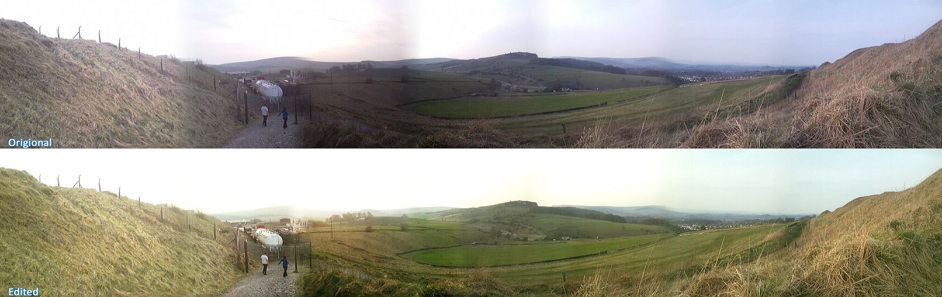
Had a quick go at editing a quick Pana that I did which turned out crap.
Top is the original and the bottom one is edited.
Don't both ps and autopano do color and exposure correction for pano stitching?
my phone did the stitch automatically using the software on it, thats why i had to fix it up because the apature adjusted to the light as i was takin it.
it's still noticeable in the fixed version :S
my first attempt, just wondering if it looks "okay", not good Lol.
another hour or so of working on it.
adding some small stuff.
it's becoming painfully obvious i dont know how guns work lol. (what does that thingy on the top even do?!)
http://i623.photobucket.com/albums/t...th_SMGplus.jpg http://i623.photobucket.com/albums/t...h_SMGplus2.jpg http://i623.photobucket.com/albums/t...h_SMGplus3.jpg
the dial? where did you even get it, I can't see anything like it on the reference.Quote:
Originally Posted by neuro
also why are there screws on the circular piece on the stock's side? far as I can see they're supposed to be slots.
as far as i can see, i'm not sticking to the concept :O
sometimes it is hard to tell
(I'm probably just dense)
Looks amazing, and I am going guess that it adjusts the rail system but moving up and down a touch. Unless the concept designer put it there to adjust mechanics inside the weapon.Quote:
Originally Posted by neuro
Wouldn't it be kinda dumb irl to have a rail mounted at an angle?
most likely, but then again, i can make a scope that mounts at an angle onto it :D
it would probably be better to make the rail completely level. That way its not completely dependent on one type of scope.
No, Con. It wouldn't. Everyone knows that you need to look at the bullets through the red dot sight as the come out of your gun. Otherwise, how will you know when they come out?Quote:
Originally Posted by Con
I'm likin it so far. My only issue is the rails just seem really fat and to me that's awkward, but since its a stylized model, its more what ever you prefer I suppose. Looking forward to seeing more
i just made the rails freehand, i havent got a clue of what theyre SUPPOSED to look like, proportion wise.
They look too tall, make them a bit shorter as in height. Actually, half the height.
http://www.modacity.net/forums/showthread.php?t=14950
p much all you need
disregard the foot snapping at the beginning, that's just a negative keyframe
also i know that the foot positions suck hoaers cock
btw: this is based off of the reach one.
The way he flips it around and puts it on his arm is really awkward and unnatural looking. Maybe just simple sheath it on the thigh?
thanks for the link there con, i totally forgot we had that thread lol.
@Con's crit: I actually like the way it 'shoves' awkwardly onto the arm cos it gives the impression its going into a sheath.
I think that the arm sheath is a great idea, but it might look more natural if he kinda flipped it into the air and caught it the other way so that he could sheath it.Quote:
Originally Posted by Con
maybe its just the angle, but your stab looks more like a half baked slash.
If he's holding the knife correctly, then he shouldn't have to flip it to put it away on his arm with the point up or on his leg with the point down.
Quote:
Originally Posted by ICEE
^these. The position of the knife suggests and is better for slashing, not stabbing.Quote:
Originally Posted by Con
AHAHA THAT IS BRILLIANT
You know... that actually works. O_o
I don't know how, but you've created some kind of unwitting masterpiece of cubist art. Nice work.
Fix the shadows (not black) /celshade or maybe a bit of gloss or something on that shit and you've got a hit.
Maybe go for a big environment, and do a proper scene, cubey hills and sky/clouds with other cubey shapes and shit flying around/cool colours.
think i'm done with this one.
afterall, i rly only made this to practice some texture work on.
http://i623.photobucket.com/albums/t...h_SMGplus5.jpg http://i623.photobucket.com/albums/t...h_SMGplus4.jpg
That is sexy. But I think you should half the height of the rails :/ And maybe bake it onto a low poly version, and give it Dane, then put in Unreal.
.Quote:
Originally Posted by neuro
Oh. *facepalm*