what are all those yellow things?
Printable View
what are all those yellow things?
I think those are supposed to be bullets (correct me if im wrong)
Yellow things hold on the magazine methinks
The one thing I dont like is on the bar that connects the stock to the gun, the scratches on there are weird, especially how everything around it is raised and would be hard to gonk it like that.
Not really tbh, and theyre not scratches btw. It's just that the underneath side of that part is just a bit more grimy than the top.
Eh, looks like scratches to me, but you made it, so you could say it looks like General Ulysses S. Grant and you would be right. :confused2:
guess what i'm making (easy mode)
also, anyone here happen to know unrealscript?
Looks like Ut3 :P
but wait, THERE'S MORE!
banned ftl, i'm 2 months worth of rep short ;D
you're looking at it wrong. the magazine is detached and floating off to the side of the gun.Quote:
Originally Posted by CLS{GRUNT}
something incredibly awesomeQuote:
Originally Posted by Tweek
whatever it is, it's pretty
come on, this isn't hard to guess!
ugh, i guess more pix are needed.
well, i'm TOTALLY giving it away now.
use your heads!
Smirfs? O_o
The Aladdin level from Kingdom Hearts 2? :confused2:
I dun like the way it looks :[
Cliffs are shiny. :o
A battle in minimized world? O.o
Tower Defence! He told me.
Quick forerunner wall, not done yet, but Im not going to go into a lot of detail on it since itll be quite far from where the player will be.
http://i93.photobucket.com/albums/l4...odels/wall.jpg
Don't use the vertical striped illuminated texture - it is intended for piping, and thus just looks out of place. Also, stick to one type of texture style. The light grey doesn't work well with the brown-grey.
Decided I'd make Gordon Freeman's HEV suit for kicks. WIP
http://i164.photobucket.com/albums/u...manChest-1.jpg
You all know the source image...
I'm not really going for an exact replication... it's handpainted so it's not going to be super detailed... but... yea. thoughts?
I took a lot of inspiration for that wall from portent, it used a similiar texture contrast, and looked really good so Ill see whether I like the end product, if not I can just swap it out in under 10 minutes.Quote:
Originally Posted by sever323
Im also thinking Ill add an epic back part of the wall, and then the background terrain and stuff can be seen behind that.
here is a base i made just today, it's going into a map im making.
It'll be attached to some cliffs, and have a dirt arc going up to it
I just want to know what I can do to make it look better.
http://i148.photobucket.com/albums/s...1R/mahbase.jpg
http://i148.photobucket.com/albums/s...mahbase_02.jpg
I like your style llama, can't wait to see it finished :)
http://img244.imageshack.us/img244/2...ionformxz6.jpg
Drew the sketch on paper freehand, painted with mouse in photoshop.
The actual concept has all these tentacles over the front of its "head" but I left them out so you could see the front of it's body easier.
Edit: Made concept better.
http://img112.imageshack.us/img112/7...formmartu9.jpg
oh hai thats sexy. :]
bullshit, looks fine.Quote:
Originally Posted by sever323
you can use it for whatever you want, just because it's ALSO on some piping, doesnt mean it's what it's intended for.
Ohshi- Now I've got to model that flood. It's :awesome:.
E: DAMMIT! MUST SPREAD REP!
Arg, must spread rep!
Dano, have my babies.
Looks like a Headcrab-Miniflood mix. I like it, but I don't think flood glow. They also burrow themselves into the hosts body and search around for the spine, quite gruesosome. Very nice drawing though.
I had to rush it :S
:lmao: @the face you drew.
EDIT: I told you to replace your head with pedobears.... but you didn't listen.
I told you I would if you were nice, you weren't nice.
and yea... I'm not happy with it either
Why did you rush it? :(
it was for a project at school, and due this morning at 1 PM
When I get my own tablet I might go back to it though.
Disgusting... in a good way.Quote:
Originally Posted by DaneO'Roo
I tryed to make a texture. And I know it isn't amazing.. Lol.
How can I improve this?
http://gamerscreek.com/users/WMHunte..._watermark.jpg
Render:
http://gamerscreek.com/users/WMHunte...der_floor.jpeg
It isn't perfectly seamless. It should look better with a bump map as well Lol. I think it needs to be more white...
Did you crop that texture?... or are you planning on leaving it with a weird size?
it's 584px × 402px right now...
Yeh, I cropped it to make it tile able. I will make it the right size once it is good enough...
Nobody want's to steal it, but otherwise it needs more color variances and theres a problem with its tiling if you look closely.
True Lol. and Ok.Quote:
Originally Posted by SilentWindPL
http://i123.photobucket.com/albums/o...thbumpmaps.jpg
My first try at really texturing, the lack of detail is intended. I can still add more though. Supposed to be a ground texture. (Actual texture res is 1024x1024px)
Looks nice, Silent!
Looks good for what it is.
That really shouldn't be 1024. More like 256 to get the same detail, 512 at most.
The grout between the tiles looks like thread
Out of boredom (and laziness to not work on other more important things) Ive decided to start on a gun concept, being its a boredom painting, Ive rushed a few things. This little piece took me about 30 minutes to make, and overall came out good. Ive been mulling over this concept anyways for about 3 weeks, so its good I finally got it on paper. Out of an enormous pet peeve I have of anything I start on not being finished, Ill probably work on this tommorow and finish it up.
http://i305.photobucket.com/albums/n.../guncopy-1.jpg
Not enough done to critizice it.
Please read the rules dude.
EDIT:
Finish your other 2 concepts before starting another.
Color variances, get rid of the greyscale it looks boring and dull.
Edit:
Color Variances = Brown, Blue, Yellow, Green, Purple, Pink. (Or atleast what I meant by color variances.)
The grey makes it look too metallic and just eh..
Something Ive been working on.
Thanks for the renders Higuy
http://i93.photobucket.com/albums/l4...Models/map.png
http://i93.photobucket.com/albums/l4...odels/map2.png
http://i93.photobucket.com/albums/l4...s/pandamap.png
Clay renders killing detail since 98.
Practice
http://img214.imageshack.us/img214/4770/failfo9.png
Tried Dano's tut
Looks great Selentic. Those renders kill the detail though. Too bad you can't just hand out the model file without worrying about someone jacking the entire thing.
And as for the texture above me, it looks alright but it seems "mixed up". nothing seems to flow in it. Just keep practicing though. Better than I can do at this moment.
that looks really good
Quote:
Originally Posted by Invader Veex
whats that spose to be for? a wall? looks good whatever
Yes, but there's a slight error on the left side, you can still see a mirror line.Quote:
Originally Posted by WMHunterTLS
The design is rather bland and uninteresting. Also, try not to make such apparent use of the fibers filter. Keep practicing, though. Skinning takes time to learn, just like anything else.Quote:
Originally Posted by Invader Veex
Where is Dane? I want some crit of him for this texture:
http://gamerscreek.com/users/WMHunte...or%20copy3.jpg
Add omni lights when clay rendering to bring out some fine missing detail, other then that it looks very bland the design is kind of small. For some reason it just doesn't seem that appealing to me.Quote:
Originally Posted by selentic
Also, try to study more on forerunner design. Some of it doesn't really look that forerunner to me.
Pretty good, but whats with the left hand top corner having plain colors?Quote:
Originally Posted by Invader Veex
Needs more scratches and maybe a few filters or darkens. Lacks a bit of detail in that.
If you want dane to crit it, PM him for it. I'm pretty sure he's just gonna say the same thing as everybody else. In my opinion it still doesn't look that great though, yet again it just lacks something I don't really know.Quote:
Originally Posted by Hunter
I think the texure lacks creativity, and the tiny hair like scratches look stupid, and the detail continues onto each piece, even though there's implied height there.
You also haven't payed much attention to in between the cracks of the plates either, which makes me think your work flow is in need of severe tuning.
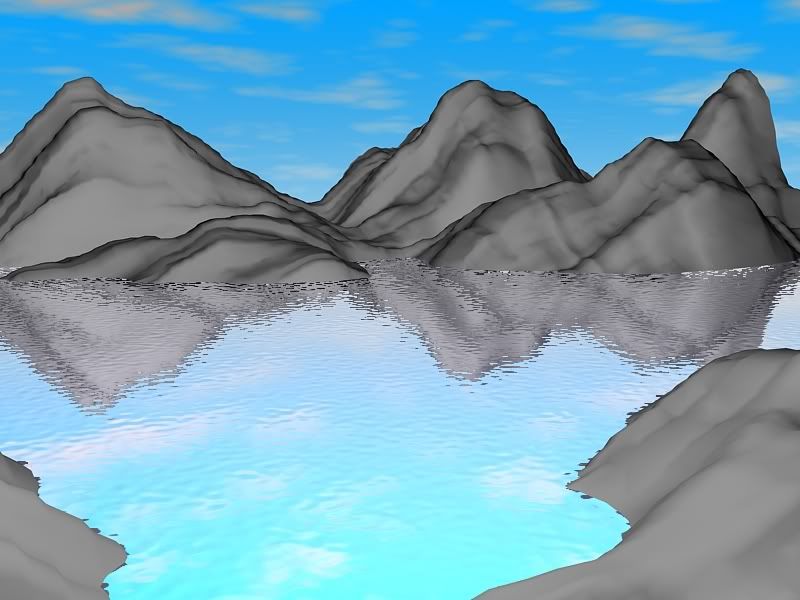
Mountain canyon scene I've been working on. I'm not much of a texturer. If anybody wants to help just send me a pm.
Sky needs work, I like the water, but it needs to be more..flat, mountain lakes are extremely calm and are like glass. Also get some sexy skins for those mountains.
Tried to do a flood form; last time I ever do anything organic. :v:
ps head isn't a dick its a human spine w/ some decayed flesh on it.
Looks pretty neat. I'm not the person to criticize 2d art though.
Looks like an elephant man
Is that on the middle right side supposed to be an area you can only get to through grenade jumping?Quote:
Originally Posted by selentic
Possibly. Im considering the possibility of allowing the players up there to get an advantage over enemies while at the same time exposing themselves to sniper fire. Im creating some other areas like that where the player can get to high ground and snipe from. Of course to stop them sitting there the whole game with a sniper, I plan on putting the sniper spawns fairly far away from these spots, so they have to come down every once in a while to get ammo.Quote:
Originally Posted by Pooky
An example of what I mean is this.
http://i93.photobucket.com/albums/l4...ybadrender.jpg
Im taking a queue from infinity here, with the sniper spots in the cliffs you had to to fly up to, those were a lot of fun for me, and with this I can try to replicate it while keeping it gameplay friendly.
If it doesnt work out, I can always take them out.
Also I appologize for the shitty render, I didnt want to spend 10 minutes rendering just to show you what you have already seen.
Awesome... I always wondered why more CE mappers didn't use grenade jumping as a tool to balance out shortcuts or sniping positions.Quote:
Originally Posted by selentic
The one in the picture is not grenade jumping, and the other one could be done using a warthog, but yes, I suppose it could be done with grenade jumping. We shall see :)
At least make it tile...
It looks like its been around snow or some arctic region, eh I guess it's pretty good.
The part in between the tiles still needs work like Dane said.
Still has a mirror line.
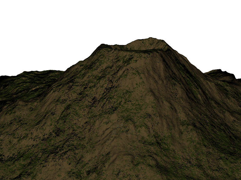
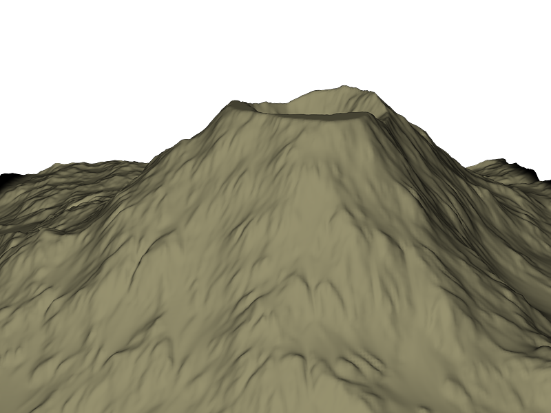
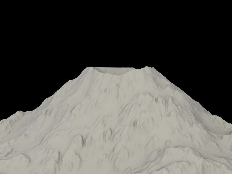
Hi-res volcano mesh
It still looks weird.. unnatural.
Its probably just the material. Let me get a render without it.
#
Still a major wip, but what can I put on the two small pieces to make it different? Like a design. Ignore the black line going through the top piece.
Goes together like this:
please use shot tags. Looks ok. Looks odd for some reason. I don't know why though.
The lights are too.. eh. I see some edges that aren't anti-aliased, so in a texture that kind of looks bad.
I like it but change the color of the light to Cyan or something bright blue, also maybe make the light have a few darker shades of Cyan and lighter so it's not all 1 color but very close to a color. Just enough so you can barely see the difference in color.
Okay, You know what I can put on the smaller pieces?
Edit:
Same thing maybe a bit more grey and lighter.Quote:
Originally Posted by Hunter
EDIT:
Your pic wont show.
I added a few more defining features to the rock face. Its a little over half a million pollygons atm.
Mountain ridge looks too griddy, also did you kill it with the noise feature? Now it looks very unnatural.
Hunter if your trying to do forerunner, your failing.
Also, your doing it wrong, because you learnt from one of those fucking gun tutorials didn't you. The ones that tell you to skin every individual piece chunk by chunk, even though everything shares a common material layer.
This is why I hate 2d tutorials. They teach bad habits and other peoples mistakes, they don't teach the logical thinking involved with how you actually do something.
Sucks tbh. Ignore whatever you've learned, because it's not going to help you.
Also, you dont really put that many scratches on the diffuse map. Do it on the specular.
@Dane.
How do you make correct textures?
I didn't use noise. I applied a sharper normal map but that's about it. Also Mountain ridge is supposed to look like that. When I can get a better material it will hopefully look better.Quote:
Originally Posted by SilentWindPL
With logic.
Parts of a texture are going to use same materials, unless your skinning a Chimera or something.
In photoshop, just make layers for certain materials, don't completely section everything off into chunks of "barrel" "handle" "button" "bolt" etc, this makes it way harder to make things look seamless. Same goes for forerunner textures, or anything else for that matter. You can just do a base layer, overlay the bump map or shape layers onto it with a high pass filter on it, and then just build up layers on top of those using the selection tools and the paint brush tool to build up layers of detail and give them different blending modes.
:( I will watch one of your tutorials.Quote:
Originally Posted by DaneO'Roo
Well, you can really do it either way. Whichever is better I think, but making it seamless when it's all seperated is much more time consuming.
Looks like the asshole of a flood.
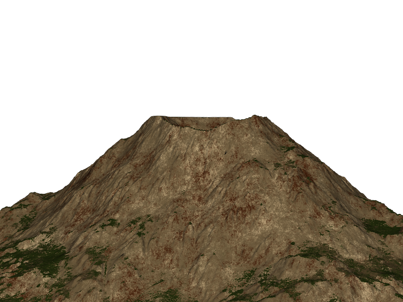
Needs more actual rock texture. Since when is a volcano a tan coloured zit looking crater?
I didnt photoshop that texture. I made it in groundwiz lite. I wish I could photoshop.
I'm going to change the tan to gray right now.
EDIT: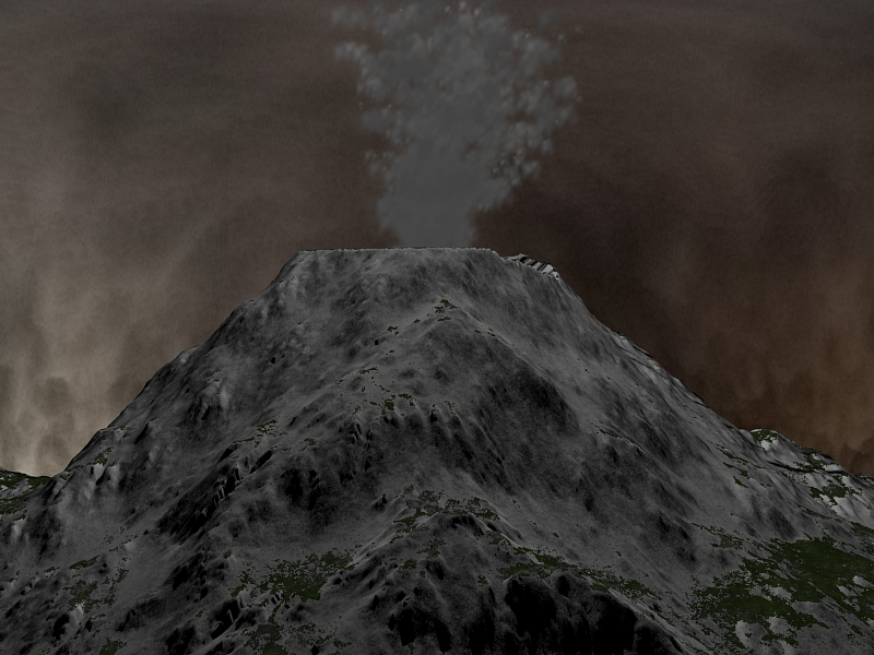
Need to get a normal map for the smoke material.
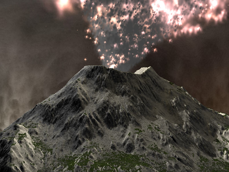
Thats what my orgasms look like.
But really, that looks more like a ginourmous cumshot than an erruption.
It looks better this colour, but... the crater, it's completely flat. :S That does not look realistic at all tbh. And to elaborate on what Dane is saying, to make this look as best as possible, your going to need to make it look real. Wether that be the actual model itself or the textures. With the textires, you should really try to have a rocky formation or obvious pointout on the bumpness of the mountain, the little and big parts that stick out that actually make it interesting.Quote:
Originally Posted by disaster
For eg, look at this pic; (Pic is 1600 x 1200; actual volcano)
You can actually see that most of the rocky area is clearly noticable, and on the snowy top of the mountain you see more rock at the base of the bumps with the snow covering the top. Also, the eruption, as pointed out by sel, lacks detail completely, it all seems to be clustered together, nothing interesting about it either, I could make something better than that and I'm not experienced, but I've seen a lot of stuff in the years that I have the knowledge to critisize. Tbh, needs more chunks and random bits all over the place (eruption that is) and it looks to flat. :S Not sure as to how to say that, or what to do, someone here would know what I mean. But anyway, just throwing some ideas and advice out there, if anyone would want to explain better be my guest. :) Hope that made sense. :(
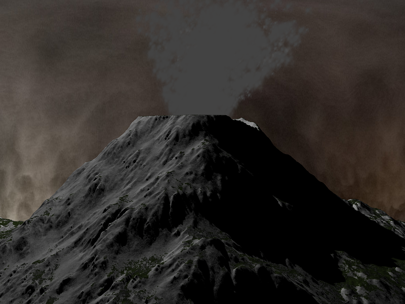
Worked on the particles a bit and variation in the volcano mesh.
Looking much better, still not very believable though. The sky looks flat, as if you placed a plane behind the mountain. Last time I checked, they sky didn't look like that. Also, basic rules of composition state that there should be something interesting in the foreground, currently all you have is a middleground and background.
Shouldn't the mouth of the volcano be more scorched looking? Also, the explosion isn't casting any light on the scene.
On a less relevant note; there's no point putting an image that's less than 800x600 or is exactly 800x600px in [shot] tags.
A quick google search came up with this nice looking tutorial with a decent final outcome, for (i'm assuming you're using) Max.
http://www.3dsmaxresources.com/tutor...vironment.html
What it teaches you to do is not great, but it's decent enough for starting off.