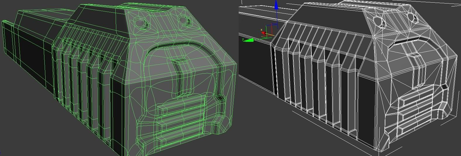
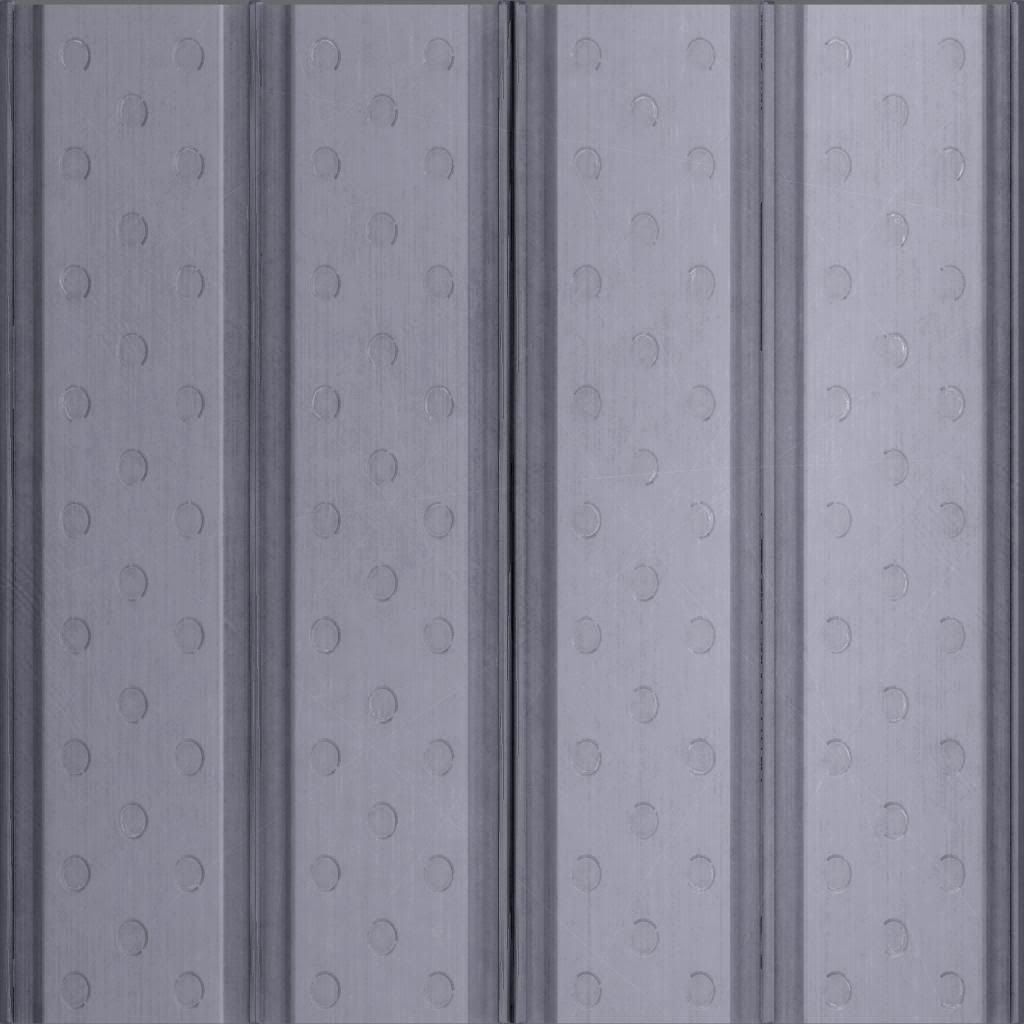
... Don't know if you were able to notice but basically everything forward of the receiver is not finished... As for that hole, yeah it is. just haven't gotten around to fixing it yetQuote:
This is what I have for the high poly so far
Printable View
... Don't know if you were able to notice but basically everything forward of the receiver is not finished... As for that hole, yeah it is. just haven't gotten around to fixing it yetQuote:
This is what I have for the high poly so far
It's very web 1.0 looking. Glossy buttons like that just look tacky nowadays. Portfolio sites should be more minimalist, so that one focuses on the content, rather than the website. To be honest, I find your template quite distracting, and just very outdated looking.Quote:
Originally Posted by MrBig
Here are two portfolio sites I've made. Very minimal, but not to the point of being drab.
My personal website: http://www.feignphoto.com
A website I made for my color theory class final project (temporarily hosted as a subdomain): http://becomingimage.feignphoto.com
It's not just for photography, so I would want to show some designs in the website. But this is just for practice, not actually for use.
Dosn't help that you spelt eiffel tower wrong.
The French spelt it wrong.
It was named after the designer, STFU
Don't do what you're doing with the tabs at the top. Make the text pop out, not just be visible. Your name, too.Quote:
Originally Posted by MrBig
http://i45.tinypic.com/kbsow3.pngQuote:
Originally Posted by MrBig
Derp
@MrBig; That doesn't look like liquid design will do anything... solid images with defined widths ect... looks cool though,
I made a small website for BTEC ICT at college, only meant to make it extremly basic, I went over the top, teacher keeps moaning at me because I keep adding more too it.
I will upload as soon as account to a web host has been validated, although its nothing special seeming as I am still a "noob".
---
Also, I attempted to give sub'd another shot, here is what I have so far for my magnum, need to add floaters of course.
Dude... get some shots without wireframe, really can't tell what's actually going on on the model. It's annoying.
Your edge loops need to be better.. right now when you turbo smoothed it, its a giant mess, shouldn't look like that. Dont put this into triangles. Needs to be quads. also sub dividision means you need to define your loops. which half of it isnt defined properly, you need to take the loops all the way around the model. It looks like you took something you already had for Halo and put edge loops on it.. thats not gonna work. remodel it mainly for sub-d. Also, some of the detail already there could be floaters, like the circles in the back.Quote:
Originally Posted by Hunter
also, spelt isn't a wordQuote:
Originally Posted by =sw=warlord
Maybe something more like this?
I wouldn't know where to begin for coding it, though.
I could code it but I doubt it would be user friendly because there will be no liquid design and it is made up of a lot of images. Which means higher load times, unless the images where compressed really well into something like gif's.
Actually, after talking to someone who is incredibly proficient at sub division modeling, they said as long as supporting edges are in quads and properly done, and flat surface between supporting edges can contain n-gons, the entire model is not required to be quads. This is of course as long as you have a good enough understanding of what will happen when you sub divide.Quote:
Originally Posted by higuy
Yes. However, he has smoothing errors arround the circular indents on the back of the gun.Quote:
Originally Posted by PenGuin1362
On the subjects of portfolios, I found this amazing site of a polycount member:
(click and drag the pages)
http://www.renderhjs.net/index_flash.htm
why the tris? Since its sub division, you can have a few ngons and non-planar quads since its going to be divided into polys anyways.
I think he released the source of that as well.Quote:
Originally Posted by Con
Well yes, thats true. I normally work in quads myself, and it seems to work a bit easier. But yeah, I don't see anything wrong with having n-gon's in unimportant places. But for this model, He should fix it up a bit and make the mesh before turbo smoothing a bit better. If you look at his mesh after, the circles don't work out very well, and in a few others places as well.Quote:
Originally Posted by PenGuin1362
Wrong.Quote:
Originally Posted by Heathen
http://www.thefreedictionary.com/spelt
spelt 2 (sphttp://img.tfd.com/hm/GIF/ebreve.giflt)v.A past tense and a past participle of spell1.
and a free hooker will tell you she doesn't have herpes.
I don't believe your free dictionary.
Remove the shading on the upper part of the tab text and it'll be better.Quote:
Originally Posted by MrBig
just finished this
First real texture. Made a High poly model then made an AO, did the rest from there in photoshop. Probably gonna add some dirt on the sides for final.. dunno.
max render, has specular map.
http://photos-c.ak.fbcdn.net/hphotos..._4479555_n.jpg
Wrestling locker poster for school. Basically just some chit for the cheerleaders to color and put on our lockers.
I keep thinking your snaf :saddowns:
and im like "wtf"
Part of my evil plan to concur modacity. But don't tell anyone.Quote:
Originally Posted by CLS{GRUNT}
Quote:
Originally Posted by CLS{GRUNT}
I've thought the same thing more than once :saddowns:
It's not that hard to tell them apart, Horns is a fair bit smaller.
Looks pretty good, just get rid of those holes in the back of your gun and have them float instead.Quote:
Originally Posted by Hunter
You wouldn't...
I would.
Looks good nonetheless :D
As good as it looks, it's still Narrows, and thus is automatically null and void.
Well, let's try this.
Super-old project of mine (a few of you guys may actually recognize this).
Decided to dust it off and try to make it walk.
In hindsight, it doesn't really look very nice. I don't like how the legs stay put sometimes, and I'm working on it, but does anyone have any ideas on how to make something "walk" believably without actually walking?
Study what things look like when they move like that. Here's an important piece of advice: if you don't know what you're making, you can't make it.
You need to know what your end product should be, otherwise you'll just be groping around in the dark and end up with something that looks bad. You can't just make something that vaguely resembles walking and hope it comes out right. If you know what your end product should be, it's just a matter of knowing how to use your tools, not a question of "[making] something "walk" believably without actually walking". Look at how the AT-ATs move in the movies/games. Maybe sketch out some poses on paper. I'd imagine looking at how large land mammals (elephants) walk would give you some help too.
As it stands, you seem to just have it going from pose A to B to C with no real purpose other than "maybe that's what walking looks like." Motion should be smooth and deliberate - even machines move with a purpose. As far as the technical side of animation, I'd suggest maybe using IK to handle the legs/body. It would probably let you smooth out the motion a lot more easily.
looooool moonwalk
I know it's not just for photography, but it still looks very busy. Additionally, though I can discern why those icons are at the bottom of your page, an actual explanation would be nice for those who just see a random bunch of icons.Quote:
Originally Posted by MrBig
Added some more to this weapon.
http://i159.photobucket.com/albums/t.../cltrigger.jpg
Hehe, looks cool/badass.
The end of the butt is really square. Also, keep adding detail to the side. The bolts only do so much to break up the planar surface. The end of the rifle/beginning of the muzzle (I think that's what it is) is a bit too boxy.
Keep working on the grip (add some texture to it maybe), but with the rest I'd keep working on keeping the flow/style you have going at that bit with the grip and all that.
the TWO rep bars give it away. :realsmug:Quote:
Originally Posted by Horns
http://i655.photobucket.com/albums/u...ermodelshz.png
Good start for massing it out or no?
needs more 64 players with machine guns.
I was going to put that in halo but not anymore. That is just way to many polys for CE to handle. I mean I am already at 30K and have all the background to model still. Which is about 20K more polys if not more.
So get rid of all the detail on the boxes and use textures like you're supposed to...
Also, this is my first attempt at an animated gif in a long time, all done from scratch in Photoshop with the exception of the Legendary shield.
http://www.lancersedge.com/images/Lancers_Edge_Ad.gif
how in the fuck did you get over 30k polys on a dozen boxes holy christttt
Yeah I'd definitely suggest just using bitmaps. Unless you're gonna put this into something like, say, Unreal :downs:
you still wouldnt put that in unreal, you'd use a parallax shader instead of a rediculously hihgpoly BOX
Thats why you bake the box's onto low poly ones.. Even if there scenery, just make sure the diffuse and multi is good.Quote:
Originally Posted by §partan 8
Looks like a good start to me.Quote:
Originally Posted by t3h m00kz
seriously dude what the fuckQuote:
Originally Posted by §partan 8
Hey, 8, i can bake that shit for you if you want :downs:
You know what I think I will still put it in halo. But I will reduce the poly count by replacing most polys with textures.
i conquer with this postQuote:
Originally Posted by Horns
it had to be done
I concur.
http://i655.photobucket.com/albums/u...cterrender.png
now for UVWs, textures, armor modeling, and possibly some Z-brushing...
The polycount is 804 polys, 1368 tris
crit?
acctually I take that back looks fine
needs more definition in it's legs, make a cut across the back of the legs, and give it some calf muscles
Upper legs or lower legs, or both? My grasp on leg anatomy has always been a bit lacking
upper leg should be 'fatter' in general, the middle leg needs a calf muscle,
where as the lower leg propably wont need muscles, as anatomy-wise speaking, that bit would be controlled by tendons. still though, some definition on it would be wide, as right now, it looks much like a plain piece of cylinder.
make the shapes flow over into eachother a bit more. just add a cut across the bac, and move it in a bit for the lower leg i guess.
you'll be surprised how much a ery small adsjustment can make to make a silhouette come to life.
Will do, thanks brosef
ITS OKAY YOU CAN JUST REP ME FOR IT
tee hee :mech2:
Figured I had repped you too recently, apparently not. I tried not too long ago and couldn't :smith:
If you had visitor messages enabled you'd be a true homie.
This is kinda shitty, but meh. =/
Attempt at a VTOL cargo/passenger aircraft, the "Eagle".
http://i435.photobucket.com/albums/q...pz47/eagle.jpg
http://i435.photobucket.com/albums/q...z47/eagle1.jpg
It's pretty long.. cargo planes typically don't look like flying pencils. Also, I thought you knew better than to inset faces like that. It has no design at all, so make some sketches first then start over.
Um... firstly, cargo planes are wide, to you know, accommodate cargo?
Secondly, cargo doors aren't going to fold INSIDE the plane. Why? Well, it takes up that precious cargo room!
Lastly, where is your loading ramp? How in the hell do you expect to get cargo into a skinny transport with small doors and no ramps?
Everything about this model is the complete converse of the intended role. You can't make something if you don't know anything about them. Do some research.
Added the launcher and a rail.
http://i159.photobucket.com/albums/t...1000/new-1.png
Tbh now it looks like you're just adding shapes to the thing and aren't really following gun mechanics or anything.
rail is wrong
its also kind of boxy
http://www.interstellarmarines.com/m...ifle03_001.jpg
I am not adding anything thats not there, and yes its boxy.
The rail, i didnt want to copy that one for some reason, its just for a halo game so im not particularly interested in making it real life accurate.
But saying that, what could i do to make the rail better?
Heh. Even though you're given a fully unobstructed side view and a marginally obscured top view, along with a perfect 3d view, you're still managing to get many of the basic dimensions and important curvatures just... wrong. You're making it look too sci-fi, and thus unwieldy. The individual pieces are being lost, and therefore the piece as a whole is becoming actually less unified - the indents, curves, and facets are losing their purposes, and making the whole thing just look silly. Make it look like something that a soldier could actually hold, use, and trust in.
oh well, ill try make my next model better i guess.
I have to say, the Russians make some BEAUTIFUL fighter jets.
Was Googling for some sci-fi stuff to model, and instead, I came across an incredibly awesome real-life (experimental) fighter jet.
http://i435.photobucket.com/albums/q...in_su47_09.jpg
http://i435.photobucket.com/albums/q...pz47/su-47.jpg
I know I'm missing the piece jutting out of the nose; for some reason I forgot to unhide it when I made the render.
While I'm here, you guys got any other beautiful Russian jets to model? Top, front, and side views are all nice.
E: A-ha! Next in line:
Sukhoi Pak Fa T-50:
Nobody ever makes biplanes.
also, here's some explosion sprite I made for a class game
http://img513.imageshack.us/img513/8751/expl.gif
Dude STOP THE FUCKING CLAY RENDERS. I can't see SHIT about the model's surface information. It looks like you have some really bad surfaces behind/around the cockpit but I CAN'T TELL WITH THE CLAY RENDER HIDING ALL YOUR MISTAKES.
Make a larger render because we can't see anything.
E: There you go.
You've got a shitload of errors near the cockpit, and you're not even following the form of the actual plane, when you've got a PERFECT top-down view of the thing with shading to show where the definition is at. Also; maybe it's just me but why would you just extrude where the ailerons are supposed to be and not make them separate objects?Quote:
Originally Posted by English Mobster
Hmm...
I see what you mean about not following the form of the plane; specifically, you're talking about the area behind the canopy, correct? About how its a "hump" when it should be more smoothened out?
Quote:
Originally Posted by Con
needs more black maybe
You also made the whole front end blend together where it connects from behind the canopy and cockpit, when it should kind of look like you booleaned a cylinder into a prism(obviously don't do that, though)Quote:
Originally Posted by English Mobster
Rudimentary paint picture done on a laptop touch pad
Red should be where the definition on the body is, green to give an idea of what the shape should be stemming from the body
Got it, thanks a lot.
This is my first time making something from the "real world", e.g. not something from sci-fi.
I don't quite know what I'm going to do with these models yet, but I'll find some use for 'em eventually. :p
Snaf sure hates clay renders :realsmug:
Is it getting any better?
As do I. That's why I made the damn rendering tutorial for people who don't have their own decent rendering method use.Quote:
Originally Posted by Hunter
still shapeless as christQuote:
Originally Posted by English Mobster
Jay next time you decide to model anything, I don't want you to touch the extrude or bevel button, becuase right now you obviously don't know how to use them properly. :downs:
...A tiny bit too late for that, although I really didn't touch them TOO much in this render.Quote:
Originally Posted by CLS{GRUNT}
http://i435.photobucket.com/albums/q...arksnormal.jpg
http://i435.photobucket.com/albums/q...termarks-3.jpg
For reference, this is what the old version looked like, from the same camera:
http://i435.photobucket.com/albums/q...termarks-4.jpg
E: Just caught a couple bad polygons on the right side of the top render.
http://i164.photobucket.com/albums/u...g/KeyesWIP.png
High Deffin' the Keyes
more soon bro yeahhhhh
@ jay That's looking alot better then the original. There's a few bad polys on the sides that come out of those tunnels, probally created from chamfering or something.
I like it. Add some more of the age lines then take it into Z-brush and get some real def going.Quote:
Originally Posted by NuggetWarmer
Not that you'd be able to use it in Halo or anything with normal mapping :smith:
I'm making it to put into Halo. Keyes' model always has bugged me.
I'll finish the body, then if I have some polies to spare I'll add a few more age lines.
Oh god, you must model in the furrow of his brow.
do i see high res halo 1 bipeds in the near future :o. anyway. i need to finish texturing this beast.
For all the scratches on that you'd expect the blade's edge to be a little more worn. I'm not diggin' the blade's colour either, but that's just me. The blade needs far less grunge and a lighter leading edge. The text stands out too much. Is it just painted on? If so, why hasn't it worn away like the knife clearly shows?
naaa, its with the base texture im usin. idk why i havent worn that part yet. i also dont like the color, i dont know why whoever made the knife would want black paint on it.Quote:
Originally Posted by Con
so you just slapped a photo onto the uvs and did hardly anything else?
Quick Crit Plz.Quote:
Originally Posted by Freelancer
Looks fine, good job.