I can't draw :( I might try tonight...
Printable View
I can't draw :( I might try tonight...
I started using photoshop yesterday so i consider this a big accomplishment. I'm going to work on it a bit more.Quote:
Originally Posted by Heathen
And @ the Bike. That looks real wtf.
The bike does look real and I think I fixed the sig up.
Looks nicer, get rid of the Awesome smiler or even better make it fit the background.
MUCH NICER. I like the :awesome: smiley on there however.
So do I :awesome:
dammit guys stop being better than me.
yesQuote:
Originally Posted by SilentWindPL
Those wheels remind me of something WOL had a while ago. They're pretty cool.Quote:
Originally Posted by ExAm
I think it was his ATV that had a similar conceptQuote:
Originally Posted by Conscars
Got around to finishing it today as power was out. Meant to be practice to play with shape and form of faces and get what I want without using many
http://img185.imageshack.us/img185/2064/logsyt4.jpg
I always get a happy feeling seeing low poly models and low res skins. Reminds me of older games.
It was the Puma, a jeep dealio.Quote:
Originally Posted by ExAm
the logs are like from harvest moon!Quote:
Originally Posted by Conscars
I like this, smooth it and throw some texture on there.Quote:
Originally Posted by killer9856
This is like advanced wars, man. I like it.Quote:
Originally Posted by Conscars
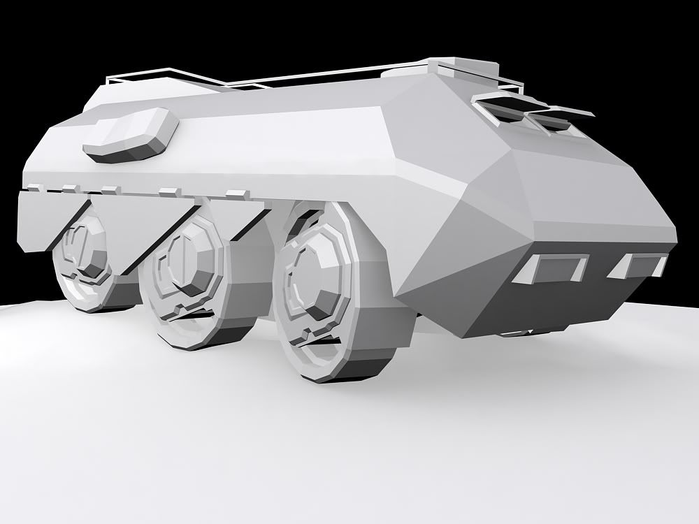
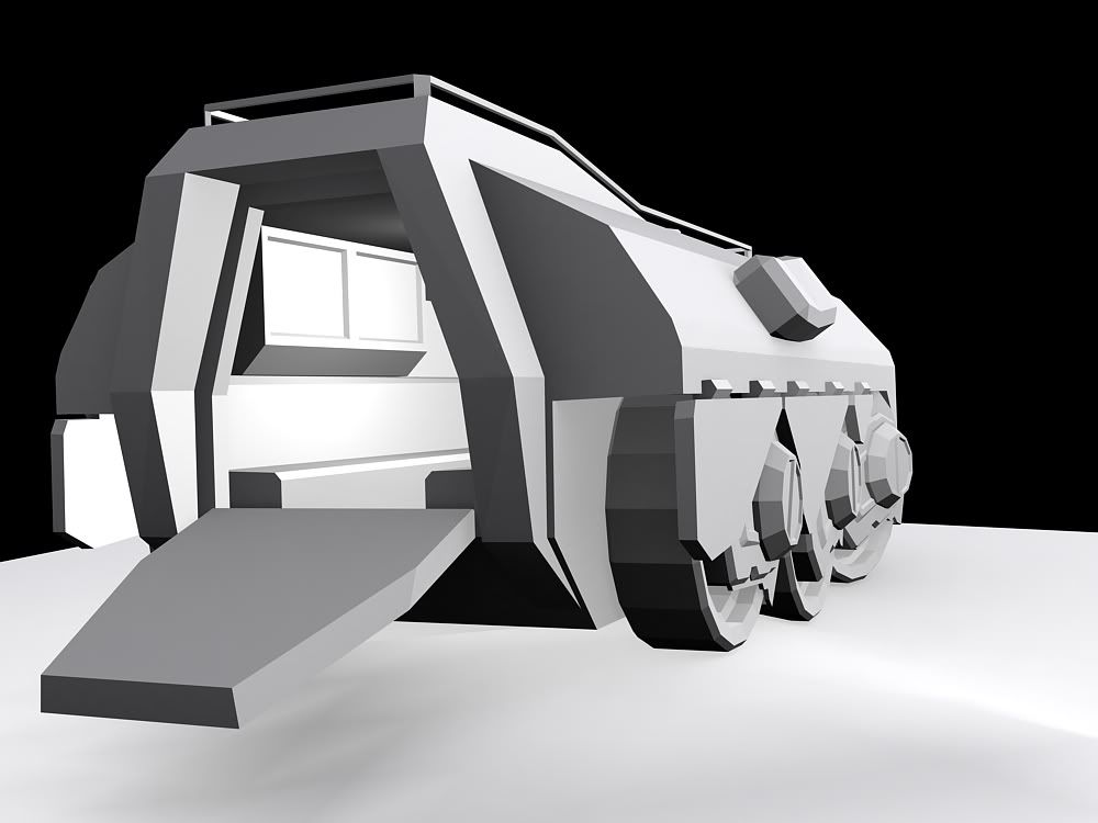
Started on my apc concept, since this was is more..different then the average apc, I'm going to do side, top, back and front for my partner.
Basically this is a modification of the wraith, its main cannon was removed, and a large bed was installed, with deployment seats, and a cage that generates a shield around the bed for protection. The cage spikes also act as boarding spikes, as they turn and clamp down to the surface the apc is currently over. Its armament is one modified plasma cannon, and its speed is about that of a hog, maybe slower. It can fit up to 12 people, including driver and gunner and can hover up to 80 feet above the ground (when boost is applied, but normally it hovers about 5-10 feet off the ground.) This is in no way the final design, and any details may be changed to fit me and the modelers preferences.
http://img243.imageshack.us/img243/4...idecopyal9.jpg
Yet again another 20% finished concept, what happened to the rest of it? And what happened to the other ones?
It's like your addicted to posting 'concepts' that are 20% done, not enough done to give crit.
I have to agree with silent. Why didn't you just finish it before posting it?
Because I showed it to my modeler, and he got confused with all the details of the paintings, so I'm letting him view it over before the finish the whole thing, were also deciding on other details, since the only thing that wont change is the part I painted, and we wanted to hear feedback of where we should go with it, or if this design is good.
I lyk high polyzz
And I just noticed some mother fucking error... Well a few actually. I got bored and I want a Bubble Shield so....
Can we see a wireframe?
Damn, Tomorrow, I've just shut max down and I have got to go out in a min, im on untill my cheese on toast its done :D Lol.
It's as simple as keeping it to yourself until you and your modeler have agreed on all the details and your concept is complete. It's pointless to show off a 20% finished concept because we only get a very vague idea of what it will look like.Quote:
Originally Posted by sKc_Chains
Share please, anyway it looks good. Now I have an urge to model it :|Quote:
Originally Posted by Hunter
This isn't high poly, it's covered in errors, and I have no clue what you're trying to accomplish.Quote:
Originally Posted by Hunter
First few hours of modeling:
The wheel turned out rather nice, still need some more detail.
http://i231.photobucket.com/albums/e...Picture171.png
The body still need some more roughing out - i'm going to mirror it when I finish with the detail.
http://i231.photobucket.com/albums/e...Picture172.png
SUPER HAPPY FUNTIME EDIT:
prettied the wheel/motor assemblies
http://i231.photobucket.com/albums/e...Picture173.png
Not high poly yet, Those stupid errors where from when I bent it, so I'm going to do it another way.Quote:
Originally Posted by Monopoly
What am I trying to accomplish? Well, have my own Bubble Shield model...?
Exam, Needs moar machine gun turret at the top =P when your finished.
I had to leave out the machine gun from the contest version, as well as remove all the wonderful detail from the wheels :(
here's the pretty-much-finished contest model
Looks like a Hippo from the front :lmao: but the rest looks good.
i didn't see the hippo at first lol.
anyways, i decided to use the polygon tool to try and do forerunner textures.
http://i148.photobucket.com/albums/s...1R/rendear.jpg
I didn't color it all the way because I suck at coloring.:(
Can someone help me out with forerunner colors?
Lol, the one part looks like a guy with big ears and a rather large mustache. The texture itself is meh. The diffuse is very bland, it looks like flat colour. If you need help with colours, open a forerunner texture and just take the colours it uses. =p
have you modelled that then planning to render to 512x512 ( or whatever dim's) and touch up in Photoshop?
spartanlasergoeshereplz
http://img112.imageshack.us/img112/6...tation1dj8.jpg
basic texture and normal map are done, once I finish the normal map fully, then I'll finish the diffuse and then the specular and so on and so fourth. Once the main body is done, then I'll work on the petal wings and the decorator tentacles.
And for fucks sake, they're not legs, in fact, they're it's arms. I modeled them in the origins of legs so that when I go to rig and animate, I have more geometry to work with. This is a flying flood, not a walking one.
*e*
http://img212.imageshack.us/img212/3320/54314843bp2.jpg
Just a snap of the hip poly mesh from mudbox
:eek:
Good stuff.
but, just a question, should there be those little tentacles like the parasites? just wondering.
Holy shit Dane, you've really outdone yourself this time. Awesome stuff!
I mentioned those. Those are the decorator tentacles. They'll be done by just planes.
Great job Dane, how did you end up unwrapping it if you don't mind me asking :)
Looks great so far, and I definitely can't wait until it's completely finished.
He probably has PS CS3, you can paint directly on the model in that.
Yeah, I'm pretty sure he has cs3, what I meant was the methods in 3ds Max or Maya. Pelt Mapping, The normal unwrapping methods etc.:)
What?
How would that work in max, noting the fact that textures in 3d programs need actual uv coordinates.
I pelt mapped it in max, I'm painting the textures in photoshop. I dunno how to paint on models in photoshop. I know how to import the models in though.
and why would it matter if it was cs3?
the other photoshops do the same shit. I don't use any fancy cs3 filtering or the extra stuff. I just paint and blend layers accordingly. Same old same old.
The CS3 model painting isn't really that great.
Speaking of whihc, I tried out a program once called Bodypaint 3D, it's like, soley for painting directly on the model, and it does it AWESOME. It's basically the texturing and uv mapping parts of max, merged with photoshop.
May I get some crit on the Spartan laser skin on the last page? :|
e. I want want Dano speaks of.
I'm glad pelt mapping was what you chose, it just seemed like that model would work great with it. :)Quote:
Originally Posted by DaneO'Roo
Also, I know it doesn't matter if it was painted in CS3, I was just mentioning to him that I thought you used CS3 to paint your textures.:(
Love you Dane :-3
Edit:
I was playing in PS and was just drawing random things, then i decided to draw a probably never going to be realistic APC. It's NOT for Snaf's challenge.
The reason for the magnetic one is for mines and other explosive objects. I figured if they were going to go through a potentially mined area they could possible use something like this to take a hit and come to the ground safely. :3 like i said, not realistic.
Ok, the laser is a good start, but focus on the edges of the geometry and how dirt and other things would take place in those areas. Right now everything is too soft and too blended for such an angular and hard weapon. Try add some slight scuffing along the edges. Also try some more detail. Not in the way of dirt and grunge, but in the way of colour. Some slight difference in hue can make all the difference.
Also, I need help, which colours, I can't decide:
I think I'm liking the second one more, but I'm not sure :gonk:
The second one does have something special in my opinion.
The second one looks better to me for some reason, but the first is not bad.
I like the first one, in my opinion; it looks more flood-like than bright blue, heh.
I didn't model/texture anything, all I did was pose the guy, lit the scene, and added the background
Graded on composition.
RUN THE GAUNTLET!
literally.
First one. Second one has too covenant-esque of colours.Quote:
Originally Posted by DaneO'Roo
OMG Dane. You really need to make a game, you could totally make one which would sit on bungies... as long as you have a good engine.
You are actually way better than all of the bungie team I think.
I prefer the 2nd one. Don't know why, just has something to it, and it is nice and bright.
And I can't +rep you :( Sorry.
Get your face out of Dane's buttcheeks.
But I like the butt cheeks. Just kidding Lol.
I'm only being honest though, his stuff is better than bungies.
Veex, dont post the spartan laser until doan quits being lazy and fixes the errors, instead of covering them up in a crappy way.
:confused2:Quote:
Originally Posted by sKc_Chains
First one definitely, it feels more flood-like.Quote:
Originally Posted by DaneO'Roo
The post before Dano's with the first pic of textured engineer flood.Quote:
Originally Posted by Hunter
Removing Till UVs are better.
:( I was just about to have a look.
And Dane, where does your flood breath from? Because I think it would look awesome with some gills on the side of it, it looks like that are some now but you can't make them out much.
I am liking the second one more.
Thank you. Hunter, praising me somehow isn't going to improve your work, if that's why you do all this.Quote:
Originally Posted by Monopoly
And I'm no where near bungie. How could you even say that. I wasn't trying to outdo anyone, all I wanted to do was bring a concept to life.
Omg. I wasn't trying to be an arse licker. And I know your weren't trying to outdo anyone. That was my opinion on you stuff. I thought it looks extremely good. And IMO, Personal, In my mind, I thought it look better than bungies stuff.
Am I okay giving you all my opinion?
Stop this before it gets stupid please.
Okay. Pins are pulled in my sig :lol:
It looks a lot like a tree, not very much like a fleshy gruesome thing as most flood look like. Interesting stuff though, it could be this PC as it displays some pictures really dark but from what I see it doesn't look very fleshy. More like a tree texture than a flood texture.Quote:
Originally Posted by DaneO'Roo
EDIT:
Nothing is better than bungies. Well maybe EPIC's stuff, correct me if I'm wrong about EPIC making the textures and models for GoW/UT3.Quote:
Originally Posted by Hunter
Whoever makes resistance could outdo bungie in my opinion, cant wait for number 2.
No, I completely agree. GOW is gorgeous.
GoW just could use a bight more color variances, also I'm not completely colorblind just Red-Green colorblind AKA 'Daltonism'.
That sucks, the red green colors on my labtop on extremely vibrant, wish you could see.
Set the color filter to "vibrant" in the settings.Quote:
Originally Posted by SilentWindPL
Must be your screen then. Or your eyes.Quote:
Originally Posted by SilentWindPL
Especially since it has alot of red and green.
Probably the combination of both because darker colors make it harder for me to tell differences between the red and the green even harder than I see so it looks like a treebark brown to me..Quote:
Originally Posted by DaneO'Roo
It's like, too shiny? The green looks almost metallic on the bottom half of it anyway. The wings are coming along very nicely though I was going to criticize you on that. The first two wings are realistic with being able to see through the gaps. I'm guessing you just haven't got around to doing it to the rest yet? But yeah good job so far. Make sure to place a lot of emphasis on the wings, as they are the main feature of your idea. The better you expand on that, the better it will be. I'm sure you have plans though, but yeah. :)
Edit: maybe even make the wings look more.. "light" in terms of weight. More... soft, not so much the muscular form of the wings. (don't know how else to put it)
Uh, all the wings use the same bitmap and shader....
You can't see through them because they're nothing behind them.....:logic:
and the green is because of the lighting I put in there.
also
http://img377.imageshack.us/img377/5...tation1uw3.jpg
anyone scared yet?
that looks awsome.... i beleive there is a way to get heightmaps (bumps) to work on bipeds ingame... if you could downgrade the normal map.
Whoa... this thing didn't seem that intimidating until you showed the scale. WTF gigantic floody vagina :phonegonk:
That thing is scary...
You best put that in SPv2 Lol.
you should blatently call it... Flood impregnator, it sucks its prey into its valve and takes their infected form.
just a less petty way of the flood spore, oh and form scale the flood infecties should be massive and butch like UT3 characters
To me, it should have more congealed blood and open wounds with shreds of skin missing, because all in all, a flood is a zombie, and all zombies need some gore.
It looks green at the bottom? :S
I'm pretty sure it's not my eyes.
Looks too green to me, like it's covered in moss or something.
The Flood organism is NOT a zombie. The Flood MAKES zombies. Reanimated corpses decay around the infection form inside, but the infection form itself does not decay. Pure forms are not zombies either, since they are actual Flood tissue, not reanimated flesh.Quote:
Originally Posted by sKc_Chains
The flood does NOT re-animate the dead to be exact, for the last time go read up on it. What they do is just act as sort of a cancer by burying themselves into the hosts body to find the spine, the highway to the brain, and in finding it they cause the muscles to grow and expand in an extremely quick way. Making it easy to see the vains, combat forms most likely have 1 'hammer' arm that they use for fighting. Also leg muscle's are basically powered up for jumping and running.Quote:
Originally Posted by ExAm
..from what I remember. The flood is 'sort of' a zombie in a way, but it kills instead of eating brains. Also, pure forms were created by the forerunner if I remember. Correct me if I'm wrong :hist101:
It's more bio-chemical. Not like the movie 28 weeks/days later. So the colors are appropriate... but if we look at an actual flood... maybe incorporate some colors that are there. Like the light browns..
http://www.gamasutra.com/features/20050727/flood.jpg
These ones do have green in them... but more light browns or whatever you would call that. They need to look more.. dead?
do you people fucking read?
I said the green was from the god dam lighting.
>_>
Even I new that >_>
or did I?
ha, in retrospect of that screenshot, i sorta forgot what shade/colour the flood were.
Dane, the Halo 1 flood do look alot more pale in skin tone than your creature, but my mind is fuzzy towards Halo 2/2 which may have been your influences, i dno.
so yeh, if designed for halo 1 scheme make it paler if not, it looks awsome.
do you intend to put it in a CE SP map?
I'm assuming what he's making is some pure form of flood, which is by no means dead at all. It's all living tissue that doesn't decay. There's a difference between a flood using a host and a flood on is own. The host decays due the infection form's energy needs and massive and damaging genetic mutation. The form inside does not.Quote:
Originally Posted by FluffyDucky™
and bingo was his name-o
I thought it was an infected engineer? :confused:
Maybe you have already said something towards this topic, but are these non-combat or combat?
It WAS going to be an infected engineer, than I thought it was a bit too silly to have the thing as big as it is, yet still have spawned from an engineer, so I'm just making it a pure form now.
I'd call them heavy combat if anything boba. These bastards are pretty much flying flood bombers, dropping eggs that explode on contact, that will try to slam you with its big arms if you get too close.
Finished H3MT's 3rd person spartan biped
http://i164.photobucket.com/albums/u...ng/MCfinal.jpg
Sorry for crappy render. Max wasn't rendering correctly today.
Wireframe, also pelvic armor and chest armor seem a bit small.
Dunno why it'd seem small. I scaled the hard parts(helmet, legs, chest) to the actual H3 model.
Also just noticed a part I have to fix. :o
It does look...off. The chest part is thicker off his chest Im sure. Also, the bulge is lower I think.
In Halo 3 it looked like they bulked his arms up a bit more, so this looks almost right. But the chest does look a tad small.
No? Where the fuck did you hear that the forerunner created the pure form?Quote:
Originally Posted by SilentWindPL
I do have really bad memory, maybe I need to get implants [/eve_online]