Printable View
Looks good for a start, but there are some areas that need smoothing (obvious areas). Also, could you get a better render? It's too dark IMO.
better?
looks like a shotgun rifle :P
or a rifle shotgun :raise:
Supposed to be a bolt-action rifle, far as I can tell.
bottom right corner
You should just make a layer and do a fill of the layer, then add details to it. Don't use the magic wand tool.Quote:
Originally Posted by =sw=warlord
http://cg.tutsplus.com/articles/news...etal-textures/
this video shows you a good way of making a base texture. This should help get rid of the black lines
it's because you're not going outside of the uv. you have to texture at least 2 pixels outside of the area to stop that seam from happening. the uv'd parts are way too fucking close together too, so of course you get bleed.
lol i can follow a tutorial
http://img149.imageshack.us/img149/5114/wuttertower.jpg
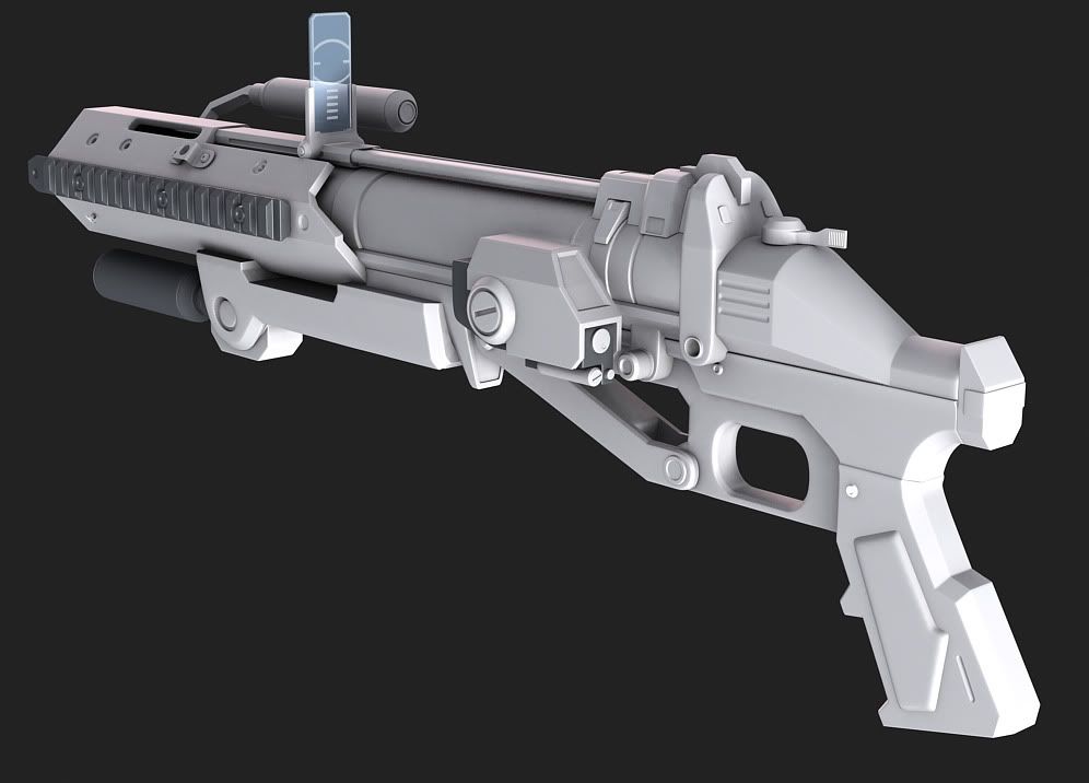
I get the feeling that the stock's too long. Anything else I should fix?
right now, it's just a shape.
add more to it to define it as a gun.
The entire gun is a bit long if you are going exactly by your reference drawing.
Will certainly try.Quote:
Originally Posted by neuro
It's actually a bit shorter, since I shortened the stock. Perhaps it looks that way because it's fairly thin?Quote:
Originally Posted by sdavis117
Well, the main thing I'm trying to go for with the HUD is to have the same basic design of Halo: CE, but to have the updated graphic style of Halo 3's.Quote:
Originally Posted by Hunter
Anyways, update:
First of all, I have to point out that the Assault Rifle currently in the ammo section of the HUD is not mine. I can't quite remember where or who I got it from, but I pulled it from somewhere on my computer and just used it for a current placeholder. So, if you happen to know where it came from, more power to ya, just want to make sure nobody gets pissed over the lack of credit.
And, most of the text is also placeholder, but it gives the general idea of what it'll look like when it's finished:
I'm a very big fan of that. I have to say, that's pretty much what I imagined for the Halo: Reach HUD and I am consumed by mild irritation every time I see the one that Bungie is using.
The vertical gradient on the shield meter is too sudden - it should fade across the whole element. The health meter's gradient, while less "sudden", is a bit too bright at the bottom IMO.
I think the ar icon is mine. I don't care if you use it, I can even port them into illustrator instead of PS now that I'm more used to it.
http://avpdragon.deviantart.com/gallery/#/d23rwxu
Please, whatever you do, don't make those red and blue things permanent if they aren't being used. It makes it look shitty.
Is this actually being put in anything?
The red blue bars will be replacing the score bars in Crysis for Project Aftershock.Quote:
Originally Posted by ThePlague
The HUD outline is actually the outline to the helmet I made a while back for the mod and Teltaur suggested he made a outline to fit it.
Been WIP for about a month now. Haven't done too much with it really.
http://i66.photobucket.com/albums/h2...21/Vector3.png
No complaints except the grass..too thin. It looks like someones hairy arm or something :wut:
ROFL. Almost looks like my own arm, now that I think about it. I'll play around with it and see what I get.Quote:
Originally Posted by Con
stock stuff is fairly rough at the moment, trying for a crazy-springs-and-levers recoil compensator mechanism.
I think you're making a common mistake with reproducing 2D side views in 3D. It's too narrow. It'd be like holding a glorified cardboard cutout. Widen it a bit.
Well it's a rifle, they're kind of skinny. Though you may be right ExAm, can't really tell unless we get a more FP-oriented view of the model.
Wrong wrong wrongQuote:
Originally Posted by ODX
bad bad bad.
You can't generalize rifles as being thin, have you ever seen an m1 garand or an m1941?
I was actually in the process of thickening a few things, and the stock mechanism will probably have a saddleplate covering most of it.
I mainly meant bolt-action rifles, specifically a WWII Lee-Enfield or Mosin-Nagant. (excuse me if I'm 'naming them improperly.' The only contact I've had with them is video games, ala CoD2)Quote:
Originally Posted by ICEE
they're still not as thin as you've made this.
I think it would look cooler if you lengthened the bolt handle a little bit
Hi. I have the former. It's not as thin as you make out, and the actual thickness varies. It flares out somewhat towards the back end, starting at the receiver pretty much.Quote:
Originally Posted by ODX
I haven't opened up max in nearly 2 months so I decided to start with something simple. 5.7x28mm and 12.7x99mm
Model are 90% accurate. I could not find measurements for some areas (ratio between rounds might be a bit off as well). visually, how could I make it more accurate? (ie. shader, material, etc.)
It looks a bit rusty..
the bullets I have around are kinda old and I was basing the material off it. lol. I have a few used shells and old bullets laying around.
Find something brass and something copper if you're having trouble basing it directly on the rounds. Work from those.
Edges any better?
Still sharp. They should be smooth enough to catch a good amount of edge high lights.
Don't round things off more than you think they're supposed to be, but remember it is much much easier to tighten support edges that are too loose than it is to loosen edges that are too tight. So, err on the side that takes less work to correct..
It looks like a pencil if you're scrolling down the image.Quote:
Originally Posted by kid908
Your materials look like wood, rather than metal.... the damn near 0,0,0 black tip doesn't help either.
This is what my first reaction was.Quote:
Originally Posted by Llama Juice
http://airbornecombatengineer.typepa...vs50bmgace.jpg
Make sure it looks similar to that, though not exactly the best looking image, the bullet has a brass appearance, with not THAT many scratches and divots as yours.
THEY SO DO... haha, I noticed that too.Quote:
Originally Posted by Llama Juice
Anyway, models look good, but the materials need work, add some reflection and a tad little bit of refraction from light sources. Also go for more of a clean detail, with some scratches rather then the grainy wood like metal detail you have applied at the moment.
The "grainy" part of the material should be there, just turn the opacity level down on those layers. Then a light brushed/scratchy look over top should do it.
The casing is brass, the bullet is copper jacketed. Don't mix them up.Quote:
Originally Posted by Newbkilla
Finished my flash photo album and upload tool for it.
It's free for anyone to use :downs: and I will be adding regular updates and new features.
http://www.beeles-place.be/
The website layout is still being worked on.
EDIT:
EDIT2:
the swf preview here is f*cked up. won't apply the width and height. You'll have to test it on my site.
Alright, I don't expect that many people here read MS Paint Adventures, so you probably don't know who these guys are, or any of the Trolls for that matter, or why she's cut the guy's legs off (it's for his own good I assure you, papa paraplegic needs a new pair of robot legs), but this is the best piece of art I've done in ages and I've got that generous sharing feeling.
Well fuck me sideways, it's a Monty Python reference and a chainsaw manufacturer pun in one image, how about that.
They bleeding shit?
Troll blood is brown.
ha ha sorry i'd better brush up on my trollapedia
Been working on getting some weapons ingame in Crysis and started work on making the plasma grenade explosion.
I'm wondering what everyone else thinks so far as I would like some pointers on what to change.
The explosion is about the same size as the rocket explosion in halo 3 currently.http://www.youtube.com/watch?v=hOlpcAD43I4
I like the shock wave which is given of at ground level. Maybe add some electricity?
That shockwave is neat, but what will it look like on any sort of a slope? Will it follow the normal of the slope?
Unfortunately the shock waves are always horizontal same with the stock grenades so I'm not too sure what I can do to change that.Quote:
Originally Posted by Llama Juice
I have been adding a bit more of a electric feel to it to give it that feel of the halo 2 plasma grenade, not so much as raw energy but more of a blue fire with electricity arcing the immediate area.
I'm calling this done. It's been nearly 9 months since I started (stupid adhd, getting me off track). Yes I know there's some details I left out, but really, they're not that significant.
Special thanks to Neuro for rendering the entire mesh for me.
Front:
Back:
Wow that's really well detailed Kid. How about building the facility that houses stargate around it? I'm sure it would be worth it
I did some more work on my scene. I'm gonna keep building on it for a while.
http://i148.photobucket.com/albums/s...1R/perhaps.jpg
http://i148.photobucket.com/albums/s15/SAH1R/wirez.jpg
Disregard this post, posted in the wrong thread.
Then why post it in quick crit when there is nothing to criticize?
^^
Was a mistake, I thought this was my gallery <_>
First bake. Why are there more detail on the high poly than what was baked? Well I fucked up and accidentally saved the file i was making the low poly as the same file as the high poly :( I lost those details. I'll remake them and fix the model to reflect that as well but for now, here's my first bake. starting at the hilt to the handle is where I lost. Had to remake the majority of the handle.
High Poly:
Low Poly:
UV:
AAAAAAATRRRGHGHGHGHHHHH ARE YOU BAKING THAT AT TWO THOUSAND PIXELS WHAT IS WRONG WITH YOU MAN!?!?!?!?!?!? YOU ARE OUT OF YOUR MIND INDEED!!!
protip: redo your UVs, your texture doesnt ahve to be square, make it 256x1024
i can tell just from looking at it your pixel density is ALL OVER THE PLACE!
make sure all UV islands are the same size relatively to eachother, right now your handle is MASSIVE, and the blade NOWHERE NEAR what it should be.
redo your UVS NOW!!
hell, you can even use a seperate texture for just the blade if you want.
Forgot to resize it :/Quote:
Originally Posted by neuro
How do you resize the UV template? I can't seem to see anything but square.Quote:
Originally Posted by neuro
I'll redo it.Quote:
Originally Posted by neuro
Click options and it should show up.Quote:
Originally Posted by kid908
http://img180.imageshack.us/img180/9365/capturewo.png
how about now?
http://img340.imageshack.us/img340/7771/sworduv.jpg
way better, but let the UV nazis have their say before proceeding
much better, that'll do, though its still a bad idea to cut your blde up like that.
to reiterate, you can use 512x1024, but for example 16x1024 is also valid.
instead of cutting it up, try a different size bitmap, because you'll go trough hell before you get rid of those seams.
True. He could simply half the height and double the width of the blade bitmap and it would work fine.
Also, why do you have the seam going through the flat part of the blade? Put it on one of the sharp edges instead.
Welcome to 2 posts ago.
I never get any responses to anything I post in my studio thread, so,
Do you think this interface effectively and appealingly communicates information about required user input?
Looks like guerilla kinda.. but I think it does convey very well where exactly you need to fix information. It ensures they don't have to go looking for it, and the red color is a pretty clear indication of error. I got that impression right away so I guess it's doing its job.
Been trying to design a pattern to go on the inside of my monitor model.
This would go on the inner rim of the shell where the side lights glow through.
http://img121.imageshack.us/img121/2...nerpattern.png
Align those buttons vertically! (make them the same width too if you haven't)
You aren't going to be able to make that a normal map as long as its extudes and dosen't bevel in somewhat. The unwrap is rendering it from the top, so you can't see the sides, which makes it show nothing there on the normal. (Talking about the about X shaped geometry on warlords pattern)
Fixed the buttons. Thanks for the feedback.
People who have played RO, need some input:
(not to scale, yet; will probably end up a bit smaller than Berezina)
Stuffing around with some ideas, not sure if it'll be turned into an actual map yet. The Axis are assaulting; the numbers on the Soviet-held objectives denote cap order. Dark green is dense (too dense for tanks but OK for infantry) forest, grey are rocks or structures, brown is road and black is rail. Dark brown doubles as fences and also contour lines, you can tell which yourselves I'd hope. The big plane shape is a crashed Do-17Z. Both sides will have fairly diverse classes, and they will also have a few (not too many) tanks.
I just realised I should've added in actual icons for slit trenches and sandbagged positions, but oh well... use your imaginations.
Does this take place in ~1941 or on the German retreat?
It's somewhat irrelevant but you've peaked my interest.
I was thinking at some point while the Germans are still on the offensive, likely during spring or summer
Looks interesting. However, having never played RO, I cannot offer valid input.
So I spend the past few hours designing a combat knife. I already got the blade done, but can't decide on the handle. I've drawn up a few concepts. I might add more concept, but for now 2. Fine which one you think goes with the blade or submit a concept of your own. btw, black in the concept is where holes are. shaded grey(ish) is indents.
http://img143.imageshack.us/img143/8...nceptblade.jpg
http://img175.imageshack.us/img175/5...cepthandle.jpg
Folders aren't combat knives. I'm not keen on the blade design, most specifically, the underside, after the serrations. Your fuller is so small that it's pointless. Actually just get rid of that shit behind the serrations. to have a top edge go past that portion is nonsense. You're better off having a guard built into the blade, honestly.
My bad, I was searching hunting knives as reference and I read hunting knife but somehow changed to combat.Quote:
Originally Posted by SnaFuBAR
The fuller can easily be widen. and the length of the top edge can be fixed.
I'll play with the design and see what I can do after serration.
http://www.youtube.com/watch?v=R_4ijZmibcA
I feel as if the grenade throw is just a bit too..lazy and lacking any sort of control. Anyone agree?
ODX shouldn't the slide go back with each shot for the pistol or do the bullet casings magically go out the front of the pistol :/
Grenade throw seems kinda slow.
Other then that it's decent.
Whoa, holy crap. I swear I had that in there...hmm, I also need to do an ammunitions overlay as well but I keep seeming to screw up on those >_>Quote:
Originally Posted by Spartan094
what do you need an ammunition overlay for on the pistol? I can help though
So on the last shot (empty mag) the slide will stay back and be like that for any animation as well when you do it. I've seen it done before and tried it myself but when I did it didn't work well. I think I know how to do it.
Frame 0 is origin, then the rest will be the shots going from full to empty, so in this case it's I believe 8 shots. That means 0-8 frames, frame 1-7 will have the slide in it's origin position, and then frame 8 will have it back. And then for the reload the slide would be back that same amount at the beginning, but of course go back to origin once it was done. Is that correct?
I believe it goes backward. If I recall.
0 = default
1 = empty
last = full
I THINK.
I think the the grenade throw looks fine.
The only thing that bugs me is the way the arm moves all the way to the left when you melee instead of going down-ish.
Dug up something back from 08 (MINUS the Mark V helmet).


I completely forgot who did the bitmaps other then he edited off the beta or something like it back in 08 but I had my douts he was able to get the beta skin back in early 2008.
Just pulling it back up and seeing what you guys think.
Looks damn good to me.
First time making anything like this. Took about an hour, cost for everything including tools was $40. Stones are cheap though, so i can make more
Holy shit, that's awesome. You should sell a bunch.
Wow, that's pretty cool. Girls would love to have one of those.
Yeah i made it for my girlfriend while i was bored at my grandmas house, but I think I'll be selling them at school next year
I found some stones around my house, but that one that I already used i bought for her because of the tiger stripish design.
http://derekdennison.codebrainshideout.net/IMG_7292.jpg
Also, the metal was coated copper. I was going to do silver, but I could only by it in $50 coils of 100 yards.
Get into steampunk after a while. Those jewelry looks really nice.Quote:
Originally Posted by MrBig
looks nice, now the lowpoly :P
you'll propably notice you could/shoulve done a few things a bit differently ;)
yup, but hopefully this low poly will work fine :) see anything that might now work?
http://img707.imageshack.us/img707/4365/columnlow2.jpg
Bump maps and normals, go go go!
Looks good kid. My only suggestion is that you might want to clean up the bottom area where I see a lot of polies that could be saved.
you're going to have to bake that in like 4 passes lol.
also, your lowpoly is terrifyingly un-optimised.
have fun :P