Very good point. I didn't think of it like that, lmao.Quote:
Originally Posted by ExAm
Printable View
Very good point. I didn't think of it like that, lmao.Quote:
Originally Posted by ExAm
Everyone should head over to Bungie's publications page and read their "Flood Anatomy" article since it gives a lot of detail about the Flood.
I decided to start this one over a little while ago and now I'm finally happy with the stock.
Next up: the other half of the stock, then the details (trigger, magazine, etc.) and then the barrel and firing stuff. Then I get to pimp it out with rims and shit, yo.
After this I think I'll get that fucking MP7 into CS:S as a skin like I said I would do decades ago.
Why now just call it the A.W.S. Magnum?
There's not really that much to comment on, it looks good although I dont get the 'cut in' in the front. That looks silly.
You could have saved a ton of polies on the grip, and the indented circular part near where the bolt would be.
I don't think he's worrying about saving polies.Look at the amount of detail in there.
Blame Ross, he made me do it >=U
<3
The cut is in there for the little clip thingy that pokes through for the strap. Right now I'm aiming for 8,000 to 10,000 triangles unoptimized and will clean it up from there. This thing is going to be very very very very detailed and smooth hopefully.
idgaf about polies, yo. This is for Source, and Source can handle polies good. I want huge detail.
also <3
Same bitmaps, new shaders. (and added bump)
http://img522.imageshack.us/img522/3617/shadersmp0.jpg
http://img359.imageshack.us/img359/9125/ohaidc1.png
Comparison: http://img479.imageshack.us/img479/4...9194583wh3.png
Sexy...Autumn look is good.
damn that looks nice
The shaders and lighting do look good, but the water needs to be alot less blue, and your uvmapping or something needs to be fixed. That second image looks woefull. If those are bungies uvw mappings though, I guess theres nothing you can do about it.
>_> It's Bungie's
They are Bungie's. And I'll see what I can do with the water. Thanks for the crit. :DQuote:
Originally Posted by DaneO'Roo
http://www.pcgameshots.com/img/104/md/dship.JPG
I'm loving that atmosphere Veex. Halo, in the Autumn. Someone released a map called Equinox a long time ago over at Halomods. It was the level Halo, but he achieved a perfect Autumn atmosphere. Perhaps if you can find him and ask him what he did you can do with same with the Silent Cartographer.
Thanks, TeeKup. I guess I have a new theme for this :3 Already found the thread that Halomods.
By the way, water has been changed. I think it actually looks much more realistic than it did.
Glad I was able to help. I'm anxious to see what you can do further.
Crit on this animation (its been smoothed out a little bit, and the wrist showing has been removed)
Fucking youtube tags. http://www.youtube.com/watch?v=G9JOmFNx9mo
Looks cool, but i can't animate so yeah.
I can take pretty picturez? take 2!
edit: fack, imageshack resized them. oh well.
Ooohhhhh, I has a pretty picture too!
Whatchu think?
It's definitely an improvement over your previous animations. It's got a very 'Halo 2' feel. The left hand looks a bit off the way the fingers barely move. I don't know about you but I don't keep my fingers stiff under many circumstances, especially not when reloading a gun.Quote:
Originally Posted by FlamingRain
I don't remember if I told you when you showed me before, but I agree that the fingers caught my eye in addition to the other things I said. The only way I can explain it is that they're sticking out like a sore thumb LOLBADJOKE
Why the hell do things always look better in photos than in real life?Quote:
Originally Posted by Conscars
Nice stuff, I really like the closeup of the rock, looks like a photo of a cliff taken with a selective focus lens. The bee photo seems a bit underexposed, but it's pretty sharp which is awesome. The background is somewhat distracting as the depth of field, although low, could be lower, but I guess, seeing as you're shooting with a compact powershot, there are limitations to that. Could be further enhanced with some photoshop lens blur maybe. Also, next time you scale a photo down, use bicubic sharper interpolation as it wont give you blurred details.Quote:
Originally Posted by Conscars
Also, when shooting with bright backlighting like that, try metering with the centre-weigted meter or even the spot meter, instead of the default matrix.
Here's what it should look like properly exposed (also added a tad bit of sharpening). It got a bit noisier due to pushing the exposure.
Not a big fan of it. Dragging up the contrast of a photo to make the colours all 'pretty' does not equal a good photo. The subject of your photo (the dumpster) is potentially interesting, but the way you composed it seems as if you just walked up, took a shot and waked away. What you did with the contrast completely blew out the highlight detail on the lid of the dumpster. To be honest, if you're going for the high contrast look, chances are it'll probably look better in black and white.Quote:
Originally Posted by corndogman939
Another tip is to shoot the details, instead of the whole scene. A dumpster like that is covered in interesting textures of paint and rust with graffiti on top, try taking close ups of these that suggest a dumpster, but not actually show it. You could even include a bit of the background to show some context.
At the very least, unless intended, keep keep horizontal lines horizontal, the top of the dum
Thanks for the tips reaper man, also I would have taken more pictures of it, but i took it out of the car window as we were pulling out of a gas station. It was just something that caught my eye so I snapped it.
I know the contrast kinda of ruined the lid of the dumpster but the photo was pretty boring before I edited it. BUt thanks for the advice I'll keep it in mind next time i take pretty pictures.
Yeah, the bee one was kind of rushed because I didn't want to fumble around changing settings/exposure lest the thing fly away. The picture you see is actually edited in PS already because the exposure was quite low. I'll try the PS lense blur, good idea. Also imageshack resized it for me, bastards :shakefist:Quote:
Originally Posted by Reaper Man
Thanks for the tips Reaper <3
edit: I could always find some sort of lens to decrease the DOF. I don't know much about lenses at all, all I know is my camera can use:
"separately sold Wide Converter WC-DC52, Tele-converter TC-DC52A and Close-up Lense 250D (52mm). In order to attach these lenses, you also need to use the separately sold Conversion Lens Adaptor LA-DC52G"
Atleast I have a mini-tripod :haw:
I guess the close up lens or the tele-converter would do it, but I really wouldn't bother with conversion lenses right now to be honest. Plus they're usually a rip-off.
Also, corndog, I don't think I've seen any other photos you've taken. Got any you'd wanna post? I'm curious.
Well I've only recently started trying to do "photography" so I dont have many, and I dont have a fancy camera or anything, but I'll upload some stuff that I just took in the smoky mountains.
E: gotta go, I'll post the pics later.
E2: K, here they are.
The dumpster original:
http://i199.photobucket.com/albums/a...y/100_0182.jpg
Edited:
http://i199.photobucket.com/albums/a...y/Dumpster.jpg
Trail original:
http://i199.photobucket.com/albums/a...y/000_0270.jpg
Edited:
http://i199.photobucket.com/albums/a...ail_edited.jpg
waterfall thing:
http://i199.photobucket.com/albums/a...y/000_0263.jpg
Other stuff:
http://i199.photobucket.com/albums/a...y/101_0135.jpg
http://i199.photobucket.com/albums/a...y/100_0173.jpg
http://i199.photobucket.com/albums/a...y/000_0275.jpg
Yea, thats pretty much all I have.
This whole "fancy camera" thing is a misconception. You don't need a fancy camera to take good photos. A fancy camera, like, say an SLR allows you to be more creative because of technical freedom, as well as producing higher quality images.Quote:
Originally Posted by corndogman939
Check this guy out, these were taken with a cameraphone. Sure he'll never get good prints from them, but they sure look great online. http://flickr.com/photos/davidhelan/sets/1304592/
Your photos aren't bad, I like the waterfall one and the one of the wood beam.
Those two are my favourites, especially the first one.Quote:
Originally Posted by corndogman939
I guess it depends on your perspective on things. I find stuff like that amazing in real life :xQuote:
Originally Posted by ExAm
Nice photos too, by the way Con :-)
Im going to take the plunge and ask for criticism on my gravity hammer skin.
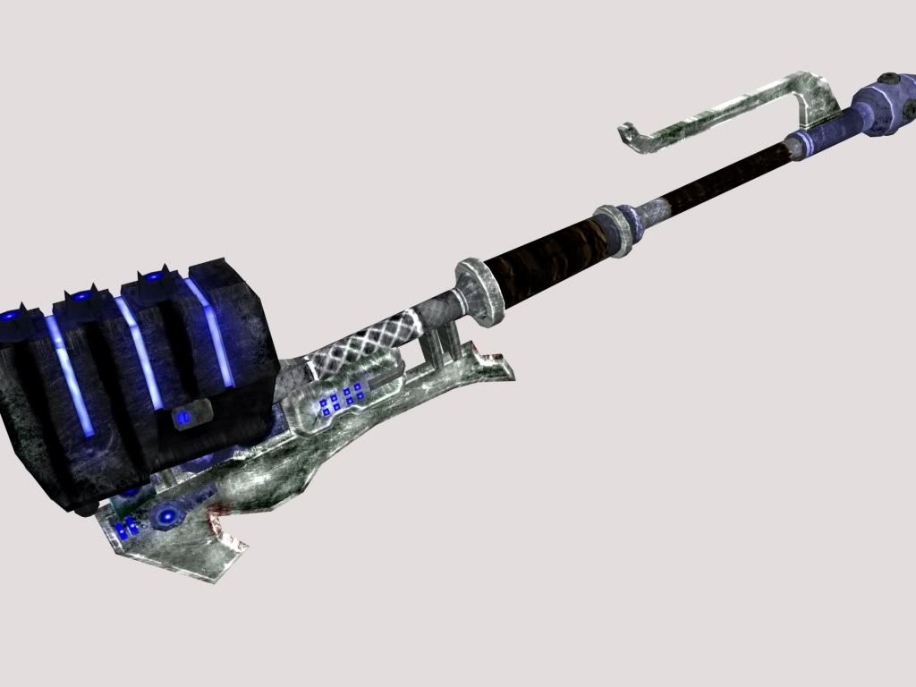
I purposely made inaccuracies to halo 3 (in the skin, the ones in the model aren't intentional but IDGF) because I wanted to use my own sort of design. Its very grimy and scratched up because thats cruise control. Crit please, but be gentle I've never really made a weapon skin before.
Uvw and skin by me, model by Donut (who isn't looking for criticism on the model)
The resolution is 1024.
The metal seems kind of contrasty in some areas
it is partly the low quality render, but I think your talking about crosshatched area above the grip?
Not what I meant, but those white lines on that seem out of place. What I was talking about was how on the blade at the back there are areas where it's almost completely black or dark. Some areas seem brightened and overdone. Looks like you've used with the burn and dodge tool a little too much.Quote:
Originally Posted by ironclad
oh those areas on the blade are actually dark green. meant to be slime or something. I made that with the thought of brutes chopping through trees in mind
lumberjack brutes? lol
edit: brb while I PS a lumberjack brute.
Looks TOO grungie. Looks good as far as the personal changes go, but you might wanna make it look cleaner. It was a good creative direction to go, but it seems too splotchy.
Lumberjack brute ftw...bit unnacurate one might say though... unless you're planning for splinters
I like it grungy. I really don't want to make it clean, because clean = boring.
http://img524.imageshack.us/img524/1...berjacksc0.jpg
I'm a lumberjack and I'm OK
I sleep all night and I work all day...
He wears high heels suspenders and a bra?!
e: must spread rep before giving it to conscars again. ARG!
http://i131.photobucket.com/albums/p...g?t=1218675504
aside from the fact there are massive UVWerrors, any tips on how to make a texture less 'plastic' looking?
http://i266.photobucket.com/albums/i...ttleship-1.jpg
Still a major WIP
Add a shader and a few metallic scratches?Quote:
Originally Posted by Malloy
Malloy: Looks like a beyblade rink thing or a pokemon stadium.
I think it's supposed to be the teleporter base from Chillout
Soft highlights and shadows, and lack of detail make it look plasticy. Just go look at some metallic surfaces on google vs plastic ones, you'll see the difference. Scratches are another good way to show it's metal, since plastic just dents or gouges and remains the same colour.
thanks i'll see what i can do http://i131.photobucket.com/albums/p...somesmilie.png
p.s its cold storage decor, not chill out...
chill outs like an 8 faced shelter with a green teleporter thing added.
o.O where did that smiley come from?
the internets
kill it
lawl its awsome, leave it alone.
it was on a user created deviant art page, so i cut out all of the smileys and saved them to a theme for my MSN :P
edit: http://i131.photobucket.com/albums/p...g?t=1218748637
i think it looks more Halo 3-ish now
I need some suggestions on the head, as I want to redo it.
http://i305.photobucket.com/albums/n.../hammycopy.jpg
I like the hammer part, but the blade needs to be redone. Also, bright green doesn't belong on it, try a dark glowing green.
D: It....Should....Die.
I dont like the color scheme. The picture hurts my brain. Try not going for SUCH a different color scheme.
Im sorry im color blind in green and yellow, thought it was gold. Also I am redoing blade, and Im going to make head/ blade/ grips be made out of jade, with black ingravings/ pole.
Battle ship is auesome disaster!
No, his battleship isn't. Don't get me wrong, the model's not bad at all, the functionality of the design is simply horrible. If he would've taken an hour to look at actual photos and schematics before trying to model one, the current stage of his product would make sense. I can tell you straight off that none of the turret clusters are even close to being efficient, and the main cannon is just atrociously set up. Seriously, Disaster, take a bit of time to study what you are attempting to emulate - learn how things work, and why they are made that way. Talk to me about it if you need help.
Malloy's teleporter thing is pretty neat, just needs some more metallic look to the texture.
Disaster your battleship looks kind of goofy and cartoony, I don't like it very much it's just missing something..
Chains your hammer lacks dimension (I.E. It looks flat and boring.) and the color scheme is off. Theres also too many random brush strokes and the shading is done wrong.. or the attempt at it atleast.
Er, I don't think he's trying to emulate any specific battleship in particular :|Quote:
Originally Posted by Sever
I like the design, it looks stylized without regard for practicality. My kind of thing. I make belt fed sniper rifles :downs:
You seem to mix up what Im doing here, Im doing a side reference for easy modeling, and front and a top and bottom, why would I make it an annoying angle for the modeler to do? Also painting for this does not require full details such as making it the engravings detailed, as you can tell theyre ingravings, and uh last time I checked paintings are made up of brush strokes. Maybe you should go look at some paintings, and zoom in on them, and youll see random lines, that from far away for things such as fire, clothes, alot of things. Also we already mentioned about color scheme, if you read my post and there was no need to state it again. Please by all means show us some of your recent work and if its better then mine with perspective, shading, dimension, not made out brush strokes, then Ill happily shut up.Quote:
Originally Posted by SilentWindPL
Yeah I know what you mean about the camera, but I've used my friends nice SLR cameras and it definitely feels better. but im obsessed with high res. thats one thing i like about my camera its 12mp so the images are usually really sharp.Quote:
Originally Posted by Reaper Man
Yeah those are two of my favorites too. Thanks for the compliments and crit guys.Quote:
Originally Posted by Conscars
Megapixels mean nothing. Once you have a camera that's over five megapixels, the others are pretty unnecessary, unless you plan on making really really large prints. 12mp ≠ sharpness, 12mp = higher pixel density = increased noise due to tiny point and shoot sensor (12mp on DSLR used to mean more noise, however, with current generations of DSLR, noise doesn't become a major issue until you start pushing your ISO past 3200 - Nikon D700/D3 are exceptions to this due to full frame sensors). Lens quality is way more important than sensor resolution.Quote:
Originally Posted by corndogman939
http://img365.imageshack.us/img365/6...eacher1zj3.jpg
http://img146.imageshack.us/img146/4...eacher2gv5.jpg
Haven't started the hair properly yet, and I've gotta hit the team up for the correct shade of everything (not sure on the colour of the leathers). He's sposed to be a kind of "god bless satan!" nutcase cold wierdo preacher, so he's gotta look seedy. He also houses the 2 revolvers I showed in my gallery thread. I also haven't done the gun holsters either yet, not sure if the team wants them ornamented to represent the guns, or just plain old leather or something.
Personally I think whoever on the team did the hi res for the normal map, didn't put much effort into the hair >_>
Looks awesome so far, though the back side looks kinda flat, unless that is going to be changed in game to make it move freely (at least I think that's for a game o.o)
He's very very flat.
Coat tails are handled by physics.Quote:
Originally Posted by OmegaDragon
quote for emphasis.Quote:
Originally Posted by ßðÐŻÍ££å
e: skin is decent, but imo it doesn't make up for what is a very boring model. Maybe when he's moving, with the coat tails trailing behind him, but in the default biped working pose it's just... boring. Looks like, fuck how do you spell it, Gumby? Gumbi? He just has that artificial, smoothed-clay feel to him.
Actually the ambient occlusion made him look quite flat, cause it sort of softened the normal map a fair bit, but added a bit of realism to the lighting.
http://img244.imageshack.us/img244/5...adelessoy9.jpg
Rendered the same scene, without the ambient occlusion and the textures.
Looks really good.
I'ma shootin tha sheriff.
You gunna shoot the deputy D:?
Also, this should get you in the mood Dano
Watch it all for crazy inspiration, and stuffs. I love this game, all the characters are so....
ooh that game looks cool.
When is it coming out :lol:
When I saw the commercials for "Death Race" I was soooo hoping it was a twisted metal movie.
looks pretty interesting, dano.
http://img507.imageshack.us/img507/5...diffuseox3.jpg
Gotta tweak the hair a bit more cause I don't like it right now, but other than that it's nearly done.
Also, first person arms:
mister preacher cowboy needs to be rendered brighter. I cant' see the details :|
fine :(
much better sir
His skin seems way too smooth, I think you should try a more textured, rugged look, as his perfect skin seems out of place with the rest of the character.
Well, I figured his clothes would be dirty and worn and not his face cause clothes don't heal and repair themselves. I could add some dirt and grease to his face I guess, but I just don't want it to totally take away from him. He's not sposed to be a grubby man, hes just a creepy preacher who has hidden motives with the satanic.
www.warmgun.ca
If you read up on the premise of the mods backstory, It may make more sense. I will try and grub up his face though just to see if I like it.
no you dont need to make his face dirty, just more weathered. If he's wearing clothes like that then he's clearly spent toom uch time out doors and in the sun.
needs a more tarnished face to suit him
he's very pale. Also, his hat looks to perfect. I would make it a little more worn and weathered. Think indiana jones
Yeah, hat.
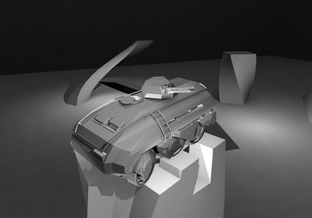
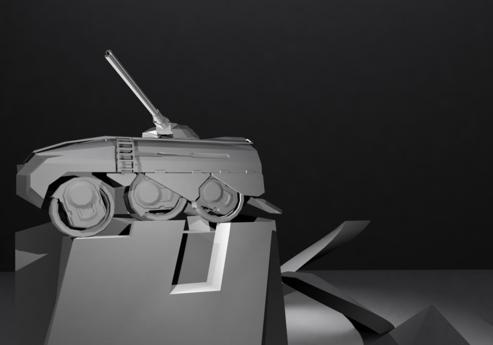
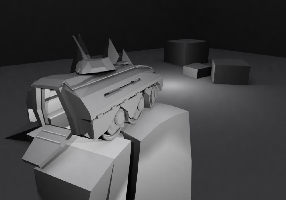
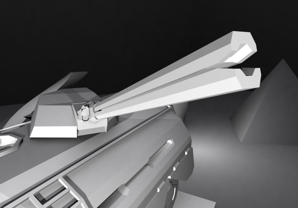
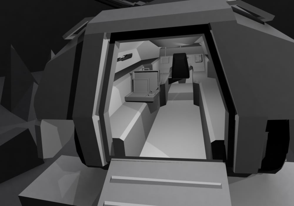
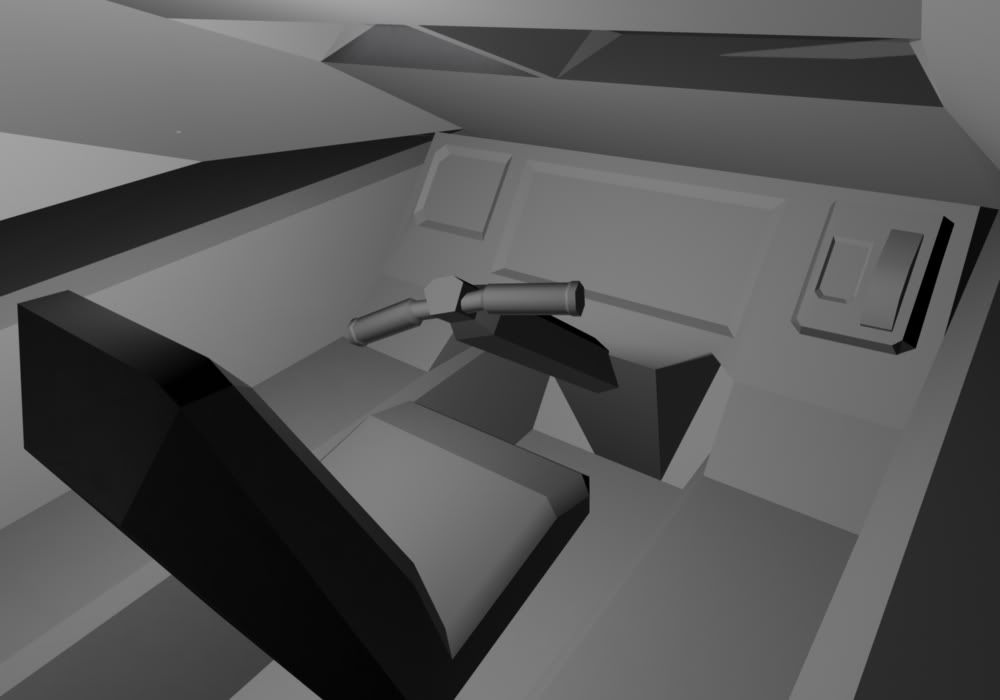
Pretty much final renders of my APC (Better be final, I spent forever on that scene >:( )
Don't mind the shadows, they kinda look like smoothing errors or junk polygons but they're not. Some of them curiously appear to be physically impossible :/
E: guh, gonna try to fix those >_<
E: first fixed render done, working on the rest
E: All fixed renders up
I like the design style, every element of the vehicle goes along with it.
edit: fff, if I could rep you I would.
Ill do it for you Con.
E: Shit I cant either D:
Wtc, I can't give you rep either. >:| Must spread rep...
I shall rep the boy...
beat cha
ZILLAAAAAAA!!!! :mad:
rep me too while you're at it.
:)
I only have two bars :(
I have one. stfu :smithicide:Quote:
Originally Posted by Snowy
Although I might have more if I had posted any other work I've done since my Mac 11 clear back when I first joined. :eyesroll: But it's all hush hush... kind of... maybe I'll post some stuff and get hit by the crit hammer that is Modacity. :tinfoil:
Rifle butt should be in contact with shoulder, should be leaning into rifle, etc.
He is leaning into the rifle.. I made sure of that using IK solvers. If rifle butt touches the shoulder then the arm would be at a very acute angle and the gun would go through the chest permution.
He's not leaning into it, look at his spine; he's leaning away from it.
His eyes are kinda far away from the scope, don'tcha think?
what are you asking for criticism on? your ripped model or the bad positioning?