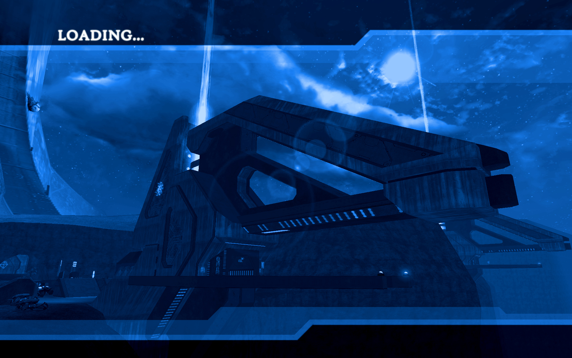
Selentic wanted a 1920x1200 version of the following by Conscars:
http://i93.photobucket.com/albums/l4...background.jpg
So I made this:
Latest/Last versions:
Printable View
Selentic wanted a 1920x1200 version of the following by Conscars:
http://i93.photobucket.com/albums/l4...background.jpg
So I made this:
Latest/Last versions:
Looks nice.
Handel Gothic ITC is the halo menu font.
Is it bundled in the Halo files somewhere so I can install it? It costs money to download apparently.Quote:
Originally Posted by MrBig
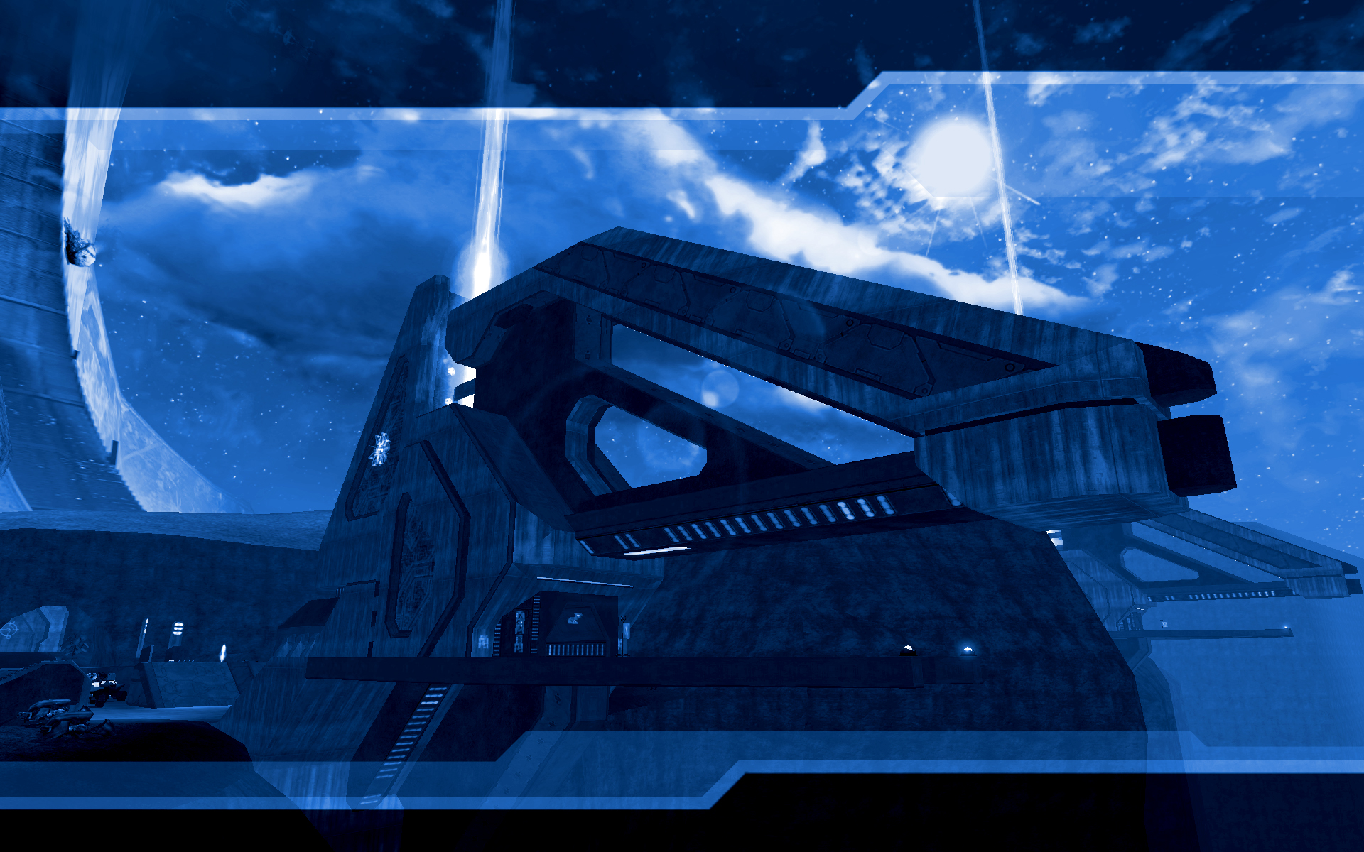
I think the blue is a bit too vibrant. Con's has more of a grey in it, vibrant colours aint too good.
Try and replicate Con's, because that is good.
I did that and then Sel told me to make it more blue :ugh:Quote:
Originally Posted by Hunter
Edit - This is closer to what I originally showed Selentic (I also like it more):
Strangely enough, I think it looks better with such that minor change.
I actually darkened mine with levels before I gave it the blue tone, so don't think that the saturation is entirely the problem when yours looks too bright.
What did you use for color adjustment? I've got levels, color balance, and hue/saturation overlays working together...Quote:
Originally Posted by Con
Edit - Here's my last attempt at messing with the colors:
And I'm going to "open source" this wallpaper by providing the community with the PSD. Maybe you can play with this Con and make it look a bit more like yours.
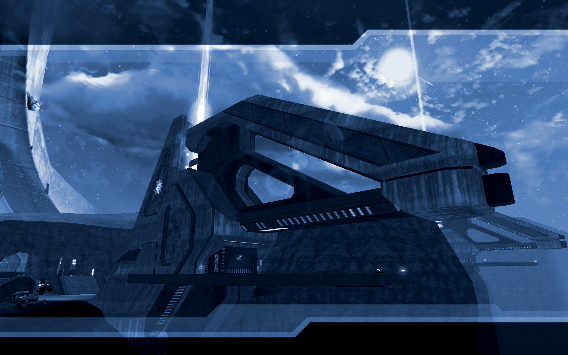
If only AA was possible in Halo, or a game that would render everything in the same way with AA capabilities. :(
EDIT: Just noticed the ring bit in the left back is extremely blurry/pixelated too. Damn it looks good zoomed out, but zoomed in makes my harder parts become limp.
Really nice shot and wallpaper but I'd at least fix those few white dots on some edges. You wouldn't have to fake anti alias with blurring cause it might come out even worse.