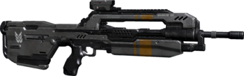
That would be because you're looking at an old, outdated render of the DMR. This current version of the DMR looks much better :


That would be because you're looking at an old, outdated render of the DMR. This current version of the DMR looks much better :

I can't help feeling we could have it all.
Rollin' in the deep!
But still not as good looking as the Reach DMR.Originally Posted by Hotrod

This.
It's hardly any different than the "older render". Still looks like crap compared to Bungie's.
I actually kind of prefer it to Bungie's model, since it looks more like a cross between the Battle Rifle and a Sniper Rifle, as it should. The Reach version of the DMR, which being quite awesome, looks just like a BR with a different scope.
that's not really a good mindset to be in, though. "i like reliant robins as long as you don't go comparing them to any other car" would probably get you branded as an idiot, so i don't see why applying the same logic elsewhere should be okay (although for what it is worth, i love the robin simply on the basis of how hilariously terrible it is, and because of only fools and horses).
i looked at halo 1's assets, and the game was pretty unique as far as sci-fi went. the weapons all looked like they made sense, and thanks to a mix of style and the restrictions on the engine at the time, details were used sparingly and logically. no greeble to be seen anywhere. every shape had a purpose, every line contributed to the overall form. halo 2 was still better than most, but you could see it slipping. halo 3 slid further still, though i will say they did a very good thing preserving the assault rifle's classic design. that abortion of a thing that was in the earlier halo anniversary teasers (i can only assume it was scrapped for the classic design, and rightly so, as i saw more recent media where that appeared to be the case) was absolutely awful in every single sense. the person who designed it must have been either slacking off or just plain incompetent.
art is supposedly a subjective thing - which i suppose is why you have art schools and critics, because of how subjective it is () - but i maintain that the 'greeble everything' style is lazy, generic, and completely talentless. you can disagree until you're blue in the face, but really, i will always hold the view that detail which does not in some way contribute to function, let alone form, has no business existing.
further to that, the best art design (if we assume it isn't deliberately abstract, or a parody) is that which is based upon reality. the best concept weapons are consistently those drawn up by people with some idea how firearms work mechanically, because everything makes sense and comes together well. people whose knowledge of guns extends to "press button, shoot bullet" consistently turn out visually confusing, messy abortions which are covered in greeble and dumb shit like phillips head screws and rivets, because they don't know any better and are so desperate to hide their inability to think of reasonable detail that they just throw whatever on there.
Last edited by rossmum; August 26th, 2012 at 01:13 AM.
With a magazine that size, the DMR should be firing out Anti-Materiel rounds. It looks stupid for a weapon that's meant to be used on the move. Might as well add a bipod and a long range scope. Those things might make it look better. It starts out looking like a huge sniper rifle from the back end and then moves forward into a regular rifle look. It's awkward.
Ignore this post. I was a retard. I agree with Amit.
"High diversity" isn't that great when all of the designs look like they come from different games.
The assault rifle looks just like it always has:
But the battle rifle looks like it was designed with a different mentality:
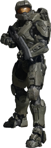
And armor designs that looks Halo-ish (MC's armor looks great, IMO):
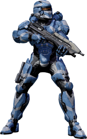
To what the hell is this:
That assault rifle looks so out-of-place in that first image. It's not over-designed and anime enough to match that spiky unicorn hat.
The AR's silhouette is recognisable but I wouldn't call it 'just like it always [was]' - it's all greebly and visually confusing now, versus a very clean, functional design in H1 and even H3. And are those fucking rivets?
There are currently 5 users browsing this thread. (0 members and 5 guests)
 Posting Permissions


Bookmarks