It seems a bit dull, Try to get some colour into it, But keep it subtle.


It seems a bit dull, Try to get some colour into it, But keep it subtle.
No! No color!
Part of my goal was for it to be entirely greyscale. And damn the American dictionary on my computer which insists that it's spelled gray, not grey. But I do agree, a lack of color makes it inherently dull. I was trying to create visual interest with simple shapes rather than color. I think I need to finish what I was doing with the bulletins, and then find a way to add complexity to the menus without making them take up more space or display less nicely. Hm...
Working on a sig for lineage 2 :>
Personally, I like robs sight. it's functional and easy on the eye.
make a desktop sized version of that and you will become a god :OOriginally Posted by Reaper Man

Hm, I'm playing with adding some more, well, taking away some of the plainness by adding stripes:
I'm not sure if I like it. Maybe I'll try making the stripes more subtle... or I'll just trash the whole thing. I'm setting it up so you can choose different skins for it, after all.
Edit: No, I just looked at it and decided that it sucks. But I'll keep experimenting- in fact, I might just give some people property names to fill in with background colors and images, and let people make their own custom color scheme for the site.
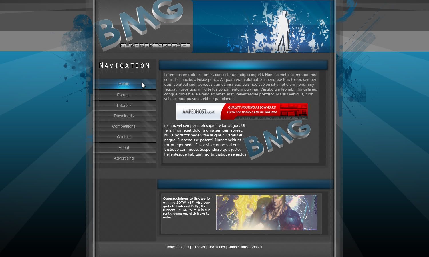
Working on my new website layout.
What happend to the fire pics??
Foo, that'r just a template. Also, my friend was too busy tonight to fire juggle D:
workin on my new website layout.
Also, I made some bawls wallpapers, and they put them on their site!
How do you do those paint splashes?
There are currently 1 users browsing this thread. (0 members and 1 guests)
 Posting Permissions


Bookmarks