maybe.


maybe.
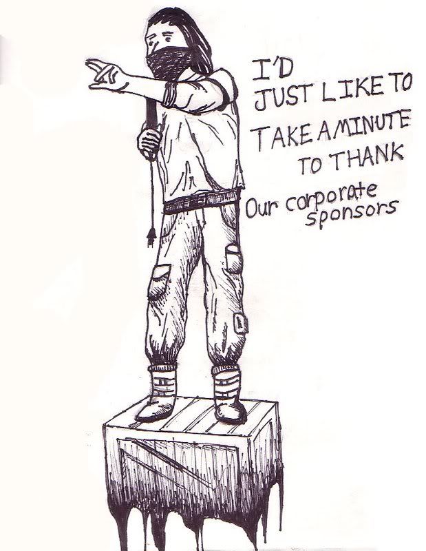
meh, filling up my handmade sketchbook
I'm redoing the layout for my site, so far I have no way of navigation with this template, but I will add navigational tabs or something later. I need some suggestions on how to present the text more interestingly, as you can see I'm trying to go for a minimalistic, yet stylish look (at least I hope you can see that, lol). Also, something about the thumbnails just doesn't look right, somehow they look tacky, whereas the large image seems to fit in with the theme quite well.. I really need suggestions to improve this quick mock-up.
Crit in general please? I'm really stuck with it, as I can't get anything below the large image to look like it belongs..

Last edited by Reaper Man; July 2nd, 2008 at 09:19 AM.
off the top of my head I would suggest you try giving the thumbnails the same sort of muted color palette, but I fail at graphic design, so don't take my word for it.
And I know what you're going for with the logo, and I know you did it differently, but it's still incredibly reminiscent of the Aperture Science logo. You just can't help but think of something entirely different when you look at it, and that's definitely not the desired effect of a logo.
e: oh, and the LED style text is tacky. I think you should use a different font- a fixed width font like Courier New would do better, imo.
But then, I <3 fixed width, being a programmer and all.
Last edited by Rob Oplawar; July 2nd, 2008 at 09:52 AM.
That N in Nature looks like an M to me x_x
Changed the digital font. Too tired to do anything else tonight.
Digital sketch

Hmm, I like that Con. How much further are you planning to go with it? I'd like to see more.
With the help of Snaf, I have refined the design a bit. He suggested I use sepia-toned thumbnails that reveal their color on mouseover. I'm just curious if they look better with color/sepia since I doubt that my main picture will permanently be sepia-toned.
coloured thumbnails:
Last edited by Reaper Man; July 3rd, 2008 at 06:25 AM.
Those lines in the background draw my eye to the edge of the page and not to the content.
There are currently 2 users browsing this thread. (0 members and 2 guests)
 Posting Permissions


Bookmarks