


I'm quite aware of that. I have better night sight than most of my friends. However, I'm also quite aware that on a moonless night, there are still going to be things you can't see worth shit. I don't want to overbrighten it (and not nearly as much as you did) because then it will look like shit on my monitor. Mine. I created this to look right on my monitor, not yours. I don't know what settings you use, for all I know you could have your brightness at 0% and your contrast at 5%. I have them at 10% and 100% (of what my monitor can do by itself) and it looks fine to me. Sure I have to squint if there's glare off the dust on my screen, but in normal lighting conditions it's fine. If you can't see it, either do something about your monitor settings or don't bother to look at it at all. I want useful crit, not people trying to customise my work to fit their bloody settings.Originally Posted by Llama Juice

Or, you know, on the leeward side of a large building on a moonless night (although that's irrelevant anyway, since it's not dark at all on my monitor). My goal was to reproduce what I'd see in that environment, and I more or less nailed it (if anything, there's too much colour). It might be entirely wrong on your monitor, but that's your problem, not mine. I don't want to fuck about with guesswork when it comes to deciding the level of brightness, colour and contrast i use.
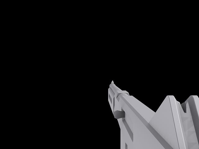
There's this funny thing called aliasing, I suggest you read up on it
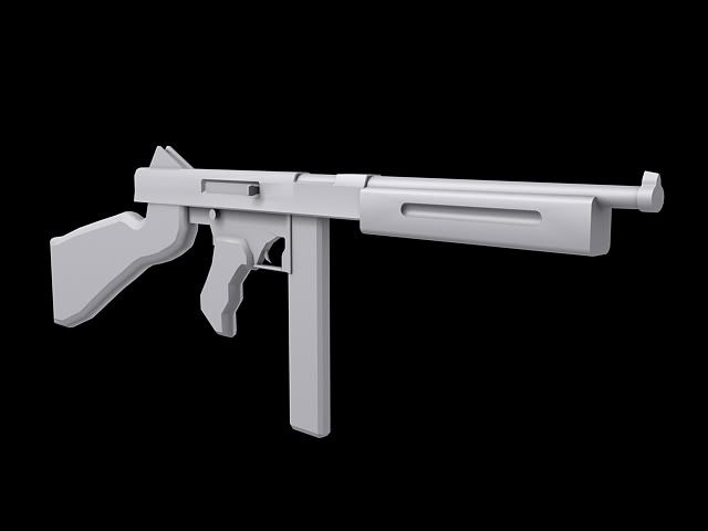
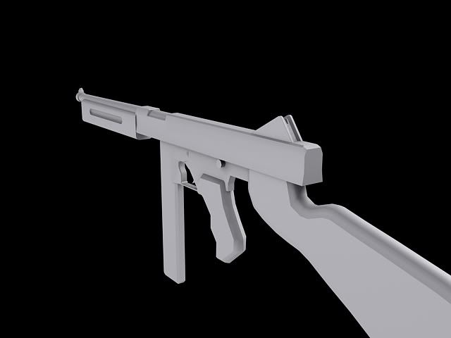
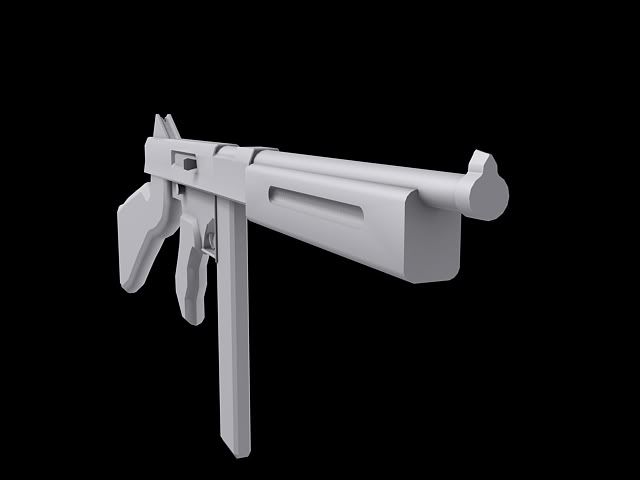
It looks nothing like a Thomspon M1A1 should, find more refs and start over. Lay off the miniscule and utterly pointless chamfers, too.


Bookmarks