


The extrusions/gradations on the the side are gratuitous and ugly, you should use panels, lights, or any form of actual item that could theoretically serve a purpose to add detail to your wall. Please use more curves too, circles and some ninety-degree bends can really break up some of your angular monotony. That piece on the top simply does not look right, you're going to have to axe that. It's phenomenally trite for forerunner buildings to be capped with that shape. The wall is very similar to something I once did but it needs more detail or bolder shapes, perhaps some sort of device every three panels or something. The cut out shape that you have in your indentation looks funky, too.Originally Posted by Newbkilla

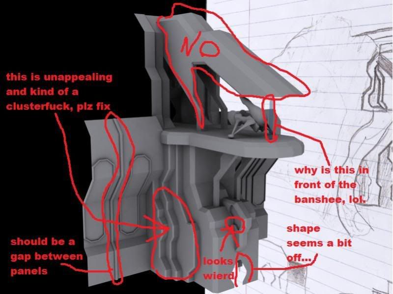
Here is what I feel looks wrong right now:
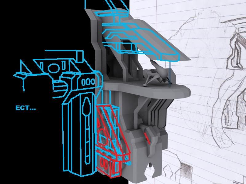
Here are some ideas for improvements:
It's not about having detail, it's about using detail.


Bookmarks