Texture.


Texture.
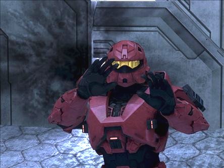
Look any better? I'm really at a loss with what to do with the rubber.
Detailing, like in this pic
And here
Last edited by Reaper Man; May 28th, 2009 at 11:02 AM.
still have a ways to go as far as the normal map goes (which then somewhat alters the diffuse and spec). i'll look at the h2 fp hands normal map and i guess the h3 normal map for reference. thanks for the idea.
That's much better. I think that the black texture needs to have some kind of detailing standout, albeit subtly, because right now there are parts of it that look almost flat (but this may be just nit-picking). Also, the thing that looks like a fin at the very top of the the texture (on the bottom picture), it looks a bit stretched, or maybe that's because of the scratches.Originally Posted by flyinrooster

What about stiches or some kind of hexagonal pattern on the black parts?
I second that.
If you look closely, there is a hexagonal pattern already. It's probably larger than it'd have to be to pass as plausible, but they were meant to be subtle. Not sure why I even put them there, lol.
I can barely see the lines that make it up.
Obviously I'd change it.
There are currently 23 users browsing this thread. (0 members and 23 guests)
 Posting Permissions


Bookmarks