Keep working on this UI I really love the feel of it. However I agree on things like
1)working on text
2)MAYBE the colors
3)round the edges out of the menu possibly
Good job so far though!


Keep working on this UI I really love the feel of it. However I agree on things like
1)working on text
2)MAYBE the colors
3)round the edges out of the menu possibly
Good job so far though!

Bungie day is here, please check the first post for an alpha build of the map. However I haven't tested it scince attempting map protection, or on any computers other than the one I have the HEK installed on, so I hope it works.
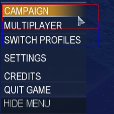
You need to decrease the bounds for your main menu item widgets (single player, settings, multiplayer, etc) so they nicely highlight. Right now the bounds of each are overlapping which is why each item doesn't highlight at the right time when you move your mouse down the list. Open up all the item widgets and change the 'b' bound down to 20 - the height of each of your (visible) bitmaps. Decrease the 'r' bound too, to the width of each bitmap so the list is only usable when the mouse is directly over the buttons (right now you can still select buttons when your mouse is just off to the right, see image).
This is what's happening:
The red box is the campaign widget's bounds, the blue box is the multiplayer widget's bounds.. Because the campaign widget is the highest child widget in the select list, its bounds are 'ontop' of all widgets below it. This is why the multiplayer button doesn't work until you're below the red box, the campaign widget's bounds.
I like what your going for here, it looks good so far :-). Oh, and I need to download a single player map before I check out your single player menu - I just reformatted so it thinks i'm playing SP for the first time.
e: Also, I think your bkd_virtual_keyboard.bitmap in your tags\ui\ folder is corrupt - I can't change the name of a profile, server, gametype, etc. When there's no profile present, I can't access any menu other than quit. This is because the game is trying to get you to create a profile by asking you for a name. This might be the cause of your exception.
Looking good, though your fonts are incorrect, if you are trying for an exact copy.
Conduit ITC is the menu item font - http://www.fontyukle.com/en/ara.php?...&button=Search
And it looks like you already have it, but just incase you had used other methods to write out "custom edition" (like copying/tracing letters), the halo 1/2 menu font is ITC Handel Gothic - http://www.fontyukle.com/en/ara.php?...&button=Search
The downloads for those are free.
I can pull out my old H3 menu .psd if you need any help with this
I made the lobbies a long time ago, but looking at it now, they are completely unsatisfactory.
Also, I may recommend widening out the menu's; here's mock up I made
(hDoan requested that forge be kept, this is a mockup I made for him)
I gave out slices of this to hdoan for use by H3MT, but I haven't heard from him in a while.
Yeah, I knew about that bug, didn't know how to fix it, got used to it, and forgot about it. I just had a quick shot at what you said ('b' bound to 20) on the Campaign button, and it seemed to fix the problem (for the multiplayer button) but sliced off the bottom of the bitmap.Originally Posted by Timo

So I changed it to 24, and did some of the other buttons on that list too, and no change (the campaign button's bitmap had the bottom chopped off still and the others were the same as before, their selection areas were even still covered by the button above them in the list (except mulitplayer, because as I said the change on the campaign button actually worked). EDIT: Never mind, they are all set to 24 now and they select properly, I think I must have forgoten to run tool again to recompile the cache file.
Nope, the bitmap seems fine (opened it in kornman00v2 and clicked "show bitmap" and it didn't look wrong). Also I just tried re-naming the single profile I have and it worked. However when I pressed OK on the settings screen to go back to the main menu after changing the profile name (I think that's where it useally says "saving, one momment please") it froze for a bit, didn't show the "saving, one momment please" message, the music went odd and I thourght it was going to exception. When I renamed my profile back (to a much shorter name) it did the same thing, but the frightening pause with the messed-up music was shorter. I am using the non-protected, just compiled, version though, so maybe the bitmap got corupted in the map when HEK+ did it's thing.
Last edited by Rhydgaled; July 15th, 2009 at 10:56 AM.
^ did you get my pm?
Yeah, I got it. I've been a bit slow in replying but you should have a reply by now.
Another problem, using the continue campaign button seems to always result in an exception
Has there been a finished Halo 2 or Halo 3 UI?
If there was a finished H3 UI, he wouldn't be working on one right now.
And there is no H2 ui so far that I know of, there are a few (good looking) UI's that are h2/h3 themed, but one that is accurately replicated has yet to be made/finished.
Nice work mate, keep it up. Incase I missed it, I hope you will/have removed the update check feature, waiting time is pretty annoying.
There are currently 1 users browsing this thread. (0 members and 1 guests)
 Posting Permissions


Bookmarks