):Originally Posted by Hunter


):
I dont even know where some of those details came from D:
idk i was bored. wood textures arent mine, i got them from cg textures, tho the uvs are mine. ignore the horrable uv on the crate on the right right now. trash can textures are mine tho
There ok, for simple shapes.
The pallet could use nails so they look together. And the trashcan has too much grunge, and I dont really see how it could get scratches. I suggest making it more stainless steel, or plastic.
Texture work could have been better.
tis stainless steel. i only used 1 grungebrush at 20 percent opacity :C. whatever, i guess ill take some of the grunge off
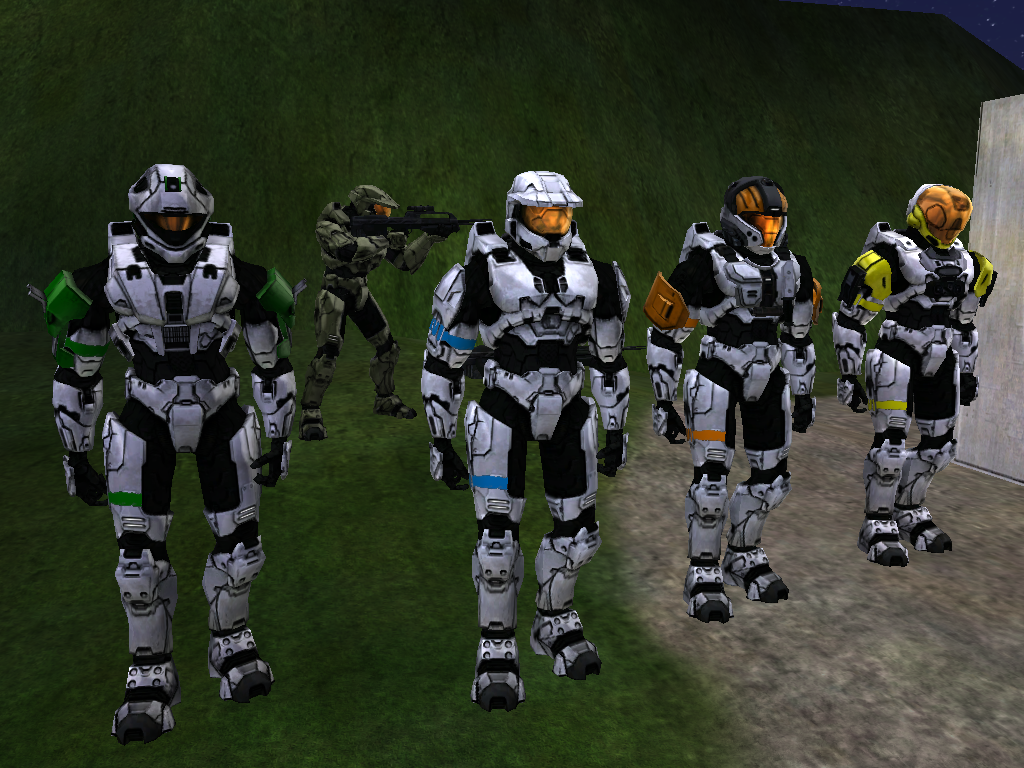
^the bottom one is just to show the difference bitmaps from MP and SP and the visor has been fixed which shows on the top...
Don't ignore my post like you guys did awhile ago since the only crit I can get is from halomaps mostly which bites sorta. The brightness is fine on it, it's just a part of the map that dims it or so. Anything I should fix other then the CQB visor. I aimed for a clean look on the MP like in the retail so.
E: damn rubber, to black, gotta fix the multi-purpose
Last edited by Spartan094; November 4th, 2009 at 08:26 PM.
Campaign looks a touch dull (the color, not the reflection) to me. The visors also look a little under-saturated.
The campaign color is actually the halo 3 retail color values that delta4097 gave me, even so I think I should brighten it up abit. And the visors, which one are you talking about, 1st pic or 2nd? since the 2nd picture is old and the 1st picture is the most recent
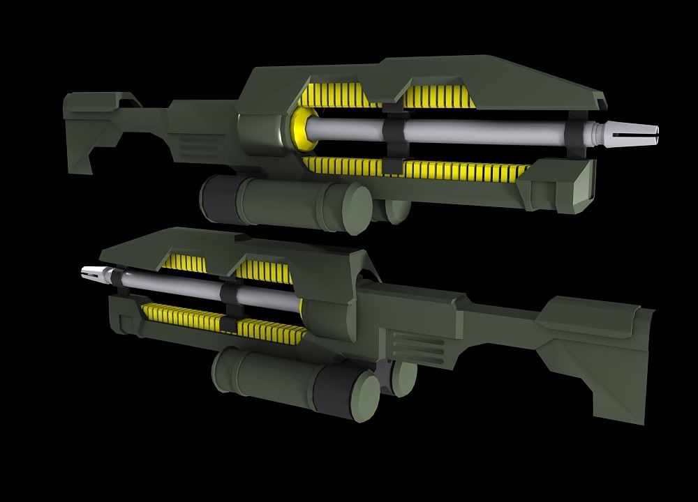
Try modeling something from a reference picture. Try modeling this flashlight.
Your call, either the left or the right one.
There are currently 41 users browsing this thread. (0 members and 41 guests)
 Posting Permissions


Bookmarks