... Don't know if you were able to notice but basically everything forward of the receiver is not finished... As for that hole, yeah it is. just haven't gotten around to fixing it yetThis is what I have for the high poly so far


... Don't know if you were able to notice but basically everything forward of the receiver is not finished... As for that hole, yeah it is. just haven't gotten around to fixing it yetThis is what I have for the high poly so far
It's very web 1.0 looking. Glossy buttons like that just look tacky nowadays. Portfolio sites should be more minimalist, so that one focuses on the content, rather than the website. To be honest, I find your template quite distracting, and just very outdated looking.Originally Posted by MrBig

Here are two portfolio sites I've made. Very minimal, but not to the point of being drab.
My personal website: http://www.feignphoto.com
A website I made for my color theory class final project (temporarily hosted as a subdomain): http://becomingimage.feignphoto.com
It's not just for photography, so I would want to show some designs in the website. But this is just for practice, not actually for use.
Dosn't help that you spelt eiffel tower wrong.
The French spelt it wrong.
It was named after the designer, STFU
Don't do what you're doing with the tabs at the top. Make the text pop out, not just be visible. Your name, too.
Derp
@MrBig; That doesn't look like liquid design will do anything... solid images with defined widths ect... looks cool though,
I made a small website for BTEC ICT at college, only meant to make it extremly basic, I went over the top, teacher keeps moaning at me because I keep adding more too it.
I will upload as soon as account to a web host has been validated, although its nothing special seeming as I am still a "noob".
---
Also, I attempted to give sub'd another shot, here is what I have so far for my magnum, need to add floaters of course.
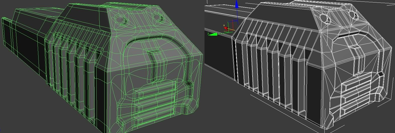
Dude... get some shots without wireframe, really can't tell what's actually going on on the model. It's annoying.
There are currently 2 users browsing this thread. (0 members and 2 guests)
 Posting Permissions


Bookmarks