If I were you I would slap this kid. Then go find someone else to unwrap it.
Printable View
If I were you I would slap this kid. Then go find someone else to unwrap it.
that uv map is terrible....
*heres one I prepared earlier*
http://img395.imageshack.us/img395/5039/unwrapus9.jpg
Use your fucking space, stop wasting it.
Tell deehunter that dano.
Also I am not going to slap dee, because it is H3MT's problem if the skin comes out crappy because of the unwrap, and they all know who unwrapped it, so they can handle him, while I just finish this skin as it is as I am sure as hell not going to redo it.
We can see someone isn't a team player, catch these problems early in the project so they don't delay the project much. If the UVW unwrap is bad, tell them to unwrap it again instead of painting it then letting them see it themselves, that's going to get you no where tbh. Not trying to be harsh or anything; It's just not a good attitude to have, especially if you plan on making something like this your career.
Hahhaha you're funny, you don't think I have asked that? This is my 2nd time skinning this thing. I have asked, dee didn't even unwrap the teeth right, and the eyes are not even on the unwrap, when I asked him if he could redo it, he basically told me to screw off and do it myself, which I respectfully said fuck you to, as no I am not on H3MT, the only reason I did this is because I wanted to skin a good-looking elite, not the h1 ones. So by now I will probably finish it, but if something is not on there or is shit, I am saying screw it and will just either leave that part blank, or do my best with it.
Hey calm down man, I'm only trying to help.
Maybe have someone else unwrap it? Or learn yourself, it wouldn't hurt.
*In other words, have someone else unwrap it and then paint to your best abilties. Make it as best as you can, then explain to them that DEE had no help in this project when it came to the texturing and unwrapping.
If you honestly can't tell what's wrong with your texture, then you don't deserve to call yourself a texture artist; plain and simple. Go watch some tuts and revise your skinning methods or something, because none of what you made looks like the materials they are supposed to. Go on cdg.net (yeah, it's full of last-gen tuts, but CE is last-gen anyway) or something and look at some of the skinning tutorials they've got.Quote:
Originally Posted by sKc_Chains
Well since you can obviously see them, why not instead of have me randomly search a site to improve on something that no one will tell me, actually list what is wrong and be some help, and not a total douche?
This is the studio critique thread. If you're showing the actually model and/or skin that is not how to do it.Quote:
Originally Posted by disaster
Use the rendering tutorial I posted and post the actual texture map. Otherwise this is not the place to just show off fancy renders.
I wasn't showing off the model or the texture. I was showing the whole piece because me nugget and deehunter are making a short CG rendered animation based on ww2. The whole piece as a whole is meant to be seen from a short distance. Not up close. The render that was posted is what the plane is going to look like in the render.Quote:
Originally Posted by PenGuin1362
should have said that...Quote:
Originally Posted by disaster
As for the render, get some nice blurred propeller action going on and some clouds.
Will do.
Also, I would have said that but I was in a hurry.
I said i couldnt UV it because the eye model was messed up. Every face was a different element. When I uved that I didnt have my computer. I was UV mapping on my dad's computer using a different tool. So I did not have max to try and fix it.Quote:
Originally Posted by sKc_Chains
So? I messaged you with this YESTERDAY too, when you do have your new computer with max, as you were bragging about earlier, proof shown by the above render you and disaster just showed off.
Your telling me over xfire that I didnt do anything about it. I was trying to enjoy a new game I bought. You asked about the eye unwrap and I say that it should be easy for you to unwrap and to just use a planar. You never asked to redo the unwrap either. But you still tell me that I did NOTHING.
HEY GUYS HOW BOUT WE TAKE IT TO PMS AND NOT SHIT UP THE TOPIC?
This.Quote:
Originally Posted by jngrow
That.
may be a little late, but w/e: you really need some motion blur on that to really sell it. Looks unnatural to see the props like that.
Clarification is nice. And yes definitely need motion blur on the props, and maybe a very subtle blur on the plane.Quote:
Originally Posted by Conscars
My entry for the speed modeling challenge over at game artists. I was pressed with the 90 minute time limit so you can see places I didn't finish. ex: the pipes by the vents lead to nowhere.
That is pretty impressive.
Wow... nice... not sure if I fully understand though.
looks great *thumbs up*
How do you not understand Foundry?
Did you actually model all that? I thought it was an h3mt project.
Credit goes to Arbiter100 for the model
You guys should make the specular and normal maps for that so that the render looks sexy with the textures Doan made.
Maxwell render.
http://deelekgolo.deviantart.com/art...ndry-104023391
The lack of AA hurts my eyes
e: the deviantart render is better. Now I can see errors galore. Now that's what's hurting my eyes.
Maxwell has errors when importing objs when it comes to smoothing. Ill make a Vray render when I get textures.
So all you did that was worthy of posting that was to stick in in maxwell?
We can't really critique anything, because, well it's a render of flat geometry, and this isn't a gallery thread, even if it was, this isn't gallery worthy anyway, so why did you post it?
Wait, if you didn't even model it then why are you posting it?
What? He did didn't he? I'm so confused... it looks good anyways. lul :)
...Quote:
Originally Posted by Malloy
DeeHunter, this thread is called the Quick-Crit thread for reason. It's to post work that's yours and to see what the community thinks of it, not to post renders of other people's work.Quote:
Originally Posted by Conscars
If you wanted crit on your rendering technique (hence rendering someone elses work), or something like that you need to say so, not just post images and make people think that it's yours.
http://img160.imageshack.us/img160/3541/progressih6.jpg
Bungie's model and UVs, my skin and lame render
since, i have changed things, like the lights on the things in the front where the plasma bolt comes from.
Made this last Friday.
pains me to say, but theres just something about it which i dislike.
I think the hexagon lines should be alittle thicker and not stand out as much.
I don't really care at all about this, I just wanna post it 'cause it's all I've done in a while.
My first UT3 project. Everything except for the ground bitmaps was made by me.
Yes, even those super super super fugly trees.
Nothing has collision right now, 'cept for the terrain. It was for a project for a class at school. A week and a half project *shrug*
It's not supposed to be a map... so... any comments about gameplay... you're an idiot.
Well, for one I'd get rid of most of the lights. The lighting seems rather bland at the moment, try to mix it up with some different Colours and Shades. Try to dot the lights around the map, to give more atmosphere/effect. Remember, In some cases Less is More.
The building's style seems very inconsistent.
The light placement seems random.
the terrain textures are tiled really bad.
It looks more like 2k4 than ut3.
All of it just basicaly looks odd.
Disaster, I want to see that Spit fixed according to the refs I gave you, and I'd like some closer renders so I can see if there's anything else aside from the proportions, the windscreen/canopy and the exhaust pipes (on the skin). If you need anything further, just ask - I also recall from memory almost every panel joint on the fuselage, not hard to tell it's my favourite plane. That's an RAAF one, by the way :P
Anyway,
I KNOW IT'S DARK
It's very grey. Reminds me of stone.Quote:
Originally Posted by Invader Veex
I can't see crap, make it brighter. It's way too dark.Quote:
Originally Posted by rossmum
end yourselfQuote:
Originally Posted by Conscars
Well if you want any critique on the subject then it does need to be brighter. I'm not even sure what you posted it for though, because you keep posting images like this without saying what you want crit on. I'm not sure if you even want crit or are just posting your work. Like we just went through, this is a crit thread not a gallery.
I want crit on something other than how fucked up peoples' monitors are. I have my brightness turned right down and I can still see it fine. It's supposed to be night, night is bloody dark, end of story. I'm not making it look like high noon on my screen just because someone else's monitor is hosed.
You sure gave rossmum a reality check, way to go!.Quote:
Originally Posted by Corndogman
:suicide:
Is this gun like... the new Mac-11 for people who are just starting to model guns?
Edit: Might as well say something.
I spot an error in the blue chunk... boolean is not always your friend.
Yeah how do i fix that? I cannot find a way to fix it D:
http://www.llamajuice.com/room3.jpgQuote:
Originally Posted by rossmum
It's a render of a bedroom scene I had to shade and light. Please critique the scene for me. I'd really like to hear what you guys think of the picture on the wall right by the window, or what you think of any of the shaders that I spent forever on.
Oh, right... I mean...
http://www.llamajuice.com/room2.jpg
I did this back in February. Sure, the second one doesn't appear all that nightish, but it looks more nightish than the day version
http://www.llamajuice.com/room.jpg
See Ross... at night.. your pupils dilate so that you can see more light than there actually is, in CG we have to make up for that because we can't force black at someone and expect their eyes to make up for it when it doesn't work the same for a TV screen. When the detail just isn't there, then the detail isn't there. Your eye's aren't going to fix it.
Raise of hands, who saw that car there in his render? I thought she was sitting in a chair.
There's going to be ambient light anyways.... the only place you'll find stuff that dark is if you're in like the rain forest at night where the trees might be able to block out all the atmospheric light from cities miles away.
If you guys haven't realized it yet, I don't care about my bedroom scene, don't bother critiquing it... I posted it as an example.
Low quality picture is low quality, also why are there visible waves on the carpert?
Also, Llama your sig grosses me out everytime I see it. :\
Yeah, you know, because that's what I was trying to do and all, I wasn't just giving my honest opinion about the matter at hand or anything.Quote:
Originally Posted by mech
All I was trying to say Ross, is that you didn't really say if you just wanted crit on the shot itself or something in the shot or what. I do think the shot looks great, and I get why its dark. Wasn't going on the offensive at all.
^Quote:
Originally Posted by GeometricGeek
this
That sig looks like an anus with teeth
Actually I always thought of it as an old vampire's vagina.
Never thought of that one...
Thompson Gun by Advancebo
Polygons: 1210
Triangles: 2494
http://i218.photobucket.com/albums/c...ebo/tommy3.jpg
http://i218.photobucket.com/albums/c...ebo/tommy4.jpg
http://i218.photobucket.com/albums/c...ebo/tommy5.jpg
http://i218.photobucket.com/albums/c...ebo/tommy6.jpg
looks nice.
Just finished a self portrait for art class.
I know my eyes are weird, but that's the way they were in the photo, I drew them exactly as I saw them.
http://i231.photobucket.com/albums/e...1124082003.jpg
It's always when I finish one of these that I realize how little it looks like what I'm drawing from...
I'm quite aware of that. I have better night sight than most of my friends. However, I'm also quite aware that on a moonless night, there are still going to be things you can't see worth shit. I don't want to overbrighten it (and not nearly as much as you did) because then it will look like shit on my monitor. Mine. I created this to look right on my monitor, not yours. I don't know what settings you use, for all I know you could have your brightness at 0% and your contrast at 5%. I have them at 10% and 100% (of what my monitor can do by itself) and it looks fine to me. Sure I have to squint if there's glare off the dust on my screen, but in normal lighting conditions it's fine. If you can't see it, either do something about your monitor settings or don't bother to look at it at all. I want useful crit, not people trying to customise my work to fit their bloody settings.Quote:
Originally Posted by Llama Juice
Or, you know, on the leeward side of a large building on a moonless night (although that's irrelevant anyway, since it's not dark at all on my monitor). My goal was to reproduce what I'd see in that environment, and I more or less nailed it (if anything, there's too much colour). It might be entirely wrong on your monitor, but that's your problem, not mine. I don't want to fuck about with guesswork when it comes to deciding the level of brightness, colour and contrast i use.Quote:
Originally Posted by Llama Juice
There's this funny thing called aliasing, I suggest you read up on itQuote:
Originally Posted by Advancebo
It looks nothing like a Thomspon M1A1 should, find more refs and start over. Lay off the miniscule and utterly pointless chamfers, too.Quote:
Originally Posted by Advancebo
@ ExAm, the shading is kinda low contrast, makes the whole thing look bland, I had to get out of the habit of shading like that. Work with blacks and whites, not just grays, would definitely help with the shirt.
I was working in soft pencil, there is ONLY gray >_>Quote:
Originally Posted by Reaper Man
No, with hard pencil there is ONLY gray. Soft pencil is awesome for blacks. Unless we misunderstood each other, soft is 2B, 4B etc etc.
6B, and I couldn't get the shading to look right any darker, it wouldn't smear into something smooth, always looked like pencil marks. I'm guessing I'm using the wrong kind of paper.Quote:
Originally Posted by Reaper Man
...6B and you couldn't get black? How lightly were you pressing man? I did this with 6B + soft chalk because it was getting too dark. I used cartridge paper.
http://img241.imageshack.us/img241/7...feign10nl6.jpg
I'm not into anything that advanced yet. I can't control my shading when pressing down that hard.
If you don't want critique on something, or if you're not going to accept critique, then don't post stuff.Quote:
Originally Posted by rossmum
If you're wanting something to look good to you only, then there's no point in showing it to other people, when everyone else agrees that it looks like crap.
I made it that bright just so that people could see what was actually in the image, I wasn't trying to fix it for you.
I looked at it on two different monitors, Conscars couldn't see shit, CorndogMan couldn't see shit, neither of my monitors could make out any images on it... Nobody commented on anything in the actual image (either because of how you exploded at both CorndogMan and Conscars... or just because they can't see shit either....) but you're right. It's us, not you.
I didn't really press that hard, I just worked into it, doing several layers of shading. *shrug*Quote:
Originally Posted by ExAm
Christ, how hard is it? I want critique that does not motherfucking depend on someone's monitor settings. You know, stuff like how I could improve the actual composition of the picture, the posing, editing, etc. I don't give a toss whether half the people I show it to think it's too dark and the other half too light, I make things according to how they look on my own monitor so I don't have to fuck about with guesswork just to satisfy a portion of the people who will see it.Quote:
Originally Posted by Llama Juice
By the way, I would've thought it rather obvious that by posting 'end yourself' with no punctuation whatsoever, I was being quite clearly sarcastic. I don't recall exploding at anyone, though I certainly bloody want to since everyone seems to think that I should make one variant of each image for every bloody brightness, contrast and gamma setting a monitor can handle. I want crit about the contents of the image, not your (in)ability to make it out. If you can't see it, then I guess that's too bad. I'm not fucking about and ending up with something that looks awful to me just so some of the people who see it won't complain about it being dark.
Ross, you just said this
then you say this?Quote:
Originally Posted by rossmum
Quote:
Originally Posted by rossmum
Somewhere along the lines there you missed a few digits, because this does not compute. If your looking for critique, you should cater to the criticizer at least a little.
Nevermind, I'll just be sure never to post anything again because my monitor settings clearly don't match up with anyone else's and I really don't want to waste my time fucking about with brightness just to have another group of people complain that it's too bright later on.
For fuck's sake, is it really so fucking hard for you lot to turn up your brightness for a moment? I work according to my monitor settings because then I know exactly how it'll turn out. Unless any one of you intends to buy me a new monitor, find something else to complain about. I can't fucking work with what I don't fucking have.
I actually think Ross's render serves its purpose. While I can't see the car door behind the character, I can easily see the tail light, her face, and part of her body, which lets me know that this is clearly meant to be a darkly rendered image with very little visible. That said, the textures a little bit low resolution, but I can understand the scene. Posing seems a little unnatural (like half sitting, half standing), rather than pressing her back against the car in an attempt to use it as cover. Take a look at the pose in Gears of War when a character takes cover and you'll see what I mean. Something about yours is...a little stiff imo. One other thing, and this is minor. But if she's going to use her head to take a look past the car, make sure it does not exceed the top of the car. That's a prime shot for a sniper.
One more thing about people saying Ross's monitor is off. It's possible, but it's also possible your monitors are inaccurate as well. I used DisplayMate to fine-tune mine to about as close to perfection as I could get, and I can see the render without too much difficulty.
THANK YOU.
Look, guys, I appreciate you may have to strain your eyes to see what's going on but aside from it being intentionally hard to see most of the picture, it's also something which isn't my problem. No matter whose monitor is the off one, I can't make my pictures suit yours when mine is different and nor do I intend to try. If it really irks you that much just don't look at it, because it is incredibly bloody frustrating to constantly be hounded about the same thing time and time again after already explaining it's out of your control.
As for the low-resness - yeah, the default HL2 car wrecks are pretty quick and nasty as far as the texturing goes. I dunno, maybe I'll see if I can improve them at some point.
Haha, I knew that car was familiar :D
:O I don't want to know what you dream about ;)Quote:
Originally Posted by Reaper Man
Nice drawing though.
Ah, time to just show a small time line of my improvement for this month.
http://i305.photobucket.com/albums/n...natomycopy.png
Speed concept made near the beginning of this month, time took was 45 minutes.
http://i305.photobucket.com/albums/n...ntrycopy-1.png
Speed concept done today, time took was 31 minutes.
Also, it looks like if she was trying to prop herself up against the car she'd have the palm of her hand pushing down on the rim of the car she's up against with her elbow pointing toward the camera - otherwise to me it looks like she's squatting with just her ass sitting on the rim, without any other support.Quote:
Originally Posted by Jean-Luc
I like that one, especially the armer.Quote:
Originally Posted by sKc_Chains
Quote:
Originally Posted by rossmum
Oh I like, the only thing I can say is that it might look a bit better if she was a little closer to the ground. It may not look too natural but if I was trying to hide in the dark, I would be as close to the ground as possible. Just throwing that out there. As for the darkness, it's PERFECT on my monitor. o/ go us!
And as for Chain's image:
I like the first picture, but it's too..bland I guess?
Needs more line defining. As for now it seems to be squigglies on a page! No offense, I can tell what it is.. but you know.
Turning up your brightness doesn't do shit. My brightness is at almost 100%, and my monitor is sure as fuck brighter than yours. Changing the brightness is going to brighten the black as well as the lighter colors, and it won't help anyone see shit, so you would have to change the contrast, and still that doesn't help much because the image was created with fuck all contrast to begin with. I can't see shit in any of your shots, and neither can anyone else. Your monitor is the one that has the abnormal settings here. If you want us to be able to even see what you're trying to do, you're going to need to brighten up the scene in gmod before you take a screen, and that's the truth.Quote:
Originally Posted by rossmum
I thought we were past this. My monitor is calibrated properly and I can see the render just fine. It is more than possible, and very much likely, that his monitor is not the only one that's off.
Fix up the errors and also redo the rail, you've got the shape wrong. Most people do, actually.
http://hahn-precision.com/armory/images/picatinny.jpg
e/
Hahaha what, I almost always overcontrast my pictures, some to the point where I actually kill a lot of the detail in the shadows... she's kneeling, by the way. I can see where the leaning thing comes from though, it's hard to see her other leg is on the ground.Quote:
Originally Posted by ExAm
O hai
MA5C Assault Rifle
Polygons: 3477
Triangles: 4784
http://i218.photobucket.com/albums/c...ancebo/ar1.jpg
http://i218.photobucket.com/albums/c...ancebo/ar2.jpg
http://i218.photobucket.com/albums/c...ancebo/ar3.jpg
Ohhh, I see that now, yeah might help if you switch which leg was on the ground.Quote:
Hahaha what, I almost always overcontrast my pictures, some to the point where I actually kill a lot of the detail in the shadows... she's kneeling, by the way. I can see where the leaning thing comes from though, it's hard to see her other leg is on the ground.
Honestly I don't care for the composition. Just seems rather bland.
She's looking off to the side which make my eye move in that direction but there's nothing there.
Does that make sense?
Actually, good call on that - I should've made it a stitch showing the hospital in the background. It didn't occur to me when I made it though, if I still have the savegame I'll see what I can do to stitch it.
http://i58.photobucket.com/albums/g2.../twoPeople.jpg
Flash at college ftw :)
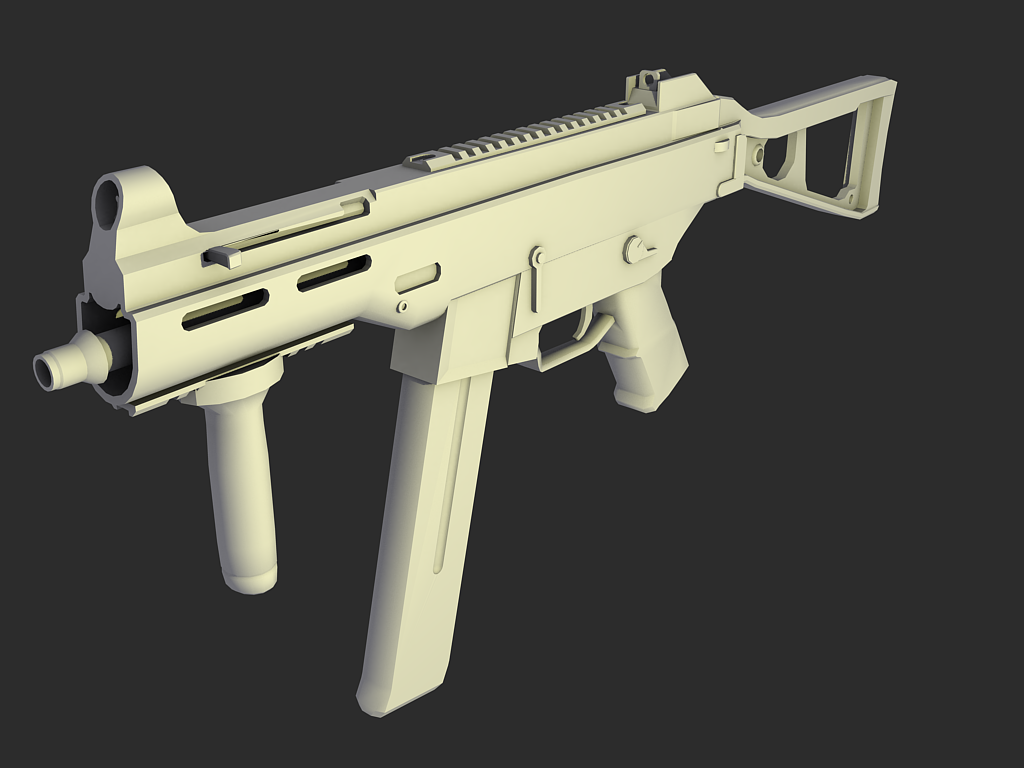
http://i266.photobucket.com/albums/i...16/umpmesh.png
Quick screen capture from maya to see the edgeloops
Another thing I notice about most of your renders is that woman's facial expressions. They seem rather...robotic. Try to put more emotion into it, rather than having her just look at something with a somewhat bored face.Quote:
Originally Posted by rossmum
Is there actually anything that can be done about the facial expressions? I don't know what engine he's using here but its possible that there is no choice
It is entirely possible, it is garry's mod, it allows for ingame setting for the face.
Quick concept for a spartan variation for sigma leet, might or might not be modeled and made for ingame.
http://i305.photobucket.com/albums/n...oto1copy-1.png
Ahem:Quote:
Originally Posted by sKc_Chains
Don't hate on haze. >:(
Anyways I based this more off of crysis and marathon, as I always thought the Spartans lacked a futuristic look. Also as for the haze, its bubble canopy goes all the way around to the back of the head and has no chin piece, unlike mine, also it has armor for its six pack, mine does not, only for the diaphragm and chest, also he wears clothes under it, like marines, while mine wears skin tight rubber.
The first time I seen it.. I thought it was from Haze...
His chest looks flat...
Haze was a terrible game, there are reviews to prove it.