Dee, lemme see your model so i can show you how the UV's should be.
Printable View
Dee, lemme see your model so i can show you how the UV's should be.
Sent.
If you made the normal maps lower res then they'd be pixelated no matter what. By utilizing more of the space, you aren't making your normal map more pixelated, you're making it less pixelated.
Which is why I made the areas that show more be less pixelated by scaling them up.
Quote:
Originally Posted by flyinrooster
I'm confused lolQuote:
Originally Posted by DEEhunter
shot tags shot tags shot tags
Dis be an ugly bitch. I'll start texturing the skin so I can stop seeing her.
BHAHAHAHAHA!
You provided great lulz.
Nice hair.
Blowup Doll lips :3
haha, keep workin' on it.
Holy Shit when did Faith get fat? I guess after she got done with Mirror's Edge.Quote:
Originally Posted by DEEhunter
It looks like a plastic toy with felt clothing.Quote:
Originally Posted by DEEhunter
:lol: Agreed.Quote:
Originally Posted by Advancebo
Im tired of seeing this ugly bitch so I pronounce it done.
Fail texture.
why is her eye so red? is she stoned?
That's not what people look like.
It looks like she was playing in the dirt.. :3
You can take solace in the fact that it's at least better than Strider Vega Core's "3D Girl" :v:
Reminds me of Jay.
It looks like DeeHunter :)
lol, the only thing wrong I see with it is that it's face is really screwed up.Quote:
Originally Posted by Hunter
in b4 dane
^This.
Nah...Jay wasn't that good looking...Quote:
Originally Posted by flyinrooster
Freakin' ouch.Quote:
Originally Posted by Hotrod
Good lord. Dane is going to come and make a bandwagon.
You are a beginner. Beginners need tutelage, and practice is practice. You, yourself, stopped working on the piece because you disapprove of its quality.Quote:
Originally Posted by DEEhunter
Although, agreeably, nobody has expressed any specific criticisms against this piece (that I've noticed), and so if Dane comes in and creates a bandwagon of people supporting him, call them out. There is no reason why anybody here should take Dane's crit as their own; if they do, they are just proving that they can't think by themselves.
The texture painting dull as all hell and really lacks any sort of definition whatsoever. One hell of a pointy chin, and uh, proportions of the face look way off, like she has some kind of retardation. The skin texture looks like she has some kind of disease all over her body. it's totally unsmooth and reminds me more of soaked leather than human skin.
This post just made my day :lmao:Quote:
Originally Posted by SnaFuBAR
I think Snaf just made a Danepost O:
i didn't cuss at all, nor did i offer help. how did i danepost? :s
ohhh burn
That fucking diffuse, jesus christ, please do more than multiply a tan fill layer onto your ao map.
Also, you have no idea what your talking about when it comes to uv space. Dithering has no fucking noticeable effect on a +150 dpi 2048 (im assuming) bitmap. Optimise your fucking uv space and stop wasting it. EVERY SINGLE FREAKING TIME you've posted uv maps, they' look like shit I did with paper cutouts in kindergarten, ok.
I seriously don't even know where to start.
Everytime you post it's like as if you've copy pasta'd someone who actually knows what they're talking about.
Stop trying so hard with this modern workflow you keep fucking up and actually try learning to do things like, i dunno:
Draw.
Paint.
Type.
and it wouldn't fucking hurt to play some tetris or something either.
RArararararaar
Please: http://www.vitamin3d.com/UT3-EgyptianWarlord.html
See how a real man does it. You've gotta PAINT that shit. You can't just simply overlay ao bakes and normal blue channels and expect to get colour detail.
The resources are good but saying things like "That fucking diffuse, jesus christ" doesnt help. And I am using 1024x1024 bitmaps.
http://i31.photobucket.com/albums/c3...g?t=1232386697
A forerunner texture I am working on. The middle black will be another texture entirely, this is from a UV template, so I was trying to build around it. No diffuse because I haven't decided the color scheme yet and my painting skills are piss poor. When I finish it up, I'll get rid of that extra white space on top and scale it to power of two dimensions.
I love the design. Well I like the middle part anyway, I dont really like the top bit.
Yeah, that's my bad, I didn't really define what I wanted to do with it (had it in my head, and I'm stupid enough to assume that you know the concept before I lay it out). Anyway, did some minor work on definition:Quote:
Originally Posted by Hunter
http://img149.imageshack.us/img149/8...cuits04qh3.jpg
I also forgot to mention that there will be a generic metal texture (which will be part of BiMyrrha, a map T1 and I are working on, and pasted wherever we will feel necessary) put into place in those grey areas without any definition.
you need to use less black lines. There's no need for them.
Use the polygon selection tool in photoshop, and just fill the selections in with a solid shade.
:lmao: this thread is amazing
e: fuck, I didn't see that there was one more page. I was referring to DeeHunter's awesome plastic disease-skinned chick.
rofl.Quote:
Originally Posted by Rob Oplawar
Just made this phonecam pano of our airsofting grounds
E: What the hell? Somebody find me a place that doesn't resize my images.
EE: Fixed
yoQuote:
Originally Posted by ExAm
http://www.hivclan.net/hivshack/
Those lips wanna make me say, plastic surgery!
http://img242.imageshack.us/img242/4...srenderwg9.jpg
Mk.23 high res o:
I've got a low res already too but I wanted to see if you guys thought this was decently good.
Few things to address:
1)The grip blocks are there purely for baking normals, and since the normals won't deform the geometry any, it's okay if I let the grip stick out like that.
2)I'll add all the other detail in via photoshop. Thing lags my view port like a bitch.
Looks sweet mate. Theres not much I can say. Looks like a really good mesh.
That comma wasn't necessary.Quote:
Originally Posted by Terror(NO)More
You didn't post a picture so I crit'd that sentence.
Looks good, any way we could get a more lit render? This one's a mite dark.Quote:
Originally Posted by flyinrooster
Sorry about the darkness.
Anyway, baked AO and normals. Haven't opened in PS, so if you spot any errors (and I already do) don't worry, I'll be fixing them, and adding more detail to the normal. Also, trigger will stay the way it is because the way I uv'd it. No one will ever see those parts in game, so why waste UV space with them?
Rendered without the AO (made it look like shit when trying to show off the bump).
http://img177.imageshack.us/img177/6342/yeahhhcf9.jpg
http://img292.imageshack.us/img292/1331/yeahhh2lr9.jpg
And the UV's
Looks pretty nice! UVs look excellent too.
http://www.hivclan.net/hivshack/imag...5hdyogls4b.jpg
Other than that, looks cool.
Also parts of the render look really fucked up, like on the barrel in the second picture. Pretty sure it's the render and not the actual model though.
He explained why it looks terrible. You chose one "skin" color and filled it in, then it looks like you multiplied it with an AO map.Quote:
Originally Posted by DEEhunter
Skin isn't just one color. Look at your face in the mirror, your cheeks are generally more red than the rest of your face, your forehead less saturated...
Just so you actually see the differences I took a picture of myself and oversaturated it so you can easily see how it changes.
(No comments about me in the pic please, I have mono and feel like shit, so I'm not all wooo right now)
In my pic you can see the different reds and the different blues that are throughout the skin, it's not just adding a dirt color throughout it, add real color.
That post reminded me of my old art teacher when ever we were trying to make something look right...Quote:
forehead less saturated...
but anyway, not really, there be shadows there, thus less saturation of a look, but in a perfect world it would be colored correctly then the shadows would be generated giving it that less saturated look.
You are correct though your skin is made up of many different color tones, I personally was never very good with that.
E: fav part of the texture is the hair.. lol
My forehead has less red in it than let's say my cheeks, or my nose. there's still some red in it though, just less saturation of that red.
The shadows aren't going to add red to an image, they'll add whatever color the "shadow" is. They can change the saturation and value of the current color, but you're not going to be changing the hue, which is what gives the lifelike look to it, rather than the dirt on plastic look that he has going now.
EDIT: 'cause I don't feel like double posting.
I'm working on a new website for me, sig is from that idea.... crits on the site and the sig?
The website is just a template design right now, my plans is that on the different pages at the bottom there it'll have links to the different "stories" which will just take it to another page on the site for that one story only. And yes, I know the contact page is butched right now. Also, for me on my mac in firefox the website has big spaces between the different rows of images at the top there. It's not that way on Safari on my lappy, but I don't know how it looks on other browsers.
site -> www.llamajuice.com/newsite/
sig -V
Lemme guess, where it says Higuy was there. You got anal raped?
Quote:
Originally Posted by Llama Juice
I like the website template. The only thing that is on the iffy side are the CSS buttons.
Yeah, that's why I need to photoshop it and fix it up, but thanks for pointing it out.Quote:
Originally Posted by selentic
doesn't look like a high res to me. post up a screencap of your viewport with wireframe on. Looking at your smooth groups, you're doing it wrong.Quote:
Originally Posted by flyinrooster
Was home sick today and bored, just kept randomly doodling until I came up with this, I have no idea whether or not I should expand onto it and make it a full piece, decided on yalls opinion might help:
http://i305.photobucket.com/albums/n...hains1/sky.png
...what is it?
Dark overhang of clouds, havnt painted them, with a large expanse open, showing the sky.
Quote:
Originally Posted by SnaFuBAR
What do smoothing groups really matter? I don't use the separate by smoothing groups check box when I turbosmooth it (serious question, it's one of my first high res meshes tbh).
Apparently you have good topology else it wouldn't smooth properly :) Nice and smooth hard edges. Seems just fine to me. However, the low res mesh doesn't seem to take the normals properly. It may be a problem with your cage.
You could have taken more advantage of that but its ok.
http://i396.photobucket.com/albums/p...Davidgtza2.gifQuote:
Originally Posted by sKc_Chains
Please....PLEASE....wait until you can at least tell what it is before you post it.
I truely hate being a dick but its hard not to.
I thought it was an overhead view of Snowtorn Cove!
Looks like a mountain with the sky vomiting in the background or an elite's vigina.
Huh?Quote:
Originally Posted by DEEhunter
How would you know how an elite's crotch looks like *looks at DEE quizzically*? /jk
:aaaaa:Quote:
Originally Posted by DEEhunter
Saying the man who has been around plastic blow up dolls so much of his life that hes forgotten what real woman's skin looks like. O/Quote:
Originally Posted by DEEhunter
rofl
I thought it was a snowy mountain scene...
Can you finish this one?
I thought it was a portal to a magical, sparkily, rainbow world.
Looked like a hole looking out of the top of a large cave to me.
Wow, many people interpret that differently without the whole environment.
ok, firstly, you're obviously using too many iterations. way too many. Can I see the lowpoly that you did your highpoly from? I didn't mean to say smooth groups, btw, what i meant is how it smooths after you highpoly, it looks terrible. Especially the trigger.Quote:
Originally Posted by flyinrooster
So, yeah, in short, use less iterations (what you got, 4? 5? you only need 2-3 max), and let's see your low-poly's wireframe screencap.
\OQuote:
Originally Posted by sKc_Chains
INTERCEPTION
Drew this up in the 20 minutes I had left sitting in class after taking the mid term.
Very random. Doesn't keep me from wanting the moons hat tho :3
I use 3 on higher detail objects and 2 on lower detail objects. And here's the unturbosmoothed low poly (couldn't unturbosmooth the little grip blocks, I had already converted them to editable poly):Quote:
Originally Posted by SnaFuBAR
Somebody I know posted this on facebook:
http://photos-a.ak.fbcdn.net/photos-...10624_6746.jpg
Meh, (edit), what the hell, I know him through a friend actually, but here are some more:
http://photos-g.ak.fbcdn.net/photos-...55262_1336.jpg
http://photos-a.ak.fbcdn.net/photos-...21784_8772.jpg
http://photos-f.ak.fbcdn.net/photos-...99301_6559.jpg
http://photos-g.ll.facebook.com/phot...60694_3285.jpg
http://photos-c.ak.fbcdn.net/photos-...05338_9933.jpg
http://photos-h.ak.fbcdn.net/photos-...56399_7380.jpg
http://photos-f.ak.fbcdn.net/photos-...65005_4199.jpg
Sorry couldn't help it. That album is epic win.
FFFFFFFFFFFFF
EPIC.
Thread needs to be renamed: "The Studio Gallery/Quick-Crit thread"
Is that oil pastel? Goddamn.
no, people just need to post their work they want crit on. you want to show your friend's work, make a fucking gallery topic. you guys aren't retarded, so we don't need to accommodate fucking up.
met, are you wanting to show off your friend's work or get crit for him?
I wanted to show off, but this was a short-term thing.Quote:
Originally Posted by SnaFuBAR
I apologize. I'll post a gallery topic next time.
I don't see what there is to gain by showing off another's work..Quote:
Originally Posted by MetKiller Joe
Nothing. I just thought you guys would appreciate it. I would have posted it in the random pictures thread, but I thought the pics were a little more deserving than that.Quote:
Originally Posted by Reaper Man
There's also another thread called "the best pictures you've seen" that you could have resurrected.Quote:
Originally Posted by MetKiller Joe
You could have just made a gallery thread like "a friend of mines art" or whatever, like Teek did.
Quote:
Originally Posted by Corndogman
.Quote:
I apologize. I'll post a gallery topic next time.
Sci Fi look is good, but stop getting bored and finish stuff. You've left a lot of good drawings just sitting around.
Eh, no point in finishing this one, I started doodling, so I did not have the grids turned on so my angles and perspective are way off.
What the fuck happened to your other stuff? Post this shit in your own thread if you aren't going to completely finish it, as they're as done as they'll ever be.
No I am good, I will just leave it sitting there, it just got comfortable.
Not worth commenting on other than to say "not worth commenting on".
You do need to start posting stuff in your own thread if you have no intention on finishing work you start.Quote:
Originally Posted by sKc_Chains
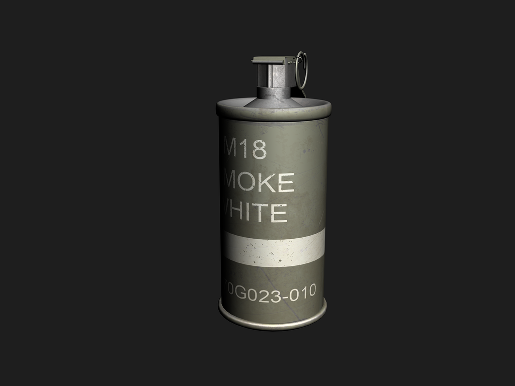
http://i266.photobucket.com/albums/i...egrenade-1.png
Not the best skin in the world. I just figured I would get some practice by painting up on my old Smoke Grenade model. This skin has pretty much gotten me used to using my tablet.
Very nice. I like the model+skin. They both look very clean.
In-game it probably wouldn't look that bad, since it's pretty small and even in FP you probably wouldn't see much of it.
pretty flat and bland. damage is so insignificant you might as well have not done it.
It wasn't supposed to be crowded with damage. Too much damage can make a skin look bad.Quote:
Originally Posted by SnaFuBAR
Most smoke grenades are pretty bland.
http://img.redwolfairsoft.com/upload...G-07-045-L.jpg
I also didn't put much time into making the skin beautiful. It was just practice so I could get used to using my tablet when skinning.