Ahh, that makes more sense. Thanks :P
Printable View
Ahh, that makes more sense. Thanks :P
Thats awsome i luv disasters animationQuote:
Originally Posted by ODX
Oh God, he joined Modacity as well.. Daniel is annoying as hell on Halomaps..
LOL, he might have changed newbkilla, ya never know :p
legitQuote:
Originally Posted by NuggetWarmer
E: also, sup daniel.
2L3G1T 2QUITQuote:
Originally Posted by Heathen
fashoQuote:
Originally Posted by paladin
http://img132.imageshack.us/img132/7582/smg1.jpg
http://img44.imageshack.us/img44/1630/smg2.jpg
WIP. Boba pointed out to me that the thing on the butt of the stock is supposed to be a button/clip thing, which makes sense because it would allow the stock to fold. So I'll fix that. Yes, there's a bit of stretching in areas too. Any thing else I don't see, or any good ideas for it?
Iunno, the "body" of the gun just looks like it has a really boring shape to it- it looks more interesting in all of the games.
Looks nice to me.
Not to busy and nicely done.
Hand grip is a bit too blocky. Also, the skin looks a bit bland without scratches. I see some, but they are a bit too subtle.Quote:
Originally Posted by flyinrooster
I could up the opacity. I'll try that.
not directly, but since normalmaps are made the exact same way, and you only really just need to bake out a template, yes i guess you can bake out a normalmap.Quote:
Originally Posted by mech
http://img23.imageshack.us/img23/2157/71505998.png
My only complaint-- texture is stretched there and would look like crap in first person.
l2readQuote:
Originally Posted by itszutak
He already said he knew about the stretching and that he was going to fix it.
Never actually said I'd fix it, and you actually don't notice it in first person because of the angle its at. I may fix it, but the uvs are kind of compact, and there's not much room for expansion.
So, uh http://feignphoto.com/newtemplate/index.html
The bio and contact pages are done, the flash-based gallery will be up soon. What should I do for the front page? I was thinking having 1 main photo (that maybe cycles - java based slideshow or something) and some sort of greeting message...
Anyway, crit for the whole website, welcomed. The URL is obviously temporary, as I don't wanna take my current website offline just because I'm testing this new layout.
Don't make people wait for your website to load.Quote:
Originally Posted by Reaper Man
LightBox 2
FrogJS
LightBox supports multiple galleries per page, but FrogJS only supports one. I've heard there are ways to get FrogJS to instance on a page with frames, but I've never tried it.
The benefit of FrogJS is that the gallery is just there. No need for the user to click and wait (all images can be preloaded).
As for the Bio site, very nice photo, but I'd go with something that shows your face. The purpose of that picture, I presume, is to show yourself; don't make whoever looks at it guess how you may look.
As for the front-page. I wouldn't put anything fancy there. A description that can be read in 5-10 seconds with 12-14 pt font. I'd have a link to your porfolio as well.
If you hand your card to somebody, and tell them "Look at this website for my work," make it easy on their time because they won't spend more than 30 seconds looking at the site as a preview (then if they like what they see they will continue).
I'd add some more CSS to the links at the bottom (when you hover over them, they light up), and for the contact page I'd do the same. It wasn't obvious that those were links (I would use a simple font there and preload the images).
Lots of small things, but they all kinda collude, so I'd fix 'em.
Quote:
Ivan Feign is an 18 year old, self-taught photographer who, at the age of 15, first picked up a camera, and,A[just a suggestion] after getting his first DSLR on his 16th birthday, he was completely hooked on photography.
.
.
////
Since then he has, on top of his creative photography, covered events such as proms, performances [which ones; link would be nice] and commercial advertisements [example? link would be nice].
Ivan mainly uses his DSLRs for his photography. However, forartistic endeavors[don't use complex language to describe something simple; e.g. (artistic photography)], he usesrepertoirefilm cameras. Ivan usually uses color slide filmssuch as Velvia and Ektachrome. He usesas well asIlford films for black and white photography.
/// <-- this section could compressed and combined a bit
.
.
Ivan will be studying photography at Savannah College of Art and Designas a cohort of the class of 2013where he hopes todelve deeper into the world of photography[again, use simple language; (learn more about and practice his photography).
The photo is sorta temp, it was the only nice one I could find. I'll take a self portrait soon, since I also need one for my Student ID at SCAD. I was thinking of adding a glow to the links at the bottom on mouseover.Quote:
Originally Posted by MetKiller Joe
I'll look into those galleries, thanks. This is the one I was looking at though, I like it because it can have multiple galleries http://flash-gallery.com/zen-flash-gallery/demo/
E: Wow, lightbox looks pretty sweet too, I hope you can disable the blackout when you click the image, as it sorta defeats the purpose of the design of my website (photo studio/projector backdrop)
I'll look into it tomorrow. I've got a cold and it's 1:50am. I need some sleep.
http://i56.photobucket.com/albums/g1...Concept2-1.png
Concept for a Netbook OS such as Moblin; this screen would be accessed by clicking "Applications" at the bottom, then "Internet" and then "Browser." I am aware that the dimensions of certain objects (sidebar, for example) are fucked.
e: Oh, and this is just the layout. Final product would NOT look like this, though the layout would remain (having used all the constructive criticism possible, of course)
Like I said on AIM.Quote:
Originally Posted by Huero
Its ugly because it seems to crowded.
Here's a small update on my works. The first one is a person i was assigned to make in pastel in my art class. The last 2 are photo of a plant infront of my house (color might be off since my screen isn't calibrated correctly right now).
http://kid908.deviantart.com/art/Steve-Carell-125387598
http://kid908.deviantart.com/art/The-Flower-1-125388285
http://kid908.deviantart.com/art/The-Flower-2-125388468
Good shit to me.Quote:
Originally Posted by kid908
While the flower shots are nice and all, it's sorta boring to have them composed dead center. I do love the contrasting colors though.
Why does it have scanlines?
uh cuz i didn't scan it. photographed and there are distortion because of the angle; i tried to get as centered as possible then just cropped some parts out.Quote:
Originally Posted by Reaper Man
also the flowers...uh i accidentally uploaded the same one twice =\
No, there's lines going across the image, scanlines or just bad compression.
Tell me which image cuz I don't really scan anything so im troubled by your comment.
also here was the actual other flower image lmao.
Heathen, stop quoting photos. It upsets me :(
Been adding shit to the Falcon. Gotta fix errors and change some stuff around ya
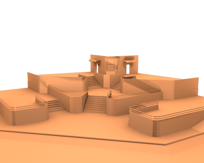
working on a forerunner flag pedistal.
http://img7.imageshack.us/img7/9457/pedistal.jpg
http://img195.imageshack.us/img195/199/sideviewd.jpg
Some other Sci-fi hallway
why is it that any time i post anything it it quickly overshadowed by another's work/ignored completely
thanks for the crit though guys i REALLY appreciate the effort
I know, I don't realize that I do it :(Quote:
Originally Posted by Jean-Luc
It happens to everyone so dont take it personal.Quote:
Originally Posted by Huero
A bit too much stuff to sift through, and doesn't seem as intuitive as it could be. Also, doesn't seem very customizable.Quote:
Originally Posted by Huero
Quote:
Originally Posted by NuggetWarmer
Gone a long way for the better. The turrent at the buttom, looks funny to me. Lol.
ftfyQuote:
Originally Posted by Fear1337
Why the hell does everyone call them turrents?
ftfyQuote:
Originally Posted by ExAm
Mine was ignored too :l But hey, must have not been too bad, because someone would have already said so.Quote:
Originally Posted by Huero
http://i.eprci.net/picard-facepalmQuote:
Originally Posted by =sw=warlord
Look at you, look how wrong you are :downs:
Let me break this down for you. It goes like this:
Since the word is a compound meaning "every one", It is, in grammatical terms, singular. Here's a situation in which you would use "do":Quote:
Why the hell does everyone call them turrents?
"People" is plural, and thus justifies the use of "do".Quote:
Why the hell do all you people call them turrents?
It's a little thing called subject-verb agreement. Look it up. :eng101:
You do realise i was joking right?Quote:
Originally Posted by ExAm
Maybe i should just use :effort: each time i be sarcastic.
Make it clearer next time, lest you face my wrath again.Quote:
Originally Posted by =sw=warlord
Look carefully and you'll see. Hmm, did you use digital zoom when you took that? Because it may explain the banding. On closer inspection it looks like aliasing/pixellation. You should never use digital zoom, it's better to crop an image post-process, since that's all that digital zoom is doing.Quote:
Originally Posted by kid908
If you're talking about the pastel, I had to manually fix the proportion in PSP b/c i didn't center the camera over the shot correctly. I would can it, but 1.) pastels tend to leave behind marks 2.) I don't have a big enough scanner. If it is the flower, I'll have to take a closer analysis.Quote:
Originally Posted by Reaper Man
...pastel?Quote:
Originally Posted by kid908
http://allaircraftarcade.com/forum/v...=199788#199788
fuck reposting all of that here
How sexy would this look with a texture. Lol
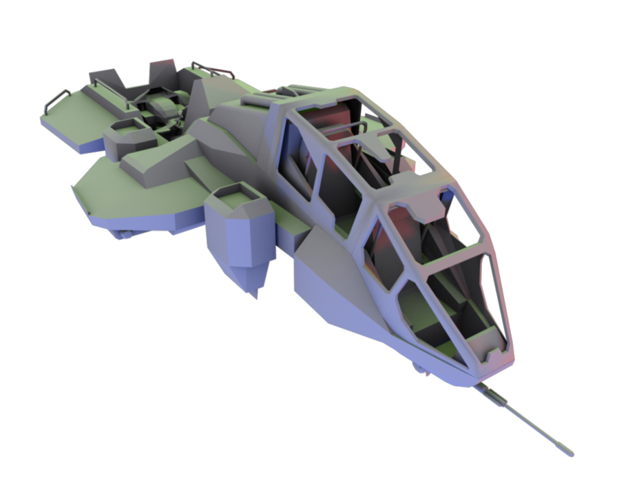
http://i58.photobucket.com/albums/g2...t_render_1.jpg
Basically I was bored and wanted to set up a good rendering scene. Tryed the pelican first.
http://i58.photobucket.com/albums/g2...n_render_1.jpg
Will try again when I have textures and normal maps :P
nice
Looks like something from an anime; otherwise, nice.
Could do with a little less DOF, but otherwise nice. I really like the way the models seem to pop out of the scene. Textures and normals would also help that. Could maybe do with a few more lights shining up from underneath, just not that boring-ass purple/green stuff.
Dude, nice renders. That mental ray?
Default scaline
O.O i didn't know it could do some of those effects
It always could, you just needed to open the effect panel.Quote:
Originally Posted by Rob Oplawar
Been working on a foreruner platform i would like some advice on.
Im baseing it on some halo 1, 3 and halowars style and tech.
Any help or ideas would be greatly appreciated.
Its ok, but whenever I make or think about making forerunner :P, I always think, 'Would Bungie use it?', So keep playin with it until 'bingo'
I know im thinking of adding braces of some sort or having some kind of energy rope because with that much weight on just the point where it goes into the wall/cliff/what ever would most likely cause the thing to snap off if there was a earth quake or large explosion.Quote:
Originally Posted by Malloy
That, is what i need help on ideas for how to brace it.
Not getting the Forerunner vibe; I can't really explain why, I'm just not. It's either there or it's not, and in this case I can sort of see some elements of their designs but they're not assembled in such a way as is required to make a whole.Quote:
Originally Posted by =sw=warlord
That probably makes fuck all sense, but I think you get the picture.
This looks a lot like construct, so if you'd like to approach a more forerunner style I'd suggest taking a quick peek at that level for reference (if you don't have it PM me and I'll send you some screens). Right now, it is a bit too flat and there isn't much going on up top. Nice architecture, just there isn't enough of it.Quote:
Originally Posted by =sw=warlord
@rossmum: yes i know exactly what you are saying, the two modules i have infront of the generators i think i may remove as they just don't seem to have the correct vibe, they were based on something found on the ark but in this situation im not sure their appropriate.
Could be why it dosnt seem forerunner and i think i may need to remake the sides where i was going to add a light strip.
@metkillerjoe: Yes i've got halo 3im playing it now actualy to get some ideas for what to add to the model.
Im planning on having this as some sort of generator platform where the generators absorb ambient heat to power a station near by which i think would make the environment rather cold.
I found the angles in 'Red' were off maybe because you used a bevel then scale approach?
http://img4.imageshack.us/img4/3886/cobbycrit.jpg
Edit:
Unless you rendered in 'User' for some obsurd reason.
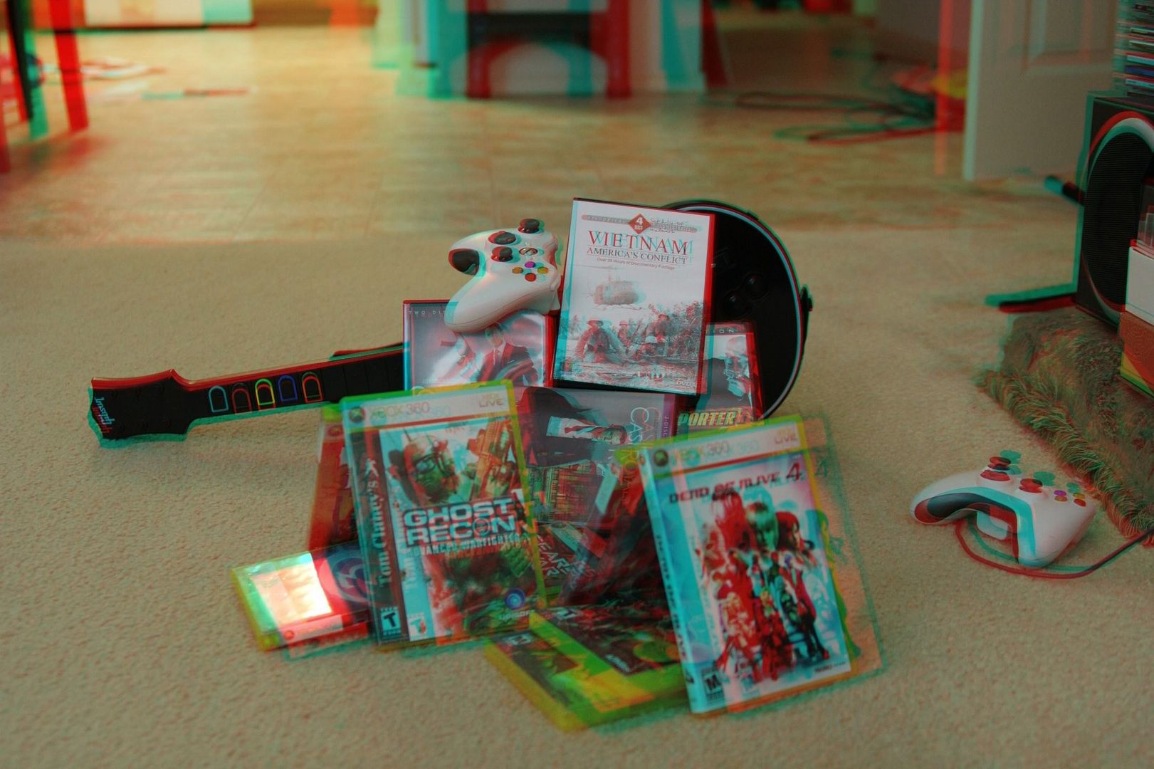
Pull out those 3d glasses! Here's a few games and movies i pulled out and made a 3d image from. Those are some, not all if you're complaining about my game selections.
You have acheived the effect well. Really pops out of the screen. Looks awesome.
I only have polarized glasses, none of those red/blue ones :(
^ same.
Redo it using the polarization method.
you do realize there's nothing you can do to an image to make it polarized on a monitor?Quote:
Originally Posted by Llama Juice
pretty sure he knew that.Quote:
Originally Posted by Con
Yea, but does kid908 know that? It's like going to a grocery store and asking them to get cashews in a shell.Quote:
Originally Posted by Con
Or headlight fluid.Quote:
Originally Posted by Llama Juice
roflQuote:
Originally Posted by ExAm
Updated my platform.
Hopefully this will give it more forerunner vibe, the idea is its a platform for power generation and the three structs next to the emmiter are there for cooling purposes.
If i use this then it will most likely be used in a ice map of some sort.
http://img200.imageshack.us/img200/6489/platformx.png
Forerunner architecture elements do not a Forerunner construct, make.Quote:
Originally Posted by =sw=warlord
You have a pulse emitter without any casing or deeper construction - you can't just have it sitting there on the platform without any interaction with anything else. It just doesn't work.
God dammit people stop making me have to rant on Forerunner systems!
Thats my point, how should i progress to make it interact more thuroughly because if i felt this was good enough i would not be asking here in the first place.
I went through the halo trilogy campaign yesterday just for some ideas and i cannot think of any ways to make the main idea work well.
for the emmiter should i have something directly below, next to the units besides it should i add something below them to make the module seem more built into the platform?
Those are the things i am asking.
The generator belongs in a room, preferably cavernous. Not outdoors on a platform.
Things which do belong on a platform are those weird Hog-sized cube duders, or simply blank space for a landing pad.
e/ Oh, lose those supports, too. They just look wrong. If you absolutely must have some kind of support (which I don't really recommend, most small-to-medium-sized Forerunner platforms are cantilevered and the larger ones are typically supported by pillars), make it conform to Forerunner angles and design. Triangular lines and 30/45/60-degree angles are the way to go.
Exactly. As I said, a casing and deeper construction.Quote:
Originally Posted by rossmum
Every model begins somewhere...
http://tehlag.modacity.net/one/pix/wip/ODST-04.png
http://tehlag.modacity.net/one/pix/wip/ODST-05.png
I've taken a few creativelazinessliberties with it, so do bear with me on those. I suppose my detail distribution is a little wacky; in some places I've modeled in tiny details while others are flat and bland... I suppose I'll go back over it when I've got more direction in what I want to model and decide on one or the other. This is also the first time modeling that I've made a deliberate effort to keep my number of tris (vs. quads) down, with questionable success.
Any worthwhile comments would be much appreciated.
http://img3.imageshack.us/img3/6928/odsthelmet.jpg
How many polies is that helmet? The wireframe looks clean.
@warlord:
http://img3.imageshack.us/img3/9828/platformcrit.jpg
Just some suggestions. Disregard the red spray, I was going to indicate that's where you could put the reflective material, but then I just realize that was everywhere anyway.
Looks nice and minimalistic, that's why I'm suggesting you make the materials stand out.
Edit: @lag below:
You can always just use it as a high poly model and bake some normals. It wouldn't fit in Halo unless you brought down the LOD; though, I'm probably not telling you something you didn't know.
Oh wow, I feel dumb. Turns out my ref was stretched out horizontally about 50%, no wonder it's too long...
Good thing I caught it now at least.
Also 3114 Polies total (:(, though keep in mind my above comment about detail)
Ive got some crit for you. MAKE THE REST OF THE BODY, PUT IN-GAME, AND RELEASE! Okay :)
Seriously though, looks amazing. How many triangles is it? And what references did you use?
At this rate the whole biped will be far to high poly to put in game
stop modeling for halo ce, it's inferior.Quote:
Originally Posted by ICEE
This, but if he was, all he would have to do is take his high poly mesh into Zbrush and use its retopo tool to make a low poly version.Quote:
Originally Posted by SnaFuBAR
Indeed. I plan on downresing it for CE use, but right now I'm not constraining myself (or rather, I'm only constrained by my ability).Quote:
Originally Posted by ICEE
Already said the tri count. My primary ref for the helmet was this, along with H3 ODST screenshots and other pics from the B.net concept art page. The Art of Halo 3 helped too.Quote:
Originally Posted by Hunter
Hey lag, have I ever told you that Project Shockwave needs you?
wooooo
'was bored during lecture.
3D Fractals(ish). Cool.
or just use the 3ds max optimizing tool:rolleyes:Quote:
Originally Posted by Disaster
If you have ever used it before then you would know that it screws most models up pretty badly and doesn't optimize properly. :rolleyes:Quote:
Originally Posted by kid908
Quote:
Originally Posted by Disaster
No. It doesn't screw it up. It turns it into some low poly crap model that you didn't make. If it screwed it up, it would just look ugly, but this does a worse job then that. Lol.
Wut limits.
Ill get unarmed animations later to show the full spartan. How does it look?
Nice find.
teh shoulder and armpit look fonky.Quote:
Originally Posted by Spartan094
I blame the uvw's and the rigging :(
nice baking
http://i623.photobucket.com/albums/t...on_handgun.jpg
finally got legal approval to post this.
yes i know there's a lot of stuff missing and it could never work as a proper gun, but that's propably because i don't really have any gun-knowledge of any kind whatsoever.
But then again, who cares, i had time to kill and felt like building a gun.
I'm not too happy with the 2 stripes on the front of the thing, but i couldn't really come up with anything more interesting to put there. oh well.
edit: albumfail, guess ill photobucket it.
Uhh album fail?
http://www.modacity.net/forums/image...?dl=1245146835
That's all I could find of what you're trying to post... and that's tiny so you can't see anything :/
From what I can see it looks like one hell of a gnarly nerf gun haha (Make a skinned version with bright colors please :3)
In all actuality though, from a design standpoint it has an interesting shape and good silhouette with a lot of neat little details thrown in to keep the bulk of it interesting. I'd like to see a wire of it... and the full size image haha
The diffuse isnt baked at all. The multi is somewhat bumped.Quote:
Originally Posted by neuro
eh maybe work off the circular piece underneath em... kinda like you did on that piece under the scope's screw.Quote:
Originally Posted by neuro
does look like a gnarly nerf/water gun though.
Looks like it belongs in an Unreal Tournament game. Has that kind of goofy not realistic look to it. Things that should be fixed would include the trigger. Looks uber tiny and kind of dumb. None the less, it's a decent model. What did you make it in?
Its not baked :S Its turbosmoothed... Looks awesome, I am learning how to sub'd models. Will be awesome when I can do it properly.