Quote:
Originally Posted by Sel
Needs a big tube subwoofer in the back :iamafag:
Printable View
Quote:
Originally Posted by Sel
Needs a big tube subwoofer in the back :iamafag:
Stage one of a photo I took with my phone. Cropped in mobile photoshop (note to self: bad idea, more control on my computer) and somewhat edited, then edited in photoshop essentials.
I then proceeded to do this in Paint.NET
crits? is it any good? do i have any possible future in photography?
e: sorry if it's not showing on the forum, just click the image to actually see it
Fixed the links for you, next time use the direct link url from imageshack.
Interesting composition, but not the most exciting of photos. Got any other photos to show?
Afraid not. These are literally the first photos I've taken outside of photo class that I meant to be artistic. I don't even have that DSLR I asked you about yet. I could scan a few of the photos I have in my portfolio in school, but I fucked up the printing process on the best one (super interesting IMO) so everything's at a shitty angle.Quote:
Originally Posted by Reaper Man
Viewport grabs so aliasing is there, but who gives a fuck.
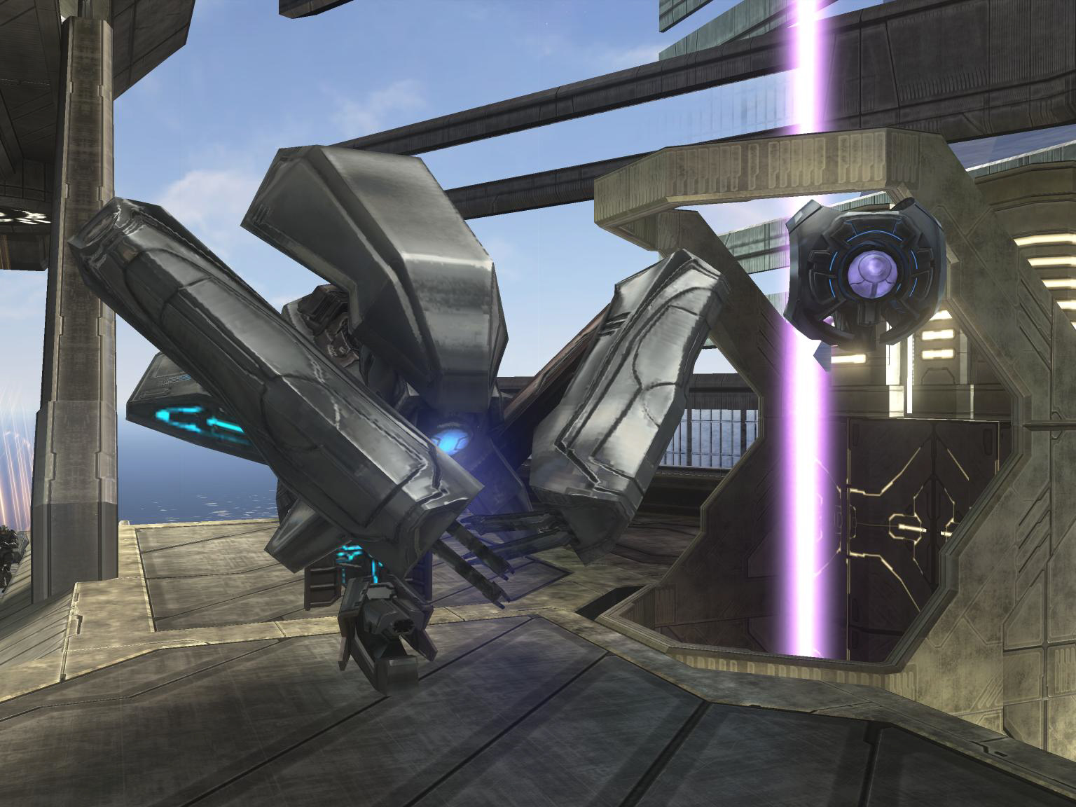
Basically a small shitty scene I'm just chucking garbage in to learn this thing. By the end it's going to be a complete clusterfuck of stuff of pretty much anything possible. (old flood thing for the advanced skin materials and shit) If anyone knows how to improve the shadows and lighting please speak up, lightmass is just bouncing it everywhere. Might have to use one of those new importance lights or whatever they are...
Modular piece I made for this very learning experience, just a light fixture type thing that can be stacked on itself. Tweek told me its too busy, and I agree.
But I like busy. I like to focus on specific parts of a piece and follow them around like a little journey across the surface, looking at certain shapes. I'm like that with musical taste too. Lots of layers and just focusing in on a different one each time.
So yeah, if it's too busy or too much going on that's a design choice.
It does look a little too schizophrenic. It would be nicer if it was a bit more clean because right now its just too much took look at.
That box thing you have going in the viewport seems to have a lot of emissive spots for the sake of having emissive spots. They don't really add anything, imo.
As for lightmass, here's the official article. Just Ctrl+F "LightMassImportanceVolume". Its a volume that lets you control the emission of the photons (number of bounces, etc), intensities of AO Spec, and other stuff like that.
I agree, there's way too much going on in that scene that it's hard to look at. The number of lights on those machines alone is mind-boggling. You just need to reduce the number of individual panels on all your textures by opting for simpler, larger patterns.
It would maybe look better if you left the core (centre) of those structures with lots of lights and removed them from the protruding parts (legs).
Yeah I have an importance volume. You can't build lighting properly without one.Quote:
Originally Posted by MetKiller Joe
I'll try toning down the emmisive stuff, but the shape complexity stays. IT's supposed to be ornate, that's why I love forerunner. If I twanted to d o big flat simple plates and stuff I wouldn't really be pushing myself creatively and I probably wouldn't be having any fun.
But I agree the number of lights is too much.
Way way way too much detail !!
Yes, you are right, forerunner is intricate and that's what makes it interesting. You could definitely keep all of the detail, but I'd make it so that the end-user doesn't have to look at all of it at once:Quote:
Originally Posted by SiriusTexra
http://img682.imageshack.us/img682/2328/texturea.jpg
http://img193.imageshack.us/img193/9...nteresting.jpg
I did a shitty job of illustrating it, but what I've seen in many forerunner textures is that the major details are there and if you keep looking you find more stuff.
Detailing the metal would also be awesome not just putting cool lines hither and tither. My two cents.
http://img526.imageshack.us/img526/9...nteresting.jpg
Is it wrong that I think this looks more "Forerunner" than what Dane posted?Quote:
Originally Posted by MetKiller Joe
also brb modelling it
you gots good taste in game engines :iamafag:Quote:
Originally Posted by SiriusTexra
Is most of that normalmapping and textures Like, how much of it isn't actual geometry?
:( But I like the pretty lights. :P
hooray i don't need to double poast
I like it but its not very Halo, if it was sposed to be.
Quote:
Originally Posted by Cagerrin
You people obviosuly don't know what forerunner is.....
What he posted has nothing to do with forerunner. That looks more like generic sci fi to me.
I see maniac just confirmed what I said.
You are only half right. Your refering to forerunner architecture textures, that have specular variations rather than physical indents.Quote:
Originally Posted by MetKiller Joe
This object is a specific generator type thing.
And what are you talking about in relation to the metal detail. That is purely subjective. There is more work there than simply "drawing lines".
I made these more subtle material detailing to not obscure the heavy design detailing.
Just a sec i'll get a flat of the material so you can better have a look. Again, I am aware its clusterfuck detailed. That is my purpose with this. IF I made something safe or realistic or simple I'm wasting my time. I do things to do them as crazed and brilliantly as i can. Subtlety has it's place, as does chaos.
Material, and then flat with no extra shit.
Theres a bit better a look, however this is an old material since this is the old version from my desktop here at work.
quite a lesson in elitismQuote:
Originally Posted by SiriusTexra
i should have taken notes!
MetJoeKiller, you are on the right track for sure.
Just look at your texture though, find the parts that have angles that are less than 45 degrees, any sharp angles (obtuse is fine) need to be fixed for forerunner, im gonna make a couple pics to explain myself better.
Look it has nothing to do with opinion. The lines are all wrong, the widths are wrong, the structure is wrong. It looks like random shapes rather than specific thought into how the shapes flow with each other.Quote:
Originally Posted by Huero
It has nothing to do with im right your wrong. I'm not the right one here, bungies forerunner style is right here, and that looks more like something from starwars or similar copy cut games style. Just generic shape on shape diagonal lines.
This is what i was talking about.Try to stay away from any angle thats under 45 degrees, it really takes away from the forerunner feel.
http://i159.photobucket.com/albums/t...ac1000/pat.jpg
Now, obviously i should have changed my grid size and not made that inset shape a box in the last pic, but you get the idea.
second example doesn't look quite right, shouldn't it be more like:Quote:
Originally Posted by Maniac
___________
/__________|
|__________/
?
doesn't seem right without the inset angles matching the slope
Yes it does not look right because i just made it real quick and never changed my grid size, if i had then the inside of that shape would not be a rectangle.
There its like that.
http://i159.photobucket.com/albums/t...ac1000/pat.jpg
Quote:
Originally Posted by SiriusTexra
Honestly when I saw the pictures of your project in the UDK it didn't scream out "Forerunner," it screamed out "holy shit that's a lot of detail."
Forerunner throughout the games generally seems a bit more subtle, less contrast-y and not so overwhelming.
But, I guess overwhelming and high detailed was more of what you were going for? :v:
I don't know if it's just me but that doesn't look forerunner in the slightest. Do you have a... better example? Like, an actual texture using these techniques?Quote:
Originally Posted by Maniac
Someone make a picture showing all the profiles that are used in forerunner architecture. I need it for modeling and I am sure many others would want it as well.
Most recent attempt.
http://img707.imageshack.us/img707/4325/forerunner.png
It is all continuous btw. Sealed water tight.
I don't think that looks bad at all. The only issue I have is the walls- they look good, but are too repetitious. I recommend having every few columns be outward, instead of inward, and maybe extending to the floor. That will break it up and add some variety.Quote:
Originally Posted by DEEhunter
This is the last texture i made, it was a little while ago now.Quote:
Originally Posted by t3h m00kz
Deehunter, that looks really nice.
Waitin' on them profiles yo. I create paths in illustrator and use them in 3ds max when modeling stuff. Helps a lot so I can know what kind of details would suit a certain type of topology.
you know you can use snaps combined with angle and rotate from edge to make the exact shapes?
huh filefront deleted that a while ago, srry no link.
do these help?
http://i159.photobucket.com/albums/t...runnercopy.png
http://i159.photobucket.com/albums/t...tebumpcopy.png
I was thinking something more like:
http://i159.photobucket.com/albums/t...ac1000/pat.jpg
Better view of the crappy wall.
http://img690.imageshack.us/img690/5391/85843139.png
Maniac I have your old tut if you want me to upload it.
I was thinking you could use photoshop to cut out the pieces that you wanted. :)
turn snap on, snap to grid,edit tab/ preferences,set the grid to 4 8 or 16 and use the polygonal selection tool to cut out what you need.
please do chainsy.
Well my professor decided to make some changes to the final project so I'm no longer going to use the groza. Inside here is the high poly model for a M91/30 Mosin Nagant, which i'll bake onto a low poly. Don't worry ICEE I'll still finish the groza for ya.
http://img12.imageshack.us/img12/461...agantright.jpg
http://img12.imageshack.us/img12/983...ntreceiver.jpg
http://img44.imageshack.us/img44/154...nagantbolt.jpg
I'd slide that bolt back if you know what I mean.
BoldQuote:
Originally Posted by Maniac
Dug the model out of windows.old
What should I add and such? Not asking about texturing obviously.
Needs some context, why is there random tower thing sticking up out of nowhere. Maybe model some other smaller structures around it. I think its maybe that you just made up your own architecture style there, it would look a lot better to have more of a base of what exactly it is.
So im looking for some design tips on my halo 1 style forerunner.
What im aiming for is the original forerunner design not the ornamental variation shown in the later games.
What im looking for is the design shown throughout the second campaign level in Halo CE.
Dane if you could give some advice i would greatly appreciate it as you sweem to have the forerunner stylization nailed down pretty good.
Im aware there are a few smoothing errors and crimpled surfaces those will be ironed out soon, once ive got the rest of the interior made.
Your angles should be down a bit in the Hallway part that connects to the door. It's also quite messy in a few area's, with weird crumpled/faces, and smoothing won't really fix these as good as it could be, ingame at least.
As i said the crimpled parts will be ironed out.Quote:
Originally Posted by higuy
Finally got some free time today to finish up the shadows/highlights. Anything I should add or take away or improve?
Mouth looks too far up on his face and a little thick, little line under his mouth seems out of place...on new fred make the straight line inside his collar a little curved, on old fred get rid of that extra curve inside his ascot, just make it one smooth "U." Looks great otherwise though, nice work.
He's so smug
I'd shoop that into an MLG variant but I'm fucking lazy.
Looks really interesting but overall seems too vertical.Quote:
Originally Posted by DEEhunter
It looks really interesting from that angle but I think from on the ground it will look more bland because less is being seen. Does that make sense?
I also can't really see any gameplay, mostly because I don't know how the player would move between levels. No visible ramps or ladders.
Wallpaper, as requested by Advancebo.
1920px × 1080px: http://img23.imageshack.us/img23/2784/siwallpaper.jpg
I don't really like the way that shade of red looks with the rest of it. Maybe I'm just used to the green/blue scheme usually found with the Superintendent, but there's some clashing going on there IMO.
The red-orange color was the one set for the ">>Mind the Gap<<" writing. Seriously. I can make a blue one, though.
e. here it is
http://img194.imageshack.us/img194/3...lpaperblue.jpg
i think it looks cool, it just looks too orange for my taste. darker red?
Get rid of the aliasing?
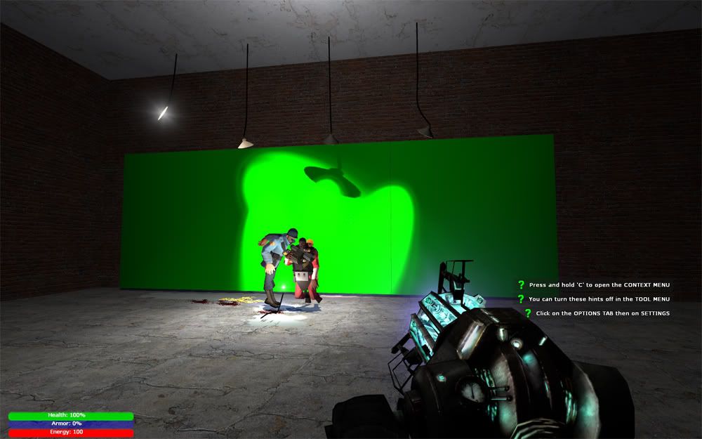
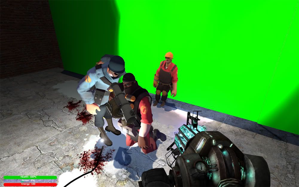
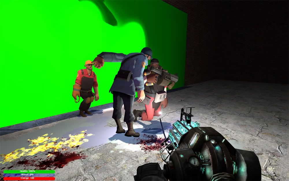
Hay guise look what I made
http://i231.photobucket.com/albums/ee6/TheExAm/SVD5.png
Thoughts?
fitting.. engineer loses lol
im sorry but virtual green screen > . <,
love it.


To do:
fix the eotech's ugly shaders
fix the eotech red dot in it
replace fp arms
make the throwing knife shine better (and not clip)
anything else?
btw first for mw2 weapons in ce (I think, never seen anybody else have them in ce)
... *to do : stop ripping and make something cool
^ to do: stop making posts that resurrect ancient arguements
To be honest, I think they look bad. Heres why.
The textures used on those guns and guys guys use normal maps as well, and are made in a next gen fashion. There going to look bad in halo becuase basically all your using is the diffuse and a multi with a cubemap. thats not adding much. The P90's skin just looks horrible, not sure why, but thats just my opinion, probably becuase of what I stated above.
The p90's scope's red dot or w/e isn't red, lol. (or its just really hard to tell, get a multi to make it buldge out more in that color)
You probally don't have a alpha on the bipeds diffuse, do you? It's very plasticy looking. Put an alpha on the diffuse to control were to shine and were not too. You can also use a multi, but there's no harm in using both. Thats going to fix alot and make it look alot better.
Acutely I am not surprised that somebody usually tries to make an argument with me when ever I post or release something, his little post doesnt bother me and has failed to attempt a flame warQuote:
Originally Posted by ICEE
Thank you best post/crit I gotten next to lags and consQuote:
Originally Posted by higuy
It is true its made for the next gen and it will look bad in hce, just doesn't stop me from trying to do new things anyways, eventually I'll make it look decent in hce, just takes alot of trial and error. The eotech's red dot is red in the acutal diffuse, just looks like total shit when I put it in hce and I cant seem to fix it.
Also since I never wanted any crit on the biped (which I knew it was bad from the start since I just did some quick shaders on it). Oh I never did add an alpha onto the biped's multi not diffuse bitmap since as I said was a quick shader and I wanted to have it in-game and it has a shit cubemap on it to anyways.
maybe explain how you're doing new things? because... being the first to rip content from mw2 and put it in CE is not accomplishing that.
Spartan, this is the quick crit thread not the "look at me i can rip things from other games and compile model+bitmap tags!"
Bro, didn't they just say not to resurrect old and dead arguments no one cares about? I'm not trying to backseat here, but try to leave it at that.Quote:
Originally Posted by =sw=warlord
He's literaly just said "dont crit this im just showing it off because i want to cool:downs:"Quote:
Originally Posted by Heathen
Seriously come on, it's the crit thread not some gallery to show off rips.
It is to show the shaders but I forgot to say that in my post, but yeah anything I post thats in hce would usually relate to shaders on how they look.
@warlord: I would suggest you think before you post. Its to show OFF THE SHADERS, christ, but I forgot to say that in my post.
You said you put some random cubemap in there, so tell me how long exactly did you work on these shaders?Quote:
Originally Posted by Spartan094
Im not trying to be condecending or giving flamebait but from what i can see, you've imported the model an applied a diffuse and arbitary cubemap woohoo?
I see no definition in the model at all and so far it looks more carboard cutout thats been glued at the seams than a actual weapon.
May i suggest you have two shaders on that model, one for the gunmetal and one for the plastic ammo clip.
Oh ok.Quote:
Originally Posted by =sw=warlord
The shaders I did in 10 minutes if not less since I wanted it in-game and done to see it. It has everything you expect, bright diffuse (fake bumped), multi with no alpha channel, and then the cubemap properties. I used the warthog cubemap and then the whole brightness thing set all to 1 (which is bad, I know) so yeah. I might have set the perpendicular brightness to 0.5 and then everything else at 1
Faked bump map is making everything look like shit. Don't even try to fake a bump map. Its not going to add any depth as the mesh is going to still be flat. All of the information you need is going to be in the diffuse.
Ugh, enough of that stuff, you posted enough times and told enough times how to CORRECTLY fake bump but you didnt know that mw2's normals map have NO Z (Blue) channel at all, ask disaster, I showed him a m16 normal that doesn't have a blue channel at all, just white. I had to edit mw2's normal maps that got ripped, they are desaturated normals where the red channel is the alpha channel map and the green channel is the entire RGB. There isnt a right way to fake bump any mw2 character, weapon, scenery, or vehicle unless in photoshop you take the normal and brighten the thing +100 and the constrast -50 and maybe do it twice then it will look semi like how it should be in the blue channel but it will look ugly and wrong.Quote:
Originally Posted by DEEhunter
Besides, ill just AO bake the weapons like higuy said on xfire to add shadows and such.
Don't even worry about fake bumping and the AO is already going to be on the texture. Don't overdo it.
Either you aren't ripping them correctly or it uses the same compression method that fable uses.(bumps are not normalized.)Quote:
Originally Posted by Spartan094
Um how could I be ripping them wrong. The modding tools were never released btw. 3ds dx ripper does the same thing to normals as the iwi to dds for the other cod gamesQuote:
Originally Posted by DEEhunter
Cod4 and Cod5 have Modtools.Quote:
Originally Posted by Spartan094
Cod6, uh, what modding? :realsmug:
Yea, games use a different compression method for normal maps. An example is unreal engine, how the normal map looks completely different after it is imported. If you where to invert a normal map you would probably get an image that is simular to what you may be talking about. Since you are using DX ripper(lol) then you will only get the normal maps that are loaded into memory, which in fact are compressed to an optimized format according to LOD. Try ripping from the actual game files and not from a frame.
Go argue with the person who makes the cod4 and cod5 files rippable (xmodel). Also why in the first place would you care so much to put in a effort into a post in which it doesnt matter if cod mw2's bitmaps are faked bump and models ripped by dx? and only the 3p models will be affected and not fp. Like it matters..it doesn't. You cant rip the raw files (unless you spend lots of time in which you can use dx ripper)....why start a big argument in the first place? Just a game.
:effort:
Only reason why that was even possible was because Infinity Ward released the ModTools for both of those games.Quote:
Originally Posted by Spartan094
You better tell me what's wrong with my virtual green screen right now mister :|Quote:
Originally Posted by Malloy
Knock off the random discussion.
...another one.
Yellow Means Yield
1920px × 1080px: http://img189.imageshack.us/img189/5...ergreenymy.jpg
1920px x 1200px: http://img695.imageshack.us/img695/2...paperblue2.jpg
you really just made that up by looking at unreal engine, and nothing else, did you?Quote:
Originally Posted by DEEhunter
stop talking bullshit about stuff you obviously dont know much about, becasue you're far, far from the truth. (though you're right about dx ripper, HOWEVER, if it loads a texture, it doesnt just NOT load ONE COLOUR CHANNEL!, do you even realise how rediculous what you're saying is?)
Idea came from an out of focus shot of my laptop case:
When did i say it just loads 1 color channel?Quote:
Originally Posted by neuro
Modern Warfare 2 M4A1 ready and reload animation
Imbrokeu told me to post them. I told him to re-upload it to youtube with something at the end since youtube cuts off half a second but he said nah, well w/e. Here it is.
brokes animations make me
The left wrist/finger frames at the end of the reload look horribly unnatural. Other than that, pretty decent copy
this is how you fix that cod normal map stuff (scroll down to normal map section)
http://wiki.modsrepository.com/index...ty_4:_Textures
I told how to do that a page ago (in a not very good understanding way), and I had to learn it myself :saddowns:Quote:
Originally Posted by flyinrooster
Lmao. For a second I thought they had changed the smug emote to that. Actually, that's a pretty cool idea. Make a :Fred:Quote:
Originally Posted by n00ber
visionary :oQuote:
Originally Posted by Siliconmaster
Still playing with it.
[EDIT]: Since it's hard to point out the exact 'odd' or critiqued locations, a picture is always nicer.
Key
Red - Could connect the meshes to make it seamed together, can't think of the exact word.
Yellow/Green - Areas that, in the render, seem odd and could use a slight touch up in the geometry of it. Move some vertices around so with the smoothing groups applied, it doesn't look oddly shaded.
Blue - This 'bar' looks crooked and not-level, either way it should be inclined slightly judging by the crevice near the door side.
Note: If I got any colors wrong, it's because I'm Red-Green colorblind.
Needs a door handle, looks like the only way to get in is thru the window. The door looks welded shut to the main body tbh. Everything else is good.
Working on a low poly right now. I intend to go through the whole process of getting shit ingame.
Right now it's very boring and I'm looking into ways at fixing that. Maybe I'll throw some straps onto the hilts/grip area or try and see if I can model in some floral bits or something.
The runes are floaters and probably oriented wrong. I'll work on fixing those up.
Looks very nice. I like the nice little touch of the Old Norse rune carvings along the side of the blade.
Yeah I was going to suggest this.Quote:
Originally Posted by legionaire45
Leatherstraps would be cool
Can someone help me on yet another UVW Unwrap.
Ok, It's a magazine low poly model. I'm wondering if there is a way to use more of the space. If not then I will have to deal with it as is. I am going to have something different on the front and back is why I have both sides unwrapped and not stacked.
http://img96.imageshack.us/img96/9945/magazineuvw.jpg
For such simple models I don't really see why the unwrap will need to be perfect, as you will not see it very often.
I can't image anyone looking at all the detail of the magazine.
Post an image on the model, with a wireframe.
Model some bullets, throw those on the same map. (I'm assuming that if he's using a separate map for the magazine than the gun that the model is supposed to be a showpiece of sorts....)
Make the top and back of your mag take up more space on the UV.Quote:
Originally Posted by Terror(NO)More
As is, you're going to have a very low resolution texture on an area that, while not seen very often, is still visible during certain parts of your animations.
Another thing - unless you plan on using that magazine with multiple weapons, you'll want to integrate the UV for that with the weapon it is intended to be used with.
Here's something that might help.