it might be just me, but the way the left arm is positioned just doesn't look right. Feels like it's too far to the left.


it might be just me, but the way the left arm is positioned just doesn't look right. Feels like it's too far to the left.
No it isn't just you. the origin was really hard to set up without looking odd. it looks a little bit more awkward in the render than it will in game because of the increased FOV. in game it wont be visible past the elbow
Good, because I was thinking the same thing. Also, if you can, keep the reloading and stuff down low on the screen because I hate animations that obstruct your view of the game.
yeah I significantly lowered the weapon in all the frames aside from origin for that very reason. now you cant see the tube hanging as much <> but no great loss I guess. It shouldn't obstruct view too much now. Creating a unique melee animation for this thing is hard though. If anyone has any ideas...
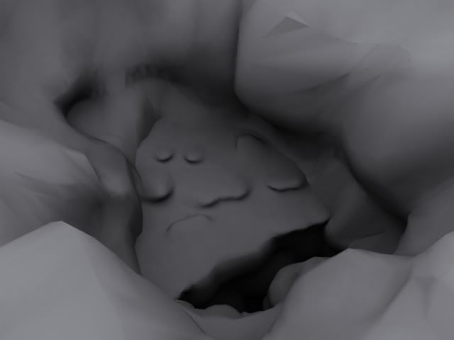
Just trying to improve on my terrain, there was a lot of analysis through SparkEdit that helped me through it quite a lot but this was one of many that I'm the most proud of. Once I'm happy with it I've got an idea of what I'll add on to it.
So if someone could comment on how it was constructed I'd really appreciate it, I find terrain a bit tough.

Suprisingly looks very nice! Keep up the good work. Seems like a natural formation to me.
For some reason that path around the model is turning me off but the rest looks ok.Originally Posted by SilentWindPL

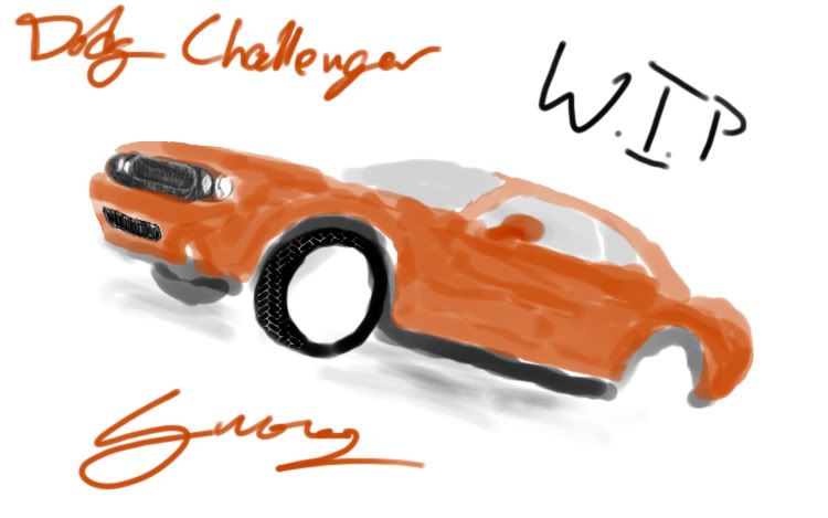
Model that I dug up today and worked on a bit.
E: crap, Double post
Last edited by Disaster; August 24th, 2008 at 07:10 PM. Reason: Double post
looks like it needs more refning but nice layout :thumbs up:
Yeaaahh.. still a WIP.
E: lol forgot the 'e' in Dodge
There are currently 16 users browsing this thread. (0 members and 16 guests)
 Posting Permissions


Bookmarks