You should seriously optimize that thing because it has way more tris than it needs. Its probably your lofts.
Printable View
You should seriously optimize that thing because it has way more tris than it needs. Its probably your lofts.
http://i164.photobucket.com/albums/u...g/MCarms-1.png
BTW not for FP arms. These are going to be printed with CNC
Whoa, thats awsome by far. :O
Might be the render,or its the model, but it looks squished in horizontally :\.
Otherwise great model!
Are your forearms really that short? Looks nice, but they really need to be longer.
@CV
They'll be longer, don't worry. I'm just basing them off my references at the moment, but once I'm done with the detailing I'll get a proportional human model to scale them onto.
@CSF
It's the angle.
hope that's nurbs or at least all quads to convert to nurbs, otherwise good luck cnc'ing that :giggle:
As I dick around :p
E: No, not finished
It's quads, but I have a few tris that managed to get in there that I need to clean up.
Any other crit? I was hoping for some long explanation of something I need to fix from one of you main guys.
http://img15.imageshack.us/img15/9585/fingersj.jpg
We have an update. Should be done later today.
Wow, that's really cool. It'd be neat to see a Halo 1 animated movie with that kind of detail.
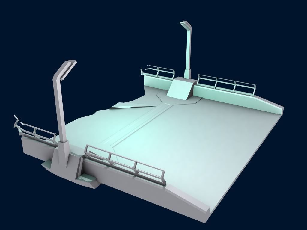
Anyway, progress. I changed the way the back parts connect to the front part. Is it good, or should I change to another look. I'll take suggestions btw. :)
http://i164.photobucket.com/albums/u...g/MCarms-2.png
-snip-
That looks really great!Quote:
Originally Posted by Jean-Luc
I keep thinking its bod making these hands and I think "shit...I didn't think bod could do ANYTHING"Quote:
Originally Posted by NuggetWarmer
They look great.
Working on some of the detail maps from sandtrap.
http://i266.photobucket.com/albums/i...216/wtfhax.jpg
Is that in-game?
No. Just a simple f9 render except the size has been changed.
There is a diffuse and bump map in the scene.
Crit: Make the scanlines more prevalent on the text on the screenQuote:
Originally Posted by Jean-Luc
and imo the texture on the metal needs some sharpening
http://img16.imageshack.us/img16/4922/almostdoneb.jpg
Almost done with this bugger. Any final suggestions before I do the final with post-processing and the like? And before anyone asks, yes, the JAF is my signature but not for my checks youdegenerate scumimmoral people. :p
Also Huero, I did end up trying that scanline look, but it actually took away from the piece so I'm gonna go with the original look instead.
Dont the screens have each individual pixel?
And the letters need the pixel-e look to, so that you can see each little line thing.
Put a couple scratches and a couple dirt/dust specks (around the edges) on the screen. Also, have you tried making the little scratches on the metal surface shiny and not black? It would look more like metal that way and would suit the nice soft specular you've got on it.
edit:
what would look cool is the blurred reflection of a marines on the screen, like he's standing over it. "whoa!"
that's an obscene amount of detail you're asking forQuote:
Originally Posted by Advancebo
That's beautiful. Can I get that in 1600x1200 or widescreen?Quote:
Originally Posted by Jean-Luc
I'd love it as a background too once you do your final render and post-processing
I'll be rendering it at 1920x1200 and 1920x1080 later on. I'll do my best to attempt a full-screen version. I'll try to do the pixels, but no promises, and I'll give it a shot with the shiny scratches.Quote:
Originally Posted by MetKiller Joe
Oh, and the keyboard now looks... out of place. I don't know why or how, but it does; just putting that out there.
like i did with my dick
http://img155.imageshack.us/img155/7366/testingj.jpg
Not sure if I care for how pixels look on this particular piece, but the lighter scratches seem to be doing a good job. Gotta tweak their intensity still.
the buttons might look better with a bit more shape to them (like laptop keys), and slight shine around their convex edges.
edit: look's great, not sure whether I like the lines or the pixels more though... (combination? :x)
http://img15.imageshack.us/img15/8321/testingk.jpg
Ignoring the "CBA to let it render" part of that. Is the convex on the bottom right kinda what you're thinking of?
yeah, exactly
Right, I'll implement that. Also Huero, what were you saying about "Obscene amount of detail?"
haha [/insane]
If only the game had that much detail!
Whats with the yellow around each key?
http://farm1.static.flickr.com/67/22...fc4052.jpg?v=0Quote:
Originally Posted by Advancebo
@ Advancebo:
E: See Conscars^^^
@ the rest of you:
http://img18.imageshack.us/img18/9207/testingo.jpg
Anything else, or can I finally render this thing out?
looks great, unless anyone else has a suggestion go ahead
Version one of the piece at 16:10 aspect ratio. I'll post the rest in my gallery thread.
I think the keys are supposed to be backlit, like this http://boldt.us/5264-4/saitek_eclipse_backlit_keyboard rather than outlined like you have it.Quote:
Originally Posted by Jean-Luc
Other than that, I really like it and it may replace my current background.
Thank you for the new wallpaper. I've been meaning to replace this old Earth+sunrise one...
You're welcome. That scene was one down out of:Quote:
Originally Posted by AdmiralBacon
http://img22.imageshack.us/img22/376...oscenes.th.jpg
:suicide:
But seriously, I intend to do a fair deal of those.
I think it would look a bit better if the keys were more like full-height keyboard keys but I guess it's too late for that now :P
Looks good.
That's actually a pretty unique project ideaQuote:
Originally Posted by Jean-Luc
E: Never mind I figured it out. Vid will be up soon.
K here we go. This is my first animation ever. Its just a simple AR ready animation.
Default origins, though I might have moved them a little. Youtube cut off the last few seconds, guess I'll need to render again.
K, this is the last time im editing. Got everything working now. God I'm an idiot.
Youtube uses .mp4 format
I actually rather the scanlines but it looks great anyways.Quote:
Originally Posted by Conscars
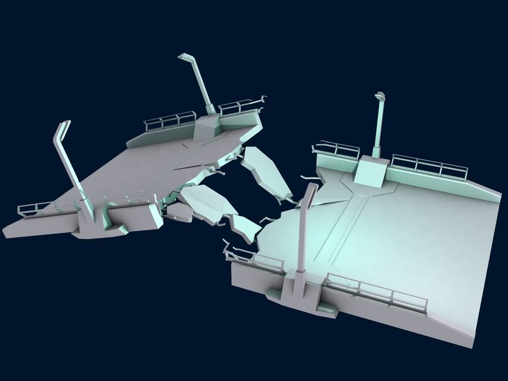
It look "broken" or not?
It's still a WIP, but I'm trying to get the end of the bridge to not be high-poly, but still look broken.
have some of the inner beams bending, and have it broken further in with some of the wire grid showing.
Not much to crit there except the smoothness of the entering, the origin and the choice of motion you made. To be honest I wouldn't do a ready like that (anymore) because it doesn't really make sense, since theres really no place on the body that the gun would be coming from. Other than that, the motion looked fairly smooth, granted it was only a second long and that makes it hard to tell. I wouldn't set the thumb that way though, space between the fingers/arm and gun is not usually aesthetically pleasing. Good job for a first try cornQuote:
Originally Posted by Corndogman
Mind explaining that a little more? I'm not really sure what you mean there.Quote:
Originally Posted by ICEE
And yeah, I accidentally messed up the origin in the beginning but didn't realize it, I was using the original H1 origin. And yeah, It wasn't meant to be an ingame, so I didn't make it very technical. I wanted to make it look like the person was letting the gun hang at their side, then pulled it up into their hand so they could shoot.
I'll do something longer next time, but this was the first time i've ever tried animating so I wanted to keep it simple. Thanks ICEE!
Break is too straight. Unless something fell on it and snapped it off at a joint between prefab sections, it shouldn't be that 'neat'.Quote:
Originally Posted by Fear1337
He means do something like this:
http://i231.photobucket.com/albums/e...ntitld-1-1.jpg
Quote:
Originally Posted by Fear1337
But have a chunk block of concrete hanging of the inner beams on an angle.Quote:
Originally Posted by Heathen
----------------------------------------------------------------------------
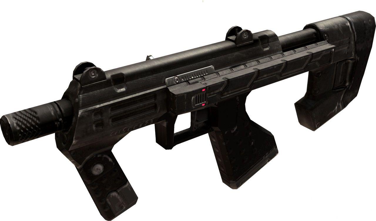
ODST Version. Reducing polys soon.
http://i58.photobucket.com/albums/g2...ball/SMG_9.jpg
I would think the rails, which I think make sense on this weapon and aren't completely out of canon, really ought to be like the br rails
http://i118.photobucket.com/albums/o...os/brrails.jpg
IIRC
Not quite.
Snaf had a huge pic somewhere, I'd post it if I could be bothered to find it.
Edit: Any better? :o
Perfect, would +rep but need to spread around.Quote:
Originally Posted by Fear1337
Considerably.Quote:
Originally Posted by Fear1337
Look at your thumb, besides that it is clipping the gun, there is also some space between the hand the gun, which is obviously not realistic. Now, take a look at the bottom middle of the screen, that's space between the gun and the arm, which I also dislike as much as ICEE does.Quote:
Originally Posted by Corndogman
Yes, you used Halo 1's origins, I get it, but I wanted to tell you about the arms though too since I'm sure you didn't understand that one. Some weapons will require you to have space though, but there's tricks to get around it and such.
Sometimes a little bit of clipping between the hand and the gun can create the illusion of the hand compressing against the hard surface of the grip. That is, if you do it right. No clipping at all between the hand and the gun begins to look awkward, as it creates the impression that the hand is not made of flesh, but solid plastic.
Thanks guys, I see what you mean. The hand should be rotated more so that the thumb is on the grip and not the side of the gun. And I'll pull it back so there's no space in between the hand and gun.
http://img24.imageshack.us/img24/5404/progress3.jpg
Working on some shaders for a H3 assault rifle and a spartan. Any suggestions on making them any better?
e. Here's some more pics
http://img9.imageshack.us/img9/8209/progress3a.jpg
http://img9.imageshack.us/img9/2130/progress3g.jpg
Your cracks look off. go walk on your nearest sidewalk/ road and look how the concrete cracks.
http://img19.imageshack.us/img19/8260/bridge2.jpg
http://img13.imageshack.us/img13/7418/bridge3.jpg
http://img6.imageshack.us/img6/1337/bridge1j.jpg
Google the any bridge collapse and you can see how it breaks based on its structure.
I don't think Halo CE will support all that detail. :embarrassed:
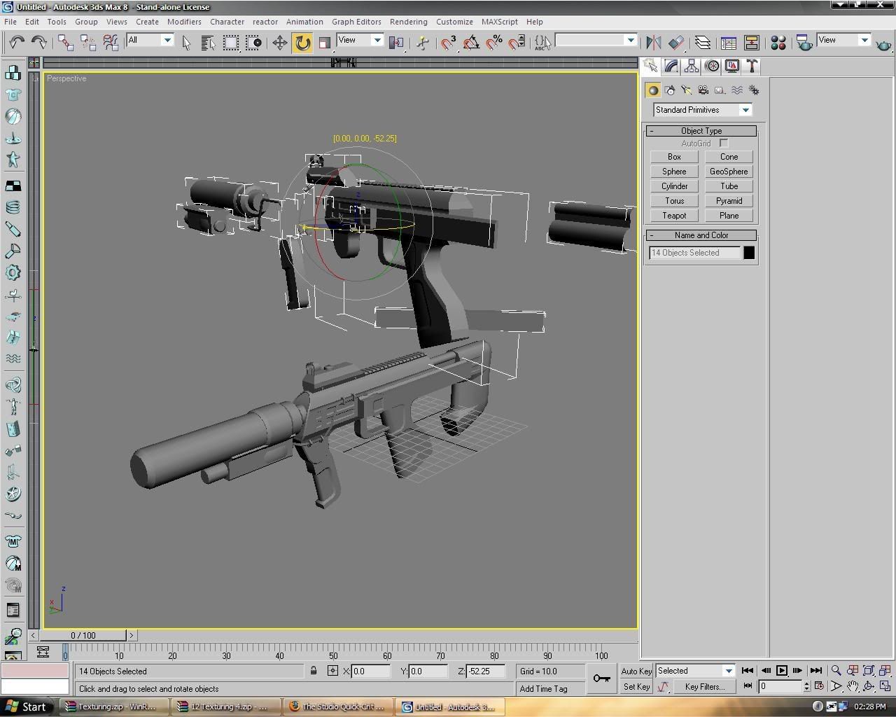
http://i58.photobucket.com/albums/g2...G_Lowpoly1.jpg
4614 Triangles. That okay for in-game? Or is it better if I remove more?
4466 Triangles. Removed two things. Lol. Same question though ^
Noice shaders Veex, see if you can make the visor a little less bright though.
Quote:
Originally Posted by Hunter
Looks to me like you could bake in some of the details on the back of the receiver, the grip and the stock to cut triangles even further. I think that the front grip looks too boring and uncomfortable as well. It doesn't really fit the mould of the rest of the gun, which has more detail. You could bake in some detail for that too, but it mostly just seems too square.
I like that a lot, except for that one cliff/rock face near the furthest outlet. It's too jagged and stands out.
I think it's just a smoothing problem, I'll see if I can fix it.Quote:
Originally Posted by Jean-Luc
E: Thought so. Fixed.
How about this:Quote:
Originally Posted by Hunter
You axe the spacing on the rails and make them look more like the BR's, or you axe them altogether. They're eating up a considerable amount of tris - especially when they're modelled as wastefully as that, you could lose hundreds of tris if you'd done it properly - and they do absolutely nothing for the design of the SMG. They'll look out-of-place in Halo and they have no need to be there when you can replace them with a lower-poly, less absolutely bloody boring design.
Try it, please. 1913s belong in CoD4 and co., not a sci-fi game set 543 years in the future.
Add more details on the walls, they just look to plain.
Take a look at the H3:ODST Pics. They aren't the best references ever, but can give you an idea for what Bungie did with their sight.
Which? The one the towers are on, or the endcap wall?Quote:
Originally Posted by Advancebo
If you mean the tower wall, most of it won't be there when I'm done, I'm modelling the cliffs and such over it to make it look as if they were layered onto a framework, as that's how the terrain on a ring works.
Oh, there be replaced with cliffs? Nevermind then, lol.
Cheers, I will have a look at that.Quote:
Originally Posted by ICEE
I know you said get rid of the rails, Masterz thought they should stay, So I left them on. But what do you mean by making them like the BRs? The battle rifle has not rails like that.Quote:
Originally Posted by rossmum
-------------------------------------------------------
E:
4150 Tris. Looking for more stuff to remove now.
http://i58.photobucket.com/albums/g2...__Lowpoly2.jpg
http://i113.photobucket.com/albums/n...__Lowpoly2.jpg
here's a few suggestion. also i don't get ur trigger very much =\ shape just seems very weird to me.
I cant remember why I modelled the trigger like that. Lol. I wanted to keep the parts on the clip because Halo:CE has no bump maps. And you can always tell when textures are used to try and give depth to something.
The random line is just a extrusion I put there to give that part of the give... I duno. Something?
Lol
http://i58.photobucket.com/albums/g2...owpolyGrip.jpg
AAAAARGH.
http://img220.imageshack.us/img220/5092/smg01.jpg
The front grip is about as wrong as possible.
I want my grip different.
http://i58.photobucket.com/albums/g2...polyUltra3.jpg
^ 2872 Tris
http://i58.photobucket.com/albums/g2...G_Lowpoly3.jpg
^ 3346 (I prefer this one)
Ross, it's not up to you to decide what belongs in sci fi games. rails can go where ever the fuck they wanna go. I personally like them on the smg.
Well this is what I have for the low poly version at 3850 Triangles...
http://i58.photobucket.com/albums/g2...G_Lowpoly4.jpg
Rails are around 500 Tris :/ I have done this.
I was thinking about a different scope. Maybe the EOTech RedDot? The current scope is 300 Tris. An EOTech ReDot will probably be around 700 for me to make...
If I put the details onto the clip then that is an extra 238 Tris.
I can appreciate that you want it different, but the handle just looks bad to me. It looks thin, sort of flimsy. Its not very attractive. I would try something else
Vert grip looks like it'd snap in two if you sneezed on it too hard, and why are you wanting to make it even less suited to the Halo universe by adding a modern sight to it? Is there some sort of misunderstanding happening here or what? Halo has a very specific design langauge and modern attachments points and accessories don't fit in with it at all. The rails are mismatched enough but an Eotech would just be the final straw. If you want to model weapons for the Halo series, stick with the established conventions. Don't go bringing in modern stuff. If you really do love modern stuff that much, then stop modelling Halo weapons. Don't mix the two unless it's just a 'because I can' model. They do not fit in with the rest of the stuff in the game.
It's like whacking a modern scope on a Springfield and then putting it in a WWII game, it does not work.
e/ Hunter, Masters is not lord god king of everything (or anything, for that matter). I'd suggest you avoid doing things just because he says so. Unless he gives a very good reason (like, say, something akin to complete inconsistency with the game's other designs), I don't see how his opinion is any more valid than anybody else's.
Peng, you're right, rails can go anywhere. Too bad they look absolutely horrible and out of place in most of those anywheres :)
Just stick with you handle you made that's in your sig. It looks a lot better.
Quote:
Originally Posted by rossmum
http://www.bungie.net/images/Games/J...Concept-01.jpg
^
ross mb you should shut up.
Well ya knowwww...it IS canon...sooo :/Quote:
Originally Posted by rossmum
The reason I listened to Masterz is because he had the same thought as me. It adds something to look at on the top. I would like to make it more interesting but I dont know what to put on it... I will change the front handle as well.
Agreed.Quote:
Originally Posted by SnaFuBAR
I think Rossmum needs to remember what the fi in sci-fi means, science FICTION not FACT.
Hunter that SMG looks to be comming along well to me though there do seem to be some un-needed detailing but i guess those parts could be usefull for if you ever go into 3d rendering, then you would already have the materials at your disposal.
*Never Mind* Will update post with another render in a min. Changed the handle a bit.
Group them?Quote:
Originally Posted by Hunter
There was something wrong with the scene. Everything was fucked up. I have found a backup version and fixed it up. Rendering now.Quote:
Originally Posted by MetKiller Joe
http://i58.photobucket.com/albums/g2...G_Lowpoly5.jpg
Handle a bit better? it goes with the style of the rest of the weapon. 3969 Tris.
Fore grip looks really tiny, and the indentation on it looks rather silly.
What else can I put on it? It cant just be a plain block. Thats boring. Anyone got any ideas?
Maybe something like this? It doesn't really matter, it's your model. Actually now that I look again the size is fine.
http://www.armymallorca.com/tienda_p...a_foregrip.jpg
I like the handle that you have on the model in your sig better tbh, it looks less boring then the one you have on it right now. At the very least make the front of it curve like you have on the pistol grip.
Oh, and please throw a few more triangles on the trigger, it looks horrifically uncomfortable to hold whether you see it or not D:
Thought I would post this. Note, I didn't make this, but my friend, working with me on the Flood Campaign (http://forum.halomaps.org/index.cfm?...&topicID=23540)
http://www.youtube.com/watch?v=YrLf0...layer_embedded
He has created fp legs, just like in Halo 2 and 3. Also note, this doesn't work in MP yet, because of course, you need 3p animations, and he doesn't have those yet. So far, this is for SP only.
That is still amazing. Would love to see that go on and progress.
It just uses bitterbanana's app to change views.Quote:
Originally Posted by Newbkilla
Hopefully, he can get the animations perfected, meaning when you jump, your head moves perfectly along with then legs. Especially hard when you pan the head (camera). I don't know many third person animators, except Spartan457 (spartan-094). But I also, hope to see this get perfected.
E/
No, look at the end of the video. He explains he added a node or something to his head, and then used a script to connect the legs and node together or something.Quote:
Originally Posted by HDoan