Nice mate ::lmao:Quote:
Originally Posted by flyinrooster
Printable View
Nice mate ::lmao:Quote:
Originally Posted by flyinrooster
Quote:
Originally Posted by flyinrooster
Look's great man, but there's a little stretching.
http://img514.imageshack.us/img514/8843/chiefcopy.png
Chief looks good in blue. :cool:
It looks alright. 8-10 hours to model something you could've simply drawn out with the polygon tool, or made with [cue dramatic music] booleans?Quote:
Originally Posted by kid908
Jean, in all of your chief renders, the stomach plate looks weird. As if it's set too low. Could you get an angle that shows it a bit better?
It is a rigging issue that I haven't figured out yet. What you're seeing is the stomach plate going INTO his body.Quote:
Originally Posted by NuggetWarmer
is knee is box, but I don't think you can do too much about it...
Get Down: HCE?Quote:
Originally Posted by flyinrooster
http://img24.imageshack.us/img24/7908/chiefrotate.gif
The gif sorta kills some of the colour. I like the visor colour much better though.
whatever happened to APNG's?
Weren't those the new gifs?
looks nice.
They also took up a shitload of space. D:Quote:
Originally Posted by Heathen
.Quote:
Originally Posted by flyinrooster
Nobody wants to use them since they're so big. <3 GIF
Render looks sexy, can we get some closeups?
Quote:
Originally Posted by Reaper Man
Image on the left is the wireframe(black lines are the wireframe, well more like black sides, lawl). right is the final render of the mesh. it's around 50k tris and i made each curve manually vertex by vertex. so yes it took 8-10 hours. also boolean sucks and leave a very horrible mesh.
@animated gif of mc: looks really good. the gif killed the quality but atleast it's still better than youtube =P
Dear god, you should've made it with NURBS. Also, yes, booleans leave messy meshes, but what you've modeled was simply for rendering purposes, so big deal.
that is a good mc you have there
it walks very nicely too :downs:
ye i should have use nurbs but ive never been able to useitwith flat surfaces. and im very ocd about my mesh being clean but i had time to kill so :pQuote:
Originally Posted by Reaper Man
Quote:
Originally Posted by flyinrooster
So, you used a premade model, premade normal map, added a detail bump( which is no feat at all) and a very sub par diffuse map from what I can gather, and then you have the right to say "all was made from scratch"
That is a slap in the face to real work.
You did nothing, no offence. I saw the pic and actually was impressed until I read what you had actuallu written.
By all I meant diffuse, specular, and gloss, heh.
e: If it's completely custom work you want, I've got that too. Check the textures in my gallery thread. The paint is obnoxious on the wall and floor textures, but aside from that I could use some crit on it.
e2: here, quoting my post
Quote:
Originally Posted by flyinrooster
I really like that rooster. I unfortunately have never been able to get the hi-res to normal map thing to normal map thing to work...
Wow. Dane actually made a serious post. :raise: joking
Anyways. The textures you made look great rooster. However, it seems to lack any color other than the yellow paint which doesn't really look that good. It is way to bright.
Yeh they're not 'that' amazing. I also dont think Dane was challenging you to show more work.
I know, but he thought the problem with the chief was that I didn't make him completely from scratch. His gripe was really with semantics, but I went ahead and showed him those in hope that he crits them and I get some good tips. I made the chief for rendering purposes, and because I didn't like bungie's diffuse and spec maps. Maybe I'll get around to making a normal map for it, maybe not.
well what does size matter if your internet isnt shitty?Quote:
Originally Posted by Conscars
Well, my internet is shitty. : |
:mysterysolved:
That said, Dane is right on many things for your chief. A higher res diffuse would certainly suit it well.
Does this work as a minimal wallpaper?
Original:http://timo.modacity.net/pix/May-09/_MG_8912-3.jpg
Was watching the rain fall past this light over the carpark outside my room, and decided to make something out of it :F I'd like to make it look a bit more like a painting and photochop it up to hell but have no skills in anything more than using filters.
lol, floating light post.
Need crit and how to improve on it:
http://www.xfire.com/video/b39c2/
Are you serious? why did you do an exit animation without the actual vehicle in the scene?
Lmao. I can tell what it is, but it would be very hard for someone else.
Watch icee's weapon animations. Does he animate without the weapon in the scene? No, because that wouldn't make any sense at all.
Well, I figured that it would be blocked a little, since its exiting in the cockpit, and you wouldnt be able to see it. Ill put in a elephant for the next render after I fix this one up a bit.Quote:
Originally Posted by ICEE
Maybe getting the angle right would be difficult, but i dont have any idea whats going on without the elephant there
pro animator
Youtube is kinda skippy.
http://files.filefront.com/Dooravi/;.../fileinfo.html
cool.
Make it transparent, maybe that will help.Quote:
Originally Posted by Advancebo
look how pro I am at animation
cool.
Definitely needs to be faster. Which I assume you already know :)
Yeah it was a quick animation :pQuote:
Originally Posted by Newbkilla
Just showing off parts of the model lol
The speed can be changed in the tags, if its for Halo CE use.Quote:
Originally Posted by Newbkilla
I think it looks nice. I'd make the smaller sections accelerate faster than the big section but have the same initial velocity. I'd also start the smaller sections .2-.3 seconds before the big section. But at the very end, you'd have the smaller fins slow down so that only the tips or ends are showing while the bigger pieces are still about 1/3 away from being done. That's how I'm remembering the multi-step doors.
Good luck, and, again, looks good.
Loop it a few times if you're going to put it on youtube. Youtube likes to cut off the last second or so of every video.
*cannot render for shit*
Basically trying to remodel Prisoner as a Covenant facility(which at this point mostly consists of adding curves to everything). Platform between the prongs is Forerunner for a reason.
Smoothing(or lack thereof) on the central trough in the floor has been fixed, I rarely remember to smooth everything that I should.
I see the resemblance between this and the original map. Keep up the work.
FUCKQuote:
Originally Posted by Cagerrin
YES
BEST LEVEL EVER
Pretty much my entire thought process behind doing this.Quote:
Originally Posted by Selentic
http://i238.photobucket.com/albums/f...b_render_1.jpg
Other wise from those few things that were bugging me, it's looking pretty good =) ( I've made some covy shit too before )
Eh, Hang em High.Quote:
Originally Posted by Selentic
But one of the maps I feel didn't get enough love: Ratrace.
every map is shit compared to prisoner
get yo shit straight warren
k yukiQuote:
Originally Posted by Selentic
slightly ot:
Yo where is Neuro, didn't he have a Prisoner remake in the works? What ever happened to that?
It doesn't matter to the HCE community - Asylum was being made for UT or something like that.
k warrenQuote:
Originally Posted by Heathen
Preliminary base redesign for Prisoner/Rehab.
I should probably make a [GALLERY] thread or something.
Been starting some stuff up on our friend the Arbiter. Normal map comes first, which you can see here. Resolution of the texture is 4096x4096, and the actual armor parts are about 75% complete.
Before anyone mentions it, yes, I'm aware the curved details were extruded in the game, Snaf and I just feel it looks better, and more logical in this fashion.
Looks good, but I dont like his fingures on the right hand. THe joint looks blah, but Idt im supposed to critique that.
Flashlight enabled shielding.
So far the shields only work when the flashlight is turned on, adds a new element of gameplay instead of running about and waiting for your shields to run down you have to think carefully.
http://s5.photobucket.com/albums/y17...Movie_0002.flv
[i hope linking to that works here...]
This has been around for a while, I remember it was in this map where you played as an elite, a long while back. Still cool though. Seems a bit big, and there aren't enough ripples - looks like you applied the elite's shield to master chief. What would be cool is first person shields that activated too. Getting the first person shields is easy enough, I wonder if it'll show up when you turn on the flashlight, if you do so.
Yeah i had edited the shields tiling a bit to make it look more like a shield instead of waves of electricty.Quote:
Originally Posted by Reaper Man
The rippling does show in FP as well.
Il boot up halo tonight and ger some more videos and pictures.
truthQuote:
Originally Posted by Selentic
The jumping could use some work. It appears as if he just sorta crouches slightly then floats off the ground. The "aww, man" animation is a bit stiff too.
The aww man animation is supposed to be a stretch, so I guess that failed lol, thanks
too much arm swing on the walk. legs a little straighter and knees should be behind the center of the person longer than infront walking.
legs needs to stretch out/extend on the jump then bring them up. (even though most people keep their legs straight while in the air, then compress them for the landing)
When I got to it, I realized that the highest of Prisoner's bridges is horribly done, the sides aren't even parallel. So I did something a bit different with it.
Don't get lazy... :rolleyes: the suspender things unter the bridge don't look very covenant...Quote:
Originally Posted by Cagerrin
True enough, they weren't really meant for that, I just copied them in since they were the first thing that came to mind.
I'll figure it out, I just need to replay High Charity a bit.
By High Charity you mean Gravemind, right? High Charity was the second of the two, where the Flood had gained a foothold in the Covenant Holy City, whereas Gravemind was the first, which was longer and had better combat areas.
Unless, of course, you want it to be like the latter.
You could always do both - make a clean and infected version.
Nope, High Charity. Gravemind doesn't have the Step of Silence.
oh dear god yesQuote:
Originally Posted by Sever
that would be sweet
yes but prisoner is confusing enough without zero visibilityQuote:
Originally Posted by Selentic
and I can't model organic stuff that doesn't look horrible
toying around... with my new toy what do ya think?
http://img23.imageshack.us/img23/732/logomockup.jpg
new toy =
So I'm designing a new website layout, trying to keep things nice and minimal looking. I need some ideas for about how I should set up the site navigation, any ideas? A friend suggested polaroids, I think that may just look a little too tacky and cliché. Maybe just some text, in a nice thin, minimal font, a lighter grey-blue than the background simply sitting on the background to the side of the backdop?
Also, what are good dimensions for the page?
Also, the aperture looks like the Aperture Labs logo, I know. But how can it not? That's what an aperture looks like, so shut up goddamn :saddowns: (though in this case, it seems to have become a ringlight.
Looks nice. Where is the menu going? Down the right side?
That's what I'm trying to figure out, read moar, look at pics less, lol. Any ideas?Quote:
Originally Posted by Hunter
E: how's this? Something about the font I used is bugging me, any suggestions?
One can barely see it. Nice website, by the way. What I'd recommend is that you use the same style as for your logo on that menu with a little less intensity.
Hmm, well I thought that would look very.. stark, for lack of a better phrase. I wanted it to be a bit more subtle. While it's kinda dark, there's not much there that can detract from it, since I framed it. I'll have a play with it, but I really want to keep this site very minimalist and subtle, compared to my lousy, unsubtle designs previously.Quote:
Originally Posted by MetKiller Joe
Also, due to interpolation it does look pretty dark in the [shot] tags, if you fullview it, it looks a bit better.
My bad, I like pictures :P
What about something like this? Apart from better, because my attempt sucks:
Hmm, nice idea with the lights, not a fan of the frame. So many ideas :phonegonk:
What if I just make the film frame a slightly transparent white instead of that blue? Image will be up inna sec.
E:
I think that actually looks really cool. Only thing I am not liking is the title thing, "feign". Seems a bit bland compared to all the rest. Almost as though you didn't try on it. But again, that's my opinion. :p
I would say this is definitely going in the right direction. I'd make the menu a litte easier for the eye to see (little less subtle) as you want to have site navigation be very easy for the end-user.
Feign's my last name, it's supposed to be a minimal design D:Quote:
Originally Posted by Fear1337
I made the text easier to read, on the previous page.. I could make it even whiter if need be.Quote:
Originally Posted by MetKiller Joe
I meant the design and color usage. :pQuote:
Originally Posted by Reaper Man
Any suggestions on what I can do to improve my logo then?Quote:
Originally Posted by Fear1337
The main purpose of the page is to show photos, so the logo isn't all that important, but if I can make it better, no harm.
That's supposed to be covenant??Quote:
Originally Posted by Cagerrin
Decided to ditch the dirty "oil" bitmap and just used a some what dirty bitmap, added a detail map in the shaders, made a new multi and added a new cubemap to it. The turn out was the two pics above me (and i think it resembles the halo 3 shaders abit :p) Anything i need to change? (other then some slight rigging errors you see)
It's Covenant in the way a good percentage of H1 maps are Forerunner.Quote:
Originally Posted by SnaFuBAR
I suck too much to redo it from scratch without fucking up the jumps and all that, so I'm just modelling over the original BSP.
I would get a darker cubemap, so its not as shiny or, make the shine less like the original mcQuote:
Originally Posted by Spartan094
I made this a few months ago
http://img183.imageshack.us/img183/4...rendershow.jpg
semi -high poly MP-40 , inspired from CoD: WaW
I cant get an exact poly count for you right now, but with the bullets i modeled (also high-poly) its around 8,000 triangles
this wont be going ingame
I like the render.
The clip could be a tad bit bigger along with the counterpart above it were it holds it, make it slightly fatter. But it still looks cool. Can we get a wire frame and a poly count (accurate) if possible? Higuy, ill decrease the tint stuff in the cubemap parts, make it darker abit.
It looks fine to me lmao. Maybe not super detailed, but perfectly reasonable for halo 1 :SQuote:
Originally Posted by SnaFuBAR
handy tipQuote:
Originally Posted by Ki11a_FTW
if you want anything to be even remotely accurate, base it off the real thing, not cod's dodgy interpretation
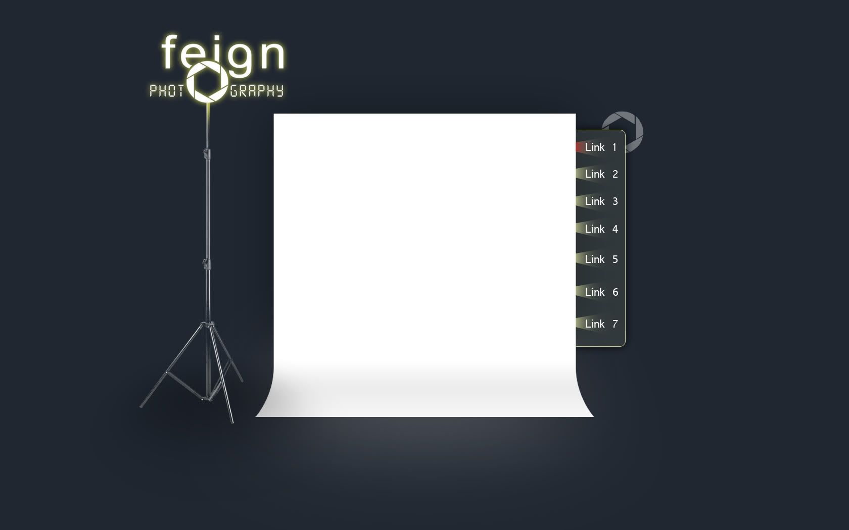
So, after following Snaf's advice, I have this; a slightly lengthened and deeper backdrop, light moved more the the side and a new navbar.
E: does it look better with or without the film frames?
Well... What is the focus point, the screen or the logo? Right now the logo is winning my attenion over the display screen, but that may change when pictures are displayed. It's stylish, but I think the screen should have a border of some kind.... just makes my eye drag to the corner of the logo and not to the main thing, a border might help and also make it look less cluttered. Another thing is maybe move the screen a bit further down, and lengthen the logo across the top half left section its at and make the tripod longer.
edit- move tripod further over, make it higher, then extend logo more, maybe having a nav bar extend into border for screen?
Without the film frames is best - just makes sure they're equally distanced from each other.
Of course it's distracting when there's no content on the website. The photos are pretty much gunna fill up that backdrop. Additionally, I think a border would ruin the whole look of the backdrop. I don't think I should move the logo any further. I want to make it look like part of the website, not some addition off to the side.Quote:
Originally Posted by sKc_Chains
Fixed. I was lazy with the other image, because all I did was hide the film layer, now the text is properly distributed. (No point uploading another pic)Quote:
Originally Posted by Timo
There's only two things that bug me:
1) How the light is yellow-white, and the screen is bright white. I've always felt they don't go well together, and I would personally either make the light white (which doesn't help with colour variety), or more likely make the light a complementing colour like an orange--something you could use in the content area and still have it look good. If you went with the complementing colour, the whole light stand might have to be orange for example, or else it may look silly. This site's source theme is a good example.
2) The light stand needs a proper hard shadow.
edit: film frames for sure
D: so many conflicting ideas. The reason I gave the logo a yellow glow was so that it was sort of like a studio light. I just tried an orange glow, it looks really weird. I also tried giving the stand a hard shadow, looked out of context because, everything is softly lit, as if by a softbox. I still can't decide between the film frames or lack thereof.
I want to keep the colors very muted, as they're not to distract or conflict with the colors of the photos that will be shown. I was thinking for the gallery to use something along the lines of this: http://www.airtightinteractive.com/projects/autoviewer/
For the lazy, here's an example of what this flash gallery can look like (the distortion is just for effect, it's not actually there in the actual flash gallery, I don't know why the maker is making it look like that)
http://www.airtightinteractive.com/p...iewer/grab.jpg
Or maybe this
http://flash-gallery.com/zen-flash-gallery/