Just seems... I don't know... horribly cartoony. I'm not sure how. Just, the shaders seem wrong, and the bitmap is too... cell shaded almost? It's the same problem the CMT biped is having. Just looks out of place.
Printable View
Just seems... I don't know... horribly cartoony. I'm not sure how. Just, the shaders seem wrong, and the bitmap is too... cell shaded almost? It's the same problem the CMT biped is having. Just looks out of place.
Over killed the multi I think. Bleh. That or its environment its supposed to be in is horribly off by 7 years.
Psh posh. I'll tone down the brightness in the multi.
you call that done?Quote:
Originally Posted by Fear1337
there's only the sides and some missiles on top which look finished-ISH, the rest is just unfinished flatness.
There doesn't even seem to be any kind of elevation mechanism for the launch rack
He said it's unfinished dawg.
The artist that made it said it was finished. Ross was just adding on to neuro's post.
http://img198.imageshack.us/img198/919/p90p.jpg
Does the handle/ trigger look any better?
I added more detail, and I added some new stuff.
Those circular details, floaters right?
Nope, I'm modeling this just to model it, not going to bake anything, or make a low poly.
Should have made the trigger a separate element. Right now it seems to blend in with the rest of the gun.
Quote:
Originally Posted by neuro
I cant add anymore detail because max wont allow me to. Its acting all retarded, thats why I sent it off to dee to render. There is more detail to the front and top wich I could add, but my comp just crashed. I might just reformat and put the other 9600 Gx2 card in.
Also, ross, it doesnt need one. It was just supposed to look realistic, not specificly accurate to the actual tank.
I'll try adding more neuro, but I doubt I can.
Specs if you were wondering:
8800 gtx sli cards currently installed
8 gigs ram
quad core 2 extreme
Edit: Neuro, I also have enough detail with the wheel train things:
I just need to add more to the top of the main body and the front of it
Sounds like you need to give it less iterations. Two should be enough for most anything, 3 in special cases. Sometimes even one will suffice.
I don't feel like finishing this, there is other things I want to move on and do, so I decided to go and make it a turret. I did add a couple stuff, and also shortened the barrels which was a pretty good idea like you guys said.http://i238.photobucket.com/albums/f...alrender-1.png
wusitfor?
What is it for?
Me, new avatar.
Oh, um... I like the middle color scheme best...
e: \/ No, but none of them look very appealing to the eye. I was kinda hoping you were making some sort of visual torture device and wanted to know which color scheme made me want to puke the most. :downs:
You seem disappointed D:
You want it for something?
middle one, because it uses a consistent colour scheme that doesnt hurt my eyes.
dont contrast your colours too much, keep it simple.
Neuro:
Model: Joshflighter
Render: Deehunter
wong.png
There still needs to be something logical to be holding up that missile rack.
Hydrolic system?
nvm.. :(
Just got my tablet and the first thing I spit out is a furry.
http://files.getdropbox.com/u/144683...%20colored.jpg
Needs to be an emoticon.
No it doesnt. :ohdear:Quote:
Originally Posted by DEEhunter
Please tell me you saved the alpha-channeled version of that :3Quote:
Originally Posted by il Duce Primo
Well this is what I'm working on now. Trying to get a better feel with this tablet. Been learning how to use photoshop but know only the real basics. Pretty much just a brush and a few other tools.
http://files.getdropbox.com/u/1446834/landscape.jpg
It looks decently colored so far, but try to make the trees pop out from the rest a bit more. It looks a bit muddy.
Throw a Rayquaza in there.
http://img196.imageshack.us/img196/2...net1024768.jpg
A file cabinet.
Looks nice but in what situation would the file cabinet have been in to get so many scratches?
Un-needed/ bankruptcy. Throw it away basically.
Come on, you've played CS, all sorts of things happen in office buildings.
That being said...
STOP WITH YOUR INSANELY LOW POLY STUFF haha
Also, the scratches and such are a bit excessive, take the side of the cabinet for example.... there is an area of non scratched in the middle that's just surrounded by scratches. The side of that poly near the doors is okay to scratch up, but... the side near the wall or the top of it?... that's just silly.
I agree with this.Quote:
Originally Posted by Llama Juice
If you were trying to practice the workflow and texturing, that is fine, but it doesn't seem like you have looked at any references for this. It looks like there is a pool of scratches on the side of cabinet, making it look more organic.
If you were going for a Fallout type art style, you're getting there, but as LJ said, just too many scratches.
Lastly, you'd benefit from following the workflow properly, and creating higher-poly, low-poly meshes.
WIP: M1A1 Abrams Battle Tank: I'm going to make the treads soon and then start on the body. I'm going to make it as accurate as I can to the actual tank. C&C.
Looks good so far. Nice to see you remembered that the front road wheels are slightly apart from the rest.
God legionaire, why would you not model the magazine feed into the gun? didn't you expect someone would do a retarded reload animation? how could you be so thoughtless?
Note: the above animation and comment associated with it are not meant to be taken realistically. I did this animation as a spinoff of tf2's scout pistol reload. It is unrealistic, and if you did this in real life you might die. It was an experiment with intent to expand my style. Crits please.
Noticing that this animation plays too slow in chrome, and too fast in mozilla.. but you get the idea right?
E: origin image added by request
Icee ur epic!
E/I cant + rep you. :(
Man I really gotta help you with those render settings D:
During the guns clip-out idleness, the right thumb should be on the bottom of the trigger guard rather than curled up in space. And on the slide pull, the left thumb just looks a bit sloppy. The left arm also snaps a bit at the end, but all the other finger movements look clean to me. Great job, sir.
I seriously think this is done. I cant be arsed to add a hydraulic system.
I added a lot more stuff because of Neuro and Disaster wanted me to. :-3
Edit: how dee rendered this. Alot of the button detail is not shown and the curved part. Sorry. :p
Do some more ninja reloads :neckbeard:Quote:
Originally Posted by ICEE
Don't be a twat. It's not hard.Quote:
Originally Posted by Fear1337
Yeah, Go ahead and add the hydraulic system just cause you can.
:gonk:Quote:
Originally Posted by Disaster
I hate you rossum. You convinced disaster to make me too. :saddowns:
:-3
It already looks awesome (with that system it'll just look more so). Any chance you might be texturing it o.O? *keeps fingers crossed*
http://img44.imageshack.us/img44/738...endered768.jpg
That looks even better Josh.
Just got all my AOs applied.
fuck me so many inaccuraciesQuote:
Originally Posted by Newbkilla
it's a lost cause, start over and use proper refs this time
turn on aa, looks nice thoughQuote:
Originally Posted by Llama Juice
@Fear1337
:O Looks awesome. Lowpoly + Bake + Ingame :)
update:
still have some tinkering to do.
http://i303.photobucket.com/albums/n...ducedouche.jpg
If someone knows how to zbrush and wants/is willing to teach me some stuff.. please pm me. (This model was modeled, not sculpted)
:downs:
oh, hiQuote:
Originally Posted by Fear1337
:-3Quote:
Originally Posted by Disaster
Reaper: You really think I don't know that? :raise:
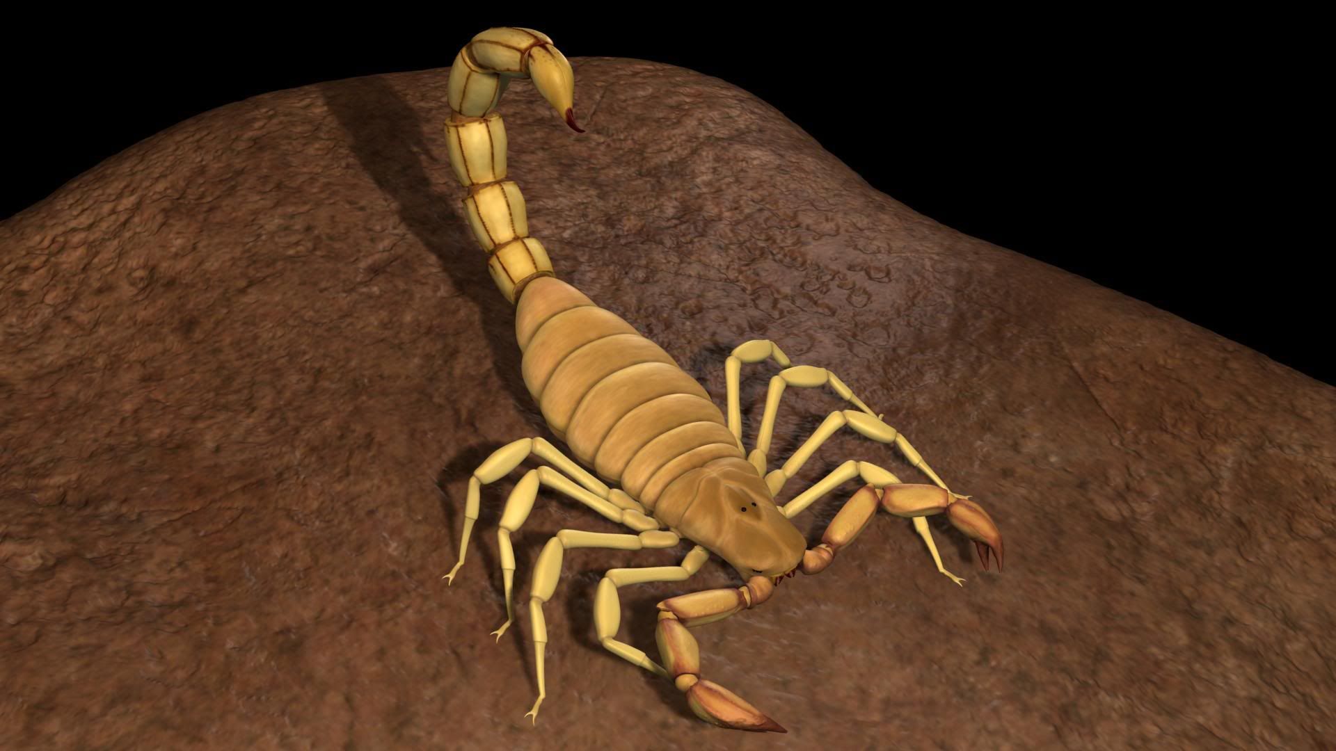
Looking pretty good, although I reckon you should make it somewhat translucent just to make it that much better. I'm no scorpion expert, but a fair few of the desert ones are translucent, I think. My little sister has one in a paperweight which is about an inch long and you can see through it pretty well, looks more interesting in my opinion.Quote:
Originally Posted by DOMINATOR
Ya desert scorpions are translucent and have a black back.
I just took a bunch of pictures of one a couple days ago if you want them; here's one of them - http://avpdragon.deviantart.com/art/Scorpion-130870183
yeah thats one of the things i want to tweak. there is a little translucency on it right now... not alot though.Quote:
Originally Posted by rossmum
I could go in my backyard at night and they're all over my wall. Scorpions are common here. The coolest ones are the really small ones that glow in the dark.
http://img44.imageshack.us/img44/5762/thetats.png
Inspired by Compiz. (The logo on the box is my personal logo, for those that don't know)
Seems more of a rectangle then a box. It might be just the angle though.
Who said it has to be a box?
http://img23.imageshack.us/img23/1183/boxd.png
Rounded corners and did some other things.
Now that I see it on a dark background, I need to fix the corner shine.
Congrats, you finally used high poly in a legitimate sense. Listen to ross, don't be a twat, finish the hydraulics, create a low poly, make a normal map, and you have yourself a nice game asset, and if you want a good portfolio, that will help you significantly more than random high poly models. Showing that you can take the process from start to finish looks better :downs:. trust me.Quote:
Originally Posted by Fear1337
http://img269.imageshack.us/img269/9882/metal1024.jpg
Metal hallway strip, was pretty easy to make, though I wish I did a little better on the bolts.
You should know I influenced the modern version of that logo :3Quote:
Originally Posted by MrBig
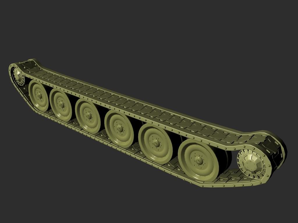
This was a real pain in the ass to make (since shortcuts didn't work so well with the treads) because each one had to be manually edited into position (all 89 of them, actual 178 since it's split into 2 distinctively different pieces). I also did a little tweaking on the rear wheel that attaches to the engine and the other 8 wheel placements.
This render does not justify the damn thing at all, but I really don't want to sit through another render session.
What bolts? The big black circle smears?Quote:
Originally Posted by Newbkilla
Do you just not like modeling? lol It's pretty apparent that you're all more than eager to texture stuff, so why don't you give that hornet texturing competition a go, see how you do with a model that's worth texturing.
Planning on doing the interior details too?Quote:
Originally Posted by kid908
That looks very nice kid908, glad to see another person doing this tank challenge other the josh and me..
~~~~
flashlight model
http://i238.photobucket.com/albums/f...flashlight.png
I am going to unwrap and texture it later.. at least the low poly one.
If I can find a good layout of it and ref pics, but I think some parts are classified and unseen (I'll worry about exterior first tho).Quote:
Originally Posted by rossmum
@higuy: your lens are too fogged up. (just saying)
If you ever do a Centurion I can help you out, as I have access to one :realsmug:
Yeah now that you point that out, I noticed. I'll fix it when I do the texture for the glass.
Boring flashlight is boring, make it interesting.Quote:
Originally Posted by higuy
http://img21.imageshack.us/img21/653...hlight1ly6.jpg
simple little things can make it look that much better. Do it.
higuy, your missing the on/off switch :cop:
your hi res mesh needs a lot more detail. otherwise, there really isn't much point in having one. :\
Already made that joke when it was originally posted. :downs:Quote:
Originally Posted by Saggy
Shut up about it looking like a fleshlight, give actual crit.
I see what you mean.Quote:
Originally Posted by Llama Juice
But, im modeling a normal flashlight, nothing fancy, just something you'd see everyday at a hardware shop, on the job, or anything similar.
I will add detail to the high poly model, I didn't see much use for it either, just looked a bit better then the low poly's roundness.
Let's see it in some nice renders.
Smore glockwork.
Spoilerd:
reload(repost):
fire:
running:
sprinting:
Please take note that this is still style experimentation. Also, ingame, the running and sprinting animations would be further enhanced with camera movements, but without an actual environment it isn't easy to simulate.
The running looks really rigid for some reason, and the sprinting looks alright animation-wise, but it looks funny. :S
I like the reload, but the running and sprinting don't look very good at all. With the running, the gun looks like it's jello, because it shouldn't move more then the arm does, especially the way he's holding it. And the sprinting just looks like someone's trying to flail they're arms around. Watch people run, their arms move to get them to go faster, not just flailing them around.
biggest thing with the sprinting is that peoples arms dont go that high
sprinting 2:
hows this suit you rooster?
better than before. it might look better once ingame. personally i think you should ball his left fist or have the fingers go together to form a fin shape, if you know what i mean. i prefer the former though.
I just don't think sprinting would have an animation really... Could he just hold it with both hands and run holding it up... hard to explain, hope someone knows what I mean.
It would definitely look better ingame. I would have the camera jiggle appropriately, like your head moves when you run, however in max it is kind of pointless since there isn't an unmoving background to compare to.
i can see what you mean bob, but im not sure why anyone would run with a gun like that. <_<
I made a very small change to the running animation, but it seems more fluid to me now.
running 2:
Any better? I added a bit more detail to it. (also I didn't forget the on/off switch this time)
http://i238.photobucket.com/albums/f...ashlight-1.png
most flashlight have a grip with Details:realsmug:
@ICE: when people run, their hands move somewhat diagonally as their upper body twist a bit, not just straight back and forth, especially with a gun.
Looks like it's made out of rubber, is that what you're going for?
excellent point kid, thanks.
@ rooster, if that was directed at me, then yes. My goal for both running and walking was to make an interesting and flowy animation that gets the point across without being entirely realistic. Intentionally overdramatic. Sort of like battlefield bad company.
Yeah, at least the grip is rubber. (Everything looks like rubbery and the same becuase of my material setup in Max.)
I was going to add detail into the grip with a normal map instead of wasting time modeling it all out, or should I model it all out? it was mostly going just going to be little bumps.
oh, i was talking about the flashlight if you mean the rubber comment. yeah, i understand its the max material. i think you should keep it a metal flashlight, and have the grip be like this one:
http://www.sd5.k12.mt.us/ghs/howl/Images/Flashlight.jpg
Yeah I think that looks a bit better too. But should I do a normal map for the grip or just model it out?
normal map, but model a hi res version of it. you don't have to do that, you could make a height map if it's easier. it really makes no difference.
Your animations pop like he is doing the robot.Quote:
Originally Posted by ICEE
:/
The left hand should be somewhat palm-down when it's coming up from the bottom of the screen, so it'll swing up and look a bit more stylized rather than staying in the same position with unnoticeable rotation. I'm seeing a pause in the movements of the left hand when it reaches it's climax as well.Quote:
Originally Posted by ICEE