The scale that some of the elements infer are weird.
August 30th, 2009, 10:52 PM
ExAm
Re: The Studio Quick-Crit Thread
Quote:
Originally Posted by MrBig
It's a concept.
It's blurry.
August 31st, 2009, 11:24 AM
MetKiller Joe
Re: The Studio Quick-Crit Thread
You don't have a scanner? I mean, it seems you used this concept idea as an excuse to mess around in mudbox. Which is perfectly ok because mudbox is an awesome program, and its great that you are learning it. But this could have been done in paint and the point would have been made in a much clearer fashion.
Also, from that, it isn't really clear what is what.
August 31st, 2009, 11:30 AM
Sever
Re: The Studio Quick-Crit Thread
Quote:
Originally Posted by ExAm
It's blurry.
It's a concept.
August 31st, 2009, 11:59 AM
Saggy
Re: The Studio Quick-Crit Thread
Quote:
Originally Posted by Sever
It's a concept.
It's a blurry concept. [/discussion]
August 31st, 2009, 02:14 PM
Advancebo
Re: The Studio Quick-Crit Thread
was bored
August 31st, 2009, 02:25 PM
ExAm
Re: The Studio Quick-Crit Thread
That would be... impossible to hold :gonk:
August 31st, 2009, 02:39 PM
rossmum
Re: The Studio Quick-Crit Thread
Not only that, but being a bullpup, that'll completely throw the balance and make it a bitch to control.
Really, really bad idea.
August 31st, 2009, 03:43 PM
Hunter
Re: The Studio Quick-Crit Thread
Looks stupid. Extremly stupid.
August 31st, 2009, 04:16 PM
Advancebo
Re: The Studio Quick-Crit Thread
Quote:
Originally Posted by Hunter
Looks stupid. Extremly stupid.
Like I said, was bored.
August 31st, 2009, 04:48 PM
Heathen
Re: The Studio Quick-Crit Thread
or
here's an idea.
Make a human reverse engineering of some sentinels.
Flying battle rifles with AI's in them that all mimic Johnson.
Imagine it :allears:
August 31st, 2009, 05:01 PM
SnaFuBAR
Re: The Studio Quick-Crit Thread
Quote:
Originally Posted by Advancebo
Like I said, was bored.
Next time, don't bother posting something that you know is ridiculousthat you made out of boredom. :haw:
August 31st, 2009, 05:40 PM
Heathen
Re: The Studio Quick-Crit Thread
I liked it.
I would like to see it furthered upon.
August 31st, 2009, 05:59 PM
Ki11a_FTW
Re: The Studio Quick-Crit Thread
Quote:
Originally Posted by Heathen
I liked it.
I would like to see it furthered upon.
EVERYONE -REP THIS PERSON NOW
August 31st, 2009, 06:04 PM
=sw=warlord
Re: The Studio Quick-Crit Thread
Quote:
Originally Posted by Heathen
I liked it.
I would like to see it furthered upon.
Definantly needs bipod attached
August 31st, 2009, 06:16 PM
Hunter
Re: The Studio Quick-Crit Thread
Quote:
Originally Posted by =sw=warlord
Definantly needs bipod attached
For what weight at the front?
August 31st, 2009, 06:16 PM
Rentafence
Re: The Studio Quick-Crit Thread
If you're going to put a drum on the BR, don't do a c mag. Have a single one offset like this
hemisphere at the barrel end wastes polies. hemisphere at the pump guide make zero sense at all. it's another halo shotgun. /snore.
September 2nd, 2009, 04:08 PM
Advancebo
Re: The Studio Quick-Crit Thread
Quote:
Originally Posted by SnaFuBAR
hemisphere at the barrel end wastes polies. hemisphere at the pump guide make zero sense at all. it's another halo shotgun. /snore.
Quote:
[17:04] =Σ= Moses: u'd get flamed BAD from someone like snaf for that
yeah, I already removed it when I had the conversation with Moses.
Also its not a hemisphere, its an extrude with the internal vertices welded to 1 point.
September 2nd, 2009, 04:08 PM
Moses
Re: The Studio Quick-Crit Thread
[17:02] [»ШМ«]Advancebo: huh
[17:02] =Σ= Moses: that's how u store like 10 shots in a shotgun
[17:02] =Σ= Moses: when u put shells in a sohtgun they slide into a seperate chamber under the barrel which the pump is attached to
[17:03] =Σ= Moses: when u pump it pushes those shells towards the firing chamber and one is loaded
[17:03] [»ШМ«]Advancebo: k get to the point
[17:03] [»ШМ«]Advancebo: so remove it on there?
[17:03] =Σ= Moses: yea
[17:03] =Σ= Moses: so
[17:03] =Σ= Moses: no hollow opening on it
[17:03] [»ШМ«]Advancebo: k
[17:03] =Σ= Moses: understand how something works
[17:03] [»ШМ«]Advancebo: removes
[17:03] * [»ШМ«]Advancebo removes
[17:03] =Σ= Moses: lol
[17:03] =Σ= Moses: just saying
[17:04] =Σ= Moses: u'd get flamed BAD from someone like snaf for that
[17:04] [»ШМ«]Advancebo: 2 seconds
[17:04] [»ШМ«]Advancebo: lol
[17:04] [»ШМ«]Advancebo: yeh...
[17:04] [»ШМ«]Advancebo: SHI! RUN! NEW RENDERS! NOW!
[17:04] [»ШМ«]Advancebo: owai
[17:04] [»ШМ«]Advancebo: i already resetted the scene
[17:04] [»ШМ«]Advancebo: :C
[17:04] =Σ= Moses: lol
[17:04] [»ШМ«]Advancebo: vray render
[17:04] [»ШМ«]Advancebo: k
[17:05] [»ШМ«]Advancebo: shi
[17:05] [»ШМ«]Advancebo: snaf posts
[17:05] [»ШМ«]Advancebo: :C
[17:05] =Σ= Moses: orly
[17:05] [»ШМ«]Advancebo: hemisphere at the barrel end wastes polies. hemisphere at the pump guide make zero sense at all. it's another halo
[17:05] [»ШМ«]Advancebo: u predicted correctly
[17:05] [»ШМ«]Advancebo: XD
[17:05] =Σ= Moses: HAHAHAHA
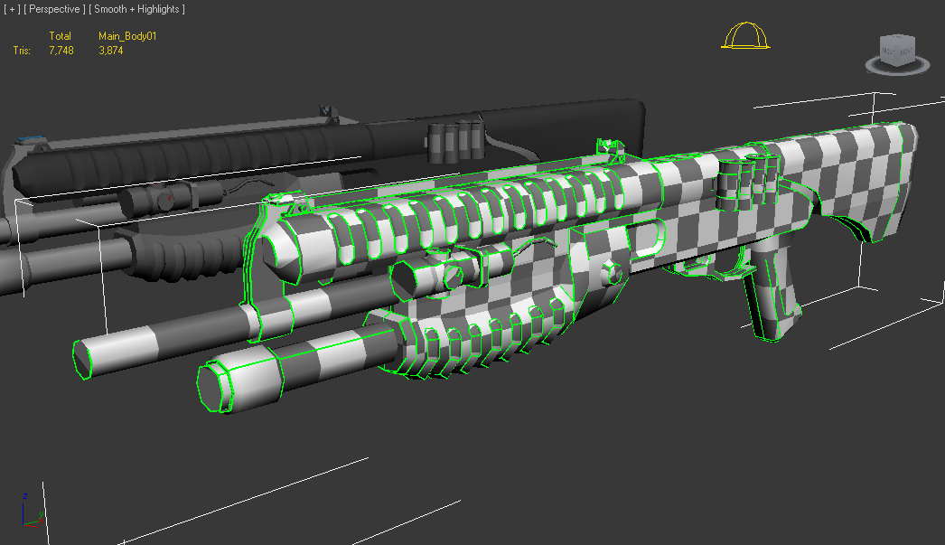
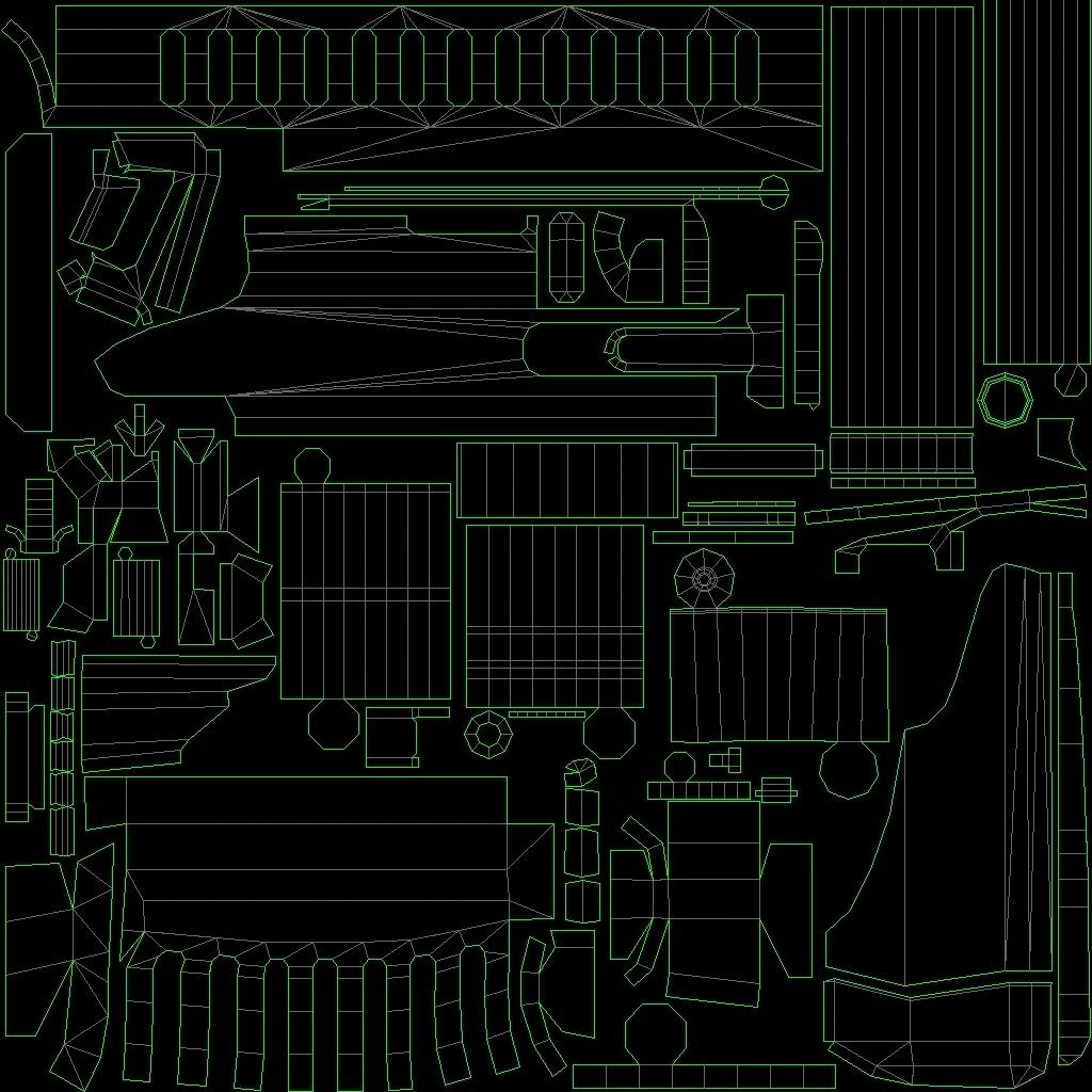
September 3rd, 2009, 10:02 PM
Hunter
Re: The Studio Quick-Crit Thread
Unwrapped shotgun.
Will rotate cylinders so seams are at the bottom. Final triangle count is 3874.
September 3rd, 2009, 10:45 PM
SnaFuBAR
Re: The Studio Quick-Crit Thread
Quote:
Originally Posted by Advancebo
yeah, I already removed it when I had the conversation with Moses.
Also its not a hemisphere, its an extrude with the internal vertices welded to 1 point.
Also, the sides of the pump are at a pretty terrible angle, and the ribs on it are pretty bad as well. Same crit i gave hunter about his pump. Fix it, it's really bad :ohdear:
September 4th, 2009, 02:48 AM
paladin
Re: The Studio Quick-Crit Thread
5 minutes in ps, working on a new head for my site.
Do you think it needs rays off the clouds, if so, can someone point me in the direction on how to do so and or link to a tut.
The clouds don't look very convincing. They look a bit too grainy, and those higher/lower concentrations of cloud just don't look too great. If you want that kind of stuff, I'd suggest either subtler colors or transitions.
Also, the clouds' silhouette isn't very apparent; it is there, but not as pronounced as it could be. The sun is also somewhat lacking (it looks like a simple glowing sphere, but not all that realistic).
I am liking the colors and the tree, but the execution just isn't all there.
/crit
I've been experimenting with MudBox as I had some time this morning. This is about a 20-30 minute sculpt.
If you can guess what it is, I'll feel better about the time used; otherwise, its back to the drawing board:
If I used stencils, they would be either stock stencils, which need no skill to use, or custom stencils, which would then be taking two steps to arrive at the same goal.
Also, stencils basically seem to be tileable textures that you can paint on to a surface either as an alpha or texture, and sure, that is useful for some things, but not for something like rubble which doesn't really have a pattern to it.
I think it was neuro that said, "Nobody's going to pay you for pressing a button."
September 4th, 2009, 02:06 PM
Advancebo
Re: The Studio Quick-Crit Thread
Quote:
Originally Posted by SnaFuBAR
Also, the sides of the pump are at a pretty terrible angle, and the ribs on it are pretty bad as well. Same crit i gave hunter about his pump. Fix it, it's really bad :ohdear:
I will fix the grip, just deciding on how it should look.
Show us a wireframe! Tis looks to much like its from the h3b model and you just did little edits to it, unless you can prove me wrong and don't de-triangle it, I know how to do that :iamafag:
September 5th, 2009, 11:11 AM
Chainsy
Re: The Studio Quick-Crit Thread
Spartan he modeled it, quit acting like a dick.
September 5th, 2009, 11:20 AM
MetKiller Joe
Re: The Studio Quick-Crit Thread
Worked on my ugly stick of gum a bit more; hopefully it now looks more like a:
But you should be commenting on the animation, not stating your observations, which anyone can see that you are wrong (except for the obvious 'oh well thars an acog and suppresr lol.'
Quote:
Originally Posted by AdmiralBacon
Hey, ODX, you interested in a non-paying job?
Yes, but I might not be able to accept because I have another non-paying job I'm working on. Lots of things to do.
Is this supposed to be a Golden State Warriors emblem?
September 5th, 2009, 07:27 PM
Futzy
Re: The Studio Quick-Crit Thread
No.
Steinbrenner High School.
e: Just looked at the golden state warriors logo. Whoever designed this one has no imagination.
September 6th, 2009, 04:10 PM
MMFSdjw
Re: The Studio Quick-Crit Thread
Quote:
Originally Posted by MrBig
Pretty much done
*snip*
aside from some anitomical issues the drawing is decent but the logo itself isn't that great. Though I assume you didn't design the logo so unless you have the option of altering the design of the entire logo then I'll hold my tongue.
September 6th, 2009, 04:49 PM
Futzy
Re: The Studio Quick-Crit Thread
Quote:
Originally Posted by MMFSdjw
aside from some anitomical issues the drawing is decent but the logo itself isn't that great. Though I assume you didn't design the logo so unless you have the option of altering the design of the entire logo then I'll hold my tongue.
Ya, I'm not allowed to alter the logo much at all.
I outlined it in paths in front of my adviser and he said not change how I did it from there.
If you can point out the anatomy issues for me that would be nice. It's pretty much my first time drawing a human.
DeviantART version has a couple changes http://avpdragon.deviantart.com/art/Warriors-136033799
Really big wip. Just looking for some suggestions on the shape. Was a bitch getting the face proportions to look right. Something still doesn't look right though.
September 6th, 2009, 05:30 PM
Bastinka
Re: The Studio Quick-Crit Thread
Vagina chin.
His mouth doesn't look shaped correctly, and his eyes seem too squinty. Looks good though.
September 6th, 2009, 05:47 PM
MetKiller Joe
Re: The Studio Quick-Crit Thread
The nose is the only thing I see as going in the wrong direction. It looks pretty accurate at that LOD from what I can see.
September 6th, 2009, 05:49 PM
Disaster
Re: The Studio Quick-Crit Thread
Quote:
Originally Posted by MetKiller Joe
The nose is the only thing I see as going in the wrong direction. It looks pretty accurate at that LOD from what I can see.
I haven't sculpted in the nose yet.
September 6th, 2009, 05:59 PM
teh lag
Re: The Studio Quick-Crit Thread
The chin doesn't look right. In the concept it seems to be more "blocky" or flat in front, while yours is smooth all over.
September 6th, 2009, 06:10 PM
Futzy
Re: The Studio Quick-Crit Thread
Looks very nice disaster.
In the concept it looks like the sides of the chin bulge out and then the lips are thin and puffy. In yours it looks like the chin and lips have nave no visible difference.
WIP site for my school newspaper:
Someone else is doing all the coding, I'm designing everything.
Right now we've got the front page layout up and running, but nothing functional.
September 6th, 2009, 06:14 PM
MetKiller Joe
Re: The Studio Quick-Crit Thread
The font is too small. You've got a TON of real estate that you aren't using. Functionality should always go before form. My only other concern is the size of the pictures (how long will the site take to load?).
Another shot. I think I've got the major details and proportions nailed. Just have to do the small things now. Then move down to the neck and so forth.
September 6th, 2009, 07:05 PM
English Mobster
Re: The Studio Quick-Crit Thread
Another shot at the train station.
I've tried to make it less cardboard-y by taking out a massive chunk of the roof.
Also, I was thinking back to the Domain betas way back when and remembered how a single entrance to any structure is bad news when it comes to Oddball camping. As such, I added in a tiny hole near the base of the Train Station which leads into the station itself.
While it's not readily apparent in the render, there IS some rebar supporting that tiny hole, the render's just at a bad angle.
Personally, I don't like the hole, but I have to have at least 2 entrances to preserve gameplay, and I can't think of any way to make it look good.
So I'm looking for your guys' opinion on both if I had succeeded in making it any better and how I can make that hole look nicer.
September 6th, 2009, 07:19 PM
Futzy
Re: The Studio Quick-Crit Thread
Quote:
Originally Posted by English Mobster
post
It's hard to tell without it being properly textured, but it looks good to me.
September 6th, 2009, 07:30 PM
English Mobster
Re: The Studio Quick-Crit Thread
While I'm at it, I have one more picture I would like crit on:
Since I'm constantly changing things here, the UVWs are temporary, as usual.
Looks good, but It looks nothing like the reference.
September 6th, 2009, 11:10 PM
Disaster
Re: The Studio Quick-Crit Thread
Quote:
Originally Posted by Horns
Looks good, but It looks nothing like the reference.
maybe because its not done :allears:
September 6th, 2009, 11:20 PM
Horns
Re: The Studio Quick-Crit Thread
Quote:
Originally Posted by Disaster
maybe because its not done :allears:
No i'm not just talking about the detail. I'm talking about the basic shape of the chest area and the face. They don't look like the reference. It looks like you just used the reference for inspiration and went off and did your own thing. Which there's nothing wrong with that, still a very good model. I'm just saying if you were trying to make a copy then you've missed the mark.
September 6th, 2009, 11:27 PM
Disaster
Re: The Studio Quick-Crit Thread
Quote:
Originally Posted by Horns
No i'm not just talking about the detail. I'm talking about the basic shape of the chest area and the face. They don't look like the reference. It looks like you just used the reference for inspiration and went off and did your own thing. Which there's nothing wrong with that, still a very good model. I'm just saying if you were trying to make a copy then you've missed the mark.
The chest isn't done. The muscles there weren't supposed to be complete. More of a guideline showing the general shape and area of them. Its a massive WIP. I'm still changing the whole bodies proportions. The neck has been fixed along with alot of the facial proportions.
September 7th, 2009, 02:12 AM
neuro
Re: The Studio Quick-Crit Thread
can't believe nobody bothered to do a paintover here
it sucks pretty hard because i don't have a tablet here, but i guess it shuold point out the most obvious lines in a fair enough manner.
you should proceed by defining the shapes of the head more, like the jaw-line for example, and the muscle thign going from the corner of the mouth to the nose.
just define the shapes in general more, then when you've got the most of it in there, you can start to actually sculpt smaller things into it.
the cavity in the side of his head.
just add muscle to where it should be, and smooth it out a bit, dig in the cavities in his cheek-area, then start to paint in some of it's tendons there
general rule of thumb in zbrush, is to just go from big to small.
September 7th, 2009, 03:55 AM
SnaFuBAR
Re: The Studio Quick-Crit Thread
i just noticed that your sculpt's forehead looks like flat ass-cheeks.
September 7th, 2009, 04:22 AM
NuggetWarmer
Re: The Studio Quick-Crit Thread
Looks like two elbows pressed together.
September 7th, 2009, 04:47 PM
=sw=warlord
Re: The Studio Quick-Crit Thread
After having taken in some crit some snaf and some advice from Deephunter i've remade my monitor shell.
The mesh is alot more clean now not as crimpled as it was i've not long started adding detail as i plan on makiing the mesh fairly high res or atleast higher res than halo 1.
I've got a side by side comparison of my old monitor mesh next to the new one.
I wont say which is the new one and which is old as i want to see who thinks which is newer, if my older mesh looks better than my new one then i know im doing something terribly wrong. http://img6.imageshack.us/img6/720/newmonitorrender.png
September 8th, 2009, 12:06 AM
English Mobster
Re: The Studio Quick-Crit Thread
The one to the right of the render is newer/better.
Made some progress on Gridlock's "West Gate". Any comments?
And, while we're at it, anyone know how to make Max listen to Alpha channels in .tif files and block out what isn't needed? The graffiti placed in that pic has an ugly black box around it, and while I know it won't be ingame, it annoys the fuck out of me.
September 8th, 2009, 03:32 AM
=sw=warlord
Re: The Studio Quick-Crit Thread
English mobster if you think the one on the right is better then i've stuffed up pretty badly.
The one with less detail to the left is the newer one.
I've decided to try and model the halo 2 monitor instead of halo 3.
Also while im here.
Anyone able to tell me for what ever reason the UV wrapping tools are all greyed out?
Im trying to unwrap my monitor and everything is greyed out for some odd reason.
September 8th, 2009, 06:11 AM
MetKiller Joe
Re: The Studio Quick-Crit Thread
If you open the material editor and go to the "Opacity" box, you should be able to put a bitmap there and it will automatically use that texture's alpha.
September 8th, 2009, 05:29 PM
=sw=warlord
Re: The Studio Quick-Crit Thread
Finished my monitor model.
I've redone the "eye" peice a little so it looks like a lense than just some beveled cylinder.
Im not sure wherther i should indent the actual glowing light peice on the side or not.
September 8th, 2009, 05:37 PM
Advancebo
Re: The Studio Quick-Crit Thread
in halo 3, the eye bulges out, instead of in.
in soviet russia, eye bulges you.
September 8th, 2009, 06:00 PM
=sw=warlord
Re: The Studio Quick-Crit Thread
Quote:
Originally Posted by Advancebo
in halo 3, the eye bulges out, instead of in.
in soviet russia, eye bulges you.
The eye is bulging out.
It'st just the lighting.
September 8th, 2009, 10:18 PM
English Mobster
Re: The Studio Quick-Crit Thread
It looks OK, but it's still missing... Something. It's passable, but I feel as if it needs some more detail work done to it. I'm sorry, but I can't put my finger on it exactly.
September 8th, 2009, 11:53 PM
UnevenElefant5
Re: The Studio Quick-Crit Thread
Put the marathon symbol on the eye. That's how it is in Halo 3.
September 8th, 2009, 11:55 PM
Advancebo
Re: The Studio Quick-Crit Thread
Quote:
Originally Posted by UnevenElefant5
Put the marathon symbol on the eye. That's how it is in Halo 3.
textures.
September 9th, 2009, 12:02 AM
BobtheGreatII
Re: The Studio Quick-Crit Thread
The eye on the monitor in Halo 3 is half a sphere isn't it?
September 9th, 2009, 01:41 AM
Advancebo
Re: The Studio Quick-Crit Thread
Quote:
Originally Posted by BobtheGreatII
The eye on the monitor in Halo 3 is half a sphere isn't it?
The eye on the monitor in Halo 3 is half a sphere isn't it?
More like a lense, i will try different variations but i do not intend to put the marathon symbol on it.
It never made sense to me how an "eye" would have the imprint of a symbol over the top of it which would distort the vision.
No wonder all the monitors are crazy.
E: http://img233.imageshack.us/img233/9...uiltyspark.jpg
Snaf where are you.
>_>
September 9th, 2009, 08:30 AM
SnaFuBAR
Re: The Studio Quick-Crit Thread
Need a wireframe and non-clay render with one omni and specularity of the material raised so i can see the surfaces better. Looks like you're doing a pretty good job so far, though.
September 9th, 2009, 10:24 AM
=sw=warlord
Re: The Studio Quick-Crit Thread
Quote:
Originally Posted by SnaFuBAR
Need a wireframe and non-clay render with one omni and specularity of the material raised so i can see the surfaces better. Looks like you're doing a pretty good job so far, though.