:] took my idea broski.Quote:
Originally Posted by AdmiralBacon
that black wireframe looking one is UUUUGLY.Quote:
Originally Posted by AdmiralBacon
Please keel the silhouette one.
Printable View
:] took my idea broski.Quote:
Originally Posted by AdmiralBacon
that black wireframe looking one is UUUUGLY.Quote:
Originally Posted by AdmiralBacon
Please keel the silhouette one.
Save as a .png and have the alpha box checked after you hit the save button.Quote:
Originally Posted by Ki11a_FTW
http://i194.photobucket.com/albums/z...a/hefegere.png
thanks ;) +rep
Looks nice
http://img217.imageshack.us/img217/4816/sniper.png
Using a different spartan model now. Weapons are extracted from Halo 1.
Bottom will not be visible, so don't worry about that part of the pose.
Doesn't look right.
Make his head tilt maybe?
http://img338.imageshack.us/img338/4816/sniper.png
http://img90.imageshack.us/img90/8294/sniperink.png
My 3DS Max is now giving me an extremely annoying bug so that I can barely work, the right click menu isn't displaying. Any help on the will be greatly appreciated.
Looks alot better.Quote:
Originally Posted by MrBig
Have him lean in more and bend his legs.
Bring that left leg a little forward.
Or wasn't that not going to be in the image?
No, its not:
http://img221.imageshack.us/img221/7785/sniperf.png
Eh, I dont like it.
i like it!!!
Ya, it looks more than a bit odd.
I think I'm going to do a different design.
Thank you. + rep to follow post.Quote:
Originally Posted by MrBig
E: too much, remind me later. I am shooting blanks.
Nice composure man.
oh, and I found this eagle while I was out:
http://img36.imageshack.us/img36/736/img1336x.jpg
Yeah, I know, digital zoom :(
it turns out the lens of my camera fits perfectly within the eyepiece of my binoculars, but the eagle flew before I could get a shot.
gj con :D
also, i guess your movie is over?
yes, everyone died or will dieQuote:
Originally Posted by Ki11a_FTW
Big, is he supposed to be reloading the sniper or just holding it? If he's just holding it, don't have him gripping the bottom of the mag. d:
Unnamed:
I am not the best artist in the world, I am shit at designing new things as well. But I am attempting to make a new vehicle, Halo style... or not. I want it to look big, simular size to the long sword, actually, will be a bit smaller.
I want it to look strong, and beefy. It will be fast and agile but week in fire power. It also needs to have some seats, inside or outside. I will probably put them on the inside seems as it will be fast.
Colours; well, black/dark-grey... yellow? whatever, will come to that when the final designs are drawn.
Weapons; railgun? but slow ROF. They could either be positioned on top or on the bottom... the bottom of it will be white, simular the hornet, as it looks nice an sleak.
My failed attempt at drawing Lol.:
[thumb]http://i58.photobucket.com/albums/g268/martynball/unnamed_design_1.jpg[/thumb][thumb]http://i58.photobucket.com/albums/g268/martynball/unnamed_design_2.jpg[/thumb]
(I need to get a good siloet for the outline of the main body, the back and front need most of the work. Might steal some ideas from the this)
E: 2nd image uploading. Also, I can't think of an interesting design for the main body... it looks boring and blocky...
Looks like the human equivalent of the banshee; I like it.
Try again, with refs (good ones). It's way off.Quote:
Originally Posted by Ki11a_FTW
Cool, it will be like, 3 times the size of the banshee though. I want it mainly for fast transport, might even make it weaponless. Going to reshape the overall body of it though.Quote:
Originally Posted by MrBig
Looks great! The cloth could be a little more contrasty though. *shrug* 's up to you.Quote:
Originally Posted by Con
Quote:
Originally Posted by MrBig
Quote:
Originally Posted by Heathen
Maybe you could move the spartan and weapon onto the center of the bevel, so it is clearer. Basically shrink it and center it in the top circle.
it looks like hes pushing the gun against the center of his chest, and resting his chin on it, not like he's firing it. thats definitely not how you would shoot a sniper rifle.
Yeah, one of my mates thought that was how you held a rifle - I had to fight the urge to take him out shooting with no instruction :P
you need to raise the arms if he's aiming down the sights, or if hes got it at the hip, bring the gun in more and a bit farther down
Why not use the animation importer to import the idle animations for the MC holding a weapon, then stick the sniper rifle in there. Done :)
I've got no idea how to do that.
Would be much easier to do it like that, though.
Make it look more like this, so he's bending into it.
http://www.majhost.com/gallery/renta...odels/this.jpg
The problem is, with your image, it doesn't show that the gun is actually where it should be, in your image, it still looks like it's in his chest, not shoulder.
Take two different renders. One with just the sniper, and one with the cyborg, and merge them together. That means you can outline the sniper completely instead of how it cuts off and makes it look like it's coming out of his chest.
10 min model:
http://i303.photobucket.com/albums/n...enderagain.jpg
The point of having a high poly model is to have extra details in the High Poly** model. The low poly can have several things removed that don't need to be there. Specifically the button like things on the side and the little extrusions arround them.
Actually you typically make a high poly model to then create a normal map out of it. So if you delete key geometry in the low poly, the normal map won't do much. If you're doing LOD models, you do it through a different approach than that. Also, for a model like the one you have there, a normal map would be a large waste of resources unless it included other important details, which is does not.
I like making the thing high poly, it makes it look awesome. :3
Disaster, im almost done modeling my weapon. :p
That's what I've been doing, I just didn't do the mask correctly.Quote:
Originally Posted by ThePlague
http://img99.imageshack.us/img99/835...iconsniper.png
Looks nice, but I like rentafence's pose.Quote:
Originally Posted by MrBig
I likey. :D
It looks alright but the fact that his thumb goes into the gun is pretty noticeable.
Well, there's a hole in the model, so I wasn't sure what to do about it.
Since these are all solid shapes in the icon it will be easy to fix without going through 3DS and changing the rig.
He's standing straight while holding the gun, it's like he's holding it in front of him. His torso should be turned where the gun meets his shoulder.
Take a closer look at how people hold guns.
This isn't going to be something look at all the time. It doesn't need to be perfect. The final icon size will be somewhere around 100x100.
@MrBig, this is what it would look like with the animations imported. Do you want me to send you the scene with stances setup?
http://i58.photobucket.com/albums/g2...sniper_aim.jpg
http://i58.photobucket.com/albums/g2...ll/test_ar.jpg
Also:
If it is going to be done once, it is best being done perfect. Saves doing it again.Quote:
Originally Posted by MrBig
sure, that'd be great.
Yeah. If you imagine a straight line running shoulder to shoulder, a fairly natural shooting stance would mean about forty to sixty degrees between the barrel and the line.Quote:
Originally Posted by Reaper Man
As Hunter said - do it once, do it perfect.
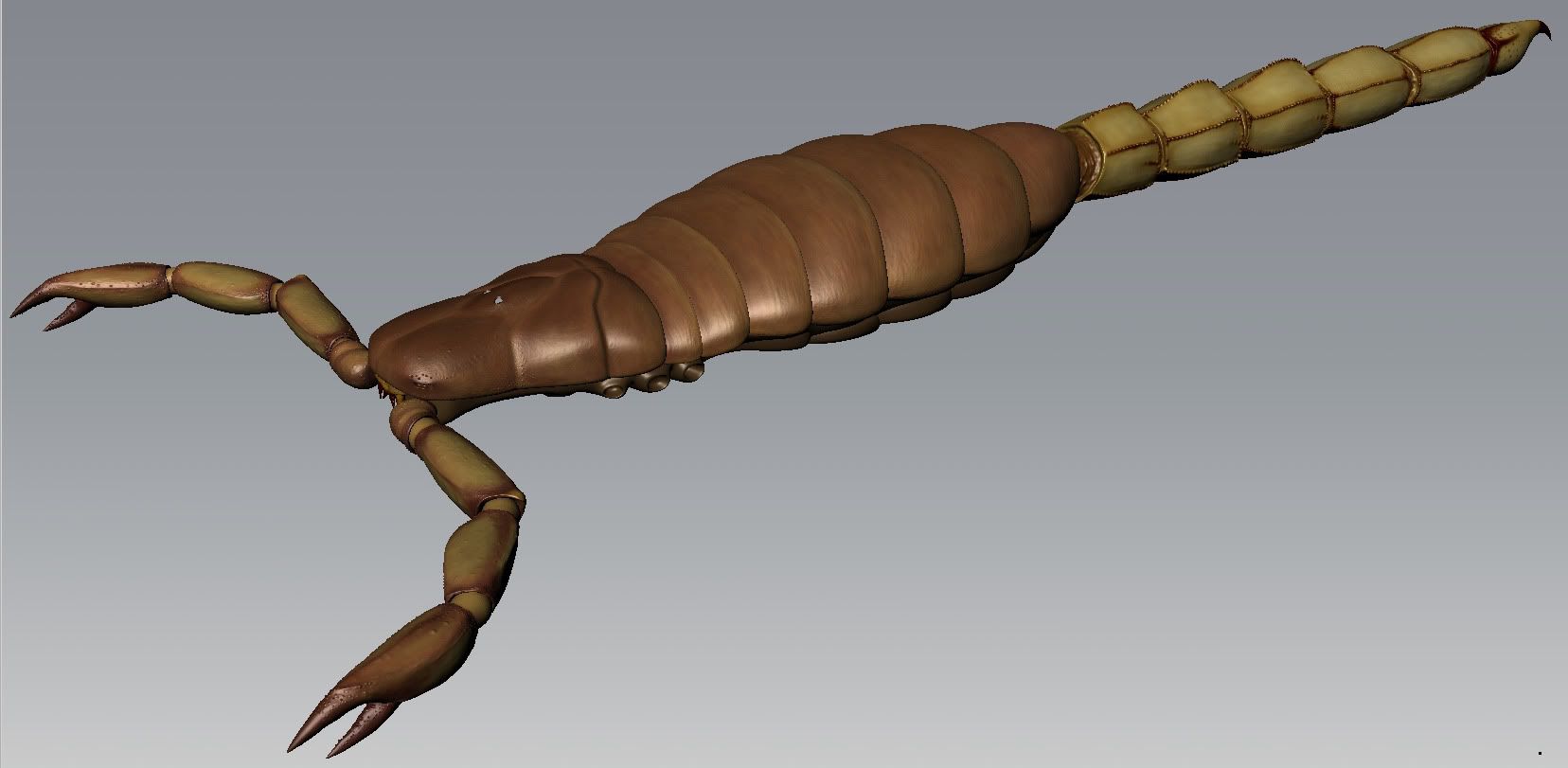
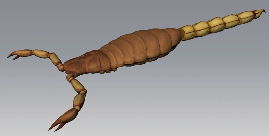
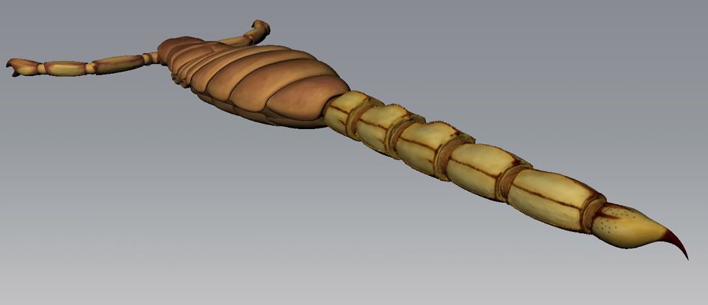
scorpion im working on.
heres a couple mudbox screen caps. (lost quality/detail when i downsized the pic) of course the legs are ripped off right now. having a bit of trouble getting all of the details to show up clearly in maya... does anyone know what "search distance" in the mudbox displacement extraction does/what it should be set at?
pretty cool.
Nice organics.
Still kinda resembles a toy though.
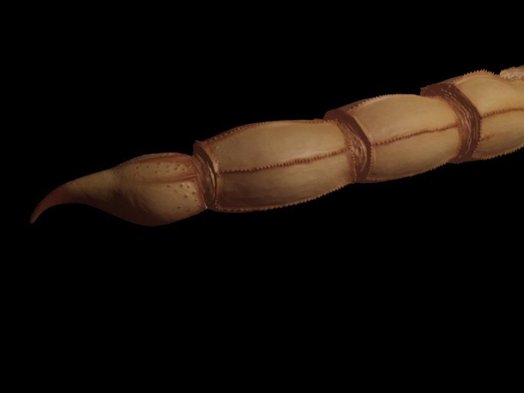
It that's a scorpion then why does it stinger face the wrong way.
when the tail curls over the stinger will be correct.Quote:
Originally Posted by DEEhunter
http://www.flightglobal.com/blogs/fl...l/scorpion.gif
the more flat part is on the top if you straighten the tail out.
hopefully it wont look so fake when i put it in a scene with nice lighting
That's not a kitty :<
Looks nice! Could use a little bit of hairiness around the stinger bit and a little bit rougher skin. You could probably do that with a normal map or something. For the hair, you could just use thebuilt in particle crap I assumed was there since I'm a presumptuous 3ds max user who can't read properlywhatever particle solution type stuff Maya has built in and have it randomly generate little flat billboards for the hair or something on those sections of it.
http://img33.imageshack.us/img33/5318/piczld.jpg
Bro I made you astalagmiteturd.
Thanks bro
show diffuse plxQuote:
Originally Posted by DEEhunter
Showing what I've got of the stance before I go to bed:
http://img259.imageshack.us/img259/38/backfdu.png
http://img219.imageshack.us/img219/7949/frontm.png
Don't even say anything about the legs.
Wireframe is halo 1 animations:
http://img248.imageshack.us/img248/2326/h1ref.png
http://img391.imageshack.us/img391/5043/yeeee.png
Seriously, fix the right hand. It just looks, soo wrong. And as for the legs, you need to turn his hips... and make it so he's actually making a stance. He sort of, and I mean sort of, looks like he's walking while aiming. So yeah...
If you must, get an AR sized prop, get a digital camera, set it on a timer and take a picture of yourself in the pose you want for the dick. Use this as a reference to pose the dick. Tired now idk. Not rocket science.
Don't hurt me.Quote:
Originally Posted by neuro
damn, did you bake that with a 100 pixel buffer or something? >_<
xnormal's cages. D:
Lower the maximum ray distances in the low poly mesh (assuming that I even know what I know what you guys are talking about :X)
What the fuck are you talking about? :gonk:Quote:
Originally Posted by legionaire45
figured out my displacement map troubles... heres a quick render of the tail with SSS shader. need to play with SSS colors and the spec, but you get the idea.
http://img174.imageshack.us/img174/5720/back.png
http://img245.imageshack.us/img245/6301/frontk.png
Not exactly sure where I'll be rendering each weapon from, but most should be from the back.
Was making assets for my map and then I realized how awesome marmoset engine is.
Sux GTFO.
Naw I'm joking its a fire hydrant. Fire hydrants are good and don't afraid of anything.
It's cool but needs better smoothing on the bottom.
You're cool.. Josh already knows about that because of me :). I don't see anything wrong with his render, you can see his details fine, as well as a clean render.
http://img195.imageshack.us/img195/5927/boxess.jpg
http://img145.imageshack.us/img145/4996/wipq.jpg
http://img161.imageshack.us/img161/2926/gasolinecan.jpg
I know that gas container should be more round, the render kind of killed some of it. The boxes are 6 polygons each rofl, and the assault rifle is my first wip sub divided object, as well as the gas container.
E/ I have no idea why I have a recycle sticker on there... Made sense when I did it, lol.
Marmoset looks more like rocks.Quote:
Originally Posted by DEEhunter
boxesQuote:
Originally Posted by Newbkilla
The skin isn't bad, but you're adding wear and tear through some simple overlays (which isn't necessarily a bad thing) and not also adding it where it's important. With the amount of wear you have on ordinary flat surfaces, the corners should be far more scratched up than you have them. Also, inset areas and concave corners should have less wear. From the amount of shading you have there, I think you would be better off modeling in those shapes rather than having this cheesy looking shading.
gas can
My complaint with the gas can is you have too much detail in places like the cap, and not enough polys spent towards smoothing the shape out. To be honest, the shape isn't all that great looking. I know you're trying to be original, but even in the future gas cans wont change all that much. With something that just needs to hold a liquid, keep it simple.
Quote:
Originally Posted by Con
I wasn't really trying for a sci-fi gas container, It was based off of this.
http://www.thereadystore.com/media/c...oline-base.jpg
As for the boxes, I hope this is better.
http://img119.imageshack.us/img119/9867/anybetter.jpg
Maybe change the font on those boxes. I'm thinking it'd look better with your generic army-type stencil letters, but that may just be me.
Hand paint edge scratches on the crates. Right now it looks like you used a bunch of scratch brushes, which doesn't look all that convincing in the way of material definition.
Ha ha, I see someone was following that grunge painting tutorial on the box.
Oh god, that's real? :gonk:Quote:
Originally Posted by Newbkilla
Uh, it's a screw. Not much else to say about that.
it LOOKS like a screw.
Actually its just practice on subdiv'd models.:realsmug:Quote:
Originally Posted by FlamingRain
Looks terrible. Go look at how the weapon is held in the game, and try again. It looks like he's just holding the gun up to his chest, not aiming or firing.Quote:
Originally Posted by MrBig
Quote:
Originally Posted by CSFLOYD
Try something harder bigger. :eng101:
:realsmug:Quote:
Originally Posted by Fear1337
Meh, sort of. It isn't exactly the same, but I got the idea from that. I've had the model for a while, but I had to subdivide it and create a low poly and such.Quote:
Originally Posted by BobtheGreatII
Also, lol at Conscars. It was an "interesting" gasoline container, that's why I picked it.
Rooster, you're right, I didn't add any extra scratches, just brush scratches, which I did tone down on my latest screen cap. I'm going to add some in a little bit. Thanks for the crit so far guys :)
http://img132.imageshack.us/img132/9867/anybetter.jpg
I added my own scratches onto it, and added a detail normal map.
Use a different font for the texture. That looks like it's on some hoakey flyer posted on a phone pole somewhere.
Something like this?
http://hans.presto.tripod.com/images...cils90x124.gif
Still need to work on defining a number of panels, and probably adding detail to the underside areas(they're the hardest part to see any details of due to the fact that they're lit up in the reference).
Fake E: Also need to figure out Kerkythea's lighting system to get a proper "crater" glow working.
yesQuote:
Originally Posted by Newbkilla
Love that base! looks exelent.
Just an AUG A3 from fpsbanana. Normally, I get the origin right first time, with some minor edits...but I dunno, something seems off on this one.http://i32.tinypic.com/2krc7p.jpg
Looks too far to the right.
http://img291.imageshack.us/img291/2910/rendered.jpg
I finally got Marmoset to work.. ATI driver didn't work with it. Anyway, here it is without the army styled text on it.