Not to be rude, but you've showed that 4 times (I believe) in the last 3 pages. Would it kill you to make a thread for it?
Printable View
Not to be rude, but you've showed that 4 times (I believe) in the last 3 pages. Would it kill you to make a thread for it?
First time showing it, but sure. *runs off to make a thread*
Oh I see, it's a different building. But yeah, it would be nice to have a thread where we could easily see all of your buildings being made and crit them without having to go back page upon page.Quote:
Originally Posted by Llama Juice
If i can bother teh lag to send me his brutes too, i was thinking of doing some elite v brute fighting posesQuote:
Originally Posted by killer9856
Maybe if i make my best puppy dog eyes...
http://www.youtube.com/watch?v=RANK_...eature=channel
:C i know theres no fingerwork whatsoever when the left hand moves out of the screene, ill fix it later
I really don't know why everyone does it so awkward with the "thumb on top of mag" reload. You wouldn't reload like that unless the gun was inline with your stomach. Act out the reload. If it's anywhere near shoulder height, your fingers would be pointed up, and thumb up, probably pressed against the back of the magazine to assure it's being seated in the magazine well correctly. You're going to bend your arm at the elbow.
While it's smoothly done for the most part, it's just contorted and weird and just anotomically awkward.
This. Just because bungie did it doesn't make it good.Quote:
Originally Posted by SnaFuBAR
I might start trying at animating FP instead of simple 3p biped animations since it's getting me quite interested....
Don't mind the mark vi chest (again)
I fixed the feet (finally) but I still have one problem, it isnt casting any shadows. The .biped has the does not cast shadow unchecked, any solution? Next to do is fix the visor's abit.
The Empty Glass:
http://kid908.deviantart.com/art/The...lass-141566517
Quote:
Originally Posted by kid908 @ Deviantart
Your diamonds are not breaking up light into different colors, and therefore, will never look like diamonds, only facet cut glass.
Diamonds look :nsmug:
Also, having your "kid908" thing in your render scenes kind of detracts from them. Gives a bit of a sense of self importance and "look at me" rather than being about the quality of your work.
Maybe make it small. I have some little things that go around the base of wine glasses so when you have a bunch of people over you knows whose is whose. Make a little thing around one of the glasses.
Needs caustics on the diamonds.
It's done i guess.
Although im not sure what to think, i think it needs alot of improvement but im not sure how to go about it as i don't have photoshop only paint.net so im hopeing i can make some decent shaders in 3ds max and bake them onto the bitmaps.
if anyone can give tips and adive i would greatly appreciate it.
The stuff spoilered are the different bitmaps i've made.
Im hoping someone here can tell me how to improve or atleast what to improve.
I realise my UVmapping is absolute crap but its my first and hopefully its a good start.
Caustic is on.Quote:
Originally Posted by Advancebo
@SnaF: I can not find a tutorial on how to create the breaking of white light into the visible light spectrum. If you have a link or tut, I'd appreciate it.
The logo was just something for the glass to reflect. I'll find something else to replace it with.
@Paladin: My wine glass don't have those =\ did It come with such objects on it?
@Warlord. Why do you have so many unwraps for your one model? Put everything on one map.
Because i want to retain as much detail as possible, im going by the standards crytek used for their bipeds which was have a bitmap for each segment.Quote:
Originally Posted by Llama Juice
make the bitmap larger...Quote:
Originally Posted by =sw=warlord
2048^2 is a large enough bitmap. But if you need, halo will accept bitmaps larger than 5120x5120.
Largest I was able to compile was 2048.Quote:
Originally Posted by kid908
Quote:
Originally Posted by kid908
you buy them seperate. I got them as a stocking stuffer a few years ago :/
Note where i said "Crytek" not "Bungie", im putting this into crysis not halo but considering this is as good a place as any to get feedback i posted for feedback here.Quote:
Originally Posted by kid908
To be quite honest, warlord. Spreading your bitmaps over 3-4 textures is easy, and it doesn't force you to think about UV space/arrangement, texel density, and detail that you can paint onto it depending on those factors.
You are taking the easy way out, imo, and using "Its Crytek's method" as an excuse (even if you aren't, that's what it looks like to us, and probably any future employer). It is also inefficient using that method because it will eat resources.
If you are trying to only practice photoshop texture painting, then I guess it is sorta justified, but you are still painting depending on an unrealistic set of factors.
I don't even have photoshop so i've been trying to bake the bitmaps with enough detail i wont need to get photoshop.Quote:
Originally Posted by MetKiller Joe
I can try to condense the bitmaps more but i doubt there is much more i can actualy do besides the chest and abdomen.
So, what do you plan to do for your diffuse? Polypaint in Zbrush?Quote:
Originally Posted by =sw=warlord
Even using GIMP would be better than not using anything to paint your diffuse other than Zbrush. What you are suggesting would, again, be inefficient to implement.
As for the UV templates, compress everything so it fits into one square then start from there resizing and scaling pieces relative to their size.
@Warlord, your idea of getting the most detail in possible... while not painting anything is more than retarded.
Also... what size are you planning on keeping these at? 1024X1024? 'cause if you have each of those at 1024X1024, then one 2048X2048 is just as many pixels. You could fit all your stuff there into one map easily, and by splitting up stuff you're losing so much useful space. You could fit most of the hand's map into the helmet or the top left map that you showed us. Try to bring your unwraps into one map.
Does Crysis have separate chunks of armor or something that you can put on your character? That's the only reason I could see for them doing what you're doing. If you're splitting up the actual mesh into separate parts... so that you could have different legs on your same torso... then I see that method being useful... but as is for one character like this... you're just being silly.
At best, if you're going to be making separate helmets that can be swapped out... then those can go on different maps while keeping the rest of the body all on one map... but other than that... keep it all together.
.Quote:
Originally Posted by Llama Juice
.Quote:
Originally Posted by Llama Juice http://www.modacity.net/forums/style...s/viewpost.gif
@Warlord, your idea of getting the most detail in possible... while not painting anything is more than retarded.
A: im a sculpter not a painter
I have not seen one good artist that shows off his/her work without having some skill in making their own textures. This is no excuse.
Some studios, granted, have dedicated texture artists, but modeling and texturing go together.
B: i don't have photoshop nor do i plan on getting it illegitimatelyIm using trials for 3ds max.
That's fine, you can still use GIMP. Though, seriously, you can probably get a cheap copy of CS on ebay, and it will do 90% of what you need to get done.
Does Crysis have separate chunks of armor or something that you can put on your character? That's the only reason I could see for them doing what you're doing. If you're splitting up the actual mesh into separate parts... so that you could have different legs on your same torso... then I see that method being useful... but as is for one character like this... you're just being silly.
Actualy Crytek used separate bitmaps for arms legs and torso, you can easily see for yourself by opening the .pak files.
No there is not a different perm because as far as i know the korean nanosuit is entirely different.
This applies for all the bipeds, including the aliens.
So, because Crytek uses that method, it isn't wrong? I mean, maybe there is something to their pipeline you are overlooking, because by itself, this method is resource wasteful and inefficient (much easier to manage one texture than 3 different ones).
At best, if you're going to be making separate helmets that can be swapped out... then those can go on different maps while keeping the rest of the body all on one map... but other than that... keep it all together.
As i have said i am trying to keep it all simple while have it working at the same time, if i scale one peice larger than the next then the pixel distribution would be shot to pieces and if there is one thing ive learned from snaf or neuro its that you do not want that.
Scale the pieces first relative to the largest piece's texel density (pixel density/distribution), that may help out.
When i said i do not have photoshop i literaly mean i cannot afford it at all.
I have 3 birthdays comming up as well as christmas to put my money towards and seeing as employment isnt the easiest thing around here right now because everyone is being laid off.
I trust cryteks judgement in making arms and legs different bitmaps as obviously they are the experts on this not me.
Honestly, I think the reason for multiple bitmaps is so they can fit more detail into it, rather than having one lolhueg texture with wasted space within it.
http://i38.tinypic.com/fjkrp3.png
Better?
That has chest, abdomen and head in one bitmap.
For the texturing my idea was to get the model unwrapped and then make a decent set of materials in 3ds material editor and bake those onto the diffuse.
Im guessing that wont work correctly?
Im just following what it says to do in my 3ds max book i got.
Welp, Crysis was terrible with optimization. It was a giant look at me.Quote:
Originally Posted by =sw=warlord
You doing this to your model doesn't make any sense at all since you don't have a mesh for normal map and AO baking; it's going to look terrible ingame, hth. You say you're trying to get as much detail from your bake. Your model is very basic and has no detail.
2048^2 is max you need for any character.
I would say crysis had fairly good optimisation but because it had pretty much every graphical technology of the time it was too far ahead of peoples computers at the time.Quote:
Originally Posted by mech
I've seen quite a few developers documentaries on it and from what i've seen it has just as good as unreal its just the shaders were too damned dynamic.
Unfortunitly because i strive to keep my self legitimate i never had a chance to get used to photoshop and so have to rely on and free programs.
i learned 3d modeling from gmax initialy but since moved on to using the various 90 day demos and by the time im done its time to reformat anyways.
In Warlord's defense, GIMP is absolutely terrible.
Think about that one for a minute. Then think about when Halo 2 Vista came out, and why it wouldn't run on most people's computers. Same reason.Quote:
Originally Posted by =sw=warlord
TBH it's more important to not waste texture space than have slightly different texel densities.... just don't make it drastic.Quote:
Originally Posted by =sw=warlord
To load in several textures all with insane amounts of wasted space is less efficient than loading in one large texture with some wasted space. If you put all of the stuff on one map, you can usually scale everything up just a little bit to make it take up more space and get more detail in there.Quote:
Originally Posted by Pyong
I am doing the best i can with what i have, considering this is the first actual full scale unwrap i've done i would like to say i started off on a good perch, i have now condensed the chest abdomen and head into one bitmap so that will cut down on alot.Quote:
Originally Posted by Llama Juice
I will see if i can put the legs and arms together but if i go any further i can say now i will have issues and im not too keen on getting some nasty texture streching.
You're only going to be getting stretching if you scale the UVs non uniformly, or if you're not accounting for how your texture will deform when you rig and animate the mesh.
If you scale it equally in U and V then you won't get stretching from that.
E: didn't see your bold stuff in the quote.
I was using H2V as an example to demonstrate your flawed logic of "Well it doesn't run on most machines, so it must be optimized."
Also, I'm not saying that Snaf and Neuro don't know what they're doing. They both are extremely smart people who are great artists, I'm saying that you're taking what they told you a bit too literally and wasting tons of space because of it. I'm not in the industry yet or anything, but I know what I'm doing here, I'm about to graduate from college with a BS in Game Art. I know my shit too sir.
.Quote:
Originally Posted by Llama Juice
Well heres the bitmap i've got so far.
http://i35.tinypic.com/24wr1i1.png
Yes alot of wasted space but much better than before...And now 3ds max has crashed....
After I got done making this render, I noticed ANOTHER rouge batch of polygons.
FUCK YOU ROUGE POLYGONS!
...They're mocking me...
Old:
New:
I've been working with CE2 for the past two years, the SP and MP were terribly optimized. Not just from an art perspective, but code too.Quote:
Originally Posted by =sw=warlord
that's just 3ds max telling you unwrap is terrible and should start over.Quote:
Originally Posted by =sw=warlord
Let's be a little more constructive.Quote:
Originally Posted by neuro
There is not much to say about it. He rendered out a pretty shitty complete map and filled his uv clusters :allears:Quote:
Originally Posted by Con
Atleast use smoothing groups. And add definition to the texture? You can't tell what any material is. There is no "material." Just colors.
Actualy it has smoothing groups thanks.Quote:
Originally Posted by Disaster
The reason it has no "material" is because i have not really messed with the material editor before and cannot figure out how to make a decent ceramic material.
It's all good and well saying hurr ur doin it wrong, but when the person your shouting at dosnt know how to do it correctly then it helps to tell them how to do it correctly.
I've now got GIMP so hopefully i can do a few texturing things in that, i've been told it supports custom brushes and filters? if anyone has any suggestions then please, suggest away.
:ugh: You should seriously watch a texturing video.Quote:
Originally Posted by =sw=warlord
http://www.game-artist.net/forums/sp...tal-crate.html
http://www.game-artist.net/forums/sp...texturing.html
http://www.game-artist.net/forums/sp...ng-cannon.html
http://www.game-artist.net/forums/sp...-painting.html
http://forums.cgsociety.org/forumdisplay.php?f=46
I point you to this particular sub forum on CG Talk
Would this be any better in terms of UVwrapping?
Got both arms and legs in one bitmap now.
http://i36.tinypic.com/245g31c.png
Lots of distortion. Also post the uv wireframe instead of a baked map.
Quote:
Originally Posted by =sw=warlord
Put everything on one bitmap, please. You are still wasting a lot of space. Enlarge your largest piece and start rearranging.
I'm still lost on how he plans to bake a norm map from that model...
from the 2 bitmaps you've posted, I can prob fit them in 1 large bitmap. You're trying to save pixels for details that, at this point, doesn't exist.
Helpful hint: use multi-layer texture to achieve desire material effect. It's still best to paint the texture.
Who said anything about making a normal map?Quote:
Originally Posted by kid908
I said i was making the diffuse map through the material editor because i no very little in photoshop due to the dislike of having to obtain softrware illegitimately and so have never had the chance of using photoshop.
it just looks so sloppy :l
Every texture looks like a placeholder.
Try to hide hard lines between textures on the same model.... and never again use that black haggard ugly stuff that you used in the last image there.
not all of the textures look entirely bad to me they just all seem misused. The only ones that jump out at me as really terrible are the ones in the last image that look like a desaturated photo of trash, and the windows
I think its because he only has about 5 textures, and because theyre all very different hues, they stand out and have harsh edges.Quote:
Originally Posted by ICEE
Like Llama said, try and blend them.
That's not what damage or a sidewalk looks like. I'm talking specifically about the part in the middle - it doesn't look right by any account.Quote:
Originally Posted by English Mobster
I know; I said "Fuck it", and just put a not-destroyed building in its place.
Get you a texture artist brosef.
wat up video editing all up in dis
looks like revelations?Quote:
Originally Posted by Ganon
we'll see soon ;]
and what exactly are you looking for crit on..?
idk, does my timeline look well organized sweetheart?Quote:
Originally Posted by ICEE
Based on this, but I didn't really like the near part of the tower so I went in a different direction with it.
OHH MY GOD <3
Looks a bit thin.
yeah, beef it up just a tad.
Certain areas are just... off. Most of it is great, but some parts appear lacking or out-of-place. Work it over a few more times then it'll be great.
A bit anorexic and visually flat. It needs tapers in different directions. Check out my tutorial.
Just try to keep in mind that monolithic structures taper towards the top. Your piece will be much more substantial if you start thinking this way.
Working on it. Pretty sure it's a result of my modelling it as much as possible from the angle in the concept.Quote:
Originally Posted by Sever
I cannot for the life of me do tapers properly, even with the tutorial. Probably because a lot of my towers have fairly complex shapes and tapering ends up with a good number of nonplanars, which I'm fairly anal about not having in models.Quote:
Originally Posted by SnaFuBAR
Accurate Picatinny Rails:
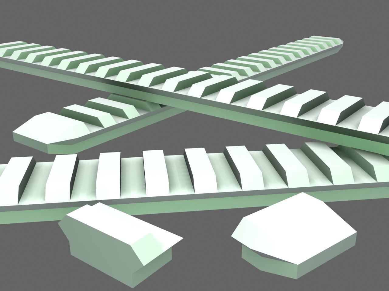
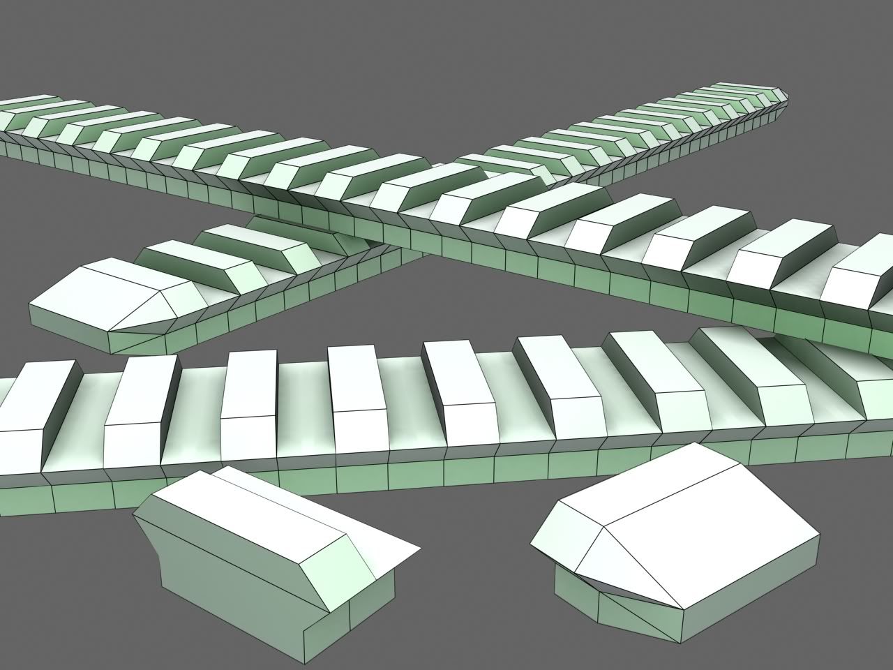
I modeled a piece of it (shown on the bottom), then just used the Array tool to lay them out.
You could make them so much lower poly.
I think because he made it so it is modular, the quads near the bottom are like that.
If you cut a bit out of that model so there are two modules it would be 14 triangles without the bottom. it could easily be 10 triangles.
Its only 4 triangles but it will save a lot when you have a long rail. You could always make them like they did on Call Of Duty 4 which is 100% inaccurate and just looks retarded. Especially on the barrel on the M4 Carbine.
Image links are dead, but you may get something out what's left of this: [link]
I assume this is what you guys mean, or at least from reading Legionaire's thread.
The top teeth mounts thing are each a seperate object, but the base is one long 9 sided object.
So, 5 sides from each teeth, plus 9 sides from the base.
Can someone tell me what a shader is? I've assumed it was a graphics modifier. Some code that takes the finished rendered frame in real time in a game, and applies effects to it.
PS: what the hell's a rail and why is it so important?!
Rails are used to mount Attachments.
http://en.wikipedia.org/wiki/ShaderQuote:
Originally Posted by FreedomFighter7
remember my earlier rant about looking things up for yourself? that took me two fucking seconds to pull up.
MA3CS Assault Rifle:
http://www.xfire.com/video/17d366/


Model by Advancebo
Tagging by Advancebo
Animations by ?
Still needs an unwrap, a texture, and new animations.
And need to fix the reticle problem, and the sensor bug.
LOL PICATINNY RAILS
Animations are by Hayabusa.
its cool except for the counter
I don't like the design =\ it just looks odd. IDK why, but it just does.Quote:
Originally Posted by ICEE
i kinda like it, except make it a dot-site
I think its supposed to be, cept its shitty atm.Quote:
Originally Posted by Ki11a_FTW
Let's try again.
http://i435.photobucket.com/albums/q...kinggarage.jpg
Taking Snaf's advice and completely remodeling Gridlock.
Things going off to either side are monorail tracks, shield generator is just there to show why one side of the garage is so bland (so people don't escape the map).
I don't want to fuck up again, so what do you guys think?
Question is: Are you happy with it?
Because there isn't much to crit.
Dunno why you have that big chamfer at the door going all the way to the window edge. That looks bad. Look at the odst concept art if you want to see how storefronts should look. You're yet again trying to do an odst theme without actually understanding the stlye. There are no real lone shop buildings, everything is connected. This is turning out to be just boxes with stretched octagonal holes, though admittedly so far you're modeling better.
It's a parking garage, sorry for not clarifying that in my post.Quote:
Originally Posted by SnaFuBAR
Jay, you do not seem to understand what this thread is for, it's for work that you don't have another thread for.
You have a thread for your level stuff, there is no reason for it to be posted in both these threads.
I post things in here because if I just post things in my other thread, people tend to ignore things there until the fail in the model reaches critical mass and I have to start over.
I'm trying to prevent myself from having to do this entire thing over again this time.
people ignore them
because they are bad hth
check out good people like CAD's thread and notice the difference :]
That has no impact on what I mean. You still would not for any reason make that chamfer there. Support beams go there. Cutting through where a support beam would be is ridiculous, and makes no sense visually.Quote:
Originally Posted by English Mobster
Your point stands.
Thanks for the crit.
*Scurries off to make changes*
Nice Golden Eye map thar
In reference to this pic...
What engine are you planning on putting this in? Well over half of the detail in that could be normal mapped in and I would suggest doing so.
Also, add stuff that changes the overall shape of the object, those are the only polies that really matter usually. I know it's fun to toss around a shitton of polies to make stuff look good, but with stuff like what you're doing there it's not really worth it.
Now of course, if your engine can push a shitton of polies, then rock it sir.
Yes Advancebo, that's what I ment :)
ODST style architecture is very smooth. There are hardly any sharp edges.Quote:
Originally Posted by English Mobster
http://www.bungie.net/images/Games/J...Concept-12.jpg
Now there are angular shapes. However, these angular shapes are very smooth. Don't be afraid to use triangles. Halo can take a lot more triangles than you think. It just requires good portaling. Pretty much everything is made out of metal. I don't think there is any concrete in the picture and there is no rust at all.
Most damage is done in the form of dents, scratches, debris, and broken glass.
http://nerdiest-kids.com/wp-content/...concept-06.jpg
If you look at this concept art, there are a few sharp edges and alot of angular patterns unlike what was in the previous concept art. However, this style is completely different from what you have shown in any of your gridlock pictures.
You also need to get better fucking textures. The textures in gridlock are terrible and make my eyes bleed.
E: you have hte texture materials all wrong. Its almost as if you never looked at the concept art. Your textures are also way to noisy. In the concept art, the textures are smooth and have common angular patterns etched into the surface. Almost like the forerunner but more modern in a sense.
this this this thissssssssssQuote:
Originally Posted by Disaster
Halo can take up to around 30k polys without clipping in most parts in the playing field. Anything past 35k is gonna require portals to run smoothly and have no clipping. Halo can take up to around 75k per BSP with good portals before getting lagged with major clipping. Use triangles wisely, but don't be afraid to use them at all. :downs:


