https://www.exchange3d.com/cubecart/...f1279//box.jpg
I modelled an amazingly detailed house. :)
Printable View
https://www.exchange3d.com/cubecart/...f1279//box.jpg
I modelled an amazingly detailed house. :)
To much detail.
shitposts are not art, and therefore, do not belong here. k thx.
Your post made absolutely no sense to me. I have never, ever heard the phrase "water resistance displacement" in my life. Also, I did say I was replacing the boat, so there's that too.Quote:
Originally Posted by Malloy
enough of that. get back on topic.
Well who the fuck uses the phrase "water resistance displacement"? I mean really? But whatever, call it that if you think its better than wake or splash.Quote:
Originally Posted by rossmum
that's technically what a wake is, he probably just said it because he couldn't think of the proper name for it. i do the same with things all the time
Hey. Shut up!
This isn't english class. Get back on topic!
On topic criticizing the... box? Well fuck that.
The compound bow on the other hand looks nice. See what you could do with a Reverse Energy Bow.
That reverse energy bow is kinda scary. It almost looks like he is shooting at himself....
re uploading
Right now it's just a purple grid.Very simple. I'd like some idea on what else to put in it.
I kinda wanted to put electricity running through it.
two things: one, jesus christ make jpegs from now on. two, what exactly is it supposed to be? without context i can't really give crit.
It's just a high res picture.
I just don't know what else to add in it.
a jpeg of the same resolution would've loaded probably 5x faster, and it's not THAT high res.
e: the point of asking what it was for was to get you to tell us so we can help you think of what to add. if we don't know what it's supposed to be for how can we think of what to add?
For me it is. :smith:
I'll re-upload it then.
Or just use PNG's. They look good and only take long to load if your internet is retarded slow.
Oh hey look what I just worked through the night to bring up to class project spec
All that text bullshit will be gone eventually. It was just there to implement a recursive method that was required for the project.
The water resistance displacement looks slightly innacurate on the descending nautical flotilla
Lol the infraction was so worth that.
But really, it looks pretty good. Glad to see the wake is matching the color of the surrounding water.
The wake originally didn't match because the background was originally going to be blue, and you originally fought battleships with a cannon. I swapped the gameplay out after fiddling with that idea a bit. This works much better. Explosions and death animations, and enemies that actually fire back will be added. Also, the enemy boats are going to be facing the other way, since i realized that no matter what I do, if I have ships pointing both directions, one set is actually going to be sailing backwards relative to the background. I think I'm going to have some guys firing off the back of them or something. Also the enemies won't be PT boats. Those are placeholders with a color adjust.
If this turns out well, I might just convert all the code to C# and apply to put it on XBLA as an XNA game or something.
SwiftboatVeterans$BlitheringIdiotException.java? lol
Should the torpedoes still have collision with boats that have been destroyed?
We should talk Exam
They don't, and I think that's a good thing. They tend to fill the screen at times, so it would get a bit annoying.
your image is bigger than the post frame. kind of mind fucked me for a minute.
Looking pretty fucking sweet, Sel
Shader comparison time:
I know these are different objects, but the shader in the newer picture will be using the same material as the sentinel wall.
New shader I'm working on.
old shader:
Anything anyone think's would help improve the look of the new shader would be greatly appreciated.
it's not the shaders, its the textures.
protip: learn to texture.
diffuse + spec + gloss + reflection mask + detail map + cubemap(mask) etcetc
no matter what you do with a shader, a diffuse will always just be a diffuse, nothing more.
any time you've put into 'making a shader' is wasted time. (besides, the stock shaders will propably do alot better anyway if you've got the right maps)
Neuro, I would like to thank you for completely skipping the point of my post in it's entirety and attacking the one part I personally cannot change.
The bitmaps were given to me by teltaur, you seemed to like his bitmaps in the UT3 thread and yet now you are attacking them, pretty hypocritical if you ask me.
if your bitmaps are bad, no amount of shader will make them look good.
are you sure you're plugging your bitmaps into the right slot?
all i'm seeing on those images is diffuse, and a flat photoshop-normal
another thign i'd like to add, that if you make an ENTIRE house one flat shade of gray, it'll look dull no matter what engine you throw it in.
that's just a design-thing, a gray box, will never be mroe than a gray box. righ now, that building is one flat shade of gray. it's boring to look at. you know it, i know it, everyone who sees it will tell you the same.
If you've got more than 3 texturesets to work with, USE THEM.
this is where the tricky part comes in, you actually have to be able to model decently!
you're going to have to build your geometry around your textures, cut in strips, shapes, imagine how you want it to look while you're modelling it. and 'GRAY' does not count!
now on a completely other note:
how about taking the advice from someone who makes a living out of doing this stuff you're trying to do, and shape the fuck up instead of beating the advice in the wind.
has it even occured to you that i might know a shitload more about this that you do, and i might actually be -GASP- right?!
fun fact: i'm working on crysis2 right now.
off 2 bed, enjoy.
I am not trying to say who is right or wrong here, but last I heard, Art was something there is no "right" or "wrong".Quote:
Originally Posted by neuro
What I'm asking here, is about the shaders not the bitmaps, get it through your skull, I'm following older styled foreunner, I do not want detail for details sake as thing's get cluttered, cramped and start to look like dog shit on a stick.
All I want, is comments on the shader, not the bitmaps, once you realise this we will get on fine, but until then we are simply going to butt heads as you are being completely ignorant to what is being asked.
But since you seem to insist on the delusion that I'm putting the wrong bitmaps the wrong place here's a screenshot of the material editor.
Before you ask, Yes I am infact using the metal shader.
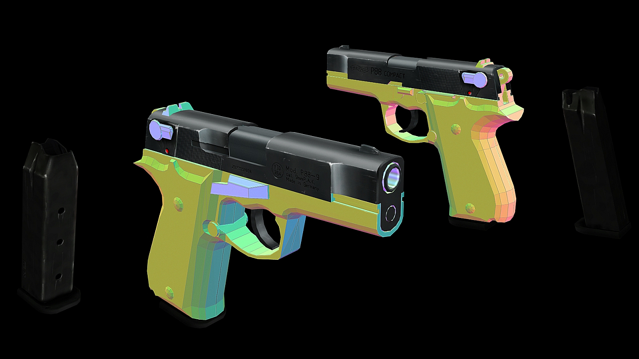
Just got a new Rebel XS, some generic shots as I'm getting the hang of it
....Quote:
Originally Posted by =sw=warlord
do you seriously get defensive about every piece of criticism someone gives you?
also, your models dont even look uv'd right
Your cat is cute corndog.
:-3
Inorite :allears:
yeah, shes looking entirely unimpressed by my photo-taking, and she hates the flash so i was lucky to get a good shot without her turning away.
#1 i dont give a rats ass wether you're capable or not, if what you produce look like crap, you're producing crap. simple as that.Quote:
Originally Posted by =sw=warlord
#2 i'm not even going to bother with the rest i was going to write since you don't care, and you're not even worth my time anymore tbh.
No, actually, but I do find it offensive when I make the effort to ask for suggestions on one subject and people decide to completely whitewash that and talk about something that I wasn't asking about.Quote:
Originally Posted by FRain
It's on par of asking what people think of apples and then you get some random guy who decides to detail the entire thing and talk pairs.
Neuro, If you stop being such a over zealous cock and actually give suggestions on the fucking shaders I will take the suggestions but for the umpteenth time, the bitmaps are not mine, they never were mine you would have to take your complaints to Teltaur who is the guy who made the bitmaps.
There seems to be a delusion going around these forum's that I'm "over defensive", I simply am not.
What I am though is intolerant of people who go out of their way to patronize me as though I am a child and could not possibly know what I'm talking about.
I will only show the same amount of respect to others as shown to me, it's only fair.
I cannot believe how much of a shitfest it becomes when I ask a relatively simple question.
Neuro just seems to have the mindset anything that's told me just walks through both ears, that's not the case as proven many time's over.
So, I'll ask again: What do you think could be changed about the shaders, add more reflection? reduce reflection?, more fresnel? what?
RAR up the textures and a model and send them to me. Also, you want to use .dds textures only, anything else is a waste of space.
Ugh.
First off, Neuro has every right to criticise the bitmaps if he believes they need to improve before the shaders can. Warlord, that's not something you have no control over. Get new textures or edit them, then work on the UVing more. Try to get some more variety so it isn't a big grey box like Neuro said. Secondly, there was no need to react the way you did. It was pretty childish if you ask me.'
Neuro, I infracted your post because it's a blatant flame. You don't use phrases like "protip: learn to texture", "shape the fuck up" in crit posts. There's no reason for it and it just makes you sound like some elitist. Like you said, if he's not taking the crit then don't waste your time.
Enough of this, please.
Shaders (shader effects) are hard to critique with still images and even harder when you're not sure about the capabilities of the engine. The only thing I could really tell is that there are highlights on the sharp corners to give a smooth appearance, which is neat, but again, my lack of familiarity with that engine means I don't know if that's anything special.
But you definitely shouldn't have included a diffuse, if that's not what you want feedback on. It just gets in the way of the shader effects you're trying to show, since a lot of would-be shader effects can easily be painted into the texture, and with only still images to reference, we'd never be able to tell.
Newest version of my stargate mod for crysis, haven't worked too much on it the past few months, all work was done these last few days. Still a lot of tweaking/editing needed, but It's I think it's starting to look good :)
video description & credits
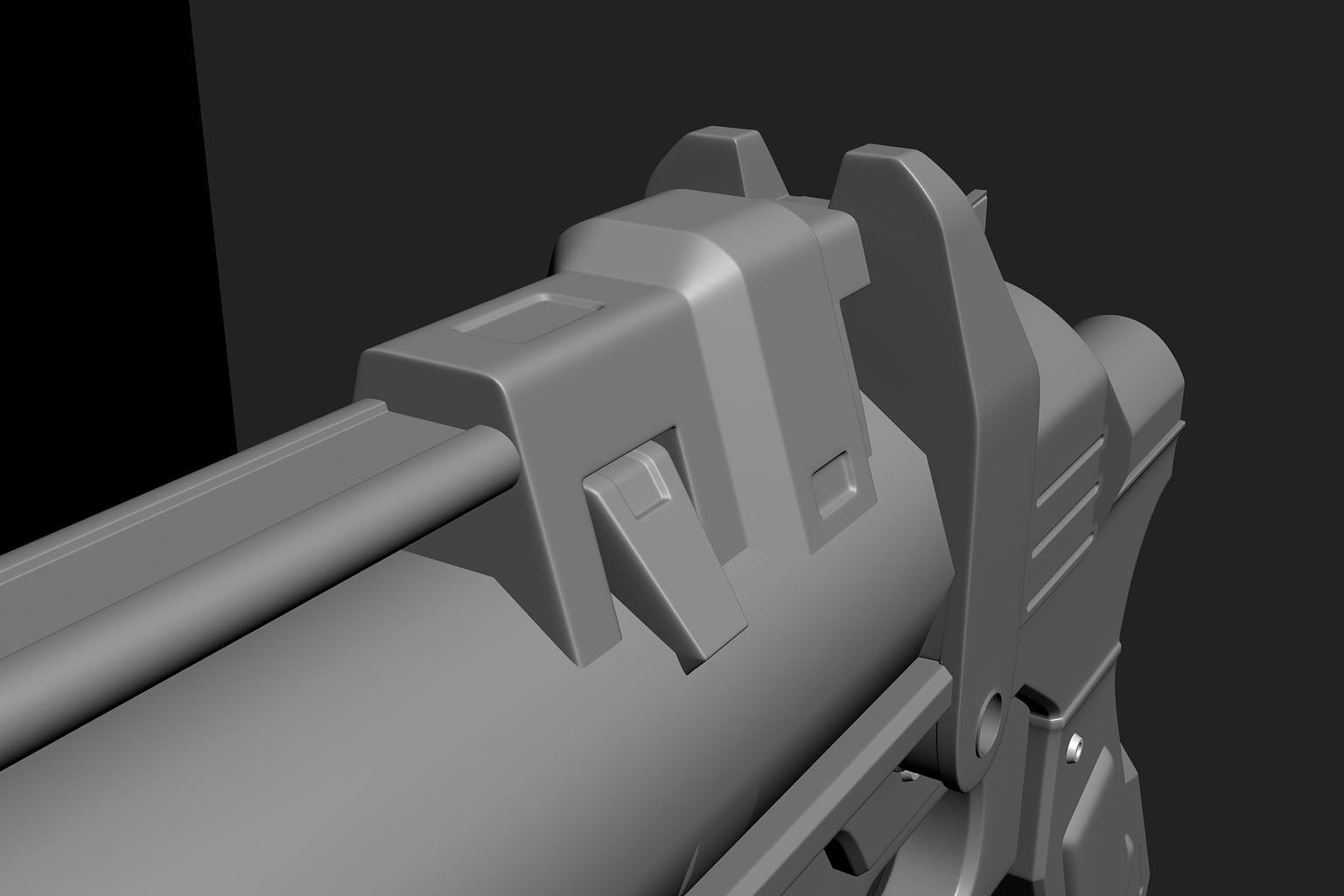
Don't know if you have any type of reference but I love the overly complex design. However, I'm not too fond of the grip at all. I'd suggest making the grip more like the one on the Battlefield 2142 sniper; I don't know the word for it but a cylindrical grip seems like an odd growth on a gun like that.Quote:
Originally Posted by Disaster
Heres a picture of what I'm talking about:
hi im bad at this
cool is that for CS?
it's for whatever someone can be bothered to compile it for
You metal on the gun itself is tool "clean." As in, it looks more like simple gradients than metal (regardless of how it was actually made). Find a way to dirty it up some - not necessarily in terms of "grime/not grime", but in terms of making it look like what it should look like. The mag is better.
yeah, i tried but it obviously didn't work. gonna have to figure out some other way of doing it ughhhhghgh
This thing just happened to be in a state where I could actually render it, so I did. It's only a preview; I have a lot of detail I want to add, but I'm not sure how much is going to stick. The final will be either a lot more detailed or a little more. If I'm happy with it, I'll build the rest of the body.
http://s3.amazonaws.com/data.tumblr....sljLqDjXQi8%3D
Note that it is not textured and the materials are default Lambert shaders sharing an ambient occlusion node. All detail is modeled-in and on-surface, because I am insane.
The render looks awfully sloppy, but from what I can see, it looks very detailed. Cool beans
I had made this Garand for a Maya project a few months ago during the semester. Never got around to doing the low poly and texture. Decided to use the model to play around with some render settings, and hopefully when I get some free time I can do the low poly and finish it up.
last two renders look nice, first two are meh.
model looks nice too, except for the triggerguard not really living up to the same kind of detail as the rest :P
The metal looks too grainy. It needs more grime added to it to be effectively nice looking IMO. On top of that, the metal should also be as reflective as tin, but also seemingly absorb the sun at the same time (I hope that makes sense). If you look at Forerunner Architecture in Halo3, you'll see this kind of effect, although I'd focus on increasing the griminess first.Quote:
Originally Posted by =sw=warlord
You mean a bit like this?
http://img217.imageshack.us/img217/3...nshot0025a.jpg
Also I'm wondering if anyone who has experience with making particle effects can give some tips for the teleporter effect's I've been making.
http://www.youtube.com/watch?v=6CKDY5vC9WE
Send me the model/unwrap and I'll give texturing it a go
http://img32.imageshack.us/img32/9277/telez.jpg
I have plenty of overlap, idk whats with the seems
Wasn't sure if you actually wanted the metal to be that tan color, but i can easily change it if you did
e: seams are in the render but not through the viewport with direct x shader
[thumb]http://img266.imageshack.us/img266/1374/95846117.jpg[/thumb]
First attempt, am I doing it right?
edges way too tight, like everyone else on these forums is doing.
also, floaters are bad, and try to avoid intersecting stuff into eachother, because it doesnt make for nice seams.
Okay, cheers :)
Neuro the edges look better? Compared to the edges on the rails with the half circle cut out.
The darker green transparent part is too wavy, sort of looks like water, and is moving too fast. The "sparks" at the bottom are also moving a bit fast. The main "beam" of it could be a bit taller. Overall I'd say just make it slower and less chaotic. Right now its too distracting in my opinion.Quote:
Originally Posted by =sw=warlord
Looks like someone set a match to vespene gas. Is that supposed to be a teleporter? The sparks are way too energetic and throw it all off.
which edges are you asking look better? they all look really tight to me.
better, but still kinda tight.
also, you don't want to have those pieces as intersecting geometry tbh, make them part of the mesh.
Okay, I will lossen up all of the edges before its finished. And I will get rid of all of the intersecting geometry. Cheers :) Just trying to practice and get the hang of it so I have got a good head start when I go Uni. Well, more of a head start. Lol.Quote:
Originally Posted by neuro
This a bit better?Quote:
Originally Posted by Con
http://www.youtube.com/watch?v=NP5m3s1aGRA
Please ignore the sound as I've yet to get sound effects in there.
@Warlord - You have too much horizontal/oblique movement and too little movement vertically. Also, add more height to counter the width you have. Unless you were going for a concentrated 'spherical' shape, of course. Maybe add something that would add more flare to the vertical movement you have now; such as having a lighter green 'gas' spiral upward. Finally, it may help to just lessen the distance the sparks fly outward
I'd focus on making the teleported's particles look more vertical and focused themselves. I honestly think it should look more swirly too.
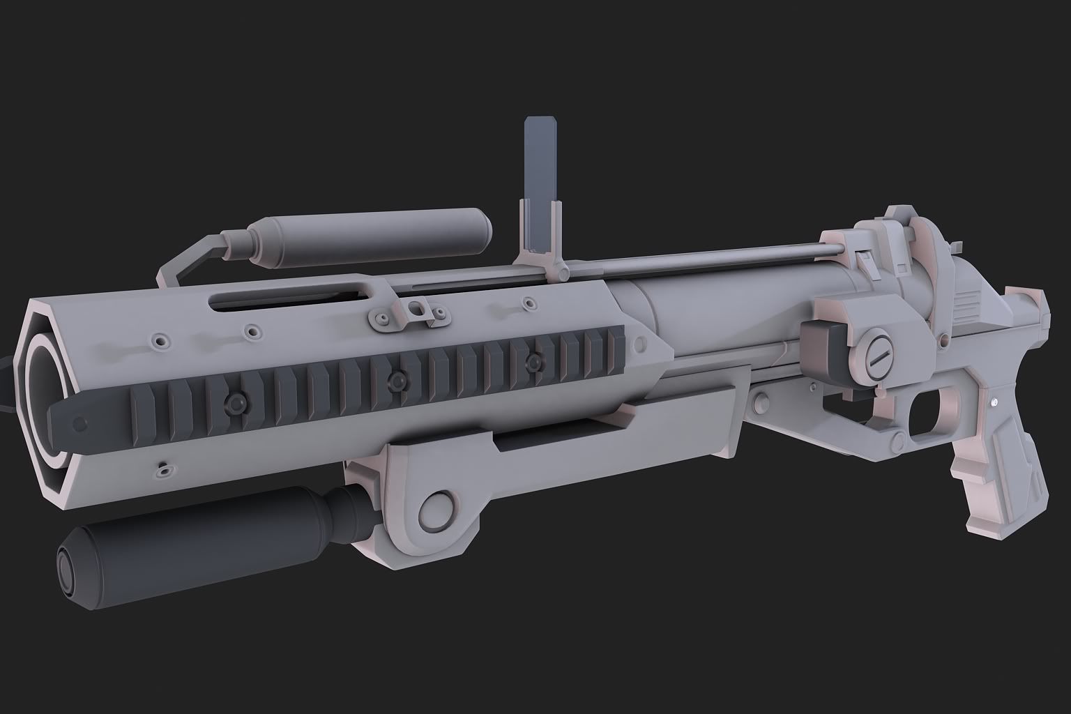
First Sub'd model, so it aint going to be perfect, about 68% complete. More details needed to be added, errors fixed and other problems need to be fixed, such as hardedges.
(First Sub'd apart from pathetic attempt like a year ago on a pistol which I scrapped).
And of course I need to stop the geometry from colliding of course. And soften almost all of the edges, just wanna get it done first seeming as it is my first Sub'D model.
Plenty of inaccuracies which need to be fixed, or not. Who cares about accuracy...
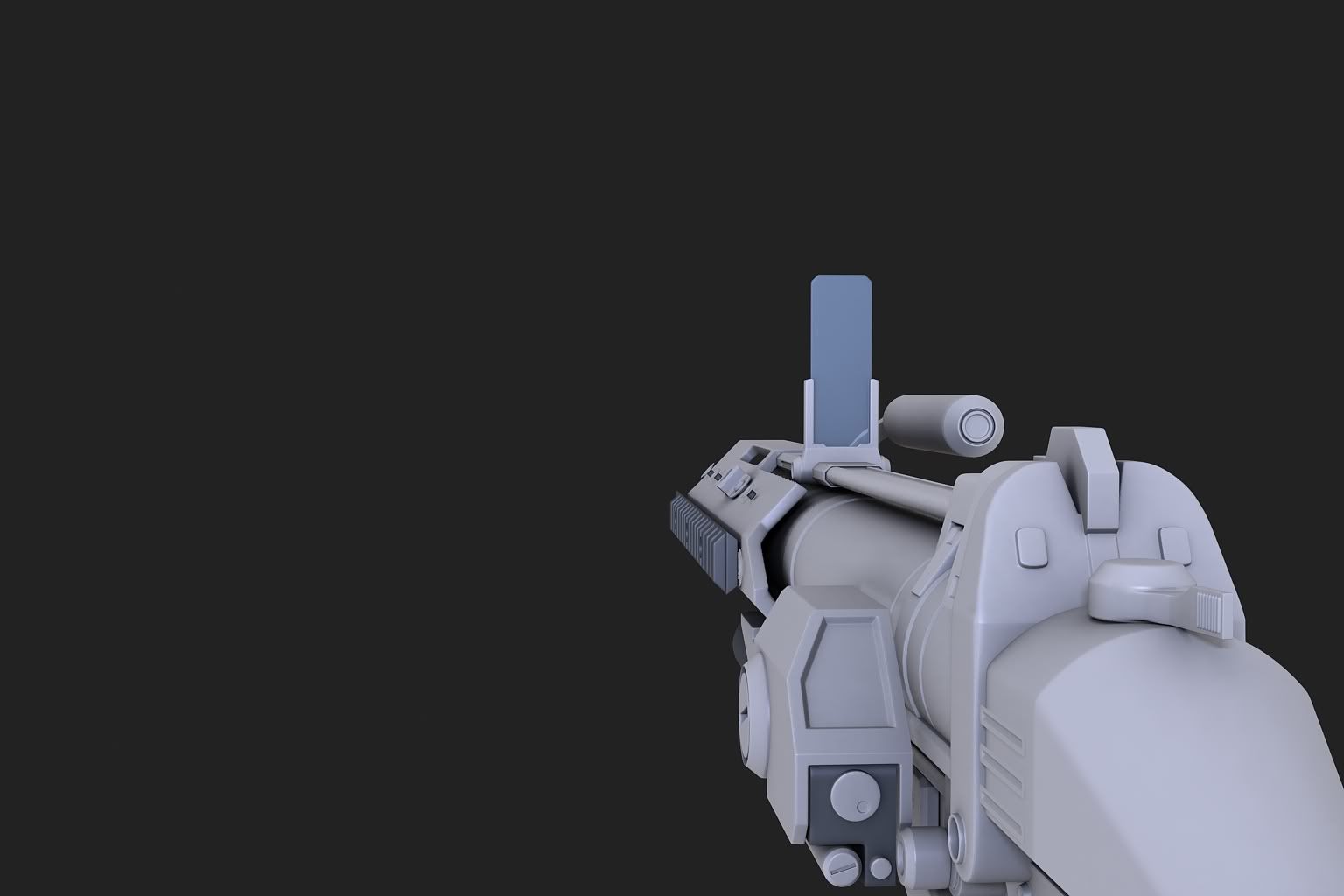
Is that suppose to be the grenade launcher from Reach? If so, never new it was that long.
I was wondering why it looked odd, thought it was too long my self. I will fix the longness of it tomorrow :) seeming as I am not doing anything till september as I have finnished college and start University in september :P
what did we say about floaters. bad. Floaters should be used for pretty mush just text, and I tend to use them sometimes for agonizing, but small and insignificant details.
:( but they make life simpler
and they'll fuck your AO, and sometimes normal map
I think that's because of how close it is to the camera in the render; The FP (for whatever it's worth without proper origins) looks pretty accurate at first glance. But I am beginning to see what you mean....Quote:
Originally Posted by Limited
He said he was going to fix it because his model was too long.
http://www.bungie.net/images/Games/R.../040510/gl.png
His length seems about right.
Pro Pipe
http://i58.photobucket.com/albums/g2...launcher_8.jpg
I'm going to have to go with Disaster on this one. That was from halomaps ^^
This a little better?Quote:
Originally Posted by Anton
http://www.youtube.com/watch?v=WGVtWHTQYAk
http://img155.imageshack.us/img155/6...maarmsskin.jpg
http://img35.imageshack.us/img35/6359/sigmaarmsskin.jpg
Did this yesterday. Redid my/Geo's skin that was made for the fp arms in SigmaLeet's project a couple years ago. Pretty much rushed the leather/rubber. I'm thinking I should add some metal bits to the back of the fingers and grips to the insides.
Oh, definitely. make the finger segments "interlock" like this?Quote:
Originally Posted by Invader Veex
....__
_/ __ \_
_/ ....\_
filters look bad :(
what filters
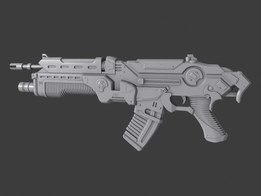
Concept looks like it was based off of Gears of War, tried to model in every detail I saw.
both hunter's and newb's model look alright, though hunter's could do with less sharp edges, and there's a bunch of stuff which can be improved upon, simply by modelling stuff more out of a single piece.
newb, ive got one gripe with your model.
it's flat.
it's really just a flat thing with thingys stuck on the side (also your edges are too tight) right now, the shape simply doesnt look right, which makes your 'first person' view look weird. (purely because it's so flat) there's simply no interesting shapes going on.
@veex:
that doesnt even look like metal tbh.
It shouldn't, the outer layer of MJOLNIR armour is and always has been ceramic. Fuck, I haven't touched a Halo game for years and I still remember that. Also, I agree about the gun - it looks detailed overall but FP isn't so great. People really need to get some curves and things happening, or at least some other kind of interesting shapes. Boxguns are boring, even the really detailed boxguns.
I don't want to seem like a prick, but the reference I used showed no indication of curvature on the flat surface of the model. --->
http://fc00.deviantart.net/fs18/f/20...imsvanberg.jpg
Secondly it has been brought up that it looks similar to the GoW Lancer, so I decided to do a google images search and the lancer itself its flat in both game model and the props created by fans.
http://media.teamxbox.com/games/ss/1167/1215619587.jpg
http://xbox360media.ign.com/xbox360/...5103816433.jpg
I agree it looks awkward in first person, but it has also been brought up that "wonder why GoW is 3p?" The guns look shitty in first person, so therefore third person.
I completely agree that some of the edges are too tight however, I just thought it seemed unfair to critique my gun based off how it should look compared to how accurate it is really to the concept. (That was what I was going for).
im not criticizing it doesnt look like the concept.
i'm criticising the fact it doesnt look aesthetically pleasing.
keep in mind that's partly your own fault, because you -could- have used some artistic licence and made it better.
in retrospect of that, give you two seperate fedbacks.
1: if you're sticking to the concept, it looks cool n all, and it is indeed like the concept. which would make it the concept's fault for not being aesthetically pleasing.
2: if you're looking to make a great model, you went too far off course, and ended up with a flat thing, which is a shame, because you could have veered away from the concept, and made it awesome by your own judgement, leaving the concept for what it is. only concept.
edit: doucebag crit: i dont care why or what your reasoning is, because it's still a fancy flat (sub-d) boxgun.
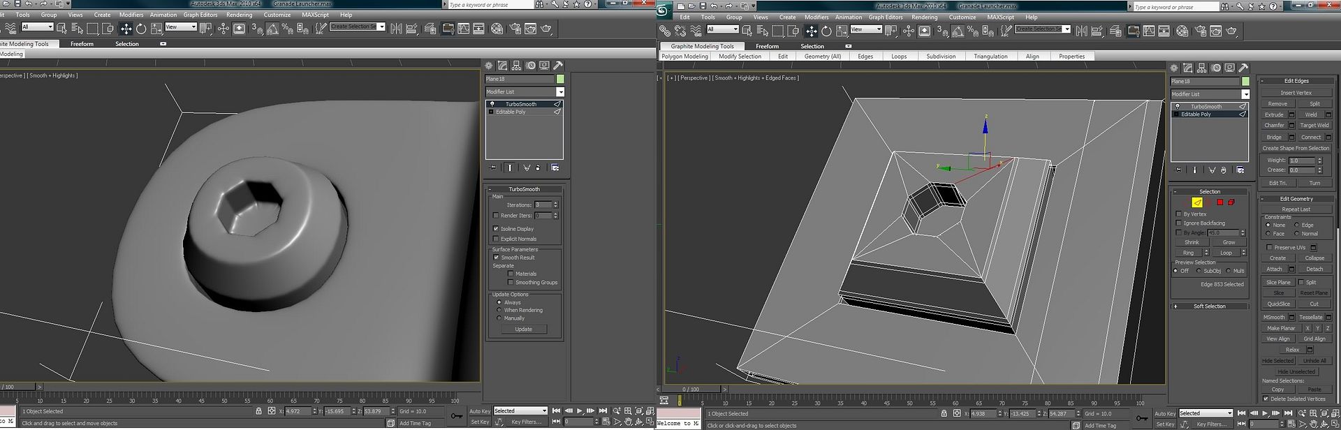
Neuro, how would you go about making a shape such as this? As you can see I have got pinching at the corners because it seems that there are too many edges in such a small area.
I did have a floater of the inset part of the screw.
Much better IMO. However, make the particles that shoot out (hope you know what I mean) more spread out. It looks goofy with those things only concentrated near the top.Quote:
Originally Posted by =sw=warlord
Haven't posted in a while... was making a small scene, trying to learn from it.
http://i148.photobucket.com/albums/s...fhappiness.jpg
http://i148.photobucket.com/albums/s...hemcalling.jpg
Learned some more proper ways of making textures. Ignore the green part for now.
http://i148.photobucket.com/albums/s...turingpart.jpg
Comments are needed. Tell me what else I could add or fix or do. Thanks.
That's nice and all, but GOW was a 3p shooter. Your model has a somewhat interesting 3p silhouette, but truth be told yet again, your fp is just a box. If you're going to spend your time creating a high-poly model and you're considering it for fp rendering or in-game, just use a concept like that as a guideline, and do what you can to make it not-so-boring. You should always consider the silhouette from perspective, the side and from the top. Even the shape from the front should be something identifiable.Quote:
Originally Posted by Newbkilla
Well, this is an HUD design I'm working on, that's essentially a fusion of Halo 3's layout and Halo 1's design. The reason for the Mk. VI-style outline is that the visor this HUD is being made for is very similar in design, with only a few noticeable variations that I've tried to include in this HUD (which I wish wasn't the case, because I'd love to have a less Halo 3-style outline, but I've got to stick with the model...) And I know there's not a huge amount to crit right now, but I might as well get any recommendations now before I get too far. The plan for now is to try being faithful to Halo 1's ammo and grenade layout, which will definitely get rid of some of the Halo 3 look, but I'm not quite sure how it'll play out with everything else in the HUD.
And yes, health is a slider instead of individual bars, but that's part of the game's design.
Health bar should be in the middle. Easy to see without actually looking at it.
@hunter first of all the inside of the screw is too straight on, needs to be at more of an angle. Also, add more sides, don't just do a square, it helps to have at least some sides in there, I usually use a 6 or 8 sides for round objects, depending on size. Iterations won't solve everything for you.
also, your edges should look more like this, supporting edges are important. http://img819.imageshack.us/img819/5162/edgeloops.jpg
That's probably not perfect either, but the two edges surrounding the outside and inner circle are
http://i623.photobucket.com/albums/t.../boltthing.jpgQuote:
Originally Posted by Hunter
make quads, and loosen your edges.
http://28.media.tumblr.com/tumblr_l4...qwt6o1_500.jpg
Boxes don't subdivide into perfect 360 degree circles. You need at least a pentagonal shape to get something decent. Octagonal is best here because the hole is an octagon.
Be careful where you terminate your support edge loops. You might wind up with something like this:
http://25.media.tumblr.com/tumblr_l4...qwt6o1_250.jpg
Just keep in mind where subdivision is trying to push the vertices. When edges get pushed over other edges, it's not a good thing. In general, I don't think it's good to have any triangles in areas where smoothing is taking place. Keep the triangles in the planar areas of your mesh.
Need some help with a seam issue.
For one reason or another, there's a horrible black seam in certain parts of the mesh but not others, the UV's have not been tampered with between the bitmap and model so I'm not too sure what's going on.
Any help would be greatly appreciated.http://img823.imageshack.us/img823/699/m6d.png
http://img824.imageshack.us/img824/7311/49197542.jpg
You need to texture out a little wider than you are. Select and grow the selection by 2 pixels or so, and it should be fine.